• Our software update is now concluded. You will need to reset your password to log in. In order to do this, you will have to click "Log in" in the top right corner and then "Forgot your password?".
  • Welcome to PokéCommunity! Register now and join one of the best fan communities on the 'net to talk Pokémon and more! We are not affiliated with The Pokémon Company or Nintendo.

Map Showcase and Review Thread

Status
Not open for further replies.
16
Posts
12
Years
Here´s my map.
mapaxd_zps389dad7e.png

Credits: EVoLiNa


-Thanks
 

Water Gym Leader

Arlyn Aquos
325
Posts
10
Years
krakacen
Spoiler:

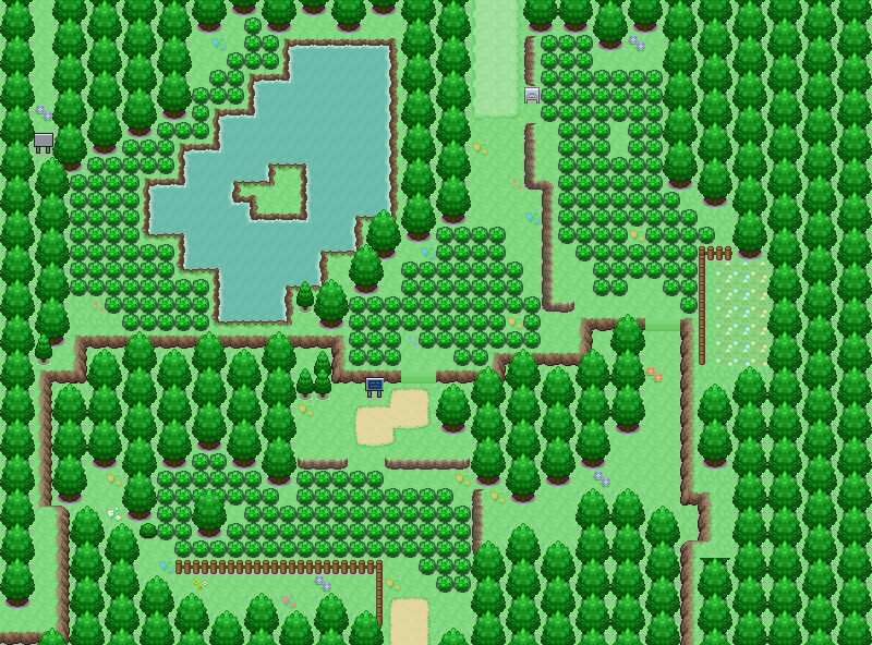
Red- Sign side fix.
Black- What's with that overly simplistic sign? Change it or dump it.
Pink- Fence you don't need.
Orange- Change the fence so its not taking up more space than needed.
Purple- Make this opening 2 tiles wide, it looks better.
Brown- How do get through there? Remove one of the trees, or put in a smaller tree. Also tile error on the tree in the bottom right.
Blue- Your slopes are WAY to simplistic.
FIX IT!
 
Last edited:

Varion Bluefire

A.K.A The Glitch
655
Posts
11
Years
  • Age 29
  • Seen Jan 3, 2015
krakacen
Spoiler:

Red- Sign side fix.
Black- What's with that overly simplistic sign? Change it or dump it.
Pink- Fence you don't need.
Orange- Change the fence so its not taking up more space than needed.
Purple- Make this opening 2 tiles wide, it looks better.
Brown- How do get through there? Remove one of the trees, or put in a smaller tree. Also tile error on the tree in the bottom right.
Blue- Your slopes are WAY to simplistic.
FIX IT!

I'll be honest here, I see nothing wrong with the fences, fences are good for the scenery, and good for blocking paths, to items, or to the route.
This fence in my opinion is needed, or it's just empty space.
Also, you say the slopes are simplistic, is there really a way to make a non simplistic slope, and actually make it look good enough?
 

Nickalooose

--------------------
1,309
Posts
16
Years
  • Seen Dec 28, 2023
krakacen
Spoiler:

Red- Sign side fix.
Black- What's with that overly simplistic sign? Change it or dump it.
Pink- Fence you don't need.
Orange- Change the fence so its not taking up more space than needed.
Purple- Make this opening 2 tiles wide, it looks better.
Brown- How do get through there? Remove one of the trees, or put in a smaller tree. Also tile error on the tree in the bottom right.
Blue- Your slopes are WAY to simplistic.
FIX IT!

No offence, but the map is pretty good... You're being nit-picky.
Many people don't like 1 tile wide paths, but in this case, I don't think it matters, the sign is man made and without it, the path is 2 tiles wide, it's not particularly a problem.
The tree you can't "pass", well if the priorities were changed, then you could, right?
Slopes were answered by Varion.
Fences on routes are fine also, I do the same and nobody judges me for it (maybe they suit my style more, I don't know)
Only thing I agree with is the tile errors, good map otherwise
 

Radical Raptr

#BAMFPokemonNerd
1,121
Posts
13
Years
Spoiler:

overall, its nice, what I dont like is how the grass you chose looks like little bushes - especially since theres a slightly darker colored version in use
its also just weird to have grass grow like that
 

th3shark

Develops in AS3/C++
79
Posts
10
Years
First time mapping, would like come critiques and advice.

Spoiler:


Some context: this map is called Ebony Sanctuary, which is a small park in the back of the professor's lab. I'm thinking this area would replace the PC's hard drive; now when you send a pokemon to a PC, instead of it being stored as digital data, the pokemon is teleported to this park. Grass-types would hang out near the forest area, water types would hang out near the water area, and so on. Later you can visit the park to see how your pokemon are doing.
 
378
Posts
10
Years
  • Seen Oct 18, 2017
First time mapping, would like come critiques and advice.

Spoiler:


Some context: this map is called Ebony Sanctuary, which is a small park in the back of the professor's lab. I'm thinking this area would replace the PC's hard drive; now when you send a pokemon to a PC, instead of it being stored as digital data, the pokemon is teleported to this park. Grass-types would hang out near the forest area, water types would hang out near the water area, and so on. Later you can visit the park to see how your pokemon are doing.

I like the concept, and if that's what the map is for, then I see no problems with it. Are you using Essentials? If so, how do you plan on making that work?! Back to the map, I don't see a problem wit it at all. There is a lot of space, but a lot of stuff will go there. Good luck!
 
320
Posts
14
Years
  • Seen Dec 27, 2021
DKJYaY4.png


Littleroot Town remake for my game Pokemon Nox.
Constructive criticism would be appreciated
 

Arma

The Hyena
1,688
Posts
14
Years
@Khkramer: I know Littleroot town doesn't have many (if any) special features, but there are still a few things you should always pay attention to.

Let's start with the house on the left, it's in front of the path. I'd think it'd be much better if you move it a few tiles to the left, and place on the same line as the other one.

Speaking of the other one, it kinda bothers me that it isn't connected to the path.

The lighter patches of grass don't make much sense to me as well, they only look nice under the sign, maybe you should try replacing the dirt path with it. the gardens bother me as well, I'm not too fond of those flowers.

Hope this helps you!

I've been away from RMXP for a little while now, can I get some feedback on this simple map?
i70g.png
 

Atomic Reactor

Guest
0
Posts
Hope this helps you!

I've been away from RMXP for a little while now, can I get some feedback on this simple map?
i70g.png

This map works fine for what it is, though I would make the middle and left grass patches less square. Just my opinion. One important thing you should note is that the mountain tile terrain, which is supposed to go ONLY on top of mountains, is being used in this map as a walkable tile. You have a sand path on the mountain edge, but then the rocky terrain, you're not suppose to use tops of mountains as walkable tiles, it looks sloppy and just... not good. If you look at any Gamefreak map, you'll notice that they never use it.

Just a thing to keep in mind, other than that, good map!
 

Vau

2
Posts
13
Years
  • Seen Nov 5, 2013
I love using the 3rd gen tiles so I tried to make a sort-of-jungle with many plants, a river and few waypoints to remember so the player is encouraged to get lost. :P

P.S. The water is not deep so the player can walk right through the river

P.P.S The upper parts of the trees next to the bottom path will be handled by events. That's why there is nothing to see right now.
 

Attachments

  • marsch4.PNG
    marsch4.PNG
    67.4 KB · Views: 80
Last edited:

YoungDante

Pokémon the Void
3
Posts
10
Years
  • Age 28
  • Seen Jun 16, 2014
I'd appreciate some feedback on this marsh map I made yesterday. I know it isn't perfect yet, I'm just trying to find out what to change/add.

View attachment 70103
 

tImE

It's still me, 44tim44 ;)
673
Posts
17
Years
I'd appreciate some feedback on this marsh map I made yesterday. I know it isn't perfect yet, I'm just trying to find out what to change/add.

View attachment 70103

8/10
Really good map.

Underwater trees though? C'mon man. Replace them with rotten logs, or real underwater vegetation.
I also think you might want to use something other than a pond to block the player on the middle island. Either that, or at least use the same water tiles as the rest of the marsh!
 
10,673
Posts
15
Years
  • Age 30
  • Seen Dec 30, 2023
I love using the 3rd gen tiles so I tried to make a sort-of-jungle with many plants, a river and few waypoints to remember so the player is encouraged to get lost. :P

P.S. The water is not deep so the player can walk right through the river

P.P.S The upper parts of the trees next to the bottom path will be handled by events. That's why there is nothing to see right now.
Completely un-playable. There's no real sense of direction in the map, and there's a lot of random placement. Remember, you're not trying to create a pretty image, you're trying to create a level. You should work with a smaller space and consider how your player is going to explore it. Here there is a large expanse of nothingness, with no direction, and nothing to see or do really. The grass doesn't pose as a challenge since you can avoid most of it. On top of that there is a mass of tile errors and tiles that don't mix.

I advise studying map layouts, and then drawing up your own. Playability is key. Then go and map with your own project afterwards. I actually can't really give you a rating, given that it's unplayable, and what I rate on is playability.

I'd appreciate some feedback on this marsh map I made yesterday. I know it isn't perfect yet, I'm just trying to find out what to change/add.

View attachment 70103
Not too bad, but there's a lot of things that need some work. The first things that do jump out at me are the underwater trees. So I'd follow tImE's advice on that front. The second is the use of tall grass underwater, I suggest not using those kind of "action" tiles out of the player's range, it's distracting and makes the player think that they can actually go down there. Also not that your underwater trees would still be sticking out at that level by two or three tiles in height. I would also like to suggest that you put some detail in empty parts of the map like where the original path is on the bottom. Some trees or grass to train in would be useful here, same goes for the top somewhat. Also remember to insert your tiles properly, the sign on the top seems to be fuzzy, probably because it is out of the grid in the tileset by one pixel.

The tall grass in the water is also a little randomly placed, I would suggest doing more clumps of it together than random dotting as is seen in some cases here. I think as a player it would be annoying to go from the top right island back to the island in the middle of the map. I would suggest adding some sort of log tiles which allow you to hop back to the lower island, and then place a ledge so that the player can't just bypass the normal route up to the upper island.

As a whole the map isn't too bad, just avoid some small walking areas too. There are some cases where there's a one tile gap, which isn't usually too favourable. A bit of organization could go a long way here, but until then you're at about a 6/10. Nice ideas and presentation however.
 

Worldslayer608

ಥдಥ
894
Posts
16
Years

Route 1 for Pillars of Destiny, final.

route_1_by_worldslayer608-d6t7zkm.png


Credits
System:Maruno, Poccil & Flameguru for their starter kit.
Graphics: Dewitty, Minorthreat, Alucus, Kyledove, PrinceLegendario, Erma96, Pokemoneclipse, BoOmxBiG, teaddiction, niknaks93, Light-PA, Lotusking, Tyranitardark, SirAzria, Celestospkmn.
Special Thanks: Cilerba, Chesu, F.M.P, Wichu, ~JV~, The Calis Projects Team, Abnegation, Murcurysky and everyone who supports this game.
 
Last edited:
189
Posts
14
Years
  • Seen Nov 23, 2023
Frankly, it looks fantastic. It has an obvious "level-like" design that clearly conveys the intended flow of the player from one side of the map to the other, and both allows for uninhibited travel as is common in the early game as well as forcing you to traverse some grass. It also has several "off the beaten track" areas that make for interesting exploration options. The only concern I have is that the gap between the trees and the tops of the cliffs is large enough that players might think they can traverse it. This could be intentional but I'm inclined to think otherwise. Also, most players wouldn't notice, but the stairs defy physics. With a vertical cliff like that, the stairs should be around 50% longer to account for Pythagoras, otherwise you have a stair-shaped ladder there. I do like the tiles you have used here, both individually and as a whole. They have a cohesive palette and work well together, and I note you've used little tiles like flowers etc to fill in details in otherwise empty areas, which is quite appealing. Over all, a very good map. 9.5/10.
 

Riansky

Purr
197
Posts
12
Years
New map made by me. Its Route 2 of my game Pokemon 0/1. I really like the map and I think its probably one of my best maps so far so I'd really like to see some feedback on it. Thanks!

Spoiler:


There are some tile errors which I'm well aware of so please don't point them out.
Credits: Kyledove, Pokemon-Diamond, Ultimospriter, Gamefreak
 
189
Posts
14
Years
  • Seen Nov 23, 2023
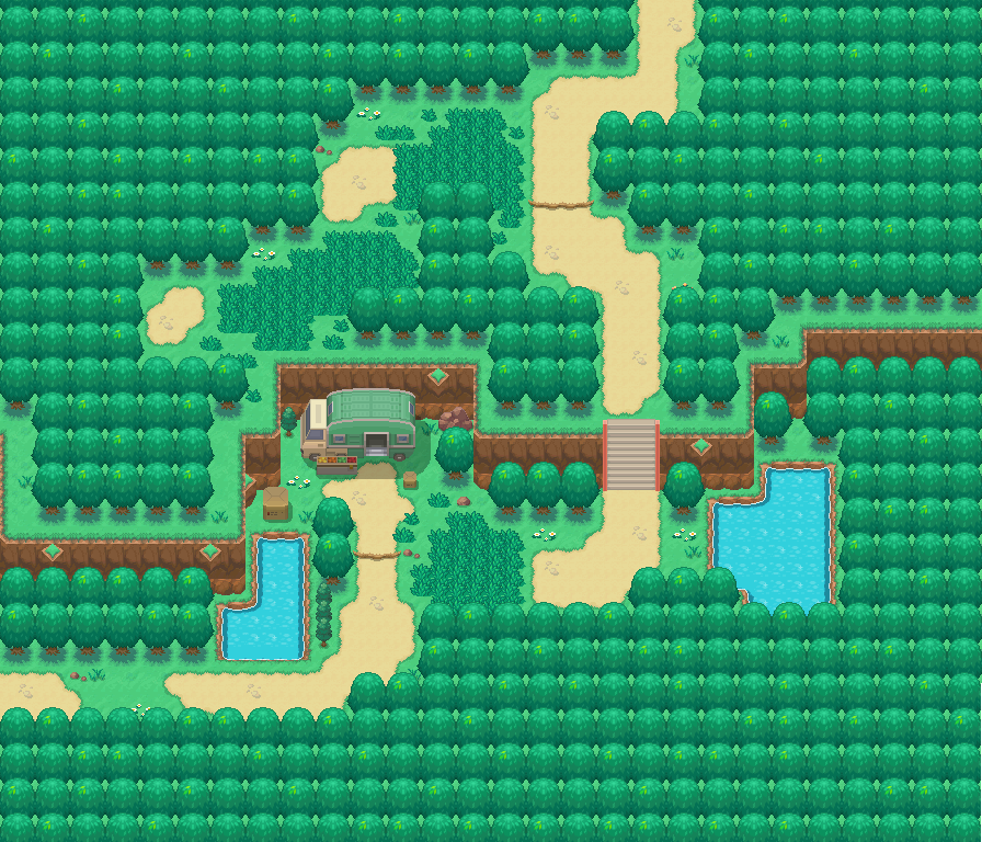
Since you said not to point out minor tile errors, I won't. A bit more toward the major side, however, is that your cliffs seem to disappear when they hit the trees. You seem to have the right idea in the middle, just south of the tree stumps, but just west of there you have a flat mass of trees even though a cliff should be running through the middle of it. Though the (top of the) cliff does reappear shortly afterwards, it disappears again as it continues west. Same for the other cliff just below it, and the one in the far northeast. I'd suggest erasing the trees from those general vicinities, drawing in the cliffs, then patching the trees back in to fit properly. Also, the grass in the northeast corner doesn't really mesh well with the dark soil.

That said, the actual layout of the map is really nice. I gather, being a Route 2, it's early one, so the path doesn't require a heap of complexity. In saying that, the direction of the path does well to make the player believe it is winding, when in actual fact it is (mostly) very linear. It's a very aesthetically pleasing effect. I could also be mistaken, but it appears there aren't any trainers on the eastern half of the route. You might consider shifting some of those earlier on to the later, emptier areas.

Overall though, it's very nice. It's a pleasure to look, despite the few flaws it has. 8/10.
 
Status
Not open for further replies.
Back
Top