• Our software update is now concluded. You will need to reset your password to log in. In order to do this, you will have to click "Log in" in the top right corner and then "Forgot your password?".
  • Welcome to PokéCommunity! Register now and join one of the best fan communities on the 'net to talk Pokémon and more! We are not affiliated with The Pokémon Company or Nintendo.

Oh, the horror! [Sprites of Shame]

Altairis

take me ☆ take you
5,188
Posts
11
Years
dpmfa151.png

D/P/Pt and B/W Mew. Something about the face seems very, very off, and I find that particular shade of pink to be kinda gross.
Oh my god, thank you for bringing this Mew sprite up because I had totally forgotten about it. I really dislike the pose it has, it just bothers me for some reason >.>

pkrs385.gif
dpmfa250.png
250.png

Literally every first frame Ho-Oh sprite from RS to B2W2, excluding HGSS. Depending on how you count, this is either four or seven games' worth of sprites.
Wow, that is pretty weird. Though I guess I can kind of understand why they did it - Ho-Oh is a pretty elusive Pokemon that can't be obtained all that often, so it was probably put on lowest priority for sprite redoing and then I guess. just never fixed? That is weird, though.
 

Musicality

~Musical Melodies~
306
Posts
9
Years
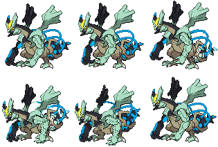
There is too much detail and zero taste in the actually design, let alone the messy execution of the sprites.

646-black.gif
Kyurem-White_BW.gif


Very glad XY had refined designs, which translated well into the 3d models. It's beyond me that people actually like Kyurem fusions.

Tynamo_BW.gif


The issue I have with tynamo is the odd positioning. It's a complete profile of its body which makes it look disengaged.


Yes. It all comes back to me now. xD

Your eyes just hurt looking at this spirte, because it has way too much detail to fit into 80x80 or 96x96, can't remember the exact dimensions, so don't quote me on anything. xD

The fact that it's animated dosen't help at all, but most of the time you're looking at it's back sprite so it dulls down the problem somewhat.... I guess.

Yeah, it does have a weird pose, but in all honesty I couldn't see how else they would have done it without people criticizing them for having put in a lack of detail. Tynamo's rather plain, after all.


Someone beat me to Charizard. It looks like what you'd get if you gave Dragonite a Fire typing. Speaking of Dragonite:

Spr_b_g1_005.png
This is Charmeleon's back sprite form the Generation I games. Looks exactly like a Dragonite, in my opinion.

Yeah, it looks almost like a direct copy with some minor edits, but while you could blame it on hardware limitations, it dosen't even have a horn. It's a protrusion of sorts, and shares the same color as it's skin.

kadabra-color.png
Kadabra's sprite in R/B looks like an Alakazam with a missing spoon and a slightly larger tail. No defining features, like the star on its forehead.

It feels mean of me to kick down the first generation while it's down, but...these are just bad.

Agreed. It's eyes are really off, and there's this black line that runs in the middle of the sprite and just really throws the whole thing off balance. It's nice to see that people are posting a mixture of older and newer generation sprites, it shows that it's not only the old generation sprites that are bad.
 

Nah

15,941
Posts
10
Years
  • Age 31
  • Seen today
Spr_1b_122.png

IDK, I think that's a little creepy.

So's the XY model:
Mr._Mime_XY.gif


EDIT: I like all 3 forms of Kyurem, in both gen 5 and gen 6, btw.
 
Last edited:

Necrum

I AM THE REAL SONIC
5,090
Posts
11
Years
Spr_1b_006.png

Okay so hear me out. Sure, this one is far superior in quality to the Green sprite, but look at this thing, it doesn't look like the Charizard drawn art at all! To me this looks more like it should have been a DRAGONITE sprite. The only thing they have to do is remove the fire.
There is too much detail and zero taste in the actually design, let alone the messy execution of the sprites.

646-black.gif
Kyurem-White_BW.gif


Very glad XY had refined designs, which translated well into the 3d models. It's beyond me that people actually like Kyurem fusions.
I have to strongly disagree with you on these ones. Particularly in White Kyurem, who is my favorite of Kyurem's formes. I think it has a graceful elegance that works quite well. However, Black Kyurem is a friggin fatass and you can be as mean as you want to him, lol.
 

Vinny Vidi Vici

Leave Luck To Heaven
270
Posts
9
Years
  • Age 32
  • Seen Jan 2, 2016
I'm surprised no one has included upside down Koffing yet. Bizarrely enough the Koffing from Green was much better.

koffing.png
109.png


Same deal with Mewtwo.

mewtwo.png
150.png


It amazes me that the few good sprites from Green actually got made worse in Red/Blue. It's almost like a pokemon form of communism where the ones that got bad sprites were improved but the ones that had good ones were made worse.

Here are some bad green ones:

94.png
130.png
9k=
107.png


Here are some more familiar yet nearly as bad Red/Blue sprites:

omanyte.png
gastly.png
primeape.png
geodude.png


EDIT - Also the reason why I think these sprites are bad is because they look nothing like what the pokemon is meant to look like. Talking about the design of a pokemon is another thing entirely, but the whole point of a sprite is to make the thing look like what it looks like in design documents, and on that level, these ones fail abysmally.
 
12,284
Posts
11
Years
  • Seen Oct 22, 2023
I'm not exactly such a huge fan of Mewtwo's green design. Its head looks a lot bigger than its whole body, which is super-strange. If it were smaller, it definitely would have made more sense and easy to bare.

Not too fond of Gengar's, either, unfortunately; somehow, its back seem sort of cut-off from the rest of its body.
 
Back
Top