• Our software update is now concluded. You will need to reset your password to log in. In order to do this, you will have to click "Log in" in the top right corner and then "Forgot your password?".
  • Welcome to PokéCommunity! Register now and join one of the best fan communities on the 'net to talk Pokémon and more! We are not affiliated with The Pokémon Company or Nintendo.

Oh, the horror! [Sprites of Shame]

Musicality

~Musical Melodies~
306
Posts
9
Years
Pokemon have had some really cool sprites, but GameFreak's definitely had their share of bad ones as well. Go down one more rung, and you end up with the worst of the worst. The idea for this popped up when I was looking through the Metal and Color generation sprites out of amusement, and my eyes have taken a humongous blow. To refrain from cluttering this thread please only limit to 3 horrible sprites, and try to justify your sprite because some people may love that sprite, and it's only right that you back it up with your personal opinion of sorts. It dosen't have to be from the GB/GBC era, it could be from any era. Also, while this is near impossible, try not to repeat the sprites that others have already featured, but at least don't post a sprite that another user has posted on the same page.

Rules

  • Do not post the same sprite that another user has posted on the same page.
  • Include your personal opinion on why this sprite is bad.
  • State the name of the Pokemon, as well as the generation it's from in the format below.
  • Have fun, and you can get sprites from pe2k.com.

Sprites of Shame exhibit is now open for all. Discuss away, and have fun!

Ekans|Pokemon Green

greenspr023.png


Are you kidding me? GameFreak must've been drunk when they created this thing. It's mouth hardly resembles Ekans, and while the color palette is excusable due to hardware limitations, it's mouth is just glaring and horrible.

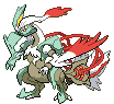
Golbat|Pokemon Red/Blue

rbspr042.png


This looks absolutely horrible. Everything about it is horrible. It's pose, and it's tongue is unusually long and sticking out like it dosen't give a care to the Pokemon world. God. And how do you justify those infant legs?

Chansey|Pokemon Red/Blue

rbspr113.png


Compare this to the other Chansey sprites. The one and only flaw with this is that it dosen't have a normal body nor does it have normal proportions.
 
37,467
Posts
16
Years
  • Age 34
  • Seen Apr 19, 2024
This is a fun idea, but since it's about the sprites from the games, I'll move it over to Pokemon Gaming Central.
 

Musicality

~Musical Melodies~
306
Posts
9
Years
This is a fun idea, but since it's about the sprites from the games, I'll move it over to Pokemon Gaming Central.

Sure, sorry for the slip up. I had a sneaking suspicion that this was the case a little while after posting the thread, but wasn't able to move threads. xD
 

Dedenne1

[SPAN="FONT-SIZE:16.5PX; FONT-FAMILY: SATISFY; TEX
6,452
Posts
10
Years
151.gif

This thing is supposed to be mew idk what game freak did but ummmm.... im disgusted
 

Musicality

~Musical Melodies~
306
Posts
9
Years
151.gif

This thing is supposed to be mew idk what game freak did but ummmm.... im disgusted

Yeah, despite the hardware limitations, this is a real bad job. It's entire anatomy is screwed up, and when you compare this to the official artwork and sprites it's a league away. Sometimes these sprites really make us appreciate the present day ones, as well as the effort that GF has put into creating original artwork.
 

Altairis

take me ☆ take you
5,188
Posts
11
Years
I think older sprites are hilarious. Someone beat me to the punch, though - my favorite is Mew. Golbat is a close second because of its face. I think hardware limitations might excuse some aspects of the older sprites, however, many of the RBY ones have normal proportions while others... just don't. I think it's pretty funny to think about because I'm sure that most of the sprites went through several people before approval.

40.PNG
103.PNG

The bodies looks fine... but their faces are kinda scary haha. These are from Red and Blue, which in general has pretty nice looking sprites for such old games. However, Pokemon Green..

97.PNG
123.PNG
144.PNG
146.PNG
149.PNG

Several things in each of these sprites just look.. a bit off.
 

Musicality

~Musical Melodies~
306
Posts
9
Years
I think older sprites are hilarious. Someone beat me to the punch, though - my favorite is Mew. Golbat is a close second because of its face. I think hardware limitations might excuse some aspects of the older sprites, however, many of the RBY ones have normal proportions while others... just don't. I think it's pretty funny to think about because I'm sure that most of the sprites went through several people before approval.

40.PNG
103.PNG

The bodies looks fine... but their faces are kinda scary haha. These are from Red and Blue, which in general has pretty nice looking sprites for such old games. However, Pokemon Green..

97.PNG
123.PNG
144.PNG
146.PNG
149.PNG

Several things in each of these sprites just look.. a bit off.

Well, Pokemon wasn't that big of a hit then if I recall correctly, so maybe they didn't go through enough QCs. xD

It's strange to think how the sprites in Red and Blue were by and large decent, while most of the sprites from Green just looked downright horrible. Wasn't Green supposed to be the Japanese counterpart of Red and Blue? Well, at least we got something better than the original group of people that Nintendo intended to release the game to.

Most of the sprites just have a problem, but the Exeggcutor stands out. How big can those heads get? If I ever caught an Exeggcutor, thank god I'd be seeing the back view. The front view would creep me out entirely. And Dragonite looks more like a house lizard in a costume than a dragon. Well, at least they've improved a whole lot, and perfected most of the sprites. ;)
 

Nah

15,940
Posts
10
Years
  • Age 31
  • Seen today
Man, the Japanese Red and Green had some ugly ass sprites.

Spr_1g_040.png


I think that looks even worse than the NA Red/Blue Wigglytuff.

Spr_1g_006.png


Charizard looks kinda off too.


And I swear that there's this one sprite that's really terrible that hasn't been mentioned yet, but I can't remember which one it is.....
 
2,850
Posts
10
Years
  • Age 28
  • Seen Nov 14, 2023
Behold, a donkey, I mean Charizard. >.>
Back sprites look even worse than the regular sprite of Gen 1 lol.

Spr_b_g1_006.png
 
12,284
Posts
11
Years
  • Seen Oct 22, 2023
Sadly, all Pokémon sprites that I was wanting to post were already added here, haha.

First and foremost, one sprite from old games that I'm not too fond of would be Golbat. I understand that its mouth is meant to be huge, which it is, but what bothers me, though, is that it seems as if it were deformed, making it look hideous in a way. Not only this, but Golbat also has its tongue sticking out, which, if you pay close attention, you would notice as if it were not a part of its actual mouth; rather, something floating by itself in thin air.

Aside from above, I also dislike Moltres' sprite. Its wings seem a lot smaller than its head, which does make it look strange. I know they were limited in terms of dimensions, but I feel that they could have avoided this mistake had they turned its neck and head slightly more small. Due to similar reasons, I also don't like Articuno's.
 

Musicality

~Musical Melodies~
306
Posts
9
Years
Yes, Charizard looks like a rip off plush toy than a flying fire lizard that it was depicted to be in the anime. :p

Most back sprites in the era of RBY and even some from GSC were bad, but it was excusable because of hardware limitations. I can't recall liking any of the back sprites for that matter from the metal and color generations.

Golbat is really the one that freaks me out, the tongue was entirely uncalled for. Why the doglike tongue on a bat? It totally dosen't even fit at all. But meh, they've done a good job fixing things up.
 

Harmonious Fusion

over the rainbow, there's a glorious sight
364
Posts
11
Years
dpmfa151.png

D/P/Pt and B/W Mew. Something about the face seems very, very off, and I find that particular shade of pink to be kinda gross.

pkrs385.gif
dpmfa250.png
250.png

Literally every first frame Ho-Oh sprite from RS to B2W2, excluding HGSS. Depending on how you count, this is either four or seven games' worth of sprites.

I'm not complaining about the art quality. It's good art. But recycling the same pose for three entire generations is supremely lazy. Surely it can't be that hard to come up with multiple poses. They recycled its back sprite pose from Gen II-IV, too, just to add insult to injury.

gbg169.gif

Gold Crobat. What a facial expression.
 

Musicality

~Musical Melodies~
306
Posts
9
Years
dpmfa151.png

D/P/Pt and B/W Mew. Something about the face seems very, very off, and I find that particular shade of pink to be kinda gross.

pkrs385.gif
dpmfa250.png
250.png

Literally every first frame Ho-Oh sprite from RS to B2W2, excluding HGSS. Depending on how you count, this is either four or seven games' worth of sprites.

I'm not complaining about the art quality. It's good art. But recycling the same pose for three entire generations is supremely lazy. Surely it can't be that hard to come up with multiple poses. They recycled its back sprite pose from Gen II-IV, too, just to add insult to injury.

gbg169.gif

Gold Crobat. What a facial expression.

Mew's face does seem to be a bit... off, bit other than that it seems fine by and large. While this shade of pink seems a tad too dark for mew, it dosen't seem to be that big of a deal. At least it isn't purple, what could be worse? xD

The Ho-Oh sprites are interesting, it's definitely quite lazy on their part to do the same pose over and over again. While the pose is nice and while I would like new poses every generation, I can't really think of any pose that could replace the current one. A static one with it's wings folded wouldn't look too good...but meh. I'm no spriter, so don't quote me on anything. ;)

The Crobat looks again, hardly lifelike as with most of the other RBY/GSC sprites featured above, and it's face just really makes it look like some sort of semi realistic plush toy.
 

Nah

15,940
Posts
10
Years
  • Age 31
  • Seen today
pkrs385.gif
dpmfa250.png
250.png

Literally every first frame Ho-Oh sprite from RS to B2W2, excluding HGSS. Depending on how you count, this is either four or seven games' worth of sprites.

I'm not complaining about the art quality. It's good art. But recycling the same pose for three entire generations is supremely lazy. Surely it can't be that hard to come up with multiple poses. They recycled its back sprite pose from Gen II-IV, too, just to add insult to injury.
It's kinda funny how it's the exact same sprite, but each gen it just gets bigger.
 

Harmonious Fusion

over the rainbow, there's a glorious sight
364
Posts
11
Years
Mew's face does seem to be a bit... off, bit other than that it seems fine by and large. While this shade of pink seems a tad too dark for mew, it dosen't seem to be that big of a deal. At least it isn't purple, what could be worse? xD

The Ho-Oh sprites are interesting, it's definitely quite lazy on their part to do the same pose over and over again. While the pose is nice and while I would like new poses every generation, I can't really think of any pose that could replace the current one. A static one with it's wings folded wouldn't look too good...but meh. I'm no spriter, so don't quote me on anything. ;)

The Crobat looks again, hardly lifelike as with most of the other RBY/GSC sprites featured above, and it's face just really makes it look like some sort of semi realistic plush toy.
To me, that particular shade of pink is, quite literally, mildly stomach-churning in large quantities. I don't like seeing it on other sprites, either.

I'll admit, Ho-Oh is a Pokemon that doesn't really look good in a lot of poses, but I've seen some others that aren't bad. I own a Ho-Oh figurine that has it standing, with its head raised as if in mid-crow. That wouldn't look bad as a sprite.
 
2,138
Posts
11
Years
There is too much detail and zero taste in the actually design, let alone the messy execution of the sprites.

646-black.gif
Kyurem-White_BW.gif


Very glad XY had refined designs, which translated well into the 3d models. It's beyond me that people actually like Kyurem fusions.

Tynamo_BW.gif


The issue I have with tynamo is the odd positioning. It's a complete profile of its body which makes it look disengaged.
 

Khoshi

[b]とてもかわいい![/b]
2,647
Posts
11
Years
Someone beat me to Charizard. It looks like what you'd get if you gave Dragonite a Fire typing. Speaking of Dragonite:

Spr_b_g1_005.png
This is Charmeleon's back sprite form the Generation I games. Looks exactly like a Dragonite, in my opinion.

kadabra-color.png
Kadabra's sprite in R/B looks like an Alakazam with a missing spoon and a slightly larger tail. No defining features, like the star on its forehead.

It feels mean of me to kick down the first generation while it's down, but...these are just bad.
 
Back
Top