• Our software update is now concluded. You will need to reset your password to log in. In order to do this, you will have to click "Log in" in the top right corner and then "Forgot your password?".
  • Welcome to PokéCommunity! Register now and join one of the best fan communities on the 'net to talk Pokémon and more! We are not affiliated with The Pokémon Company or Nintendo.

Bulbasaur's Explosion

47
Posts
14
Years
Props to whoever gets the topic title reference. There's a hint in my custom title :P

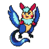
Making some fakemanz and custom trainers. I'm mostly a custom-style and Fire Emblem-style spriter, so these are my rare forays into the world of Pokemon spriting.

Attaching images is horribly inconvenient. :( I have a girl trainer named Jackie, a boy trainer named Robbie, a Grass starter named Buddinger, a Fire starter named Heffalump, and something i herd u might liek.

All sprites are full custom unless otherwise noted. At the moment they use R/S palettes until I get around to figuring palette editing out.
 

ScizorZ

ROAR I"M A TACO!
281
Posts
14
Years
  • Seen Aug 3, 2011
your really goo! I really like the shading you've done on the Heffalump and Budringer. Those trainers have really good poses and positions and look pretty much professional especially their arms, legs, and chests.
 

ScizorZ

ROAR I"M A TACO!
281
Posts
14
Years
  • Seen Aug 3, 2011
then maybe IGB should make it a prevo like with just a head connected to a tail with one spike? I really love this one and it's just too awesome to be a 1st evolution (like itsover said)
 
47
Posts
14
Years
Flippeel's two evolutions are even cooler looking. I'll try to get them done soon.

For now, here's a legendary. This is a Famine Pokemon, which is Bug-type, has the ability Flash Fire and is built for sweeping. But it doesn't have a name yet... and it looked better on paper.
 

Cloche

エスパーレディ
788
Posts
18
Years
I really love the "Famine" pokemon. It's mouth looks very intimidating, its color scheme is a great shade of green an dits got a nice "feel" overall to it.
One thing I noticed, however, is on the blue coloration of the "hero and heroine" sprites. It seems like there isn't much pallet shade differentiation. It only seems to be the blue, as the other shading is great. <3
 

Ayesha

惚け
83
Posts
15
Years
I like the Famine as well. It's really nice!
The trainer sprites are also well made.
You could improve Flippeel though.
Something about it just doesn't seem right..
 
2,799
Posts
18
Years
Well, as just sprites, they are practically flawless. As Pokemon sprites... they don't really make me think "Pokemon". Though if you're making a hack with these, I wouldn't even really recommend changing them, as this style is much sexier than Pokemon style.

The shading is fabulous, the anatomy is perfection... the concepts are quite nice, as well, though I'm not quite sure what that Grass starter is supposed to be. :P

That Bug legendary is awesome. The wings are just a bit awkward, but isn't a huge deal. I love the head. It's terrifying. XD
 

GFA

Mega Blastoise is my homeboy
1,830
Posts
15
Years
  • Seen Sep 7, 2018
These are incredible! Your shading is fantastic, but the outlines should be darker. Are you using Image Shack or something else to upload, 'cause it's annoying to have to have to zoom in to see the full view.
 
47
Posts
14
Years
@Starchild: The palettes for the trainers are directly from the R/S player characters. When I get around to palette editing, I'll see if I can add another shade of blue.

@Ayesha: I was thinking the same thing, but I can't quite figure out what's wrong with it.

@Kenji: Thank you! I'll tweak the wings when I get its back sprite made.

@9000: Just so it has an immunity to fire. It learns Heat Wave and all the Fire TMs, too.

@Bacon: I'm using the attachment feature at the moment, because it won't let me post images any other way until I get more posts. Once I get enough I'll put everything on TinyPic.

Here's the final stage of Flippeel. For now, it's named Caduceon--feel free to suggest new names for it.
 
658
Posts
18
Years
  • Age 30
  • USA
  • Seen Dec 10, 2020
...Wow! You're very skilled, with excellent ideas (loving the grass starter-- I can't wait to see what its final stage is like). Your water starter's final stage seems a bit lackluster, though-- you're confined by the 64x64 limits, and it shows. The face seems a little too bent inward in comparison to the neck. I would make the neck arc further. I'd also recommend adding some complexity to it; it is a final stage after all.
 

Cloche

エスパーレディ
788
Posts
18
Years
I like the new one. Its face seems a tad bit squashed but, you are workingwith a very small pixel space, so it's understandable. I like how it is sooo the opposite of the Dratini evolutionary line. I have a good pallet for Denim, but it takes a while to get used to pallet making. <3
 
793
Posts
15
Years
  • Age 30
  • Seen Jun 24, 2011
Wow, these are pretty good! I love the Famine legendary, looks pretty good. I don't see anything wrong with any of these, the shading and proportions are excellent. Keep up the good work!
 

= GPR =

Birding Extraordinaire
655
Posts
15
Years
bulbasaur_explosion_celiodon_help.png

http://a.imagehost.org/0704/bulbasaur_explosion_celiodon_help.png

This is a great sprite! There are, however some minor details that i thought you may want brought to your attention...

One of the first problems that i see with this sprite is the the shading. The light source is very confusing, since there are conflicting illuminations (left side of neck vs. under belly in middle of portion). Your shading is a bit off, and so the outline shading is off as well. You need to match the lighter tones of the outline with the light tones of the body's pallette. Instead, you have gone a bit overboard with the black in some parts. Along the more cerulean/sky blueish hues, you should have a dark blue as an outline, it would give it a nicer look... the black boldens it too much. Along the horns, you should go with a more grayish tone... the black contrasts WAY TOO MUCH.

Now, also looking at your outlines, there are gaps everywhere. Along the belly, the horns, the wiskery things... you ought to fill in the outline to make it look more complete.

Here at PC, we call patches of pixels that the same tone and hue that are bunched together "CLUMPIES"... well, at least us old folks do... ^_^
Clumpies are no-no's though. They create thick overbroadening points in the outlines. These thick spots detract from the overall apparance of the sprite. To avoid clumpies, just erase the extra unneeded pixels, or change the tone of others...

And a final general point, NEGATIVE SPACE. You want to be careful when you leave unused space in the middle of the sprite. You have to remember that you don't want this space to conflict with the sprite. Having large spaces, like the one you have is not bad... but the little one pixel spaces that go unused create some problems when layered onto game backgrounds. They absorb the colors of the background pixel, ruining the quality of your sprite. Ridding of negative space will require redesigning certain aspects of your sprite, hence it is a wary point to make... since it is often left unchanged...

Some your sprite specifics now, this pixel here makes this patch to blocky... get rid of it and it provides for a better brow shape.

This patch is a bit confusing... it seems a bit too blocky and large, maybe try to round it to the back of the head more?

Are these claws? That's all ^_^

Alrighty then, main point. The horns. This part really is detracting from the sprite. The fact that they are of the same curviture kinda homanizes the entire top end, and just makes it look plain. I would suggest scratching new horns that go off in different directions... this would lead to a more creative and unique look! It will also make the sprite look more skilled.

----------------------------

Alrighty, so i made some basic edits to your sprite to show you what i meant... among them being completing the outlining, ridding of clumpies, and suggesting a new horn direction... i am not saying that YOU MUST MAKE YOUR SPRITE LIKE THAT... they are ONLY SUGGESTIONS! But i hope they are helpful ^_^ i spent the better part of an hour going over this sprite. So i hope you put as much time into fixing it as i have ^_^

Anyhow, you're doing a great job. The shading is a bit off like i said, but it's still a bit patterned... so i give it a 6/10. The outlining is really killing this sprite though... the clumpies, gaps, and coloration... i give outlining a 4/10... the pose of the sprite is very nice! The twisting of the body is a great touch that i like alot. But the horns are kinda pulling the sprite down... i give it a 9/10 on the pose... as for anatomy, the neck and body are a bit thin compared to the head... and the flippers are kinda small... (they don't seem like they would be very effient ^_^) but it still fits the general theme of big headed pokemon. The only thing that really pulls this score down is the little one pixel negative spaces. I give the anatomy an 8/10. As for creativity, it's a blue, tubular, finned water pokemon. I can think of a good ten of those. still, the face is very dragon like and is substantially different enough than other pokemon that makes it distinguishable... even more, the scratch work of the face, the snaking body, and the evident talent of the spriting skill helps set this sprite apart in my mind. I give it an 8/10 as well. Overall that is a 35/50... or a 70% (C-). Gosh, that seems so horrible... i'm sorry...

But some quick fix it ups will help this sprite really become a masterpiece! I'm positive that you can bump that % up considerably just by fixing some of the little nuisances like the shading, or the outlining gaps... or clumpies... either way, you have a great sprite here, and i recommend that you work to improve it! Practice makes perfect! Take my advice as that: advice. I'm positive you can do better! Take care!

Keep Spriting!
 
Last edited:
47
Posts
14
Years
Thank you all. The help and comments are greatly appreciated.

vglac1.png


MAJOR EDIT: Just saw GPR's critique. WOW! Thank you so much for taking the time to be so thorough. You really, really helped. I changed the horns shape and tried to fix what you addressed. Again, thank you SO MUCH! Critique like this is a spriter's dream.

ve4yeg.png


This is the middle form, Plesipent. I really, really dislike these colors and they'll be changed to match the other two as soon as I get around to palette editing. I also would like to add more detail, but couldn't think of anything besides the belly stripe. The stripe will be lighter than the main body once the palette is edited.
 
Last edited:
47
Posts
14
Years
I'm going to bypass posting the un-edited palette and post what this one is actually supposed to look like.

2dqogvd.png


This is Mortoll, the Gravekeeper Pokemon. It's the final stage of Buddinger (the little grass guy in the first post). He's a Grass/Ghost type. I'd like it if he could look a little bit less like Dusknoir, even though he's a R/S style sprite.
 
Back
Top