• Our software update is now concluded. You will need to reset your password to log in. In order to do this, you will have to click "Log in" in the top right corner and then "Forgot your password?".
  • Welcome to PokéCommunity! Register now and join one of the best fan communities on the 'net to talk Pokémon and more! We are not affiliated with The Pokémon Company or Nintendo.

The Graphics Rating Thread - Read Post #1

Lunoon

Even through the wire.
25
Posts
13
Years
  • Seen Sep 6, 2010
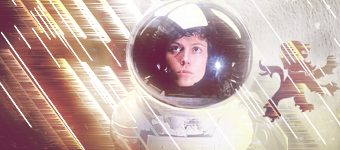
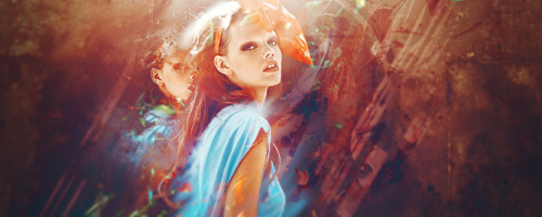
'Tis a sig I finished not even 10 minutes ago, not too proud of it. It originally was going to be in color, but it didn't look as good as in b&w, so I'm posting this version. This is basically somewhat based off of a tut that I'd found somehwere on deviantart, followed a few steps here and there but after a while I took off in my own direction. NOTE : I currently don't have Photoshop, so I use GIMP as a substitute. ( Just in case if you are wondering, the sig is in my signature area. )

EDIT | I haven't done graphics in a while so I'm kind of rusty at the moment. :S
 
1,396
Posts
16
Years
Lunoon, I like the banner despite it's simplicity and the huge red bar on the right side. The effects are pretty cool looking, but you could really fix your lighting and depth.

--

suit.png

Rates please!
 

Darkhunter101

Ice Trainer
35
Posts
14
Years
Comic Tragedy, I find the motion blur on the glowy things, seems like you've put too many in, the only other thing i see is that, to me, the lion seems out of place, it might just be me, i dunno. Just doesn't seem to fit in with the whole spacey theme.

Spoiler:


I'm not very good, sowwie. Please try to rate it..
 

monkeyandhead

I didn't train to be a Pilot.
73
Posts
13
Years
I like the idea of adding some colour while the rest is black and white, but it is missing detail, sometimes space is good, but in this case theres too much. You could fix that with some new positioning, but your better off adding some more things in there. Also, try blurring unimportant bits a little so peoples eyes don't wander too much, then sharpen the most important bit a little. When your adding texture, also try to remove it from the main subject so it doesn't get in the way. Hopefully I helped :) Don't take this as a rant :D.

Man, this is my first graphic ANYTHING in months, I've mainly been doing photography.
Hate mail is appreciated.

WINTERavatar.png

WINTERcopy.png


(You don't have to rate icon, I just added it in there)
 

Apple Juice

who are you
1,222
Posts
14
Years
  • Age 25
  • Seen Jul 15, 2014
The above is alright. The coloring is a little off and the focal point is weird. But it's good.

Made a large piece because I'm bored.

Spoiler:
 

PSI-Claus

The Devil itself
40
Posts
14
Years
  • Age 28
  • Why?
  • Seen Apr 1, 2014
The white space around the shoe is a bit distracting. I like how the glasses have a little shadow to make it where it's set down, I think the shirt needs something like that so it doesn't seem that it's just floating around. I do like the colours and the text.
--
animismoffate.png
 

moments.

quixotic
3,407
Posts
15
Years
Quite a nice tag, although my first irk is the border. Borders which go around the entire tag are really like old school and to be honest, they destroy the flow by stating, "the tag ends here."
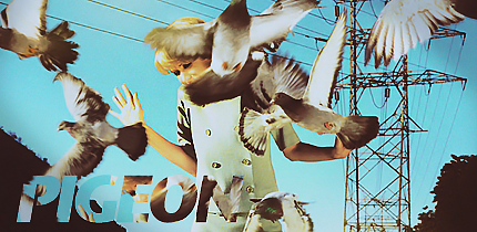
Anyways, I feel the effects aren't very strong and don't match the render that much I must say. That render makes me think of big, bold, strong movements and the effect C4Ds you've used are really light and weak. Either load up a lot more and really build up the effects, or get solid C4Ds. The smudging in the back is alright, but colour is a bit eh.

Anyways, first tag back in a ridiculous amount of time due to school work. However I'm now finished exams and ready to jump straight back in!
pigeon.png
 
10,673
Posts
15
Years
  • Age 30
  • Seen Dec 30, 2023
I could kill you for that text. It's stuck in the corner (which is a total nono, text should always be closer to the focal), it's slightly hard to read, and the font is so generic looking I think you should have gone with something that was at least a serif. It's also anti-aliased, which makes the edges seem rough. Have a look at the "i". Don't know what your stock was, I could assume you put the pigeons in yourself, and if so, they're nicely places and rendered, if not well, it takes less from what you've done in the tag. At any rate, this isn't one of your better tags. The pylon should have been blurred and not sharpened. The focal, which is her expression, is covered by a pigeon, if that was already in the stock, then bad choice of stock. The colours are nice, which is a given from you. I understand it's been a while, but this lacks flow and in general, it lacks your usual class. Lack of focal, lack of flow and text having a lot of mistakes is what kills it. But get back up on the horse and do another until you're back into the swing of it!
 
1,396
Posts
16
Years
Though I do agree that a lot of the image seems rough, I do not agree that moments' tag was "killed" by lack of flow, and text placement. It's a good concept and that alone (in my opinion) makes it good. I mean, sure, it's not executed perfectly and looks a little bit awkward but, as you said, you cant expect much of someone who is warming up his graphical skills.

On that note:
mafia.png


CnC please!
 

moments.

quixotic
3,407
Posts
15
Years
Immediately I am thinking Ezzo and I wish I knew how to do that style... so gonna try it out later
Anyways, first thing is that I reckon the guy could be sharpened. Only because the background and text and everything is sharper than him, but he is the focal, so...
Love the flow and the effects, however the fact that the white box is not centred is irking me a bit, however I can see why you did it, probably my OCD kicking in.
Love the colours though, and love that old school style.

RATE COMIC TRAGEDY's TAG!
 
1,396
Posts
16
Years
Immediately I am thinking Ezzo and I wish I knew how to do that style... so gonna try it out later
Anyways, first thing is that I reckon the guy could be sharpened. Only because the background and text and everything is sharper than him, but he is the focal, so...
Love the flow and the effects, however the fact that the white box is not centred is irking me a bit, however I can see why you did it, probably my OCD kicking in.
Love the colours though, and love that old school style.

RATE COMIC TRAGEDY's TAG!

mafia2.png


Good change?
 

moments.

quixotic
3,407
Posts
15
Years
I think so, although, the right side of his neck, where it meets the collar is like ridiculous pixellated... That's just the render I think, but you could blur it a bit, then perfect!
 

Stratos99

Banned
276
Posts
13
Years
Just a quick avatar I made with brightness/contrast, gradients, that color thingy and lighting/sharpen filters. It has a white border so it might be best to view it on a darker background.

avatar237340_32.gif


original image:
Spoiler:


I like it. \o/
 
10,673
Posts
15
Years
  • Age 30
  • Seen Dec 30, 2023
What bothers me most here is the darkness of the icon. If you cannot add detail and depth when making a dark icon, then avoid doing so. What I would have recommended here would to have emphasized his eye colour (blue would be a nice choice) with selective colour and possibly some brushing also, then adding some dodge to brighten them up, followed by some light sharpening. The jacket is done quite well, I think you could have put a little more effort into the bottom to make it perfect, and again, brighten it up. The face however, well the face's skin colour contrasts greatly with that of the neck, it looks like badly applied make-up. I would advise you to be careful with your colours. Don't go overboard on certain things, currently it does not look natural, despite the lighting. In saying all of this, the stock is quite low quality and dark to begin with, I advise looking for better stocks with more to play with. Some good points, but overshadowed quite literally by the bad ones I'm afraid.
 

Alternative

f i r e f l y .
4,262
Posts
15
Years
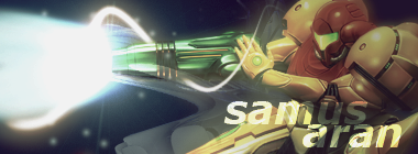
Since Gavin hasn't posted a graphic for rating, and I can't see the previous graphic, so I think it may be suitable for me to post a graphic for rating. I'll say one thing first.
moments. Your Pigeon tag is nice and all, and it's really good to see a full stock, and not just a render used. One thing I feel is that the colours within the tag have gone over the top with saturation, and it kills it. I'm not sure if that seems to be intentional or not. I'm also not a huge fan of the clipping mask you used here, since some of the colours from the text blend in with the background, making it slighltly harder to read.

samusaran.png
 
Last edited:

derozio

[b][color=red][font=helvetica][i]door-kun best boi
5,521
Posts
14
Years
Uh, since I'm not really good at critcs and stuff, I might actually say one or two things that may be off. I'm not really good at this, I guess.. ^o^'

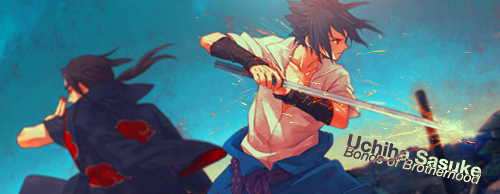
Well, let us see: The first thing that come to my notice is the monotone of the tag. It just doesn't pop up. Colors are kinda dull. Try using the selective color option and/or saturation. Apart from the dull colors, another thing that this tag lacks is effects. Overall, you just need to spice this tag a bit. As it is now, it just doesn't appeal to me. Oh, and I just don't know, there's something wrong with the text...it just doesn't seem right to me..

SasukeUchiha1.png

Here's mine.
 
Last edited:

Haonn

hello, zombie ♥
103
Posts
14
Years
Really good, although I should say that the first character - sorry, I'm no Naruto fan so I don't know anything about it- is a bit too smudged, also a bit of the text is vague thanks to the background, but yeah, that's just my taste I guess xd.

34p0v44.jpg
and
2884jtl.jpg

ohgod I haven't made anything in so long and I wasn't very good to start with. But myeah, rate whichever you want or rate them both, oh and, as for the second one, I kept it textless because everything I added ended up messing it up.
 

me2hack

Graphics Artist
286
Posts
14
Years
  • Seen Mar 12, 2011

Hmm, I love the color on the first one, just the focal is a bit off. It lacks good lighting, I'd say darken the left part of her face and add a light source just above her arm; 300px white soft brush does the trick. That color that you put on it, it's nice, however also affects the girl in it, I'd say erasing that part out with a soft brush on 80% opacity. Or darken it with a soft brush and then lighten it again.
As for the second one, it seems you put a c4d on top of it with a color doesn't mix so good, that's ok, you can blur or smudge it to make it look better. ^^ As for it's lighting, same thing I said about the first one, but put the light source at the bottom right corner.


Uhmm.. Rate meh icon and tag.
 

derozio

[b][color=red][font=helvetica][i]door-kun best boi
5,521
Posts
14
Years
My main problem with this tag is that it looks too simple. You should have gone for more effects. Plus, the text should actually have been closer to the main stock/render. Neither the font nor the placement seems proper. Another problem with this tag is that it is pretty monotonous. The scanlines don't help it in any way, imo.

What you could've done while making this tag:
1) Tried to put the text closer to the main stock. Oh, and a better font.
2) Paid a little more attention to lighting. Should've used burn/dodge tool where necessary.
3) Went for more effects.
4) More colors. Lack of colors take a lot away from the tag at times. Unless, of course, you're a master at giving tags a lot of depth.
5) Did something to add more depth to it.
6) No scanlines. Scanlines, at times, ruin some works. Err, many works. (This is sorta me being a little biased so don't take this one into consideration if you don't wanna. :P)

Now, for my turn:

Experiment2c.png


Rate that, pwease.
 
Back
Top