
You are using an out of date browser. It may not display this or other websites correctly.
You should upgrade or use an alternative browser.
You should upgrade or use an alternative browser.
Rate The Signature Of the Person Above You
- Thread starter abnegation
- Start date
- Status
- Not open for further replies.
More options
Who Replied?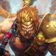
Captain Gizmo
Monkey King
- 4,843
- Posts
- 11
- Years
- Age 30
- Canada
- Seen Jan 30, 2024
10/10
The girl is cute o3o
And the CSS are well aligned with one another and your username on the top left is clean also.
The girl is cute o3o
And the CSS are well aligned with one another and your username on the top left is clean also.
Victini
Guest
- 0
- Posts
I like the tag and the relevant smilies that go along with it.~
The only thing I don't really like, and don't worry I know why you did it, is the colors in the 'Friend Code' text. ^^;; It's just kinda... throwing off the deep reds, blues, and even yellow color scheme you have with Spiderman. The variations of those colors are too bright.
8.9/10
The only thing I don't really like, and don't worry I know why you did it, is the colors in the 'Friend Code' text. ^^;; It's just kinda... throwing off the deep reds, blues, and even yellow color scheme you have with Spiderman. The variations of those colors are too bright.
8.9/10
Captain Gizmo
Monkey King
- 4,843
- Posts
- 11
- Years
- Age 30
- Canada
- Seen Jan 30, 2024
8/10
Kinda big but I like it. The background color is kinda unappealing (to my eyes). But the Gen VI Pokemon are definitely awesome, I'll give you that :P
Kinda big but I like it. The background color is kinda unappealing (to my eyes). But the Gen VI Pokemon are definitely awesome, I'll give you that :P
- 866
- Posts
- 11
- Years
- Seen Jul 16, 2014
Its a bit meh.Just use some Slowpoke tag instead of that meme.
3/10
3/10
Rodriguezjames55
No Jokes #MegaCharizard
- 391
- Posts
- 12
- Years
- Age 27
- United states, New York, New York City, Bronx
- Seen Jun 25, 2021
dewott high quality and awesome 10/10

Kikaito plush
Angeline plushxKikaito plush
- 5,557
- Posts
- 14
- Years
- Age 31
- plushies resort
- Seen May 30, 2019
I am not sorry I don't get your sig image
2/10
2/10


- 2,096
- Posts
- 15
- Years
- Age 29
- «UK»
- Seen Apr 6, 2024
9/10
It's pretty awesome, but there's a few teeny things that bug me. Like how the yellow, orange and red square don't really fit the colour scheme of the sig.
The font that runs across the bottom seems out of place, but tbh that could just be me and my browser not loading the font.
It's pretty awesome, but there's a few teeny things that bug me. Like how the yellow, orange and red square don't really fit the colour scheme of the sig.
The font that runs across the bottom seems out of place, but tbh that could just be me and my browser not loading the font.
Rodriguezjames55
No Jokes #MegaCharizard
- 391
- Posts
- 12
- Years
- Age 27
- United states, New York, New York City, Bronx
- Seen Jun 25, 2021
10/10
Im up for a game or ten
Im up for a game or ten
- 866
- Posts
- 11
- Years
- Seen Jul 16, 2014
Badass Fennekin is badass.
10/10
10/10
- 866
- Posts
- 11
- Years
- Seen Jul 16, 2014
10/10
Funny and good quality and organization.
Funny and good quality and organization.

Captain Gizmo
Monkey King
- 4,843
- Posts
- 11
- Years
- Age 30
- Canada
- Seen Jan 30, 2024
7/10
Not bad. The girls is pretty but not anything wow :P
Love how the texts are aligned also.
Not bad. The girls is pretty but not anything wow :P
Love how the texts are aligned also.
CourageHound
Trust & Courage. Nothing More
- 823
- Posts
- 11
- Years
- Florida
- Seen Oct 5, 2016
9/10
Love the pic in the sig. Captivating yet deadly, nice choice ;)
Love the pic in the sig. Captivating yet deadly, nice choice ;)
Captain Gizmo
Monkey King
- 4,843
- Posts
- 11
- Years
- Age 30
- Canada
- Seen Jan 30, 2024
10/10
Shaun Micallef fits you really well.
Shaun Micallef fits you really well.
- Status
- Not open for further replies.