
You are using an out of date browser. It may not display this or other websites correctly.
You should upgrade or use an alternative browser.
You should upgrade or use an alternative browser.
Pokemon: Carbon Version
- Thread starter <~F.M.P~>
- Start date
- Status
- Not open for further replies.
More options
Who Replied?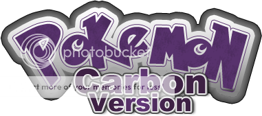


KingCharizard
C++ Developer Extraordinaire
- 1,229
- Posts
- 14
- Years
- Age 35
- Pennsylvania
- Seen May 15, 2016
Uh I like the project, dont like the way the screens are in the thread though, they are off and why is there a second screen to the side? Also wasn't there already a topic for your game?
- 67
- Posts
- 15
- Years
- Seen Oct 12, 2013
Lookin pretty incredible, I'd say! Not the most beautiful overall, but certainly very convincing and cohesive.
I'm hoping you are using something similar to the Gen IV battle system! :]
I'm hoping you are using something similar to the Gen IV battle system! :]

Everything here looks sleek and very good FMP! I like it alot, just what we need around here! Keep it up! yes! XD
lol Thanks man.
Uh I like the project, dont like the way the screens are in the thread though, they are off and why is there a second screen to the side? Also wasn't there already a topic for your game?
Oh sorry about that, It's fixed now. Yes there was another thread for this same game but It had so much back trail from the first time It was presented that I made a new one to keep up with the new style and hopefully this one won't confuse too many people. Glad you like the Project though ;)
Lookin pretty incredible, I'd say! Not the most beautiful overall, but certainly very convincing and cohesive.
I'm hoping you are using something similar to the Gen IV battle system! :]
Thank you I'm glad you like it! Yes we're using something similar to the fourth gen system. I'm trying to implement a touch system at the moment (Compliments to Collassal Pokemon for that.)
I love your tiles and when choose Pokemon, but the back sprite of hero is not good.
Thank you, I'm glad you like them. What don't you like about the Back sprite?
Alright everyone I have 3 Fakemon concepts I want to show.
http://falsefate.deviantart.com/art/...mite-147227763
First Off Is Grawmite. Grawmite is a Sand Crab pokemon and can be found in Caves and such. It'll have an Evo soon that I've been working on. For the most part Grawmite Is a small powerhouse.
http://falsefate.deviantart.com/art/...roxy-145651422
Second off Is Sandroxy (subject to name change). This is the Evo to Cripet Who I'll be revamping with a new sprite as well in D/P style. Sandroxy is a Big Tick pokemon and can be obtained further in the game in Grass on routes if you don't feel like training a Cripet yourself.
http://falsefate.deviantart.com/art/...rame-145250806
And third, Inflarrame. Inflarrame is A bold Horn Pokemon (Ram) and Will evolve from the starter Pokemon. Haven't decided on a name for the Starter.
Tell me what you think, and If you want to see something specific come next update let me know.
- 67
- Posts
- 15
- Years
- Seen Oct 12, 2013
The coloring & design of the tick fakemon makes it a little hard to tell what it even is. I like all the green & purple areas, but the white area seems pretty odd... like it's supposed to be a piece of clothing or something.
I think the other two designs are top-notch, though.
I think the other two designs are top-notch, though.
~JV~
Dev of Pokémon Uranium
- 684
- Posts
- 16
- Years
- Age 30
- Rio de Janeiro
- Seen May 13, 2022
Amazing work man ^^, you already know I'm your fan =p. So... which is the heroine official hair color by the way? In the sugi it's blackish but in the screens it's brownish =x. Well, good luck with this restart!
Neo-Dragon
Game Developer
- 1,835
- Posts
- 19
- Years
- Age 36
- Dublin, Ireland
- Seen Sep 22, 2014
Very impressive and well presented first post.
This project has quickly become one of my favorites around.
The layout for the interface is really good (and the battle system looks to use good use of it), and overall artwork is very consistent.
This project has quickly become one of my favorites around.
The layout for the interface is really good (and the battle system looks to use good use of it), and overall artwork is very consistent.
KingCharizard
C++ Developer Extraordinaire
- 1,229
- Posts
- 14
- Years
- Age 35
- Pennsylvania
- Seen May 15, 2016
Ok now its easier to look at the screens and very impressive, but i'm not sure you answered my question... Whats the extended part of the screens with the green pokeball in most is that like a dual screen of some sort? Othen than that love the game good tiles good sprites and fakemon look cool. I'll be watching this.
zane203
Zetsumei barer
- 54
- Posts
- 14
- Years
- Age 31
- Kingdom of Souls
- Seen Dec 10, 2011
im falling in love with your work. I swear to think i've gone this long without knowing about a community of pokemon rmxp builders x.X
The coloring & design of the tick fakemon makes it a little hard to tell what it even is. I like all the green & purple areas, but the white area seems pretty odd... like it's supposed to be a piece of clothing or something.
I think the other two designs are top-notch, though.
Ah sorry about that lol. There really isn't any shading on the Whites of the fakemon so I can understand, the white parts are basically the wings (on it's back) and the front white is the same material that makes up the wings.
Glad you like the concepts though. I'll be working on the Starter Concepts this weekend.
Amazing work man ^^, you already know I'm your fan =p. So... which is the heroine official hair color by the way? In the sugi it's blackish but in the screens it's brownish =x. Well, good luck with this restart!
Ha thanks dude. Originally the Sugi's hair color was going to be used for all the sprites but I never got around to it. I'll change it once I've got the basic stuff out of the way, and Thanks again lol.
Very impressive and well presented first post.
This project has quickly become one of my favorites around.
The layout for the interface is really good (and the battle system looks to use good use of it), and overall artwork is very consistent.
Thanks Neo I'm glad you like it.
Don't give up it looks really cool !
Thanks alot.
Ok now its easier to look at the screens and very impressive, but I'm not sure you answered my question... Whats the extended part of the screens with the green pokeball in most is that like a dual screen of some sort? Othen than that love the game good tiles good sprites and fakemon look cool. I'll be watching this.
Ohhh sorry 'bout that, didn't mean to skip that question. Yes It's basically and extension screen that'll have Dual screen attributes so the Menu will be where the Green part is. I just didn't show the old Icons because I'm making newer ones to match the new button style. And Thanks once again!
Hmm...looks really good! Glad to see Carbon's back!
I had costume change in my game I just never really released information about it. Should I keep the feature?
Thanks lol, Nope I say you keep it. I'd love to see it in Sparkling Yellow.
The sprites are looking good, love to see that carbon has a new thread.
Though is the fire starter some sort of ram?
Thanks! and Yes It is lol, that's the 3rd Evo though because I really wanted to do it so I'll be working on the first this Weekend.
im falling in love with your work. I swear to think i've gone this long without knowing about a community of pokemon rmxp builders x.X
Ha ha Thanks, I'm happy you like it. That's how I was when I first saw this section lol.
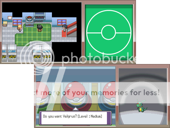
Ahhh its back! I can tell just from the cool CSS design that your serious about finishing Carbon once and for all. All the screenies look good in my opinion except for the night one (I think its a little too dark, not a big deal though. The palette works, just a little dark). and the second to last one. Eton doesn't have a level?
Anyways, good luck man, we all know you can do it!
Edit: I decided I actually like the night screenie, haha
Anyways, good luck man, we all know you can do it!
Edit: I decided I actually like the night screenie, haha
Chibi Robo
of the entire epoch!
- 854
- Posts
- 15
- Years
- Age 28
- Cali
- Seen Apr 2, 2013
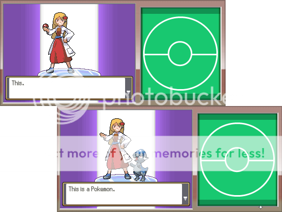
Looking really great Ty. Im sure people will really appreciate the huge improvements in the graphics. It also looks like you have sprited all of the sprites. Which really impresses me. Coal's backsprite could use a bit more work. Looks kinda funky :l
But anyways it looks amazing Ty.
But anyways it looks amazing Ty.
Ven
Tyrian
- 124
- Posts
- 14
- Years
- Seen Mar 19, 2011
Looks pretty nice, well the heroes overworld sprite, especially the side sprite, needs a bit of work, the hair looks a bit squished together, and while I'm at it, I kinda think you should scrap te day/night system. It's your game so It's your choice, but your graphics look pretty bad during the night, but during the day they look gorgious.
mulch_ar
What should I type here?
- 150
- Posts
- 15
- Years
- Age 27
- Jakarta, Indonesia
- Seen Feb 27, 2012
Yeah, Carbon is back! I've waited for this, and this is one of my favorites here. Great Screeenies and sprites (and what's up with the Snorlax there? -,-). Keep up the good work!
- Status
- Not open for further replies.