Vrai
can you feel my heart?
- 2,896
- Posts
- 15
- Years
- Age 29
- Seen Oct 24, 2022
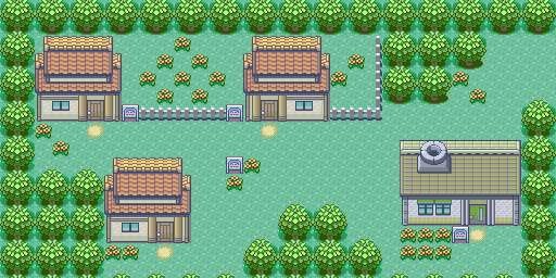
now my map :)
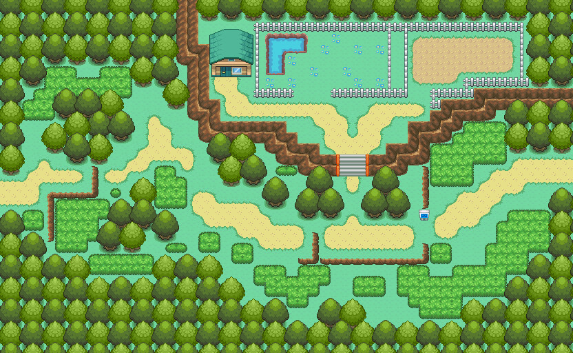
i want to see what people think of it, its for an upcoming hack im going to make.
if it looks really bad,please dont be harsh and dont say its REALLY bad because it will make me feel bad.
Map Name:route 1
Base:fire red
Hack: soon to be part of a hack
Map:in attachment
Comments: i just noticed a tile error that prevents you from going through the route( theirs a rock in the middle of the road) but other than that, i think there aren't other tile errors.
the signpost is messed up also, i forgot to repaint it.....also thanks Wah for the mountain tiles.
Okay. So let me tell you something.
If you want something you make to ever be judged, you can't say "oh and don't say bad things because I don't like it". If you really want it to be judged right, you have to accept the good criticism and the bad, regardless of how mean they sound. They're just trying to help you improve, okay? I can't just tell you everything looks perfect and wonderful just because you don't want me to say otherwise.
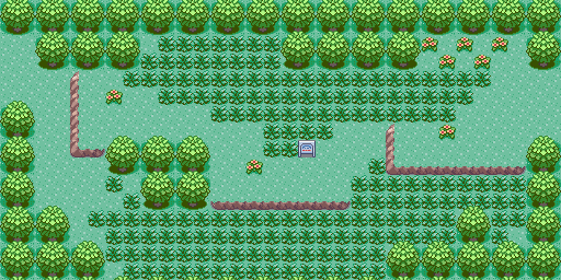
Anyway, there are indeed a lot of problems with your map, but also a lot of things that come with being a first-time mapper. The first thing is that you're using those rocks and bushes as like a border for the player to follow. They're not really meant to be used in that manner. In fact, they're intended to me more like decoration than to make pathways for the player to use. So;
Step 1. Don't use rocks and bushes (you know, the long green things) as pathways for the player to walk through.
And partially because of that, you've gotten yourself into another problem. I know you wanted to make this map like a maze, but it's usually really difficult to do that without severely cutting into the map's playability. If you don't know what that means, it's basically how enjoyable it is for the player to actually progress through the map. If they're stuck walking through 1-tile pathways all the way (and especially one for that long), most players will get really tired of the map and could even stop playing your ROM hack (which is not something you want happening!). There are a lot of spots in your map where there are 1-tile pathways that you need to avoid.

This is almost a perfect example of what I'm talking about. You see how you can only get through there by following the exact path you specified? You can't do that if you want people to enjoy your map. The stairs count, too - you should have more than one stairway lined up together, otherwise that's a 1-tile pathway too. And now, we have;
Step 1. Don't use rocks and bushes (you know, the long green things) as pathways for the player to walk through.
Step 2. Fix up all of the 1-tile pathways. The player should have more space to move around.
Step 2. Fix up all of the 1-tile pathways. The player should have more space to move around.
Alright, so what's going to happen next? One problem that most beginners have is with flowers. People either usually don't use any, or they use way too many and it makes the map look bad. Can you guess which category you fall under?
Fortunately, this is easier to fix than one would think. Your flowers are actually fairly good; I mean, as a beginner. Flowers generally should go in a diagonal pattern, like the way you've got them going here:

...but aside from that pair and another just below it, the rest of your flowers aren't so hot. They should be clustered together diagonally, but only like two or three in a group. Spread the groups out a little bit. It's really not that difficult to get the hang of, and they can make your map look really nice in-game if you do it right. If not... then it doesn't. Anyway, you need to touch up your flowers a little bit. And now we have another step added!
Step 1. Don't use rocks and bushes (you know, the long green things) as pathways for the player to walk through.
Step 2. Fix up all of the 1-tile pathways. The player should have more space to move around.
Step 3. Flowers need to be clustered together, and then they need to be spread out more. Don't let the player see more than two clusters at any given moment!
Step 2. Fix up all of the 1-tile pathways. The player should have more space to move around.
Step 3. Flowers need to be clustered together, and then they need to be spread out more. Don't let the player see more than two clusters at any given moment!
Now, I kind of want to talk to you about what the player can see. As the player goes through your game, they see your maps through a small window. If I recall correctly, it's a window that is five tiles each direction tall, and then seven wide, although I can't remember exactly. I do know that seven tiles away from them is the maximum they can see at any given time. But as they approach the edge of your map...

What shows up in this red circle, do you know? They have to see something there. What the player sees are called "border tiles" or blocks, I haven't mapped in a while don't hit me! D: . You can set them in AdvanceMap, right above your normal tiles. However, border tiles (or blocks :x) won't look very good with your map. Do you know why?
It's because the tiles that are closest to the edge of your map keep changing. Some of them are mountain ledges that point off the edge of the map, some of them are just a continuation of the grass tile. You could probably be fine with the grass, but... the mountains coming off the edge really break it, because they'll just be running into trees or whatever the border block is and it won't look right. These are called border errors, and they're some of the hardest problems for a mapper to fix. Basically, you're going to have to turn up the mountains so that they don't run into the edge and thus allow you to use a tree for the border block. Either you do that, or you add enough trees to the edge of the map that the player can't walk all the way to the edge to see the border. It's a problem, and there are only a couple of solutions, but you'll have to pick one for it to look alright at the edge of the map. And now we have another step!
Step 1. Don't use rocks and bushes (you know, the long green things) as pathways for the player to walk through.
Step 2. Fix up all of the 1-tile pathways. The player should have more space to move around.
Step 3. Flowers need to be clustered together, and then they need to be spread out more. Don't let the player see more than two clusters at any given moment!
Step 4. Try to fix the border errors. I know it's difficult, but you can always post your map here and specifically ask if there are any border errors.
The next notes I have written down are about your mountains. They're not bad, but they could still be improved a lot, especially right here:

It's really annoying for the player to have to push down, left, down, left, down, left, down, left, down, left, down, left, down, left... heck, it was really annoying to type that. :( While "how" you should map mountains isn't really a set standard, there are some things that you should keep in mind while mapping them. First of all, don't make mountains like that. It's not worth your time, and people hate pressing down, left, down, left, down, left... I'll stop myself now. :>
Mountains are really a flavor thing. You can map them really straight, or you can give them a lot of turns and stuff to add spice. Keep playability (that 1-tile stuff I mentioned earlier) in mind, though. That's really what mountains are all about.
I also like the tile you chose for the mountain. Good choice. :)
Step 1. Don't use rocks and bushes (you know, the long green things) as pathways for the player to walk through.
Step 2. Fix up all of the 1-tile pathways. The player should have more space to move around.
Step 3. Flowers need to be clustered together, and then they need to be spread out more. Don't let the player see more than two clusters at any given moment!
Step 4. Try to fix the border errors. I know it's difficult, but you can always post your map here and specifically ask if there are any border errors.
Step 5. Mountains need some touching up. Keep playability in mind when you're changing them!
The next thing I have down is the grass tiles. It's nice that you know how to change palettes and you can work with tiles and stuff, and I know this isn't a tile/palette rating thread, but the color of the grass tile really takes away from the quality of the map. It's also really hard to tell what color the little spikes of grass are (they're usually the lighter part of the grass). I'd advise you to change them back to the original palettes or something less... "blech"-y. I'm not trying to insult your palette choices, but they mesh really poorly with other FireRed tiles and I think it makes the quality of your map less good.
Step 1. Don't use rocks and bushes (you know, the long green things) as pathways for the player to walk through.
Step 2. Fix up all of the 1-tile pathways. The player should have more space to move around.
Step 3. Flowers need to be clustered together, and then they need to be spread out more. Don't let the player see more than two clusters at any given moment!
Step 4. Try to fix the border errors. I know it's difficult, but you can always post your map here and specifically ask if there are any border errors.
Step 5. Mountains need some touching up. Keep playability in mind when you're changing them!
Step 6. Grass palettes need some changing. They're not as good as I think you imagined.
Okay! Whew, that was a lot of typing. ;-;
As you can see, there's a lot of things I think you could use to help you fix up your map. I tried to bold stuff that was important, and I made a step-by-step outline of things that should be improved. It's not a comprehensive list (by that I mean it's not everything you need to fix); there's always more things you can fix. You can't expect to make a perfect map the first time, so I hope you take this criticism/help guide/tl;dr whatever in stride to help you make better maps!
/like an hour and a half of writing