• Our software update is now concluded. You will need to reset your password to log in. In order to do this, you will have to click "Log in" in the top right corner and then "Forgot your password?".
  • Welcome to PokéCommunity! Register now and join one of the best fan communities on the 'net to talk Pokémon and more! We are not affiliated with The Pokémon Company or Nintendo.

Spriter's Showcase Thread

Status
Not open for further replies.

Elaitenstile

I am legend
1,908
Posts
11
Years
  • Age 24
  • Seen Feb 27, 2015
The updated Russel sorted a lot of things out. Now he really looks like an explosive guy! (Literally, as well) And for that other girl, the edit you did today made her look perfect! The first one you put up had an awkward position with the legs. I guess the Pokéball is green in colour due to palette issues? And also, the first two versions had longer hair, and the new one kinda shortened out.
 

Superjub

Pokémon Aureolin
2,288
Posts
16
Years
The updated Russel sorted a lot of things out. Now he really looks like an explosive guy! (Literally, as well) And for that other girl, the edit you did today made her look perfect! The first one you put up had an awkward position with the legs. I guess the Pokéball is green in colour due to palette issues? And also, the first two versions had longer hair, and the new one kinda shortened out.

Thanks. :D Glad that the new version looks better for Russell. :)

As for the girl, I'm glad she looks normal now ahaha. xD And yeah, the PokeBall's green due to palette issues- it was originally red but when I found out it went over 16 colours I had to edit a lot of things. :x I might see if I can change it back though and stay under the limit. :) And yeah, noticed a lot of my female trainers had long hair so I thought I'd opt for shorter hair this time. :) I think it suits her more imo.

Thanks for the comments once again. :)

EDIT: More sprites await. Revamps to be precise. :) I'm starting to consider opening up my own thread since it seems like I'm getting fairly active again. ^^

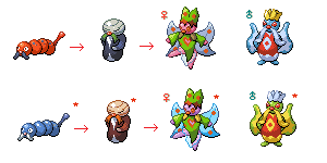
bug_evolution_family_by_superjub-d5w6tjm.png


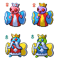
Pendug (Pendulum + bug)
Bug Type
"Even under extreme stress, it swings its pendulum-like tail at the same pace."
Original:
pendug_by_superjub-d368avp.png

----

Buglar (portmanteau of bug and corruption/phonetic version of "butler")
Bug Type
"Buglar serves Buttafrone eternally. This Pokémon would sacrifice itself to protect a Buttafrone."
Original:
bugler_by_superjub-d36f5ds.png

----

Buttafrone (portmanteau of butterfly & throne spelled phonetically.)
Bug/Flying Type
"Female Buttafrones have vivid heart and polka-dot markings as opposed to the male's diamond markings."
Original:
fancy_butterfly_thing_by_superjub-d373fne.png
 
Last edited:

Elaitenstile

I am legend
1,908
Posts
11
Years
  • Age 24
  • Seen Feb 27, 2015
The first three dudes look good enough. Good caterpillar. And nice male/female alteration.

The second one looks pretty weird. I think it's because you're lacking a basic style, it's too plain without much details. There should be some kind of pattern, maybe some colour-separating stripes. On the head, you should've made a head piece (maybe a bell! Besides, what's a clock without bells?). The initial body shaped should be altered, so as to get the pendulum type (long and thin, huge ball in the end) of body. There are too many stripes, just make it two-third of that many. You should also include more colours for it.

The next one is designed well, although the pose is not looking great. Make a standing straight (B/W type) type of view with a salute or bow. It is a servant, after all.

The last one, well, not much about it. Nice robe-wings, but I can't see the polka-dots on the female.

You are pretty good at this stuff, I think you'd better start a new Showcase Thread. ;)
 
Last edited:

Superjub

Pokémon Aureolin
2,288
Posts
16
Years
The first three dudes look good enough. Good caterpillar. And nice male/female alteration.

The second one looks pretty weird. I think it's because you're lacking a basic style, it's too plain without much details. There should be some kind of pattern, maybe some colour-separating stripes. On the head, you should've made a head piece (maybe a bell! Besides, what's a clock without bells?). The initial body shaped should be altered, so as to get the pendulum type (long and thin, huge ball in the end) of body. There are too many stripes, just make it two-third of that many. You should also include more colours for it.

The next one is designed well, although the pose is not looking great. Make a standing straight (B/W type) type of view with a salute or bow. It is a servant, after all.

The last one, well, not much about it. Nice robe-wings, but I can't see the polka-dots on the female.

You are pretty good at this stuff, I think you'd better start a new Showcase Thread. ;)
Thanks for the comments. :) Just to clarify, are these comments: "The second one looks pretty weird. I think it's because you're lacking a basic style, it's too plain without much details. There should be some kind of pattern, maybe some colour-separating stripes. On the head, you should've made a head piece (maybe a bell! Besides, what's a clock without bells?). The initial body shaped should be altered, so as to get the pendulum type (long and thin, huge ball in the end) of body. There are too many stripes, just make it two-third of that many. You should also include more colours for it.

The next one is designed well, although the pose is not looking great. Make a standing straight (B/W type) type of view with a salute or bow. It is a servant, after all.

The last one, well, not much about it. Nice robe-wings, but I can't see the polka-dots on the female." aimed at the older sprites? e.g.:
pendug_by_superjub-d368avp.png
I have to admit these are really really old so they're kinda nooby ahaha. xD I like some of your ideas though like the bell headpiece and I'd love to incorporate that. :D
 

Elaitenstile

I am legend
1,908
Posts
11
Years
  • Age 24
  • Seen Feb 27, 2015
Yep, they were. But I loo-oove the first batch, the revamps, namely this :

bug_evolution_family_by_superjub-d5w6tjm.png


Like I said, they're perfect.
But still, the servant would like a salute or something.
And yeah, consider the bell and colour.

(You know, I never realised you revamp'd the last three sprites into the first, I'll apologize for shooting at you, that's pretty stupid of me xD)

I guess the next place I'll comment will be in your gallery!
 

Reb0rn

Son of a Plunder
33
Posts
11
Years
Water Tiles for an upcoming ROM hack of mine, They're all animated. Would upload more, but I'm tired.
 

Aryan143

The Fennekin Fan!
757
Posts
11
Years
I have sprited/perfectly resized Yveltal sprite to be inserted in a GBA rom hack. Can someone give comments on this and how to improve it. I know that there is a problem in its head but I don't know how can I correct it. I need your help.

Here is it:

zPmk4LB.png
 

Elaitenstile

I am legend
1,908
Posts
11
Years
  • Age 24
  • Seen Feb 27, 2015
Aryan, judging by the quality, I would still find a lot of jagged lines, especially on the right tail-claw. The cloud neck-scarf is in particular unfinished, with a jagged stop rather than a smooth curve. But the main problem seems to be the lack of selective outlining. I think Log suggested than in R & F thread long ago, but I would recommend looking at other sprites. There are lighter outlines at lighter parts of the sprite. The palm of the tail and arms should have more pillow shading and surfacing. Other than that, you're all set, mate.

I would want professional help with these sprites :

MetangSymetry_zps21843df5.png


Symmetrical Metang sprite, dated 3/15/2013

BeldumPixel_zps00852616.png


Pixel Beldum sprite, dated 3/15/2013

How do they look? Please, don't refrain from commenting!
 

Demon Days

Element of Magic
177
Posts
11
Years
Aryan, judging by the quality, I would still find a lot of jagged lines, especially on the right tail-claw. The cloud neck-scarf is in particular unfinished, with a jagged stop rather than a smooth curve. But the main problem seems to be the lack of selective outlining. I think Log suggested than in R & F thread long ago, but I would recommend looking at other sprites. There are lighter outlines at lighter parts of the sprite. The palm of the tail and arms should have more pillow shading and surfacing. Other than that, you're all set, mate.

I would want professional help with these sprites :

MetangSymetry_zps21843df5.png


Symmetrical Metang sprite, dated 3/15/2013

BeldumPixel_zps00852616.png


Pixel Beldum sprite, dated 3/15/2013

How do they look? Please, don't refrain from commenting!
The Beldum's shading looks jagged, and isn't consistent in places (example: its claws).
 

Elaitenstile

I am legend
1,908
Posts
11
Years
  • Age 24
  • Seen Feb 27, 2015
Thanks for the feedback. I really appreciate it. I'll get working on that straightaway. (Also, I know Metang's shading is completely bust, but it was for a fun picture, actually)

EDIT : More stuff. All random. Seems I'll ramble on over here than start an art thread.

CelebiGrade_zps48b5dead.png

PlainBall_zps9e82f1e6.png

RuffianBoy_zps84289e0c.png


Not one iota of base.
 
Last edited:

ChronasDaKid

Enraged Trainer
8
Posts
11
Years
  • Age 26
  • Seen Aug 14, 2015
Opinions On My Trainer Sprite

This is my first time making a pokemon trainer so I would like for you guys to tell me how i did and what I can improve on if I need to.
 
2,982
Posts
15
Years
This is my first time making a pokemon trainer so I would like for you guys to tell me how i did and what I can improve on if I need to.

This thread is for artists to show off one specific sprite for improvement. A thread in the Pixel Art requires 4+ original sprites (like non-scratch) to qualify as a showcase. Double check the rules of the section.
 

ChronasDaKid

Enraged Trainer
8
Posts
11
Years
  • Age 26
  • Seen Aug 14, 2015
This thread is for artists to show off one specific sprite for improvement. A thread in the Pixel Art requires 4+ original sprites (like non-scratch) to qualify as a showcase. Double check the rules of the section.
I read the rules, I just misread somethings. Sorry.
 

Demon Days

Element of Magic
177
Posts
11
Years
Ahum. Something I made to entertain myself. Gentlemen, I present to you...
flaresant_by_a_discordant_person-d5yx4jk.png

Flaresant.
I actually got proper shading for once!
Please, criticise. I need some improvement; I haven't made any real sprites in ages.
EDIT: I made this. Is gud day to be pixel-art man.
rayquaza_weather_trio_scene_pixel_over_by_a_discordant_person-d5yxlux.png
 
Last edited:

Elaitenstile

I am legend
1,908
Posts
11
Years
  • Age 24
  • Seen Feb 27, 2015
Ahum. Something I made to entertain myself. Gentlemen, I present to you...
flaresant_by_a_discordant_person-d5yx4jk.png

Flaresant.
I actually got proper shading for once!
Please, criticise. I need some improvement; I haven't made any real sprites in ages.
EDIT: I made this. Is gud day to be pixel-art man.
rayquaza_weather_trio_scene_pixel_over_by_a_discordant_person-d5yxlux.png

Foo-reeeee!

I'll tell about Flaresant then. Okay, I'll criticize.

From what I have seen, I think the general shaping is great, especially the head. Although it wouldn't hurt to put in two more claws on its feet, would it?

Fire effect is nice, especially the infernal shading.

I think the wing which can be seen from here is in need of highlights. Also, I think the sprite can be better off with more detail, something designs and patterns on its body, and coloured feathers.


rayquaza_weather_trio_scene_pixel_over_by_a_discordant_person-d5yxlux.png


Good Pixel Over, especially since I have the Rayquaza on my sig xD. Clean shades, good colouring, but I'd suggest some anti-aliasing and dithering.
 

Demon Days

Element of Magic
177
Posts
11
Years
Foo-reeeee!

I'll tell about Flaresant then. Okay, I'll criticize.

From what I have seen, I think the general shaping is great, especially the head. Although it wouldn't hurt to put in two more claws on its feet, would it?

Fire effect is nice, especially the infernal shading.

I think the wing which can be seen from here is in need of highlights. Also, I think the sprite can be better off with more detail, something designs and patterns on its body, and coloured feathers.


rayquaza_weather_trio_scene_pixel_over_by_a_discordant_person-d5yxlux.png


Good Pixel Over, especially since I have the Rayquaza on my sig xD. Clean shades, good colouring, but I'd suggest some anti-aliasing and dithering.
Heh, thanks for the comment.
The thing with Flaresant is that gains claws over evolutions; one for itself, two for the evolution, and three for the final evolution. I tend to avoid feathers and such. As for Rayquaza, dithering's not something I'm good with (my dithering's just straight, so it makes the shading choppy). I'll probably anti-aliase it though.
EDIT: Made the change.
rayquaza_weather_trio_scene_pixel_over_by_a_discordant_person-d5yxlux.png
 
Last edited:

Silversnk

Valar Dohaeris
98
Posts
11
Years
That's a really nice pixel over, I love the coloring. There are some things that you could still improve like the placing of some lights, they're just a little incongruent with the flow of the sprite. Another thing: on the third section of Rayquaza's body, he seems to crack or something like that xD I mean, it's not as curvy as it should be.

Really good work, I liked it very much.
 

Demon Days

Element of Magic
177
Posts
11
Years
That's a really nice pixel over, I love the coloring. There are some things that you could still improve like the placing of some lights, they're just a little incongruent with the flow of the sprite. Another thing: on the third section of Rayquaza's body, he seems to crack or something like that xD I mean, it's not as curvy as it should be.

Really good work, I liked it very much.
Heh, thanks. The Rayquaza's based on one of Ken Sugimori's drawings (Groudon & Kyogre fighting with Rayquaza aboves them, and a thunderstorm in the sky), so that's why the shading's odd.
 

Elaitenstile

I am legend
1,908
Posts
11
Years
  • Age 24
  • Seen Feb 27, 2015
Heh, thanks for the comment.
The thing with Flaresant is that gains claws over evolutions; one for itself, two for the evolution, and three for the final evolution. I tend to avoid feathers and such. As for Rayquaza, dithering's not something I'm good with (my dithering's just straight, so it makes the shading choppy). I'll probably anti-aliase it though.
EDIT: Made the change.
rayquaza_weather_trio_scene_pixel_over_by_a_discordant_person-d5yxlux.png

Yeah... it looks much smoother now. Why don't you do Kyogre and Groudon too?
 
Status
Not open for further replies.
Back
Top