You are using an out of date browser. It may not display this or other websites correctly.
You should upgrade or use an alternative browser.
You should upgrade or use an alternative browser.
chromophobe;
- Thread starter moments.
- Start date
More options
Who Replied?Shining Raichu
Expect me like you expect Jesus.
- 8,959
- Posts
- 13
- Years
- Age 33
- Australia
- Seen Nov 20, 2023
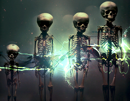
OH. MY. GOD. Such inspiration I don't even.
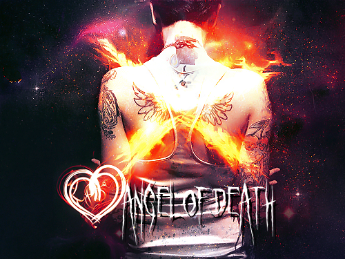
This is the sort of stuff I'd love to do but would never have the skill to achieve. My favourites are the skeletons and the Angel of Death. Just so much love.
This is the sort of stuff I'd love to do but would never have the skill to achieve. My favourites are the skeletons and the Angel of Death. Just so much love.
- 10,673
- Posts
- 15
- Years
- Age 30
- Seen Dec 30, 2023
I honestly dislike where your style has gone. You're on a one way, fast track to a slim horizon for art. All your examples are stuck in one style, and looking back on your other work, it's the only style you seem to pull off. I know your work so well at this stage, that I simply think that if you continue to keep going down this route, you'll regurgitate the same stuff over and over. What I see here, is nothing like I've not seen from you before. Your style has become too sharp and contrasted that your focals are too lost in detail. You're enveloping your concepts in too much technique, for all of these.
http://i233.photobucket.com/albums/ee207/mattimogalli/angel.png
This is the best though. But again, over contrasted and sharpening is too frequent. I know you like doing it, but your concepts are suffering because you're going too far into your own style. You should branch out a little. And lay off the touch ups a little.
I realise that might sound harsh, they're all good really, but I think a little general critique on style can help also.
- 1,396
- Posts
- 16
- Years
- Age 29
- The suburbs, and no I don't need to describe much
- Seen Dec 21, 2015
DIIIIISSSSAAAGRREEEEEEeeEEEEeeEEeEEEEEE!!!!!!I honestly dislike where your style has gone. You're on a one way, fast track to a slim horizon for art. All your examples are stuck in one style, and looking back on your other work, it's the only style you seem to pull off. I know your work so well at this stage, that I simply think that if you continue to keep going down this route, you'll regurgitate the same stuff over and over. What I see here, is nothing like I've not seen from you before. Your style has become too sharp and contrasted that your focals are too lost in detail. You're enveloping your concepts in too much technique, for all of these.
http://i233.photobucket.com/albums/ee207/mattimogalli/angel.png
This is the best though. But again, over contrasted and sharpening is too frequent. I know you like doing it, but your concepts are suffering because you're going too far into your own style. You should branch out a little. And lay off the touch ups a little.
I realise that might sound harsh, they're all good really, but I think a little general critique on style can help also.
While I agree you are pushing the contrast in your newer pieces, I feel it has been to general success. For example, /skeletal1.png has high contrast, but it only complements the effects and composition of the tag.
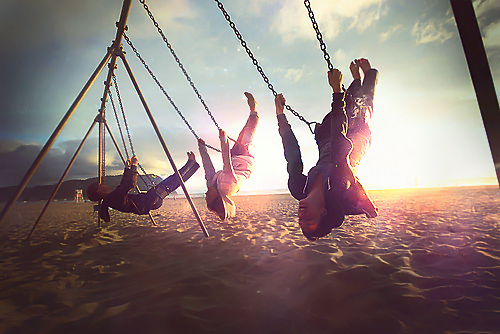
As for where your concepts are going. I think all of the ideas (or how I interperate these pieces) for these tags are really cool, and I think you should keep making art that expresses your true thought. DONT FILTER THE GENIUS! Ahaha, this stuff is gold. Honestly, I don't know how you come up with halve of these sick tag concepts.
Very cool stuff moments. I'm planning to edit this post later to give you what I think of every tag, but for now: 'I APROVE!'
- 10,673
- Posts
- 15
- Years
- Age 30
- Seen Dec 30, 2023
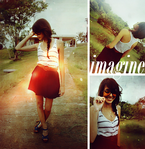
http://i233.photobucket.com/albums/ee207/mattimogalli/imagine.png
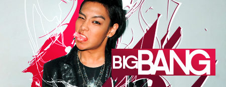
You say I wont like it, yet it's pretty much my contrasted/gloomy icon style in a larger piece dude haha. Anyway, it actually derives from your usual style somewhat. Simply because it's actually MORE COMMERCIAL, so I secretly think you felt that I would like it. At any rate, onto the critique.
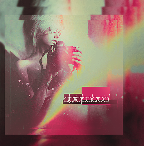
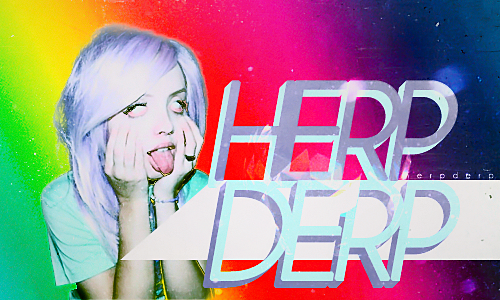
I'm liking the text for the most part, though I think that you know it might have been annoying due to the fact you can't really see it right. On the G at least. From what I've learned about magazine typography is that you need to actually be able to make out at least 70% of the letter, usually, and here I think it is a little risky by cutting off so much of the G with the white border. So possibly try and work your way around that one. Reds seem a little dirty. I generally avoid it when I use this sort of style (I hope you forgive me for comparing this to one of my icon styles). You could have also made the blues a tiny bit more cyan, just a bit though.
For what this piece is really, it's quite good. Positioning is quite well done. Though just tweak those colours and try to be a bit consistent, try not to have any glaring reds such as the effect on the left photo. And then possibly work on the text, but I think it's not too bad as it is.
I think you should try some typography at some point though, you always seem to use rather nice fonts, so a large piece with typo maybe? Also if you wanted to test yourself again, do something conceptual, I like your ideas, but what I mean is, using a number of stocks to create your desired concept. Good work though.
Alternative
f i r e f l y .
- 4,262
- Posts
- 15
- Years
- Age 31
- Adelaide, Australia
- Seen Jul 5, 2020
I have to really agree on Gavin with this one Massimo, the contrasting you've used, and everything about it is great! The red is starting to get to me though, since you're going for a gloomy setting. Colour is an important asset and you don't want to use the wrong colours for these things. Maybe you could try changing it to something more dull like blue or green? It's good to suit colours with the mood.
Speaking about the mood, I don't even think that this sort of image is exactly suited for the gloomy style, which I've seen from you so much, like your current avatar, where it works. The woman in the piece seems to be very happy, and uplifting in terms of the mood she's in, and you've gone with the gloomy side, which doesn't really seem fitting if you ask me. It does seem like the sort of piece where you'd use some bright colours, like yellows and stuff for everything. Just give that a thought for your next piece maybe.
Text is great, with font choosing, and positioning. That "g" is offputting though, with some of it in the spaces between the two parts. You should play around with that some more, like maybe making the G a smaller font so it fits in the same plane as the rest of the text or something.
Apart from all that critique, from what I've seen of your work and your latest larger pieces, this has probably got to be one of your best works yet. Keep it up! :D *gives sticker*
Photomanipulation large piece. Yes it's dark and gloomy, but I guess it suits the concept which I actually planned out in my mind before hand which I don't normally do.
malformed.png
Link because it is pretty big. :P
malformed.png
Link because it is pretty big. :P
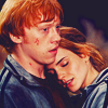
'Cause we all have a bit of Potter obsession at the moment! Give me comments please, I'm not too confident with my icons, decided to finally churn through heaps and try improve. So yeah, any comments. Plus I've already like quintuple posted... :P









Last edited:
Sestuple posts are something else. Something magical I can assure you.
Seriously though, someone say anything? :(

Just liked the stock, I'll admit I didn't do all too much besides adjustments, but I do like the stock, it's so peaceful yet restless /philosopher.
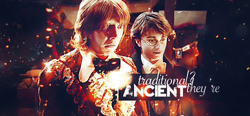
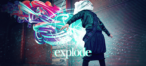
The next bunch are requests from my shop!

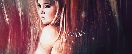
Seriously though, someone say anything? :(

Just liked the stock, I'll admit I didn't do all too much besides adjustments, but I do like the stock, it's so peaceful yet restless /philosopher.
The next bunch are requests from my shop!


- 13,373
- Posts
- 14
- Years
- Age 29
- Seen Jan 28, 2019
http://i233.photobucket.com/albums/ee207/mattimogalli/padfoot.png
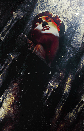
http://i233.photobucket.com/albums/ee207/mattimogalli/david.png
Out of all your new work, I'd say these catch my attention the most, just the feel and look of them makes them stand out from the rest. The Padfoot one, even tho you say you didn't do much (And I haven't seen the stock before so I can't say how much adjustment you did) it still looks pretty impressive, it goes together nicely. The David one looks great. I can't really put what I feel of it in words (Since I'm bad at art terms and such) but I have to say it looks equally as impressive.
Anyways, keep up the good work!
Who's Kiyo?
puking rainbows
- 3,229
- Posts
- 12
- Years
- Age 28
- Olivine City
- Seen Jul 21, 2022
WHY ISN'T THERE AT LEAST SEVENTEEN THOUSAND POSTS INBETWEEN VERY UPDATE. THIS IS AN OUTRAGE.
Your graphics are absolutely beautiful, and I am truly blown back.
The only criticism I have is the text seems to awkwardly placed in some of works and they sort of take away from the image itself- but then again, I'm not partial to adding text to a picturemy selfso I can shut my mouth.
Don't stop what you're doing.
Your graphics are absolutely beautiful, and I am truly blown back.
The only criticism I have is the text seems to awkwardly placed in some of works and they sort of take away from the image itself- but then again, I'm not partial to adding text to a picturemy self
Don't stop what you're doing.
Thanks and thanks I guess! :Dhttp://i233.photobucket.com/albums/ee207/mattimogalli/padfoot.png
http://i233.photobucket.com/albums/ee207/mattimogalli/david.png
Out of all your new work, I'd say these catch my attention the most, just the feel and look of them makes them stand out from the rest. The Padfoot one, even tho you say you didn't do much (And I haven't seen the stock before so I can't say how much adjustment you did) it still looks pretty impressive, it goes together nicely. The David one looks great. I can't really put what I feel of it in words (Since I'm bad at art terms and such) but I have to say it looks equally as impressive.
Anyways, keep up the good work!
I'd show you the original for the Padfoot stock, but I don't have it online anywhere, and unless you really wanted to see it, I can't really be bothered uploading a copy of it. :P
I don't really know what to say besides, thank you! And that I'm really nothing special, I've been doing this for quite a while and it's all just practise and experience. But thanks so much!WHY ISN'T THERE AT LEAST SEVENTEEN THOUSAND POSTS INBETWEEN VERY UPDATE. THIS IS AN OUTRAGE.
Your graphics are absolutely beautiful, and I am truly blown back.
The only criticism I have is the text seems to awkwardly placed in some of works and they sort of take away from the image itself- but then again, I'm not partial to adding text to a picturemy selfso I can shut my mouth.
Don't stop what you're doing.
As for the text, understood, text is definitely a tricky aspect of making tags, but also because I can appreciate that I tastes and things are radically different in everybody, so you don't need to "shut your mouth." :)
But yeah, thanks a lot!
Alternative
f i r e f l y .
- 4,262
- Posts
- 15
- Years
- Age 31
- Adelaide, Australia
- Seen Jul 5, 2020
I just want to say I'm in love with what you did for those icons you did for Red. They're absolutely amazing. <3 The way you've made them a silhouette, and use the rainbow glowing effects just astounds me and it works beautifully. Just everything about them looks amazing and I don't think I could fault them even if I wanted to. I just don't like the first one of that set, but that's just me. They're still perfect.
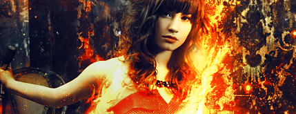
Just one thing though with this tag is that it looks very good. The effects and background look very well designed and looks also quite sharp. The flames on the hair look stunning, but maybe you went a little overboard on the sharpening, expecially around the left side of her? I wouldn't know, but that's how it looks to me. :/ One thing I just don't get are the little red/orange specks on her arm stretching out. They seem s little oddly placed and seems weird. Maybe if you moved those down a fraction, maybe 10-15px~ and it would looks better? Or even just got rid of some of those specks. Apart from that, your requests have been turning out amazing. <3
Just one thing though with this tag is that it looks very good. The effects and background look very well designed and looks also quite sharp. The flames on the hair look stunning, but maybe you went a little overboard on the sharpening, expecially around the left side of her? I wouldn't know, but that's how it looks to me. :/ One thing I just don't get are the little red/orange specks on her arm stretching out. They seem s little oddly placed and seems weird. Maybe if you moved those down a fraction, maybe 10-15px~ and it would looks better? Or even just got rid of some of those specks. Apart from that, your requests have been turning out amazing. <3
- 10,673
- Posts
- 15
- Years
- Age 30
- Seen Dec 30, 2023
Aight studs, time for some icon critique.


Let's pretend these are numbered from left to right beginning with one, through to nine. Anyway, you're getting better with icons, I see you've actually been snatching the methods of my technique in some of these, which include the circular gradient. If it helps, I usually use a medium brown on exclusion, I think, and at times a grey, depending on the icon. At any rate, you've got some critical errors in your icons. Let me start out by saying that you can't just use the same style with every icon. Icons number 1 to 3, they should never have be worked on in this style, they're too contrasted, too dull, and too saturated. The first two are nice stocks, but don't be afraid to use a nice, clean high quality edit. Icons are mostly about colour and bringing out the focal point. The circular gradient helps do that for some icons, but to be honest, for some icons you need to avoid the gloomy style. I advise you to try being original with colour, on some of your icons, without going dark, if you look at some of my brighter work you'll know what I mean. At ant rate, you can make an amazing icon with 4 adjustment layers. If you concentrate on colour. Then sharpen your focal, blur the background, and seriously keep the focal in the forefront. An example of where I like your colour is number 5, Emma Watson, I love what you did with the colour, but I think you killed the quality of the icon by adding extra effects to give it that washed out style. I think you know what I'm getting at, you need to avoid it sometimes. I recommend developing more than one technique. So that you can apply it to the necessary stock and work from there each time. I'm not actually drawn to any of these, I think they're all a little to washed out. The one I like most however, is the one you're using as your avatar. But I still think it's a little monotone. This is a very hard style to pull off, because you tend to concentrate a little too much on nailing the style that you forget about your stock. Never forget how important your stock is moom. I'm going to go and just say that you should apply the above advice to all the icons above. I'd be specific, but the issue is a general thing. Tone down how heavy the effects are, try not to think about the technique too much, and concentrate on retaining the quality of the stock.
Anyway, you've made some more since then so let's take a look.






Again, one through to eight. First icon is over saturated, I'm not a fan of the colours, again it's a little too dull. The next is better actually, it retains most of the quality. The next two work in the style, but they're made for it really, still though, work on emphasizing your focals more. As for the bottom four, I actually like these a lot more. Due to the colour more than anything. I think you've done well on that here. But believe me, if you could apply this sort of class into colour without reducing the quality of the stock, you'd make amazing icons.
I'd go through your tags, but I think icon critique is something to concentrate on more right now. I also dislike critiquing request tags because they're usually ~forced~ art if you know what I mean. But as far as they're going, you're getting a lot better with tags. But dude, you really gotta stop blowing effects out your ass ;]
Spoiler:


Let's pretend these are numbered from left to right beginning with one, through to nine. Anyway, you're getting better with icons, I see you've actually been snatching the methods of my technique in some of these, which include the circular gradient. If it helps, I usually use a medium brown on exclusion, I think, and at times a grey, depending on the icon. At any rate, you've got some critical errors in your icons. Let me start out by saying that you can't just use the same style with every icon. Icons number 1 to 3, they should never have be worked on in this style, they're too contrasted, too dull, and too saturated. The first two are nice stocks, but don't be afraid to use a nice, clean high quality edit. Icons are mostly about colour and bringing out the focal point. The circular gradient helps do that for some icons, but to be honest, for some icons you need to avoid the gloomy style. I advise you to try being original with colour, on some of your icons, without going dark, if you look at some of my brighter work you'll know what I mean. At ant rate, you can make an amazing icon with 4 adjustment layers. If you concentrate on colour. Then sharpen your focal, blur the background, and seriously keep the focal in the forefront. An example of where I like your colour is number 5, Emma Watson, I love what you did with the colour, but I think you killed the quality of the icon by adding extra effects to give it that washed out style. I think you know what I'm getting at, you need to avoid it sometimes. I recommend developing more than one technique. So that you can apply it to the necessary stock and work from there each time. I'm not actually drawn to any of these, I think they're all a little to washed out. The one I like most however, is the one you're using as your avatar. But I still think it's a little monotone. This is a very hard style to pull off, because you tend to concentrate a little too much on nailing the style that you forget about your stock. Never forget how important your stock is moom. I'm going to go and just say that you should apply the above advice to all the icons above. I'd be specific, but the issue is a general thing. Tone down how heavy the effects are, try not to think about the technique too much, and concentrate on retaining the quality of the stock.
Anyway, you've made some more since then so let's take a look.
Spoiler:


Again, one through to eight. First icon is over saturated, I'm not a fan of the colours, again it's a little too dull. The next is better actually, it retains most of the quality. The next two work in the style, but they're made for it really, still though, work on emphasizing your focals more. As for the bottom four, I actually like these a lot more. Due to the colour more than anything. I think you've done well on that here. But believe me, if you could apply this sort of class into colour without reducing the quality of the stock, you'd make amazing icons.
I'd go through your tags, but I think icon critique is something to concentrate on more right now. I also dislike critiquing request tags because they're usually ~forced~ art if you know what I mean. But as far as they're going, you're getting a lot better with tags. But dude, you really gotta stop blowing effects out your ass ;]
- 1,542
- Posts
- 16
- Years
- Age 28
- Boston, MA
- Seen Oct 9, 2017
You needed more comments and love, so HERE I AM. <3
Anyway, I'll pick out a few pieces of your work and comments about them. I don't know if I'll be giving a ton of CnC, but I'll try if I see anything that bugs me. I might not be very clear, but I'll try my best. XD
Yeah, see not a lot of CnC, but I'm tried. Plus, honestly, I just really love your work, and you needed some comments. I SHALL WORK ON MY CNC AND GRAPHICS BECAUSE YOU'VE GOTTEN AMAZING. =]
Anyway, I'll pick out a few pieces of your work and comments about them. I don't know if I'll be giving a ton of CnC, but I'll try if I see anything that bugs me. I might not be very clear, but I'll try my best. XD
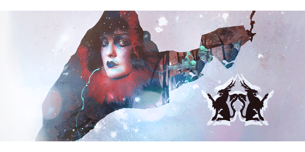
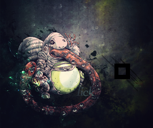
^ I had to look at this a few times. At first, I didn't really like it, but after looking at it closely, I do think this is one of my favorite tags from you. =] So, did you use like hair texture or something around the render? Either way, whatever you did was really cool, and interesting in my eyes.
I love this a lot, too. The only thing that was bothering me was the bright, red color on the face. I actually really wish I could suggest something about that, but I got nothing. >..>;;; I thought it had something to do with the contrast in that area of the head/face, but I think I was wrong. Anyway, overall I just love it. The red part will still bug me, but it still looks great. The flow, the blending, I just love it. =]
Ahh, so pretty. <3 I love the colors, and you can see a better focal point (except, I think the tree icon has a better focal point than the other icon).
Yeah, see not a lot of CnC, but I'm tried. Plus, honestly, I just really love your work, and you needed some comments. I SHALL WORK ON MY CNC AND GRAPHICS BECAUSE YOU'VE GOTTEN AMAZING. =]

