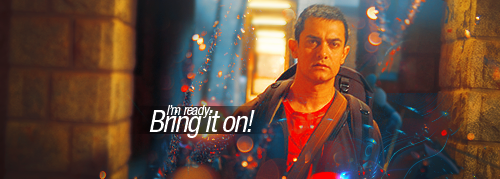
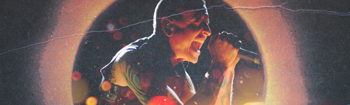
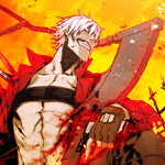
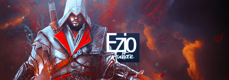
• Our software update is now concluded. You will need to reset your password to log in. In order to do this, you will have to click "Log in" in the top right corner and then "Forgot your password?".
  • Welcome to PokéCommunity! Register now and join one of the best fan communities on the 'net to talk Pokémon and more! We are not affiliated with The Pokémon Company or Nintendo.

[Showcase] Way Regained

derozio

[b][color=red][font=helvetica][i]door-kun best boi
5,521
Posts
14
Years
@Gav: Aye, Aye, Captain! Made one. Though idk what to say about it..

AamirKhan.png


@Dr. Kotov: I did read about it at a tag tutorial but never really paid much attention to it. But now that I know it is really important, I'm gonna try and use that rule in every tag I make. :D
 
10,673
Posts
15
Years
  • Age 30
  • Seen Dec 30, 2023
@Gav: Aye, Aye, Captain! Made one. Though idk what to say about it..

AamirKhan.png

Yeah dude, this is looking like a style you could easily run with. However there are a few concerns of mine on the focal. The face is a little too red, I think you should be careful on the selective colour. However if all you wanted to be more red was the t-shirt for example what you could have done was simply cut out and pasted the general head and neck area and pasted it above where you put the red selective colouring. Or cut out the t-shirt and pasted it above the focal in the correct place, used a selective colour layer as a clipping mask on the red t-shirt. This would avoid any unwanted discolourations. I think a few bokeh textures would have been nice here. I can see it a little bit here and there. At any rate, keep working with this style dude, don't be afraid to use C4D's either.
 

Alternative

f i r e f l y .
4,262
Posts
15
Years
There's something about your newest tag which really does irk me. Props for going the RL stock/render route, since it's harder than anime tags to grasp, but it does seem like you're trying to stay with your anime style, which you've been using all this time, and incorprate it into your RL stock style. It's confusing to explain what it is, but it's not my favourite piece of work. Your backgrounds and blurring techniques are still impeccable as always, and I like how you've gona minimalist with the effects, which is really nice to see. As Gav said, the focal's face does look a little on the red side, and in retrospect, it's not too appealing. you've tried to go with some blues in the vertical lighting and it clashes with the reds, so maybe brighten the skin tone a bit, and it should look nice. Overall, it's a very nice piece for a RL stock.
 

derozio

[b][color=red][font=helvetica][i]door-kun best boi
5,521
Posts
14
Years
I had a feeling you guys would say that his face is too red. XD; Does this look better?

AK1.png


With Bokeh:
AamirKhan1.png


Thanks for the crit, guys. And yeah Alternative, I'll have some problems breaking away from my anime style for some time. Hopefully, I'll come up with something next that doesn't look like any of my previous works.
 

Dr.Kotov

& the symptoms.
213
Posts
12
Years
  • Seen Dec 11, 2012
In addition to what Abnegation said, I think you should try to meander or liquify the effects around his head to give it a more complete feel. As of now it looks like you've randomly placed those layers around the focal without concern. The bottom gives it a nice base; just
try and curve off the effects on the top and see if it works out. Try and incorporate it with the pre-existing flow of the tag to make it match.
 

Dr.Kotov

& the symptoms.
213
Posts
12
Years
  • Seen Dec 11, 2012

If you still haven't merged the layers, I want you to quite literally use the 'liquify' tool in Photoshop (assuming that is the software you're using), to twist and bend the effects around the person so that it compliments the focal. Or if you can spend more time on it, individually rotate and erase them for better quality. After all, the devil is in the details.
 
Last edited:
13,373
Posts
14
Years
  • Age 29
  • Seen Jan 28, 2019
AK1a.png


This one, out of all your tries, looks the best, imo. I'm not very good with rl tags and such, but maybe try blending some of the effects intp the background more? Sorry if it's not the best advice, haven't done any gfx in years x.x

Also, for the life of me, I can't remember the actors name. I saw him in a movie my parents made me watch last night.
 

derozio

[b][color=red][font=helvetica][i]door-kun best boi
5,521
Posts
14
Years
He is Aamir khan. ;P

And updates:

Courage.png

ChesterTag.png


I said I'd make something 'totally different', right? ;)

ChesterAvatar.png
 

Alternative

f i r e f l y .
4,262
Posts
15
Years
http://i862.photobucket.com/albums/ab183/ASC303/Courage.png
This is one I really do like. It's simple in terms of effects which is good, and very clean and crisp. Text is something I really do like, but it does seem a little boring to me, especially that second line you've used. Maybe if you used italics or put some sort of symbol on the other side or something idk it's missing something, that's what I know. It also seems quite dark for my liking as well. I would try and make the light effects somewhat stronger and brighten up the right side of the tag a little bit, and you've got yourself something nice. :)

http://i862.photobucket.com/albums/ab183/ASC303/ChesterTag.png
When I first saw this from you I thought that it looked amazing, and the style was really cool, but now I look at it and I feel you've gone for the old magazine photo style, and the effect you've used is too strong. What I think should be done is just soften that style a bit, and maybe add a little touch of gloss to it, and it should be reallt great. I can't really comment on lighting, composition or effects, because I just love all of that. I must say, this has got to be one of your best pieces I've seen.
 

derozio

[b][color=red][font=helvetica][i]door-kun best boi
5,521
Posts
14
Years
Thank you for that comment, Alternative! :3

Updates:
TombRaider1.png

TombRaider1-1.png

Overused texture in first. Hence, reduced its opacity and made some other adjustments to come up with 2nd. Both pieces..idk, I don't really like 'em all that much. :<

FraternalBonds.png

I like this tag. Even though I didn't do MUCH in this one, apart from a little effects, a scratch texture and some color adjustments, I like this one better than the TR one I posted above. :o

Dante-1.png

Dante1icon.png

Icons featuring Dante. (You can't really expect me to NOT make something on Dante, can you? :D)
 

moments.

quixotic
3,407
Posts
15
Years
TombRaider1.png
This is quite a good tag, but like you said, you overused the texture and resulted in the piece looking quite low quality. That said, even the retweak still looks low quality, but better than the first version. I think as a tip for you with textures, cause I notice you are doing it a lot, try many different layer settings. Looks like you've got something like screen for this tag, but something like 'Soft Light' doesn't give that same low quality effect. Despite this though, you can actually get away with a bit of low quality if the whole tag has the effects. It is especially noticeable in yours because you have very clean elements like C4Ds and stuff, and then you add only one area of textures.
If you tried a tag using nothing but textures, I'm sure you'd come up with some fairly good results!

Also in this piece, the lighting isn't really dynamic enough. Yes you've got heavy shadows around the edges which is all good, but you haven't really brightened up the face, which is where the dodge tool is perfect for the look I'm thinking of. If you get the dodge tool to target Highlights, and then the range on about 30%, and click once on her face / shoulder, it will make her pop a whole lot more and the whole tag will feel a lot less flat.

Also another thing to work on, you're getting good with effects and stuff, but I'd think you can put more into the foreground. More effects and C4Ds and textures and stuff in front of parts of the stock to make it both blend more, and to add a bit more depth. This piece in particular, but also some of your others feel a bit flat despite your blurring and stuff and very simple because you haven't got a strong foreground. You don't need to really layer up heaps of effects, but at least one strong section of foreground is pretty important.

As a more general note not really about any piece in specific, you used to be the master of colours, and you are still really good, however because it is all feeling very similar and your method/style of colouring seemingly hasn't changed at all since much earlier on in your graphics career, I'd definitely recommend experimenting with colour and especially gradient maps. I don't know how much you rely on gradient maps currently, but your colours I must say are feeling a little boring, only because they are so consistently similar. Just try and break it up a bit, don't always pop the blues and reds, try some crazy looking colours or using interesting gradients and stuff...

Yeah, I think you are getting very good, but you are limiting yourself and your rate of improvement is slowing down, only because you have reached a plateau of your current technique style. You can't really get much better at what you are doing now, you have to branch out and experiment a lot more, in all aspects. I know working textures is still fairly new to you, but your tags are still following the same structures, colours, typographic elements which makes using textures seem redundant. Break away from what you're doing now, and you will improve ten fold very quickly! At first it will feel bad and like you are going backwards, but you really need to work in new elements into your array.

Hope that's all ok, I don't mean to sound like a blunt dictator... :)
 

derozio

[b][color=red][font=helvetica][i]door-kun best boi
5,521
Posts
14
Years
Like I said in my VM to you, no matter how harsh you become in your crits to me moo, I'll always appreciate 'em. Love you for the comment, bro! Thanks! :D

And a vertical I made yesterday to fill up my signature. Sorry if it isn't anything different from the regular 'Derozio' style, though. Don't bite me for that! Promise I'll make something totally different next time. ;P

DanteVertical.png
 

moments.

quixotic
3,407
Posts
15
Years
DanteVertical.png
This is such a typical 'old school dero colour scheme', but it works so well, and the piece itself, is damn good too!

For one, (besides colour) you have broken away from your typical style, maybe because it's a vertical, and they always seem to make you do stuff differently, but if you can pull off that style on a normal canvas, you'll be in business.
But yeah, use of textures as effects, and your use of depth is really quite excellent!

The only thing I'd consider critiquing, is the positioning of the stock. Verticals are hard, because putting it directly in the centre feels weird (which is what I'm noticing in yours), but they don't offer much in terms of other good positions. I'm not sure there is much you can do, but perhaps just playing around a bit more and finding a stronger placement might be viable?

Anyways, much better from you! Try and get this style going into normal tags!
 

derozio

[b][color=red][font=helvetica][i]door-kun best boi
5,521
Posts
14
Years
I fail miserably whenever I try to incorporate it into a horizontal tag, moo. ;o;

Failed attempts:
Ezio1.png


SignaturePC.png


Oh, and icon:
Ezioavatar-1.png
 

moments.

quixotic
3,407
Posts
15
Years
Reminds me of a tag I made whilst stuck with Elements a long time ago, before you came around! :D

But yeah, I can see how you've gone and how you've brought the effects into the horizontal, and it actually is quite good! The main thing I'd fault, is that the effects aren't visible enough. The intricacies and details are lost because you've blurred / made it dark to bring focus to the render, which is all well and good, but you can easily get away with keeping some elements and details in tact.
Another thing, I don't like the angle you've rotated him on. Possibly done to generate flow where the stock didn't provide any originally, but it just looks funny I'm afraid!

Colours and quality is maintained perfectly in typical Derozio fashion, however that darn font / text style makes it look exactly like a Dero tag. xP
It is completely different to your normal stuff, and I appreciate that, but it honestly is entirely the text making it look so familiar.

I've told you to experiment, and you have, I think perhaps try experimenting with text as well. Not just placements, but sizing, font and colour and stuff. It is getting way too familiar and I think it's that you're stuck in this same aesthetic even though you mix up the effects that is holding you back.

No comments on the second piece or the icon, the icon is delicious, the larger tag is sort of similar, epitome of Derozio style in a tag. :P
 

derozio

[b][color=red][font=helvetica][i]door-kun best boi
5,521
Posts
14
Years
Yo, thank you for the coomments, mooments! :D /lame

Experiments!

Ezio12.png


LuffyXHancock1.png


^ Something really new. :P

SignatureforPCa.png


Just consider the 'tag' part of this third one. Too lazy to upload the cropped part. Especially since my net is being such a pain in the @$$ right now. ;-;

Icons:
DMCIcon1.png

DINOAvatar.png


^ best icon ever by me, I guess? :P
 

moments.

quixotic
3,407
Posts
15
Years
Ezio12.png
Alright, so you've got your generic Derozio text style in this tag again. :P But yeah, this tag has got great atmosphere, and the effects really add a mood and almost a photo like background, but I think that's what is weak about this tag at the same time. Yes you replicate depth of field like a champ, but all the effects are blurry and can't really stand out enough. You've got the details and intricacies here, but by blurring them, you are losing a lot of their appeal.

The colours are good, however it drops off to black way too quickly, and there is too much black on that right hand side. You could either crop it or get rid of some of that brushing / burning.

So summary, get more sharp effects in there, particularly more foreground and prominent effects, kill the text and tweak that dark patch on the right. Otherwise it is a nice tag, just some bad habits you keep finding yourself in.
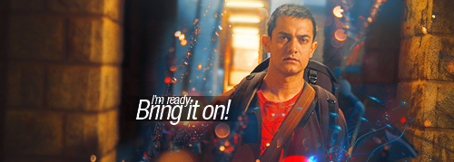
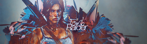
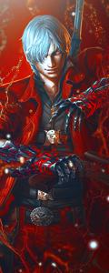
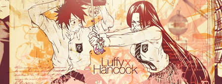
LuffyXHancock1.png
While it is great to see you moving away from anything like your normal style and trying some new things out, this really is a large step down in standard from your other stuff. Probably because it is so different from you, which is understandable, but there are a few things I'd like to mention.

Firstly, this feels like those sort of generic 'getting the hang on Photoshop' tags, where you've got heaps of basic effects, primarily brushes in the background, but none of which actually feel like effects. They all just seem to make up a background and then there are no actual effect elements over that. I can't tell if you've brushed all the elements in the background, but if so, I need to give props for that. Yes it is a little messy and doesn't really feel like it has much concept going on, but it doesn't look bad, it seems to work in it's own way. Again though, way too much gap between blurred and sharpened. On a tag like this, having all the elements in the background sharp, (not quite as sharp as focals, but just not blurry) could've worked because it is a very flat tag to begin with, all 2D elements, and that would've worked. You don't need to blur every pieces background just because depth exists. :P

Then you've got the kind of iffy double focal, abuse of mini-text, but that's alright I guess. That clipping mask on the left side I don't feel is working too well either, just doesn't add anything, feels like it is there to fill space. The colours are a little monotonous as well, but the texturing feels good, not too obvious and you've maintained quality which is always good.

Yeah, not your best by any stretch, and yes it is a good experiment, but really you've gone about it the wrong way, especially in terms of the blurring, it doesn't go with that style as well as not blurring it...
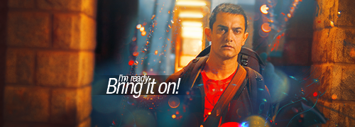
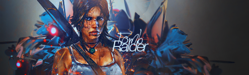
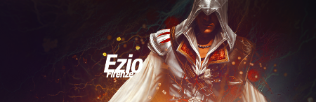
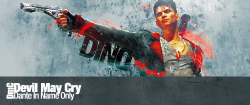
SignatureforPCa.png
Alas, the big guns. THIS is what I want to see. Both experimental, and pulling it off, and look, no Derozio text. xP
But seriously, this is a large step in the right direction, particularly for you, who I know got stuck in that same style and have found it hard to break free.

First off, text. While generally I try to avoid diagonal text, because it often feels messy / amateur, you've done it quite well here, and that's largely because of the effects over the top of it. It makes it feel like part of the effects scheme rather than text added at the end. I still think the same font / size / colour could've worked very well horizontally, in a similar position and felt a little more solid, but this definitely is not in any sense "poorly done text".

Again, unlike your other tags, this has the clear background, the clear focal and then effects ranging throughout the whole of that space. That's good! Those green textures are working very nicely, as are the red smudge / textures. However, that one little bit that sort of curls around his extended arm is breaking the flow, and I think could easily be removed and would straight away make the tag look stronger. Also, that effect over his right shoulder that is red, but sort of transparent, that'd look good beefed up and made more saturated and just as red as all the other effects like it. It just feels weak right now.

Lastly, the colours. While the colours are all very good, especially that sort of green / blue in the effects, the guys skin is way too yellow. Went a little overboard on the selective colouring there, but that's easily fixed. Another little thing regarding his face, you've got some lighting or a texture or something which looks kind of cloudy almost, it is lowering the quality of that area considerably. If you want to lighten it up, apply the image and use the dodge tool, or else put the soft brushing on like linear dodge or colour dodge or something so it works with the tones rather than being solid.

But yeah, good experimentation, that last tag really is the way to go from here. Try sort of imitating it and continuing that style / method a little bit more!
Also, sorry for ripping in to that second tag, it's not as bad as I made it out to be, it's just dwarfed compared to all your other stuff, and while it is a experiment, you should still be able to maintain a similar level of standard. But yeah, really good work, keep on experimenting and stuff! :D

HOLY JEEPS! How's that for a tl:dr... xD
 
10,673
Posts
15
Years
  • Age 30
  • Seen Dec 30, 2023
Well it looks like I've got a lot of work I've missed out on! And so, I'll go through every update on this page so far Dero, but let me say, you've gotten so much better.

Spoiler:


I'm actually liking this piece quite a lot. You've got some super flow going on, and the colours are really, really tight. The text is pretty good too, nice choice of font. You could of perhaps done a little more with the text though, possibly some shapes could work well here. Nice works on the flames. The only thing that bothers me a little about the tag is the effect above the focal, I think without it, it would have looked a lot better. Notably on the face, it just looks a little low quality and distracting to the eye in all honesty. At any rate, in addition to these things, I might recommend that you add a little more depth to the background with some dodging and burning for example, or perhaps some extra brushing. However, this is a pretty solid tag in all honesty, I wouldn't have too many other refinements in the way of it. You certainly do well in working with fantasy type renders.

Spoiler:

Pretty sure I left crit on this once before, perhaps on the Tag of the week thread? Anyway, I'll give it a revision in case there's anything I missed out on last time. I love the composition of this tag overall, but it falls down on quality and clarity. I'll be getting into further detail on those things soon. But let's start with colour.

The colours in this tag are actually quite good, they're quite consistent and nicely chosen. However, the issue I see in a lot of your tags is the use of reds, I believe that you tend to make them a little too strong at times and this really comes across in your work, and not always to your advantage. Red is one of the strongest colours you can use in graphics, it forces itself through everything. So just be sure not to overuse it and think about how heavy it looks. If it does look overbearing, just tone it down with selective colour. I can tell that you use quite a lot of selective colour to get your colours across. But don't be afraid to use the other adjustment tools.

The biggest problem with the tag is the use of texture. While it works quite well in terms of composition, it is a little heavy and it smothers the focal point somewhat. I would have liked to have seen you erase a little of that texture around the focal point so as to make it stand out that bit more. Rather than engulfing it in noise. It ruins the quality of the tag just a bit. Which is disappointing because it does actually shape out to be a really nice tag otherwise.

Your composition is very nice though, you've got a nice thing going. Usually centered based tags are really hard to pull off, as are stocks that look away from the viewer so evidently. Again though, just work on the clarity of the stock, you see, Chester's face is a little smothered in red and that kills the tone of it a little. Skin colour is one of those things in graphics which is best kept at a natural colour, otherwise people associate it with deformity and that's not what you want to be going for in most cases. At any rate, I think my comments on that one explain themselves.

Spoiler:


For an icon, this one isn't too bad. This will be a few short comments since there's not a great deal that needs to be changed. First of all though, the lighting is really annoying for a number of reasons. The background doesn't correspond with the lighting on his face, it's all bright behind his head which it really shouldn't be. But what bothers me most is how one side of this face has really, really dark shadows. Which is the most off-putting part of the icon.

I'm not a big fan of the stock anyway, but I don't think the strong cyan colours suit the stock too much. In saying that, the stock doesn't really suit an icon all that well. And that's where this icon falls down most really.

Spoiler:

This could have been a much better tag, I think it has some potential for improvement. The colours are decent for the most part, but I'll have to whip you for your overuse of reds again I'm afraid. There's a lack of blending and the text could use some work. However, I'll get into detail now.

Starting with colour, the skin is way too red and unnatural looking. As I said about the previous tag; you need to avoid making the skin looking too red. It looks unnatural, or oddly sun-burned. Try to keep the original skin colour as best as you can. The blues are decent, but I'd change their hue a bit, look towards a little more royal bluish than bright blue here since it's a pretty dark tag overall.

What this is missing primarily is more blending. The render is kind of sitting on top of all the effects instead of being included in them. There should be some C4D's above Lara, not just lurking in the background.

The lighting is really heavy, too much so. You should tone that down, without making the tag too dark, and rather than putting in straight down the middle, try putting it at an angle. The lighting should be coming from the right to meet the lighting on her nose.

The text could use some work. I think the font choices here could have been better. Not to mention that the text is also pretty generic. You could have possibly thought of something more original for that one. The "Tom" part is a little illegible though, so if you do make a refinement, make sure your text is more easily read.

Spoiler:

Eh, not the biggest fan of this one. You're also still sticking to your blue and red fiasco. You should be going towards other colours, besides, blue and red don't go amazingly well together. They clash slightly. Red is too hot and blue is too cold, which creates a uneasy contrast.

Anyway, the composition is decent, but the messyness of the tag, and the colours just throw me off. I think this tag doesn't really bode well as a black and white one, with a little colour. I think it would have looked a lot better if we could see it all in colour and if you put the work into showing it. Otherwise you effects kind of fall flat. That's the thing with black and white tags, they tend to kill any effect work that you've put in.

The text is a little bland, I think you could have experimented with bigger and more rash fonts. It's very much in contrast with the tag's concept, too plain and really a bit distractingly small. The tag is pretty weak, but I think if you worked on bringing back in the colour, it would look a lot better.

Spoiler:

Verts are becoming very unpopular actually. Just as a not of interest haha. But anyway I don't think this stock really suits a vertical tag. Dante looks a little squashed in it to be honest. This makes the tag really busy and lacks the sort of good focal point required. The colours aren't all that bad but it's kind of an overall monotonous tag. I see a little too much red. The lighting is also a little unnecessary too. The use of textures here is pretty good, but the positioning of the stock kills it all completely. There's a decent sense of depth, but thanks to that overuse of red it kind of smothers this tag. I actually don't see a great deal of work put into this one compared to your other tags, so I'll leave it at that. It's decent, but I just don't see the same amount of work put into it and I don't think the stock positioning (or just the stock) works well as a vertical.

Spoiler:

Big fan of this. Stock positioning is possibly the best part of the tag. I am in love with it. I wouldn't have thought to put that render at that angle at all. Which works really well with the flow you've added. The composition and the flow, the atmosphere, all those things work really, really well on this tag. The colours are good too, but I'm glad to see more orange than red this time. Just again, watch the skin.

The only suggestion I could really make about this one would be too 1) tone down the lighting ever so slightly (move it down) and 2) add more depth. The tag falls a little flat due to there not being enough usage of textures and C4D's in the background behind the orange and blue effects. Other than that, I like this one a lot. Again though, try some new things with text, you're sort of stuck in your ways with it and it's a little repetitive.

Spoiler:

Liking this one a lot too. Your style works well here, but make his skin look a little less orange. I would also recommend blurring the front of the render a little too, it focuses the face a little bit more which is necessary when concentrating on focal point. Again the text is playing it quite safe, I think there needs to be a little more effort put into it here. The background works pretty well here and whether it was implemented by you or not I don't know, but if it was, nice use of it. It works well and is really consistent of your render.

The only thing that really bothers me though, is how there's not really many visible effects. The render is very high quality and visible, but there needs to be an implementation of some effects in the foreground which are not so blurred.

Spoiler:

Perfect, just tone down that red lighting. I dislike 150x150 icons, so I'd rather see this in 100x100. Honestly though, I can't see anything else wrong. Except perhaps get rid of that red flake and blur the background a bit.

*cracks knuckles again*
Right, latest batch. Let's go.

Spoiler:

This is decent. But //THE REDS MAAAN//, they're pretty heavy on the render. Especially around the hood where they're pretty blinding. The background doesn't really go with the flow too well though, that's my only issue with it really. It creates good depth but it has little relation to the position or action of your render which is a little disappointing here. The tag also needs more colour, the background is looking a little monotone. On the right, the clouds have a really bright patch on them which needs to be toned down, due to the fact it is a little distracting to the eye. The text isn't too bad, following your usual style, but change the bottom font, it's hard to read and too small.

In saying that, the text isn't even necessary, I would be more inclined to suggest more effects in the foreground. After that you would have a better looking tag. It also needs a smoother transition to black on the right hand side.

Spoiler:

It is good to see you doing something new, but this style is definitely nearing on "beginner" for me. It's really rather playing safe and a little too old school. It's overly messy and has no real sense of flow to it. I much prefer your usual stuff. You're abusing textures here, it kind of looks like someone who is trying out graphics after getting the hang of photoshop and throwing in as many textures as they can to fill it up. The background is looking all to blurry an lazy overall. I think you need to drag in the basic elements you're used to doing, but apply them to a different style like this.

I can't really see what you were going for, but don't dis-abandon your old techniques when trying something new, just apply them to the style in a relevant way.

Spoiler:

Overall it's lacking in the continuation of that flow. The tag needs more effects in it, behind the render, going in the direction of the arm. The text is pretty good here though. Different to what you usually do and it looks well here. But you need more effects, the depth falls short here and that's the main issue.

It's a good experimentation, you just need to really expand on it and fill out the tag more. Thinking about what it needs and identifying what it's missing.

Spoiler:

Cannot see the focal well at all. Try toning down how strong you make the colours here. It's hard to make anything out in this icon. You've blurred the background pretty well but it just lacks a lot in clarity due to the saturation of the colours.

Spoiler:

Defiantly one of your best. Only thing I dislike is the mini-text texture on the left. Shave it and you've got a great icon. Though get rid of that lighting on the top left, I'm assuming you added it, it's distracting.

A lot better from you Dero, you're really getting better every time I see you. I'll continue to keep my eye on you!
 
Back
Top