
Whitney's Shaymin
Creator Of Pokemon Grace
- 596
- Posts
- 12
- Years
- Goldenrod, Johto
- Seen Jan 1, 2021
I got some more maps for you, here you go
Last edited:

More practice mapping for my game. Finally got the tall grass sprited up, added in underwater decorations although not entirely sure whether I'd be keeping them.
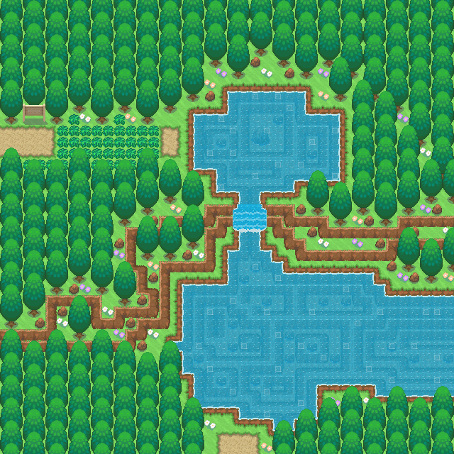

Anyway, onto my submission.
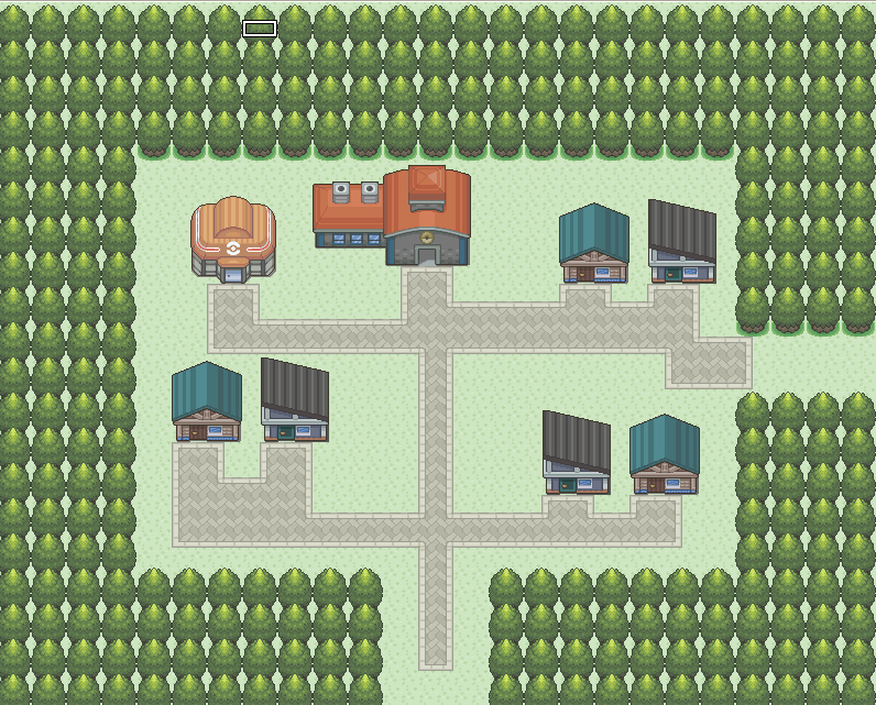
Celadon City from my game Pokémon Blaze Red
EDIT: Ignore the chimneys cut off on the Restaurant and Hotel. It's an error made by my map-rendering program and RMXP priorities.
Spoiler:
[/SPOILER]
I really like this. I think its a bit open, But at the same time feels right. And it would be hard to squish this map.
Celadon City from my game Pokémon Blaze Red
EDIT: Ignore the chimneys cut off on the Restaurant and Hotel. It's an error made by my map-rendering program and RMXP priorities.
Spoiler:
The map's rendering and the bright colours look well, I guess...
And great job with the trees surrounding the main part of the city. They look so natural... they look beautiful. So 10/10 for that, tImE. You're a very good graphics synthesizer. Also, I love the small changes here and there you made like the river. They always give a new feel. It seems you always choose good tiles!
But the trees around the Game Corner look weird since they aren't the same colour as the other trees, and very similar to the grass.
And the Pokécenter's door doesn't fit right. You should consider shading the bottom part of the door a bit so it'll look better.
@tImE, overall, your map is great!
Maybe the pink flowers are too bright.
The bridge would be better if it was darker or more orange, its color is very close to the rocky tiles' color.
I simply love your trees.
Too many lampposts around the little seating area in my opinion.Anyway, onto my submission.
Celadon City from my game Pokémon Blaze Red
Spoiler:
EDIT: Ignore the chimneys cut off on the Restaurant and Hotel. It's an error made by my map-rendering program and RMXP priorities.
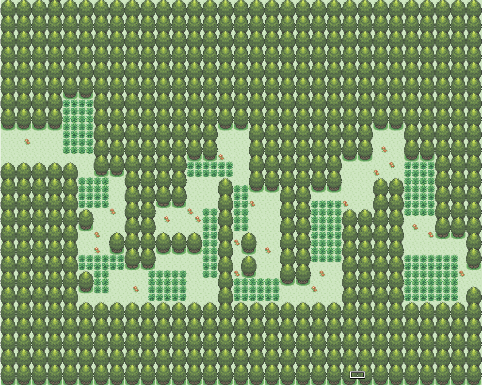
Revamped Route 2 for my game Pokemon Zero / One.
Spoiler:
Nope not at all actually. The only similarities I can find are the waterfall, the style of mapping( which might be similar as he was my "Mentor" with mapping and all that stuff :D )aaand the style of bridge and that's pretty much about it. But if Gav feels like so I can change it ^^This looks VERY similar to Abnegations' Map in the OP. Is it based off of it? It looks good, I just notice his map in it. :L
Nope not at all actually. The only similarities I can find are the waterfall, the style of mapping( which might be similar as he was my "Mentor" with mapping and all that stuff :D )aaand the style of bridge and that's pretty much about it. But if Gav feels like so I can change it ^^
This looks VERY similar to Abnegations' Map in the OP. Is it based off of it? It looks good, I just notice his map in it. :L


The starting Sable City. I'm through fooling around with tilesets, I wasted too much time playing with those. Aside from the housing style clashes I'm happy with it. As the game goes on the city will expand outwards.Spoiler:


The starting Sable City. I'm through fooling around with tilesets, I wasted too much time playing with those. Aside from the housing style clashes I'm happy with it. As the game goes on the city will expand outwards.Spoiler:
@Riansky
It's great aside from the "groves" of small trees. I think they just stand out as eyesores bunched like that. Maybe one or two and some grass around them?
The starting Sable City. I'm through fooling around with tilesets, I wasted too much time playing with those. Aside from the housing style clashes I'm happy with it. As the game goes on the city will expand outwards.Spoiler:
