• Our software update is now concluded. You will need to reset your password to log in. In order to do this, you will have to click "Log in" in the top right corner and then "Forgot your password?".
  • Welcome to PokéCommunity! Register now and join one of the best fan communities on the 'net to talk Pokémon and more! We are not affiliated with The Pokémon Company or Nintendo.

Help Thread: Map Rating/Review Thread

Status
Not open for further replies.

firekoopa

Combat the Infinite
27
Posts
14
Years
  • Seen Aug 16, 2020
First of all, I love the concept of this map, I like how you implemented both town and route features, without actually placing grass in every single little space on your map. Good job.
The grass placement is good, and I think the houses are placed well too. But there are also a few little things I'm not overly fussed about. The flowers, for one thing. I know you said that this place is overgrown and stuff, but if you narrow it down a little it would look better imo. That's about it actually, I quite like this map. :)
Rate: 7.5/10


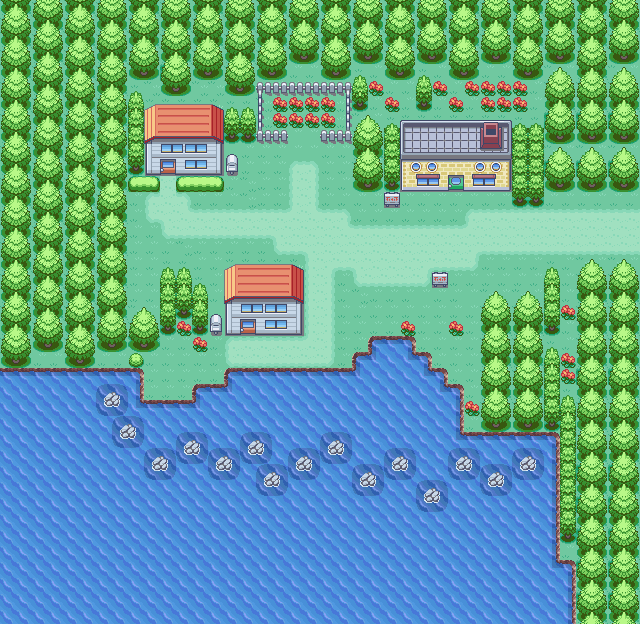
And here you go guys, this is mine:
Spoiler:


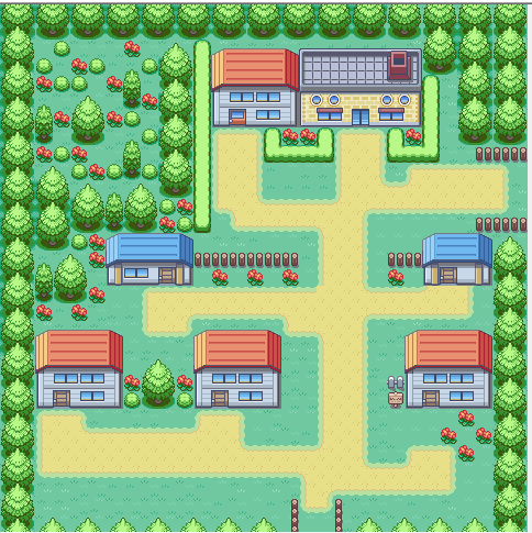
This is Alusru Town, aka The starter town for the protagonist. Professor Oak currently resides here, since he heard about sights of Pokemon with different colours here. One of your rivals lives here too.
Aren't I generous? I fixed it for you!

Anyhow, the first thing that came up to me was the large unplayable area in the top left corner. Replace that with something that actually makes sense for the player. I find that the roads are a bit too squarish and all the houses lined up in rows, which annoys me a bit in a similar fashion as straight flower lines. There is also this apparent lack of depth in the picture. Unless your map is set in, I don't know, Netherlands or something, then I wouldn't like to have such a flat map. But I do like the concept. Sorry, but I have to be an ass and give a 4.5/10 because I don't like being dishonest. :(

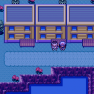
And yeah, I fixed my flower problem a bit and all...
 

Skystrike

[i]As old as time itself.[/i]
1,641
Posts
15
Years
Mapshot:

Spoiler:
Review: Well, since you said you fixed something, I'll rate it again. Anyways, right off the bat, where the small water area is with the rocks, them being altogether doesn't look very well because the shadows touch. Some of the actual rocks (not the sea ones) are missing their shadows. I also spot a tile error, with the small tree that's blocking the grass only accessible by surf. It's missing the tip. You're also missing another tip...here, I'll circle what I'm talking about...
Spoiler:

Rating: 7/10
Why?: Those tile errors. If I would've circled every shadow "error" (I think I'm being nitpicky)...ugh. Just fix those and I'll change the rating to be higher :)

----------------
Map Name: Clearview Town/A Starter Town

Map Game: FireRed for Pokémon Pure White (Redux)

Comments: It's a starter town. So far I haven't planned for you to get your starter Pokémon in this town, rather, on a route. It's a quiet, quaint town and not many people live there, besides you. Design-wise, I think the grass path should be centered (I love everything symmetrical. Else it drives me crazy lol :P) Also, looking back on my older maps...I see a greater improvement. Anyways, please point out those tree shading errors and any other errors you see, thank you! The rom base that I used was made by lalo101, Zein, and Laidjon. Thanks <3 (yes I went back into my history and grabbed this) I've also changed a few things from the last time

Mapshot:
Spoiler:

 
Last edited:

teejermiester

Minnesotan, you betcha!
320
Posts
13
Years
[/B][/COLOR][/FONT]Map Name: Clearview Town/A Starter Town

Map Game: FireRed for Pokémon Pure White (Redux)

Comments: It's a starter town. So far I haven't planned for you to get your starter Pokémon in this town, rather, on a route. It's a quiet, quaint town and not many people live there, besides you. Design-wise, I think the grass path should be centered (I love everything symmetrical. Else it drives me crazy lol :P) Also, looking back on my older maps...I see a greater improvement. Anyways, please point out those tree shading errors and any other errors you see, thank you! The rom base that I used was made by lalo101, Zein, and Laidjon. Thanks <3 (yes I went back into my history and grabbed this) I've also changed a few things from the last time

Mapshot:
Spoiler:


Well, as nice as the symmetricality of it is, usually, the most effective way to make a map is try to stray from ANY symmetricality. The more asymmetrical it is, the better, in my opinion.

I realize you see the shading errors... so I have no idea why you wouldn't fix them. Therefore, I'll point them out anyways.

Spoiler:


Another thing that bugs me is the small trees. The only areas they are placed are right in front of big trees, and then there are always two of them. Some more variety would be great.

Last thing, the spaces behind the two red houses are a bit conspicious. You might want to make them smaller, or make them bigger and place something in them.

Rating: 6/10

Edit: The rock in the middle is also a bit odd. Really random. Either place more or take that one out.
 
Last edited:
1,344
Posts
14
Years
  • Seen Dec 10, 2021

Review: Well, since you said you fixed something, I'll rate it again. Anyways, right off the bat, where the small water area is with the rocks, them being altogether doesn't look very well because the shadows touch. Some of the actual rocks (not the sea ones) are missing their shadows. I also spot a tile error, with the small tree that's blocking the grass only accessible by surf. It's missing the tip. You're also missing another tip...here, I'll circle what I'm talking about...
Spoiler:

Rating: 7/10
Why?: Those tile errors. If I would've circled every shadow "error" (I think I'm being nitpicky)...ugh. Just fix those and I'll change the rating to be higher :)

----------------
Map Name: Clearview Town/A Starter Town

Map Game: FireRed for Pokémon Pure White (Redux)

Comments: It's a starter town. So far I haven't planned for you to get your starter Pokémon in this town, rather, on a route. It's a quiet, quaint town and not many people live there, besides you. Design-wise, I think the grass path should be centered (I love everything symmetrical. Else it drives me crazy lol :P) Also, looking back on my older maps...I see a greater improvement. Anyways, please point out those tree shading errors and any other errors you see, thank you! The rom base that I used was made by lalo101, Zein, and Laidjon. Thanks <3 (yes I went back into my history and grabbed this) I've also changed a few things from the last time

Mapshot:
Spoiler:


Symmetrical usually isn't a good way to map, the more natural-looking the better. You have a lot of tree shading errors that teejermiester pointed out. It also looks really empty and simple but I'm guessing that was what you were going for. The house near the bottom could also be moved up a bit, since one-tile paths aren't that good for playability, and it looks really un-noticeable. :/ Buuut, It's a nice simplistic map for a starter town and it's in a nice style. :)
 

Skystrike

[i]As old as time itself.[/i]
1,641
Posts
15
Years
Map Name: Clearview Town

Map Game: Pok
émon FireRed for Pokémon ??? (No name yet)

Comments: My ROM got corrupted which means my map got corrupted which resulted in me trying to fix the corrupted map, only for me to just remake it.
The rom base that I used was made by lalo101, Zein, and Laidjon.

Mapshot:

Spoiler:


I did have a review but the post got deleted.
 
Last edited:

Aljam

[i]Sweepin' ain't easy...[/i]
615
Posts
15
Years
Map Name: Clearview Town

Map Game: Pok
émon FireRed for Pokémon ??? (No name yet)

Comments: My ROM got corrupted which means my map got corrupted which resulted in me trying to fix the corrupted map, only for me to just remake it.
The rom base that I used was made by lalo101, Zein, and Laidjon.

Mapshot:

Spoiler:


I did have a review but the post got deleted.

For some reason, something about this map seems kinda off... the map seems all over the place. the pond is kinda misshapen and the blue house seems too small and out of place. Adding those small tree's to make the map look natural adds to the cluster of random stuff that's going on with the map. I see you want to make the map look "natural" but you got to factor in that people would make their town look too "natural" they would have a mix between unnatural and natural. Take a look at pallet town's map. It's small and unnatural because it's a town. Maybe make you town ovular in a little bit bigger size of a map. when you do something like that the map as seen by the player would look like a healthy mix between natural and unnatural.

I give you a 5/10. Keep at it! :D

-------------------------------------------------

I've been working on a world map for the last day or so. I'm trying to make a map that's mostly mountainous but has areas that are habitable for many different types of pokemon. Still working on a region name atm.

Spoiler:
 

SK3

Pokemon Hacking Company™ CEO
276
Posts
13
Years
For some reason, something about this map seems kinda off... the map seems all over the place. the pond is kinda misshapen and the blue house seems too small and out of place. Adding those small tree's to make the map look natural adds to the cluster of random stuff that's going on with the map. I see you want to make the map look "natural" but you got to factor in that people would make their town look too "natural" they would have a mix between unnatural and natural. Take a look at pallet town's map. It's small and unnatural because it's a town. Maybe make you town ovular in a little bit bigger size of a map. when you do something like that the map as seen by the player would look like a healthy mix between natural and unnatural.

I give you a 5/10. Keep at it! :D

-------------------------------------------------

I've been working on a world map for the last day or so. I'm trying to make a map that's mostly mountainous but has areas that are habitable for many different types of pokemon. Still working on a region name atm.

Spoiler:

Pretty interesting world map, nice layout. Looking forward to seeing the actual maps for the areas themselves, a mountainous region sounds interesting! :) 9/10

--------

Name: Aubranch Town
Hack: Pokemon Daydream White
Base: Fire Red


AUBRANCHTOWN-1.png


Comments: My first seriously attempted town map, a friend of mine helped me out with it but here's the result :)
 
Last edited:
37
Posts
13
Years
  • Age 27
  • Seen Feb 7, 2014
Pretty interesting world map, nice layout. Looking forward to seeing the actual maps for the areas themselves, a mountainous region sounds interesting! :) 9/10

--------

Name: Aubranch Town
Hack: Pokemon Daydream White
Base: Fire Red


AUBRANCHTOWN-1.png


Comments: My first seriously attempted town map, a friend of mine helped me out with it but here's the result :)

Rating: 7.5/10

For a starter town, it looks great. I like the town's layout, the path, along the flora added. Although, I feel that some of the areas look a bit empty. One spot I'd like to point out is the area that's in the picture in your signature. It looks too plain and could definitely be added on to. You could remove the water that's budging into that area and put a hill or possibly even a Pokemon pin. Next, there are a few tile errors. Look at the small trees that go in rows. See how the majority are missing their tops? Fix that. Next, I've noticed that it's possible to go past the rocks in the water. There are rock tiles that connect to the edge of the water, so you should make it like that so the player doesn't think he's able to escape.

My town..
--------------------------------------------------------------------
Name: Quercus Town
Hack: Pokemon Mod Redux (working title, hopefully)
Base: Fire Red
Credits: Mew_Ryn's Rom Base
Comments: This is the second town in the game. The bottom right path is blocked off by a guy saying he's guarding his house, but it's really to prevent the player from seeing the border block of trees against the water. This map is based off of an old map, so I'm unwilling to change the doorless building on the short elevation. The hole in the bottom left is accessible by talking to a man. Down the hole is a minigame.
Spoiler:
 

FrozenInfernoZX

What is out there?
756
Posts
11
Years
The Teajo Region

Rating: 7.5/10

For a starter town, it looks great. I like the town's layout, the path, along the flora added. Although, I feel that some of the areas look a bit empty. One spot I'd like to point out is the area that's in the picture in your signature. It looks too plain and could definitely be added on to. You could remove the water that's budging into that area and put a hill or possibly even a Pokemon pin. Next, there are a few tile errors. Look at the small trees that go in rows. See how the majority are missing their tops? Fix that. Next, I've noticed that it's possible to go past the rocks in the water. There are rock tiles that connect to the edge of the water, so you should make it like that so the player doesn't think he's able to escape.

My town..
--------------------------------------------------------------------
Name: Quercus Town
Hack: Pokemon Mod Redux (working title, hopefully)
Base: Fire Red
Credits: Mew_Ryn's Rom Base
Comments: This is the second town in the game. The bottom right path is blocked off by a guy saying he's guarding his house, but it's really to prevent the player from seeing the border block of trees against the water. This map is based off of an old map, so I'm unwilling to change the doorless building on the short elevation. The hole in the bottom left is accessible by talking to a man. Down the hole is a minigame.
Spoiler:

Just, wow. That is an amazing map. I really like your usage of that cave entrance you used there. The tiles and graphics are simply well used. I like it! Great mapping skills! I'll give this a 10/10, I honestly do not see any improvements! Seeing maps like these always inspire me to continue my hack!

Name: Taejo Region
Hack: Pokemon (TBA)
Base: FireRed
Credits: Houndoomed (for the excellent DP map making tutorial)
Comments: Originally had the region based off of FRLG tiles. However, since this is first time attempting at rom hacking, I haven't made my tiles properly suited for 8x8 tiles. I had to do it over. I decided that using DP tiles would make my redoing process less boring and more refreshing and I am actually pleased to have done this. This region will consist of two other sub regions located west and south. Hmm, can you guess where the Pokemon League will be located? Well folks, below in my attachments you will find my outdated and updated region maps. Long live the Taejo Region!
 
17
Posts
12
Years
  • Age 27
  • Seen Aug 1, 2016
Rating: 7.5/10
--------------------------------------------------------------------
Name: Quercus Town
Hack: Pokemon Mod Redux (working title, hopefully)
Base: Fire Red
Credits: Mew_Ryn's Rom Base
Comments: This is the second town in the game. The bottom right path is blocked off by a guy saying he's guarding his house, but it's really to prevent the player from seeing the border block of trees against the water. This map is based off of an old map, so I'm unwilling to change the doorless building on the short elevation. The hole in the bottom left is accessible by talking to a man. Down the hole is a minigame.
Spoiler:
I like it. The things that bother me is the pointless path up at the top left, and the tall grass. It might just be me, but I really hate tall grass in towns, even if it's to fill empty spaces.

9/10

------------------------------------------------------------------------------
Name: I haven't really figured a name for this region yet...
Game: FireRed
Spoiler:

This is my first serious attempt at a region map. Give me every nitpick and fault you see. I may add on to it latter, but for now, this is all I could think of that I'm throwing in this hack.
My other attempt looked like a child threw up on the screen.

I really want to improve my map skills, as I have 2 more ideas for hacks, and my entire summer is pretty open as of right now.
 
Last edited:

DaleFails

Pokémon: Giovanni Origins developer
199
Posts
12
Years
  • Seen today
Name: Quercus Town
Hack: Pokemon Mod Redux (working title, hopefully)
Base: Fire Red
Credits: Mew_Ryn's Rom Base
Comments: This is the second town in the game. The bottom right path is blocked off by a guy saying he's guarding his house, but it's really to prevent the player from seeing the border block of trees against the water. This map is based off of an old map, so I'm unwilling to change the doorless building on the short elevation. The hole in the bottom left is accessible by talking to a man. Down the hole is a minigame.
Spoiler:

My Rate
Spoiler:


My Map
Spoiler:
 
54
Posts
13
Years
  • Seen Jul 5, 2013
A simple and short route. There's nothing more to add, however if this route is in the middle of nowhere, having a PC is odd. The choice is yours.

Rate: 8/10

Spoiler:
 

thanethane98

Self Proclaimed Expert
82
Posts
11
Years
  • Seen Nov 16, 2013
Spoiler:

My Review: It's nice, but could use some improvement. The map seems very empty in the grassy area, especially on the far right where you've got an entire area of grass with absolutely nothing in it. Also, the house in the bottom right corner has some incorrect textures in some areas by the looks of it, though it might not be too noticeable in game, I'm not sure. The only other problem I see with it is that the bridge and the path on the grassy side have a small gap, while there is none for the other path. Sorry if I'm being a little picky with this, just saying what I've noticed about it.

My Suggestions: Create a gap between the path on the dirt side and the bridge, it'll make that look a little nicer. After that, I'd fill in some empty parts of the town with something else, could be something as simple as expanding the mountain a bit or putting in some extra flowers, just fill those spots in a bit! I'm not quite sure what you can do about the textures though, you'll have to see if there's any tile that would correctly fit in there.

My Map

Spoiler:
 
7
Posts
11
Years
  • Seen Jun 29, 2012
My Review
Spoiler:


My Map

Name: Sapling Town (Start Town)
Hack: Pokemon "Project S" (FireRed ROM Hack)
Credits: AdvancedMap
Comments: This is a simple town. The top water area will lead to somewhere, and the bottom path leads to Route 1.
 
10,078
Posts
15
Years
  • Age 32
  • UK
  • Seen Oct 17, 2023
My Map

Name: Sapling Town (Start Town)
Hack: Pokemon "Project S" (FireRed ROM Hack)
Credits: AdvancedMap
Comments: This is a simple town. The top water area will lead to somewhere, and the bottom path leads to Route 1.

Flora:

Your tree's form a perfectly square area around your village. This mapping rarely looks good, and since your town is actually teenie-tiny compared to the square area, it doesn't work at all. Basically, the best way to fix this, is to pull in all the trees so they fit more snugly around the buildings. Remember there are small trees in a FR ROM as well! Use them too!

Your flowers are also overused. In the gardens it's acceptable, however in the field more then 2 or 3 flowers together look bad. Diagonally is the favourite way of placing flowers too.​

Buildings and stuff:

They seem too far apart, very disjointed. The fact there is a huge gap between the sandpath and where the actual town is is quite bad too.

Whilst the garden is an OK idea, I feel like it's overused here - does the lab need a garden? Would both houses have identical gardens? Probably not. Also the 'monument' tree, with the sign by it, is so out of the way. It should be brought down into the centre of the town.

Finally the map needs to be given direction. At the moment it's 3 buildings in a field, it needs to feel more like a thought-through game and less like a blank canvas. Your paths, a key point for direction, are very square when used, so try shaping it up so they have some corners or areas that are less perfectly square.​

***​


Incase anything I have said is unclear here is what I am saying in visual form (quickly edited up in paint). Black line = new tree border, yellow line = sand path.

Overall I'd say this is probably a 3/10​
 
6
Posts
12
Years
  • Seen Jul 23, 2016
Review:

Spoiler:

It's good, but there's one thing I don't understand. Those two grunts sitting at the table, are they battleable or do they just spew random dialog? If it's the former, I have one suggestion: make a reward for fighting them. Good design from a gameplay perspective will reward a player for all their actions, and EXP can only go so far. It could even just be an Antidote or something. Other than that little nitpicky criticism, it's pretty good!

And now for my contribution (hogging this thread):

Spoiler:


Also @Mods, sorry about the other post. I misread that I had to also contribute a review to have mine own map reviewed. It's pretty fair to have my post eradicated for me being an idiot.
 
Last edited:

Controversial?

Bored musician, bad programmer
639
Posts
13
Years
  • Age 28
  • UK
  • Seen Oct 11, 2020
Reviewed Map

And now for my contribution (hogging this thread):

Spoiler:


Also @Mods, sorry about the other post. I misread that I had to also contribute a review to have mine own map reviewed. It's pretty fair to have my post eradicated for me being an idiot.

MY REVIEW:
It's definitely better than the old Viridian Forest. Although much of it still seems to stay in Nintendo style, I can see it pushing the boundaries of natural as well. It's much less boring, I have to say. I especially like the amount of optional paths that wind around the forest; it's much better than the paths around the original, which, when they branched out, were extremely boring.

The only thing that bugs me at all about the map is the pond; I know you're trying to make it seem Nintendo-style, but I just don't like the fact that it's square. Also, even though there is a hill in the map, the overall feel to it is still ever so slightly flat, to be nitpicky. Maybe I've just been on the HGSS map of it too much, but that one is soo layered.

RATING: 7.5/10

My Maps
Erm...I have 3. And I'm not b othering to make a review for each map.

CREDITS: Project Theta ROM base (PHO)

#1
Map Name: Anulla Village
Map Game: FR
Comments: It's a run-of-the-mill starting town, I guess. Not really much to say. The path to the right is accessible later on in the game, with the first route going upward.
Spoiler:


#2
Map Name: Anulla Path
Map Game: FR
Comments: This is the first route, going north from Anulla Village. The path going to the right leads to a forest which contains a landmark which is central to the region, while the path up goes to the next town.
Spoiler:


#3
Map Name: Timpani Town
Map Game: FR
Comments: The second town, and my least favourite of the maps I'm posting. Not much to say, it's a standard Oldale Town clone or something. The path to the left leads to beach-like path towards the first city and perhaps a cave, I'm not sure yet.
Spoiler:
 
6
Posts
12
Years
  • Seen Jul 23, 2016
Spoiler:

Good map. The only thing I guess I can criticize is that it isn't clear which house belongs to the player. I like being able to differentiate (such as the player having a larger house).

Spoiler:

Really good, love that little simple cliff near the beginning. The only criticism I have for this is one is near the north exits, there's no way to cross without hitting grass. Almost all Routes in Pokémon have a way to get across a route without hitting grass.

Spoiler:

Okay, I like this one a little less. The Pokémon Center and Pokémart are placed off the beaten path, which is (although minimally) immersion breaking. For the center, I say get rid of the left side of the fence and for the mart, just to put it closer to the path. A player shouldn't be have to walk longer than they need and have to look for certain important waypoints. Lastly, the beach section looks a bit unnatural to me. The sand looks like it shouldn't be extending that much to the right.

Ok, so that was a bit nitpicky and I don't think I gave you enough credit. Good maps, lovin' the style, but there are a few bits that could use some work.

MY MAP:

Spoiler:
 
Last edited:
10,078
Posts
15
Years
  • Age 32
  • UK
  • Seen Oct 17, 2023
MY MAP:

Spoiler:

I really liked your forest, but this map just seems rushed and unfinished.

Firstly, looking at the forest, you have absolutely no trees that break the pattern. There are no trees at all in the town, which is something I really dislike, and even in the surrounding trees it would be good to have some variety.

Your water is a good shape, but I feel like there is too much, especially at the top of the map.

Buildings wise, the houses look totally separate to the rest - and the three main buildings are all in a perfect line (surrounded by an odd box path). I think you really need to work on building placement, it's far too simple and boring at the moment. The paths themselves are hideous too, and could do with being thinner. Personally, I don't think it looks good when two different paths run along side each other, so perhaps you should use a narrower, grey path to connect the main area to the houses.

Lastly - empty space! There is so much left to add to this map. The area below the gym/center/mart is pretty dull. Trees! Bushes! At least some flowers! Fill up this space, it's far too empty and boring to run through at the moment. Your cliffs are also boring, you could add trees to them, or rocks, or add a layer of 'dirt' rather than grass so it stands out more.

Overall... 5/10.
 

Pinta77

Guest
0
Posts
I give neo viridian city an 8/10 :) i think it's pretty cool.. It something i'd enjoy playing on.
 
Status
Not open for further replies.
Back
Top