FL
Pokémon Island Creator
- 2,444
- Posts
- 13
- Years
- Seen Apr 22, 2024
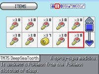
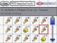
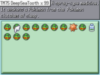
I vote on second screen too, but for bag and Items PC I like the idea of scrolling the items like the pokémon in HgSs Pokédex or even the boxes
But for the pokédex put the BW with the different color and boxes style, but displaying the icons and battlers the same way that BW does. Maybe also an option to compare the size, weight and a option to see the backsprites and different pokémon forms (including male/female) seen before.
I wish that the clock on pokégear be in the pokégear selection screen, not a separate screen.
Maybe is right to jump forward and design the battle screen like BW with backsprites full body and bases for supporting this.