• Our software update is now concluded. You will need to reset your password to log in. In order to do this, you will have to click "Log in" in the top right corner and then "Forgot your password?".
  • Welcome to PokéCommunity! Register now and join one of the best fan communities on the 'net to talk Pokémon and more! We are not affiliated with The Pokémon Company or Nintendo.

Apple Juice's Pixels

Apple Juice

who are you
1,222
Posts
14
Years
  • Age 25
  • Seen Jul 15, 2014
So I sprited some fakemon for my game, Pokemon Amber.

Starters:
b9f4ff635c4380cbdc29735aa607aa18-d61zsz4.png
iaza12439958147200_by_kalypso_j-d642yic.gif

653_by_kalypso_j-d61ztb4.png

656_by_kalypso_j-d61ztfw.png


Other:
677_by_kalypso_j-d63mlxi.png

672_by_kalypso_j-d63mlod.png

664_by_kalypso_j-d61zu1z.png

659_by_kalypso_j-d61ztl2.png

661_by_kalypso_j-d61ztqy.png


Old:
jwaL7MQ.gif


I would really like to get better at this for the sake of my game, so please give me some critique!
 
Last edited:
35
Posts
11
Years
  • Seen Oct 16, 2021
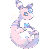
You should use more reference while spriting. Even if they are full custom, using real pokemon sprite as reference isn't consider splicing and will really improve you sprite. Specially since you now have 649 sprites to help you and even more if you take each gen sprites. You purple pig bat could use more Woobat as reference to help you to make it cleaner.

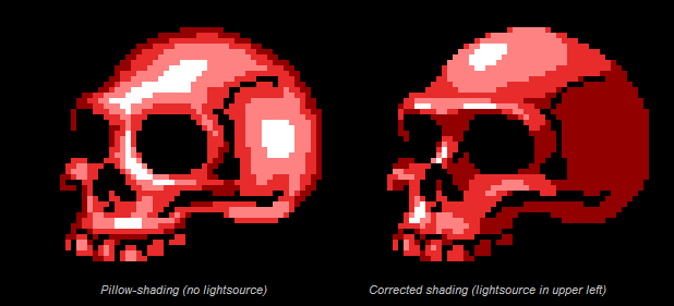
There is often shade missing which make them look sort of plain and sometime boring. Not because they aren't nice, but because they look more like WIP then finished sprites.

I think your main spriting problem is your lines. Many don't look clean. Maybe due to shading or I don't know, but not clean.

As for your old one, I think using reference is VERY important with fire because it easily look wrong. Rapidash, Magmar, well any pokemon with fire on it is a good ref and you'll see the difference between those and your fire and how your look stoic instead of freely moving.


I only point negative thing, not because I think your a bad spriters, but because I think it's the best way to improve. It wasn't meant to be harsh if you ever considered it that way.
 

kinataki

david tennant so much!
142
Posts
14
Years
  • Seen Jan 13, 2014
SHADING, you need more shading, and more straight lines, that being said, those are perfect!
 

Apple Juice

who are you
1,222
Posts
14
Years
  • Age 25
  • Seen Jul 15, 2014
Thanks for the input, guys. Unfortunately I just finished spriting this guy when I read your posts, but critique nontheless, please! His name is Chamelub, the evolution of the grass starter Felore!

iaza12439958147200_by_kalypso_j-d642yic.gif
 
41,232
Posts
17
Years
And as usual you impress me with your work. <3; I'm a big fan of your color schemes; the pastels on some of them look pretty great with the overall designs. But my gosh I have my eye on that little water shark since he's just precious, ahhh.
 
2,982
Posts
15
Years
Shading is actually alright. The problem is that your line-work needs a lot of work. I'll get more in-depth about this later. Also, the black outline on top of this Pokemon's head shouldn't be black:
659_by_kalypso_j-d61ztl2.png
 

Apple Juice

who are you
1,222
Posts
14
Years
  • Age 25
  • Seen Jul 15, 2014
And as usual you impress me with your work. <3; I'm a big fan of your color schemes; the pastels on some of them look pretty great with the overall designs. But my gosh I have my eye on that little water shark since he's just precious, ahhh.

Thanksss. <3 I'm glad you like them!

Shading is actually alright. The problem is that your line-work needs a lot of work. I'll get more in-depth about this later. Also, the black outline on top of this Pokemon's head shouldn't be black:
659_by_kalypso_j-d61ztl2.png

Thank you for your input, and I agree with you, my line-work is pretty bad x____x It's the hardest thing for me. I don't know if it makes a difference but the electric bunny and poison bat were drawn with a tablet before it started spazzing on me. o_o

Here's kind of summary of the pokemon I've sprited so far.
Credit for the template goes to orohnpokemon and MisterMayVark on dA.

On the final form of the bug line - I could NOT make it look good. The wings just... Oh my god. D: Someone help me with that.
Spoiler:
 

Tackle

Pancham
140
Posts
11
Years
Your fakemon sprites are great, but the outline's erm, looks a little distorted, try to improve the outline, okay? (Don't be like me. xD) If you do, your sprites will be more than perfect! :)
 
2,982
Posts
15
Years
Let's take a closer look at your sprites;

3305la8.jpg

The Bat
The bat is in a position where the other eye should be slightly shown as well. We can easily relate this pose to Swoobat because of similar features where Swoobat has two visible eyes. Pignite too.
The outlining on this sprite isn't bad at all, but it could be better. For instance on the left side (our left) of its head, you can see that the outline is very irregular and pointy, and now we'll refer to this I quickly made up:
xm2ywg.jpg

Notice how on the left, the outline is very jagged and unequal as opposed to the right side where the outline looks very smooth and curvy. This is the general rule for outlines and mainly spheres or curves (like heads/ears) where the number of pixels gradually increase and then decrease when sloping down.

You can see the scale below the two large outlines of 1 - 2 - 3 - 2 - 1 where it shows how generally the curves and outline is done. This can be improvised and enlarged like 1 - 3 - 5 - 8 - 5 - 3 - 2 - 1. It mainly depends on what size and type of curve you're going for. This applies to the bat's head and lower belly outline.

2j1lhmh.jpg


The Bird
What I said previously can be applied to this sprite as well. The sides and bottom of the bird's head. The other eye should be shown as well. You can look at references of bird Pokemon sprites to get help with the talons and feet.
672_by_kalypso_j-d63mlod.png

And to help make this brief, you can also fix this Pokemon's ears and body shape with the general outline rule I said.

16bybup.jpg

The Bug
Sometimes it's better to not have so much anti-aliasing otherwise it will look as if it's pillow shaded. If you don't know what pillow shading is, basically it's a very bad shading style for sprites and some people actually offer it as a choice in their sprite shops which is completely fine considering it's for show. This is pillow shading:

pillowshaderedux.png


The lightsource is not found on the left sprite while there is a definite lightsource on the right skull sprite. Notice how the colours get darker and darker around the highlights for pillow shading. Pokemon's lightsource is the top left which I believe you know already. The main point is to not apply so much AA on sprites. This actually isn't much AA but the B/W style barely has any at all.

---
Keep spriting. :D
 
Last edited:

Apple Juice

who are you
1,222
Posts
14
Years
  • Age 25
  • Seen Jul 15, 2014
Thank you so much for the helpful input Logeidan and thanks for the compliments everyone else! I'll hopefully have some new sprites up soon for critique.
 

Apple Juice

who are you
1,222
Posts
14
Years
  • Age 25
  • Seen Jul 15, 2014
This is personally one of my favorite fakemon designs, so I would like some feedback on the sprite (which I am quite proud of for not looking terrible)

IdJCD4P.gif
 
Back
Top