• Our software update is now concluded. You will need to reset your password to log in. In order to do this, you will have to click "Log in" in the top right corner and then "Forgot your password?".
  • Welcome to PokéCommunity! Register now and join one of the best fan communities on the 'net to talk Pokémon and more! We are not affiliated with The Pokémon Company or Nintendo.

Map Showcase and Review Thread

Status
Not open for further replies.
585
Posts
11
Years
  • Age 31
  • Seen Feb 7, 2017
Unfortunately Cities, in general, tend to be un-natural. They're man-made. How could they be natural at all.

Well, when it comes to big cities (And I mean really big, like Lumiose City), with man-made roads (Like the bricked roads), then the un-natural style is definitely preferred and better. But when it comes to small towns with dirtroads through them, which are basically most towns and "cities" in Pokemon, the "natural style" is more realistic. At least that's what I think.
 

tImE

It's still me, 44tim44 ;)
673
Posts
17
Years
I would like to thank you for taking the time of remaking the map. But, honestly, I really, really hate the "not natural" pattern of cities. I love the benches you put in, and I replaced the ones on my map with them, but the rest... just way too "square-like".

Again, thank you both for your advice, and I definitely won't ignore it. I'll change the map, but I just can't make it too similar to cities from actual Pokemon games. It's one of the few things that really bothered me with them. I guess it's just two different styles.

And that is entirely up to you! You should make what you like yourself.

However, some of the points I mentioned still stands.
Snirkly roads doesn't make sense in a city and it doesn't work well gameplay-wise without pixel-movement and if you intend to have differents buildings in the same city, you should at least recolor them to the same color scheme.

Looking forward to your next version of the map!
 
585
Posts
11
Years
  • Age 31
  • Seen Feb 7, 2017
However, some of the points I mentioned still stands.
Snirkly roads doesn't make sense in a city and it doesn't work well gameplay-wise without pixel-movement and if you intend to have differents buildings in the same city, you should at least recolor them to the same color scheme.

Looking forward to your next version of the map!

Of course they stand. You're definitely right about the roads, they are too random. It might look good on a route, but not in a city. As for the color of the houses, I've written about that in my previous message. They'll be changed once I finish the game xD
 
Last edited by a moderator:

tImE

It's still me, 44tim44 ;)
673
Posts
17
Years

A simple city with a fine layout.

I think you have way too much empty space, though.

Try shrinking the map 20% in both directions, but keep the size and amount of the houses, and just remove the unneccesary empty ground tiles everywhere.

Also, you shouldn't have empty space behind/above houses unless there is a road there. It looks bad. Try moving the fence and trees down, so that they are under the rooftops, just like you did with the Pokémon Center.

6.5/10
 
46
Posts
10
Years
A simple city with a fine layout.

I think you have way too much empty space, though.

Try shrinking the map 20% in both directions, but keep the size and amount of the houses, and just remove the unneccesary empty ground tiles everywhere.

Also, you shouldn't have empty space behind/above houses unless there is a road there. It looks bad. Try moving the fence and trees down, so that they are under the rooftops, just like you did with the Pokémon Center.

6.5/10

How's this? Better or worse?

View attachment 71303
 

tImE

It's still me, 44tim44 ;)
673
Posts
17
Years
It's a little better, but it's not that much of a difference.

Let me show you what I mean:
Spoiler:

Here, I recreated your map and fixed what I thought was needed.

I made the map slightly smaller and removed unneccesary space.
I then moved down the treeline and placed it BENEATH/BEHIND the roofs of the buildings.
This is just how I prefer it to be, though.
 
46
Posts
10
Years
It's a little better, but it's not that much of a difference.

Let me show you what I mean:
Spoiler:

Here, I recreated your map and fixed what I thought was needed.

I made the map slightly smaller and removed unneccesary space.
I then moved down the treeline and placed it BENEATH/BEHIND the roofs of the buildings.
This is just how I prefer it to be, though.

That does look a lot better, but why did you use that for the path? In firered, that's used in saffron city to show shadows.
 

Radical Raptr

#BAMFPokemonNerd
1,121
Posts
13
Years
That does look a lot better, but why did you use that for the path? In firered, that's used in saffron city to show shadows.

I believe it may have been a way to recreate what you have done, but without the tile error - the edges of the tile you were using have green on the edges so they can be placed on grass, but you placed them on (a stone path? I dont really know what to call it).
You can easily take what he has done and use it as inspiration or as a reference, it was just a way of getting his point across.

Also, pro-tip, bigger is most often than not, not always better especially with towns and other such areas, try to have a small, and controlled area. It not only looks much better, but helps give the player a sense of direction and what is going on.
 

tImE

It's still me, 44tim44 ;)
673
Posts
17
Years
Yeah, it's like Saving Raven said.
The path tile you used has grass corners and does not blend together with the brick-ground tile.

And Saving Raven is right, while bigger areas may look cool at first, they easily end up boring unless you can manage them right and it's better to start small, because it's easier to control the flow of the map and it's easier to not leave holes and emptiness in your wake. XD
 
947
Posts
11
Years
Semolous, The building right to the Gym has the "public lantern" (I don't know what that is called in English) on the wall.
Also, the grass where you put the fontaines look weird. needs some more work to make it more symethric. You should work on make it look more symethric imo.
The streets border tiles (those tiles with some green) need more work.
 

tImE

It's still me, 44tim44 ;)
673
Posts
17
Years
The starting town in Pokémon Chaos:

Spoiler:

Simple and nice.
8/10

A few points of critique though:
1. The "hidden item" area up the stairs from the lake is really straight and boring.
Try making the trees less linear in that area.

2. The South exit looks kind of overlooked. Try to give it a proper path, just like the northern one.

3. The fenced in area near the bottom looks out of place. Either give it some proper content or fill the area with trees instead. (Filling the area with differently colored flowers would be nice, for example.)
 

Rayquaza.

Lead Dev in Pokémon Order and Chaos
702
Posts
12
Years
Simple and nice.
8/10

A few points of critique though:
1. The "hidden item" area up the stairs from the lake is really straight and boring.
Try making the trees less linear in that area.

2. The South exit looks kind of overlooked. Try to give it a proper path, just like the northern one.

3. The fenced in area near the bottom looks out of place. Either give it some proper content or fill the area with trees instead. (Filling the area with differently colored flowers would be nice, for example.)

How's this?

Spoiler:
 

tImE

It's still me, 44tim44 ;)
673
Posts
17
Years
How's this?

Spoiler:

Well, your really only fixed the fence thingy, but I think you put a little too many trees there.

Remove this tree and put a flower or two in its place.
Spoiler:


The score is rather unchanged, though. You went from an 8.1 to an 8.4 basically.

I suggest you try and fix the other things I mentioned aswell.
Either way the map looks fine and will probably be fun to play.
 
69
Posts
14
Years
  • Seen Nov 19, 2014
Well, this map isn´t complete yet, it need some little details, in the house of the left corner is supposed to be some sandash.
 
84
Posts
10
Years
  • Age 28
  • Seen Jun 11, 2022
Well, this map isn´t complete yet, it need some little details, in the house of the left corner is supposed to be some sandash.

My overall comment with this one is that I think that there's too much space in between everything, without there being significant enough reason to walk there. Everything is so far apart, even though there's not really any way to justify it. Maybe that's what you're going for, but I'm personally not a fan of it.

It's not a town with much 'personality', but then not every town has to be. Sometimes you just need to have a 'pass-through' town, which I get the feeling this is.

I'd say it's a 6.5/10, but like I said, that's not too bad for a town without anything really important going on in it.
 
69
Posts
14
Years
  • Seen Nov 19, 2014
My overall comment with this one is that I think that there's too much space in between everything, without there being significant enough reason to walk there. Everything is so far apart, even though there's not really any way to justify it. Maybe that's what you're going for, but I'm personally not a fan of it.

It's not a town with much 'personality', but then not every town has to be. Sometimes you just need to have a 'pass-through' town, which I get the feeling this is.

I'd say it's a 6.5/10, but like I said, that's not too bad for a town without anything really important going on in it.
Yeah that town is a 'pass-through' town, in fact its the first town that the player visit after leaving his home town. I changed it a little and i upload the first town, where the player lives :)
 

Derxwna Kapsyla

Derxwna "The Badman" Kapsyla
437
Posts
12
Years
Game: Touhoumon Faith & Prayer Version
Map: Cinnabar Volcano Island and Cinnabar Island, rebuilt

Large image under the spoiler, here's a direct link to the image: http://i.imgur.com/iQYDvtp.jpg
Spoiler:


Cinnabar Island, in the era of Red the Legendary Trainer, was a very prosperous island and a very popular tourist spot. There were three reasons why people would visit the island so often and in such mass. The first of these was Cinnabar Gym, where trainers would go to challenge Blaine, the Fire Type gym leader, in an attempt to obtain the Volcano Badge. The second was Cinnabar Research Labs, were individuals who had fossilized Pokemon could go to restore the fossils to their Pokenoid forms. The third reason was the defunct Cinnabar Mansion, the former location of several scientists who engaged in the Mewtwo Project, and is rumored to the creating grounds of the MissingNo Legend (These rumors, however, are unconfirmed). These reasons helped Cinnabar Island prosper beyond its confides as an island. That all changed when the fire nation attacked when Cinnabar Volcano exploded

Cinnabar Island, two years after the Era of Red, saw a drastic and violent event happen: the eruption of Cinnabar Volcano, once thought to be dormant, that rested under Cinnabar Gym. Blaine managed to evacuate the island so that nobody got left behind, but the island was wrecked regardless. They set up a temporary Pokemon Center for refugees, and Blaine moved gym operations to a cavern within Seafoam Islands.

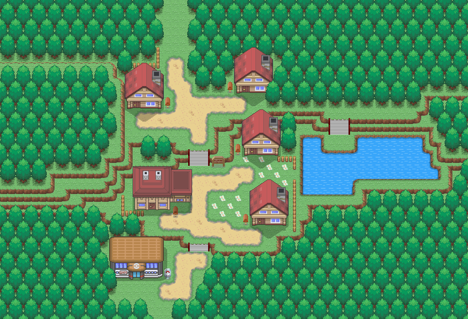
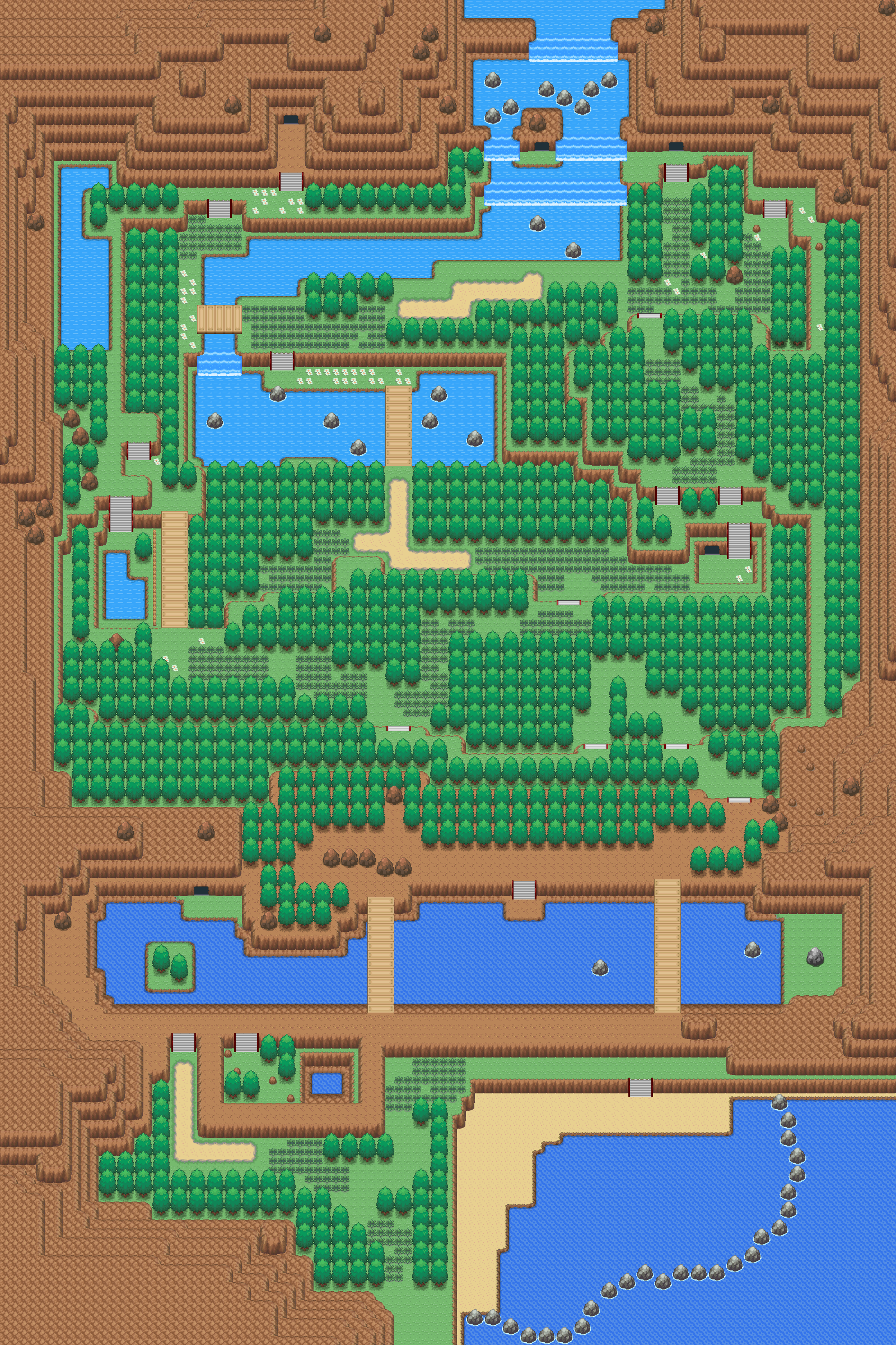
Three years later, Blaine decided to rebuild Cinnabar Island, just a bit further south of the original island. Within time, it became a popular tourist spot once again, with the Volcanic Caverns being the biggest tourist attraction of all. A Seismology and Geothermal Center was built on Volcano Island, in order to keep track of the volcano's activity. Some people discovered the portions of Cinnabar Mansion remained intact under the volcano's destruction, just very disheveled.

In the present day, Cinnabar Island has regained its role as a popular spot for tourism - vendors have set up street booths selling exotic and rare items, items from all over.

However, Cinnabar Volcano seems to be important to Team Rocket… Why that is though is anyone's guess.
 

Rayquaza.

Lead Dev in Pokémon Order and Chaos
702
Posts
12
Years
So I submitted this map a while back and got some unhelpful feedback on it. Nothing about how to fill the empty space or what to fill it with. Just people telling me that there is too much of it.

Original [WARNING: Big Image]:
Spoiler:


So I got back to the map earlier this week and completely re-mastered it with my newer mapping skills (Assuming I've actually learned anything) and am very happy with the outcome.

New Design [WARNING: Also a Big Image]:
Spoiler:
 
Status
Not open for further replies.
Back
Top