• Our software update is now concluded. You will need to reset your password to log in. In order to do this, you will have to click "Log in" in the top right corner and then "Forgot your password?".
  • Welcome to PokéCommunity! Register now and join one of the best fan communities on the 'net to talk Pokémon and more! We are not affiliated with The Pokémon Company or Nintendo.

Map Showcase and Review Thread

Status
Not open for further replies.
585
Posts
11
Years
  • Age 31
  • Seen Feb 7, 2017
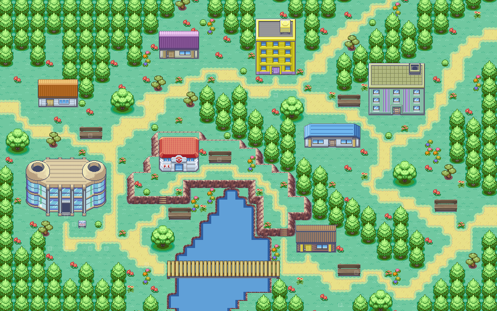
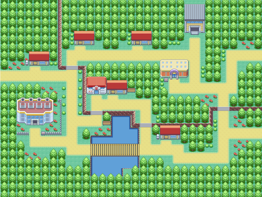
Another 2 cities from my game

You can't use the automated brick road automated tile. It has ground surrounding it, and your surrounding is another brick path.

Also, I must say, your cities are too.... linear. They're too geometrically correct. Everything's so parallel. Try displacing the houses and buildings a little. Move them a few tiles in any direction. Make their position random, if you know what I'm saying.

Also, there are no details. I wouldn't place a city on a bricked path. I'd put grass around the bricked road, to make adding trees, flowers and other "random details" possible. The way you're making it has a lot of empty surfaces.
 
46
Posts
10
Years
You can't use the automated brick road automated tile. It has ground surrounding it, and your surrounding is another brick path.

Also, I must say, your cities are too.... linear. They're too geometrically correct. Everything's so parallel. Try displacing the houses and buildings a little. Move them a few tiles in any direction. Make their position random, if you know what I'm saying.

Also, there are no details. I wouldn't place a city on a bricked path. I'd put grass around the bricked road, to make adding trees, flowers and other "random details" possible. The way you're making it has a lot of empty surfaces.

I get what you're saying. Thanks for the input!
 
585
Posts
11
Years
  • Age 31
  • Seen Feb 7, 2017
That is much better. Although it's still too square-like for me. It looks fine, I guess I just really hate maps with a perfect layout.

One problem, though, the roof of the building in the bottom right corner is cut off. Add it to the third layer.
 

tImE

It's still me, 44tim44 ;)
673
Posts
17
Years
A revamped version of one of my cities

View attachment 71259

It kind of reminds me of Canalave City.

First off, you should make a tree-border around the city, so that the player cannot see outside the map boundaries.

Secondly, I think it'd look nicer with "harbor-fences" lining the wateredges. (You know those white big thingys.)

And lastly, the Gatehouse in the lower right corner looks really bad.
Check some official maps to learn how to do a proper one.

For now: 7/10
If you fix the things I said, probably: 9/10
 
585
Posts
11
Years
  • Age 31
  • Seen Feb 7, 2017
NostramCity_zpsc31b0be1.png

Nostram City. Was originally Nostram Town, but when I built it too big I decided to rename it to "City" xD
 
46
Posts
10
Years
It kind of reminds me of Canalave City.

First off, you should make a tree-border around the city, so that the player cannot see outside the map boundaries.

Secondly, I think it'd look nicer with "harbor-fences" lining the wateredges. (You know those white big thingys.)

And lastly, the Gatehouse in the lower right corner looks really bad.
Check some official maps to learn how to do a proper one.

For now: 7/10
If you fix the things I said, probably: 9/10

I'm not entirely sure what you mean by 'the Gatehouse in the lower right corner looks really bad' Could you please explain?
 
84
Posts
10
Years
  • Age 28
  • Seen Jun 11, 2022
NostramCity_zpsc31b0be1.png

Nostram City. Was originally Nostram Town, but when I built it too big I decided to rename it to "City" xD

Hey, here's my opinion on your map:

Firstly, there's not any unity between the buildings of the town. If you use multiples of the same sprite for each town, it gives each town a specific feel, making them much more memorable and much less 'oh, another random town. Cool, i guess.'. It gives each town identity and just generally looks better.

I'd also reccommend expanding it out on every side, and building a solid border of trees all around (except for entrances to other routes of course). There are a couple of points where it looks like not quite the entrance to a new route, but just like you missed a spot of trees to complete the border.

The bench sprites are disproportionate to the buildings as well, which makes them look funny. It looks kind of like a BW sprite was but into a RSE game.

The mountainy bit in middle doesn't feel necessary either.

Overall rating: 4/10
If you fix these things, maybe a 6 or 7. Sorry, I just don't really like the design of the map - it looks haphazard. I know what a pain this is to hear, but I think you should get a really solid idea of what you want the town to be, and then give it another try. Just the other day I completely redid one of my earlier towns, and as difficult as it was, it looks much better now. Sometimes when you have the inspiration you can punch something really good out straight off the bat, but you won't always be so lucky unfortunately : (
 

tImE

It's still me, 44tim44 ;)
673
Posts
17
Years
NostramCity_zpsc31b0be1.png

Nostram City. Was originally Nostram Town, but when I built it too big I decided to rename it to "City" xD

First off, you are trying to make the trees, paths, lakes and mountains look way too "natural".
I know what you are trying to accomplish, but it rarely looks good in a Pokémon game, especially not with FRLG tiles.

Secondly, you don't have a specific "theme" for the city. You are using a ton of different houses, with no regard to how the player is supposed to recognize the city. Pokémon games often use a set color scheme to set towns and cities apart for the player to recognize them.

Furthermore, you have way too many open spaces with nothing in it except flowers. You should keep these to a minimum. Empty spaces are fine if they make sense or containt something, for example, a garden for a house, etc.

Lastly, using small snirkly roads doesn't work well with Pokémon games. They work better in games with pixelmovement rather than 4 direction tile movement. And having only 1 tile wide spaces for the player to move through makes it feel too cramped for the player.

I give this a 5/10.

Of course, this is all according to my opinion. If you prefer this style you are using, that's fine, however if you want to see an example of this map in more of a "Pokémon style", check the spoiler.
I remade your map as I have learned to make maps.
Spoiler:
 
46
Posts
10
Years
First off, you are trying to make the trees, paths, lakes and mountains look way too "natural".
I know what you are trying to accomplish, but it rarely looks good in a Pokémon game, especially not with FRLG tiles.

Secondly, you don't have a specific "theme" for the city. You are using a ton of different houses, with no regard to how the player is supposed to recognize the city. Pokémon games often use a set color scheme to set towns and cities apart for the player to recognize them.

Furthermore, you have way too many open spaces with nothing in it except flowers. You should keep these to a minimum. Empty spaces are fine if they make sense or containt something, for example, a garden for a house, etc.

Lastly, using small snirkly roads doesn't work well with Pokémon games. They work better in games with pixelmovement rather than 4 direction tile movement. And having only 1 tile wide spaces for the player to move through makes it feel too cramped for the player.

I give this a 5/10.

Of course, this is all according to my opinion. If you prefer this style you are using, that's fine, however if you want to see an example of this map in more of a "Pokémon style", check the spoiler.
I remade your map as I have learned to make maps.
Spoiler:

I'd have to agree with tImE on this. I generally like to use 1 colour scheme when doing cities or towns, and I try to fill only the spaces that need to be filled. Hell, I've even had to completely redo some of my older work.
 
585
Posts
11
Years
  • Age 31
  • Seen Feb 7, 2017
Hey, here's my opinion on your map:

Firstly, there's not any unity between the buildings of the town. If you use multiples of the same sprite for each town, it gives each town a specific feel, making them much more memorable and much less 'oh, another random town. Cool, i guess.'. It gives each town identity and just generally looks better.
Actually, that's one of the things I plan to fix at the very end of the game. Having each house different makes it easier to name the maps ("Green house", "red house", etc.). I do it to not get confused when making the "Transfer player" events. Complicated, I know, but I have my weird methods of avoiding confusion xD

I'd also reccommend expanding it out on every side, and building a solid border of trees all around (except for entrances to other routes of course). There are a couple of points where it looks like not quite the entrance to a new route, but just like you missed a spot of trees to complete the border.
The trees are there - they're just not visible on the image.

The bench sprites are disproportionate to the buildings as well, which makes them look funny. It looks kind of like a BW sprite was but into a RSE game.
Yeah, that's true. I replaced them, thanks for the advice :)


First off, you are trying to make the trees, paths, lakes and mountains look way too "natural".
I know what you are trying to accomplish, but it rarely looks good in a Pokémon game, especially not with FRLG tiles.

Secondly, you don't have a specific "theme" for the city. You are using a ton of different houses, with no regard to how the player is supposed to recognize the city. Pokémon games often use a set color scheme to set towns and cities apart for the player to recognize them.

Furthermore, you have way too many open spaces with nothing in it except flowers. You should keep these to a minimum. Empty spaces are fine if they make sense or containt something, for example, a garden for a house, etc.

Lastly, using small snirkly roads doesn't work well with Pokémon games. They work better in games with pixelmovement rather than 4 direction tile movement. And having only 1 tile wide spaces for the player to move through makes it feel too cramped for the player.

I give this a 5/10.

Of course, this is all according to my opinion. If you prefer this style you are using, that's fine, however if you want to see an example of this map in more of a "Pokémon style", check the spoiler.
I remade your map as I have learned to make maps.
I would like to thank you for taking the time of remaking the map. But, honestly, I really, really hate the "not natural" pattern of cities. I love the benches you put in, and I replaced the ones on my map with them, but the rest... just way too "square-like".

Again, thank you both for your advice, and I definitely won't ignore it. I'll change the map, but I just can't make it too similar to cities from actual Pokemon games. It's one of the few things that really bothered me with them. I guess it's just two different styles.
 

Rayquaza.

Lead Dev in Pokémon Order and Chaos
702
Posts
12
Years
Actually, that's one of the things I plan to fix at the very end of the game. Having each house different makes it easier to name the maps ("Green house", "red house", etc.). I do it to not get confused when making the "Transfer player" events. Complicated, I know, but I have my weird methods of avoiding confusion xD


The trees are there - they're just not visible on the image.


Yeah, that's true. I replaced them, thanks for the advice :)


I would like to thank you for taking the time of remaking the map. But, honestly, I really, really hate the "not natural" pattern of cities. I love the benches you put in, and I replaced the ones on my map with them, but the rest... just way too "square-like".

Again, thank you both for your advice, and I definitely won't ignore it. I'll change the map, but I just can't make it too similar to cities from actual Pokemon games. It's one of the few things that really bothered me with them. I guess it's just two different styles.

Unfortunately Cities, in general, tend to be un-natural. They're man-made. How could they be natural at all.
 
Status
Not open for further replies.
Back
Top