Lord Varion
Guess who's back?
- 2,642
- Posts
- 15
- Years
- Age 29
- Seen Jan 6, 2015
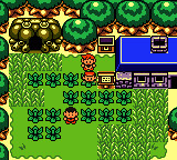
Omg is that a tLoZ starter kit? It looks awesome. I would love to use it if you ever decide to let people use it :3
I will be letting oter people use it. :3 I just need to script alot of things, then it's good for a public release :'D
Also, I'm mapping http://vgmaps.com/NewsArchives/April2008/LegendOfZelda-OracleOfHours-Falsia(Day).png for it. Just to give you something to explore when 'testing' the engine.