hinkage
Everyone currently in an argument with this member
- 383
- Posts
- 13
- Years
- Age 28
- Seen Apr 15, 2024
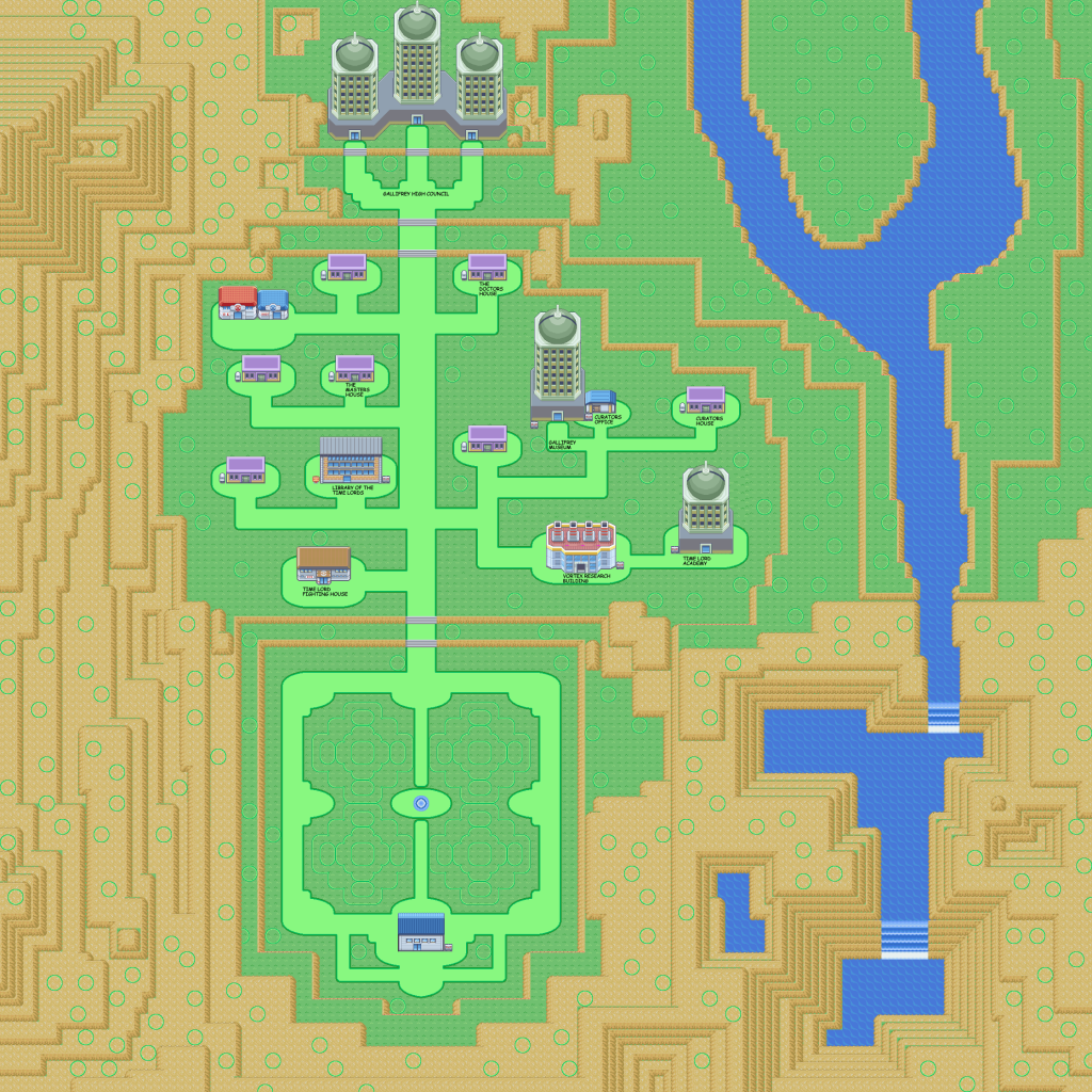
Honestly, I dont really care for this map too much. Definitely not the worst ive seen, but it could definitely be better. the pathways seem really thin, and yet theres only one patch of grass that youre forced to take more than a few steps through. and on that subject, there is a LOT of grass on this map. there usually shouldnt be that much grass on a map, at least in my opinion, because it starts to look kinda cluttered. and unless this is on of the really early routes, id suggest adding an alternate path, at least in one direction. i hate being forced to take a certain path all the time
i realize this was about half opinion, half actual review, but i just called it as i saw it. id probably give it a 5/10
on a side note, i dont really care for the tiles or the palettes either. they seem too washed out, but this isnt the place for reviewing those, so ill stop there.
anyway, here's my map
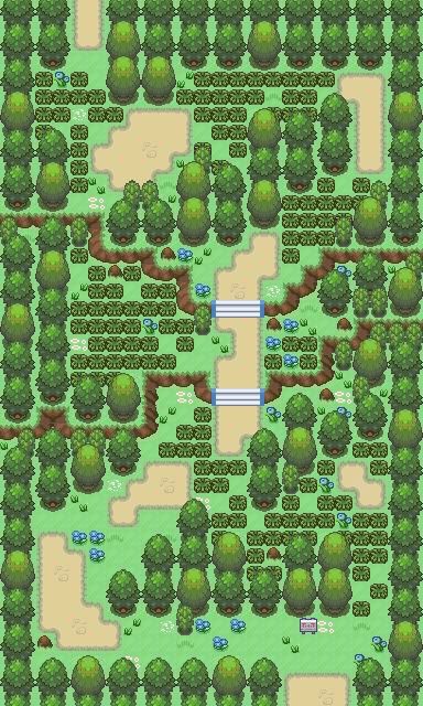
Map: Acacia Forest
Rom: Firered
Tile Credits: Skillmen, ThePokemonChronicles,
When you first go through, youre going west to east
also in the actual game, it uses the cloudy weather effect, and that darkens the palette just right

I like this. It's very much like a Gamefreak-styled map, although I'm not sure if that's what you were going for. It would be great at the start of the game I think. The trees and paths look natural, but not unbearably disorganized like some forests.
It's playablility looks good, too. Easily navigated, but with some Trainers it could also be somewhat challenging. (This style reminds me most of Eterna Forest). Rating: 8.5/10.
Honestly though, I'm not sure what could improve it, sorry. Unless you want to add some pathways, but that might take away from the natural feel, and give it more of a man-made feel. (Both are good, that's why it's tough to judge :P)
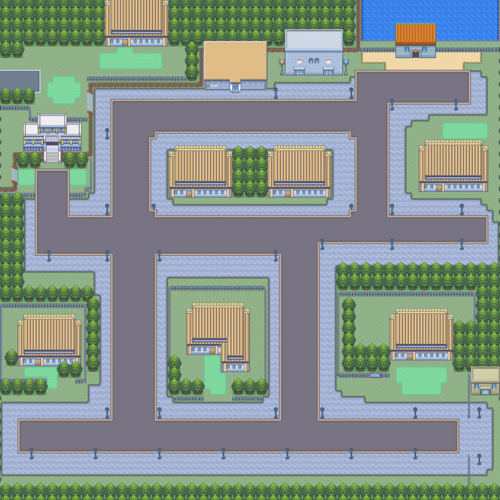
My map:
Spoiler:
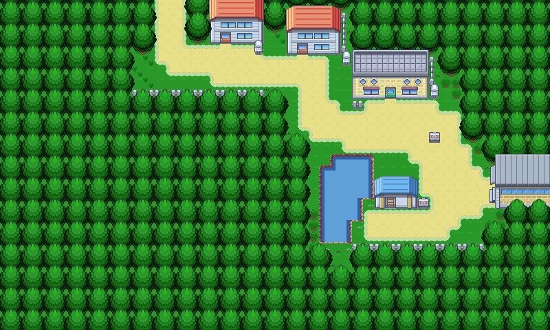
Name: Greenwich (pronounced Gren-itch)
Comments: Have you ever seen Greenwich? It's pretty freaking rich -- everyone owns a huge house and tons of land. And making a rich, preppy city is fun, by the way. This is an early version without many tweaks yet. I need some more details, besides flowers, since I'm adding those later. I know there's some tile errors. They've been fixed too.
Last edited: