• Our software update is now concluded. You will need to reset your password to log in. In order to do this, you will have to click "Log in" in the top right corner and then "Forgot your password?".
  • Welcome to PokéCommunity! Register now and join one of the best fan communities on the 'net to talk Pokémon and more! We are not affiliated with The Pokémon Company or Nintendo.

Ugliest Pokemon

KorpiklaaniVodka

KID BUU PAWAA
3,318
Posts
10
Years
I'm suddenly reminded that we forgot one. I'm so ashamed; how the heck could we forget THIS:

250px-349Feebas.png


I can't believe we all forgot this pile of ugly.

milotic___animation_by_saphira1994-d5mnwu0.gif


...except it evolves into this. If people hate Rhyperior because it looks nothing like Rhydon, shouldn't they hate Milotic because she looks nothing like Feebas? (although Milo is kinda hated as well but for other reasons, and Milo is also one of my favourite Pokemon alongside Weavile, Rhyperior, Crobat, Gengar...)
 

mew_nani

Pokécommunity's Licensed Tree Exorcist
1,839
Posts
14
Years
milotic___animation_by_saphira1994-d5mnwu0.gif


...except it evolves into this. If people hate Rhyperior because it looks nothing like Rhydon, shouldn't they hate Milotic because she looks nothing like Feebas? (although Milo is kinda hated as well but for other reasons, and Milo is also one of my favourite Pokemon alongside Weavile, Rhyperior, Crobat, Gengar...)

Considering that Feebas looks like... well.. Feebas, I don't think that applies. I don't get the whole "hating an evolution because it doesn't resemble it's pre-evolutions" thing either. Butterfree doesn't resemble Metapod or Caterpie, and neither Huntail nor Gorebyss look like Clamperl. I think the reasoning behind that hatedom is that there are Pokemon we expect to look vastly different from their base stage, like Beedrill, and some we expect to look at least similar, like Electrivire. I think we catagorize this as we would in real life, because when's the last time you saw a bunny metamorphose into a hawk, or a fish metamorphose into an octopus? So we look at Remoraid and Rhydon and wonder how the heck they turned into Rhypervoir and Octillery. We often forget that Pokemon sorta operate more like bugs than they do real world animals, so we don't expect the ones that are more animalistic to just suddenly turn into something else. Of course even if the final form looks different, like Dragonite or Milotic, if it looks pleasing we can still like it. I think people just start calling foul if the end result looks dumb compared to what came before it.
 

mew_nani

Pokécommunity's Licensed Tree Exorcist
1,839
Posts
14
Years
I can't believe no one said Darmanitan.

I dunno about that one. That kind of look it sports isn't that rare in Japanese monsters. Play Okami for a bit; you'll see a couple of monsters with that look. I think Simipour and Simisear look far worse. (Really why do those exist?)
 

PageEmp

No money puns. They just don’t make cents.
12,636
Posts
8
Years
No way Conkeldurr and Magmortar are awesome!!

Okay, jokes aside, I wouldn't say there is an 'ugliest' poke, but I do think that there are many deranged or weird looking megas. Mega Gyarados really killed the mutated slug for me. It's...a fucking prawn, are you kidding me. And Clawitzer is a prawn too and he's cooler. Also Mewtwo Y.... What is up with his tail being on his head? And those swollen fingers? And couldn't they have made its build... A bit less plastic? At least the X form looked badass. And DON'T get me started on the stupidity duo, aka the Megas of Mawile and Gardevoir. They have been my mortal enemies ever since I saw them and I will NOT go down without a fight.

As a dishonourable mention, Mega Absol. I'm praying Absol gets a normal evo that's Ghost/Dark and has a threaghtening design. Because a kind-ass design on someone who predicts disasters? I think I brought this up in like maybe the 'watch out for ghosts' thread, but I don't think anyone was listening, and it's becoming a bit of a pet peeve for me.
 

KorpiklaaniVodka

KID BUU PAWAA
3,318
Posts
10
Years
I dunno about that one. That kind of look it sports isn't that rare in Japanese monsters. Play Okami for a bit; you'll see a couple of monsters with that look. I think Simipour and Simisear look far worse. (Really why do those exist?)

Wow, how did I forget about Simipour? That has to be one of the most pathetic designs of gen 5... definitely the laziest design of any monkey. I did like the other two though.
 

Junier

Fake Friends Forever (´・ω・`)
1,074
Posts
8
Years
  • Age 22
  • Seen Dec 5, 2019
Exactly what you said about Arceus, mew_nami. I agree completely.

Jynx is gorgeous, okay!? Well, Smoochum looks fine... Jynx isn't an abomination, at least. I've always liked Simipour's dreadlocks. Not a fan of the Unova monkey trio but at least their designs are interesting. Still will never understand why they didn't name Simipour something Simisoak since Simisage, Simisear...

Honestly, Garbodor's design is... interesting. Busy, but not White-or-Black-Kyurem-busy. He's an actually trash Pokemon with sewer pipes and texture and everything. Not like Muk which is probably the laziest design out of all 700+ 'mons. Like, it's Grimer but bigger. With squinted eyes. At least Voltorb's color scheme flips. Muk stays the same. Might as well make it a single-stage!

I mean, at least these Pokemon with sporadically different final forms have origin to explain it. Feebas is an "ugly duckling" sort of Pokemon, going from hideous to gorgeous, a later counter to Magikarp transforming from useless carp to intimidating dragon. '

I don't get Golem though. Rock ---> four-armed rock ---> rock lizard. 'kay.

AT LEAST IT'S NOT UGLY AS BLOATED-ASS MEGA GYARADOS. Like Meem-er said. And Mega Absol is way too... "emo-esque" for my taste. The eye-covering bang, angel wings and overall build reek of DA fursona collections.
 

mew_nani

Pokécommunity's Licensed Tree Exorcist
1,839
Posts
14
Years

Honestly, Garbodor's design is... interesting. Busy, but not White-or-Black-Kyurem-busy. He's an actually trash Pokemon with sewer pipes and texture and everything. Not like Muk which is probably the laziest design out of all 700+ 'mons. Like, it's Grimer but bigger. With squinted eyes. At least Voltorb's color scheme flips. Muk stays the same. Might as well make it a single-stage!

Actually there is a small but noticable difference between Muk and Grimer: Muk's right arm just randomly disappears. I don't know why this happens, but in Gen III and Gen IV its right arm seems to either shrink or just completely vanish and then return depending on the sprite. It doesn't seem to show up in Gen V or any of the 3D games though so I don't have a clue. Other than that though it's just a different shade of purple. Can't say I expected much more from a sentinent pile of sludge but eh.

As for Mega Absol... just... why? Why does it look like every fan girl's DeviantArt Absol picture EVER? Why does it have wings? It's the freaking Disaster Pokemon; am I wrong for expecting something a little more cool considering it has a big ol' blade on the side of its skull? It looks all fangirl-ish now.

Actually no less than half of the Mega Evolutions look terrible, or at least have something horribly wrong with their design. For every awesome design like Mega Diancie and Mega Pidgeot we have something nonsensical like Mega Salamence (it's a hang glider dragon. How's it supposed to be able to fly?), Mega Alakazam (it's a Buddha with spoons around it), or Mega Manetric (it looks like it's got a giant lightning shaped tumor on its head.) Part of the reason I dislike Mega Evolution is because half the designs either don't fit the Pokemon or just look awful. If Mega Banette and Mega Ampharos can look totally awesome I don't see why Medicham or Slowbro have to be saddled with horrible megas. (I'm actually kinda neutral about Mega Gyarados; it's design is horribly cluttered but it does remind me of the sea dragons from Okami.)
 

KorpiklaaniVodka

KID BUU PAWAA
3,318
Posts
10
Years
Actually there is a small but noticable difference between Muk and Grimer: Muk's right arm just randomly disappears. I don't know why this happens, but in Gen III and Gen IV its right arm seems to either shrink or just completely vanish and then return depending on the sprite. It doesn't seem to show up in Gen V or any of the 3D games though so I don't have a clue. Other than that though it's just a different shade of purple. Can't say I expected much more from a sentinent pile of sludge but eh.

As for Mega Absol... just... why? Why does it look like every fan girl's DeviantArt Absol picture EVER? Why does it have wings? It's the freaking Disaster Pokemon; am I wrong for expecting something a little more cool considering it has a big ol' blade on the side of its skull? It looks all fangirl-ish now.

Actually no less than half of the Mega Evolutions look terrible, or at least have something horribly wrong with their design. For every awesome design like Mega Diancie and Mega Pidgeot we have something nonsensical like Mega Salamence (it's a hang glider dragon. How's it supposed to be able to fly?), Mega Alakazam (it's a Buddha with spoons around it), or Mega Manetric (it looks like it's got a giant lightning shaped tumor on its head.) Part of the reason I dislike Mega Evolution is because half the designs either don't fit the Pokemon or just look awful. If Mega Banette and Mega Ampharos can look totally awesome I don't see why Medicham or Slowbro have to be saddled with horrible megas. (I'm actually kinda neutral about Mega Gyarados; it's design is horribly cluttered but it does remind me of the sea dragons from Okami.)

Mega Ampharos looks pretty stupid if you ask me. It's just Amphy but with ridiculous hair and a tail that looks like topping.
 

LilyGardy

The Flowering Pokemon
4,496
Posts
8
Years
Barbaracle - The one Pokemon I refuse to use solely on how it looks.

Probopass - I understand the design but surely they could have come up with something less goofy than this for the evolution of Roxanne's signature Pokemon.
 

mew_nani

Pokécommunity's Licensed Tree Exorcist
1,839
Posts
14
Years
Mega Ampharos looks pretty stupid if you ask me. It's just Amphy but with ridiculous hair and a tail that looks like topping.

You mean you don't like that gorgeous mane of hair?! Outrageous.

Sarcasm aside it's definitely better than some of the other Mega designs, and it's pretty popular with people so I put it on the good design pile. Sure it has flaws (like those horn ears) but it doesn't look like it has a giant tumor on its body or look completely ridiculous like Mega Garchomp with its scythe arms so I can't complain too much. I really wish they put more thought into the designs though. I know fan artists that come up with better designs.
 
Last edited:

Sirfetch’d

Guest
0
Posts
The ugly Garbodor, Jynx and the scary Mr. Mime.

I find the garbage Pokemon line to be so adorable :(

I don't find any Pokemon "ugly" in all honesty. Some are less visually appealing to me than others though. For example, I don't care for Heatmor's design at all. It's not ugly but just not my kind of Pokemon tbh.
 

Bidoof FTW

[cd=font-family:carter one; font-size:13pt; color:
3,547
Posts
10
Years
Diggersby. It's a balding middle age man with arm ears. Eugh.

be careful what you say, Diggersby is always watching.


Nah but really, Stunfisk is prettyyyyyy ugly, even though Stunfisk'd is one of the best themes ;c
Flounders overall are not a pretty species
 

Frozen Lotus

Shay's Ice Prince
263
Posts
8
Years
  • Age 35
  • Ohio
  • Seen Nov 17, 2015
Not sure if anyone mentioned it, but Mega Salamence totally has arms... it just tucks them in to reduce air resistance, which if anything adds to the quality of the design. That said, I am -not- a fan... but I also never liked normal Salamence, so there's that.

Ugliest to me... Lickilicky. I hate everything about its design. Lickitung was never the best looking thing, but it had kind of a cool salamander/dinosaur thing going, and it was almost so ugly it was cute. Lickilicky, though? They took -everything- bad about Lickitung, made it all worse, then completely destroyed the good qualities by making it a figureless blimp, slapping a wi-fi signal on it, and giving it a weird haircut. I can't even really find a proper place to break down what's so... awful here. It's just a terrible, terrible design.

Some honorable mentions...

Rhyperior: Not the biggest fan of Rhydon, but I do like it and feel it indeed did deserve an evolution... but not the one it got. Sadly, Rhyperior really isn't that far off from being a good design, they just... screwed up somehow. It no longer has ANY figure of any kind, it's just round... which makes it look lazy. It's supposedly meant to look like a construction worker, which I just find silly and kind of lame. The plates on it feel random, impractical, and just copy-pasted on. The complete lack of ears is APPALLING... and while this has nothing to do with looks, the stats are just pathetic. +10 to each stat except Speed? Really? That's ALL it gets? ALL that extra bulk uglying it up, and it ONLY gets +50 BST in the laziest, least useful distribution possible? Eesh. Strangely, none of my hatred stems from it looking very different from its previous evolutions... I actually think it matches pretty closely. I just think it completely sucked all the good out of the first two stages.

Barbaracle: I'm kind of offended it even exists. It's just one of those designs that's so ugly it makes me kind of angry to look at. It's kind of creative I suppose, but it's done in the worst possible way. Maybe if the faces weren't so... unbelievably stupid looking, that might help... but they just look really, really stupid. Nothing about this feels like it works for me.

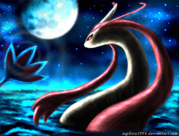
Hoopa: Let me get this out in the open right away; I adore Hoopa Unbound. I think it has a really solid design, it's menacing, it looks legendary... it works. And because its Unbound design is SO good, it improved my opinion on the normal version. However... it's still pretty terrible looking to me. It's not cute, it's not cool, it's not even really unique. It's the worst kind of combination of 'filler' and 'ugly' design to me, and if it weren't for the Unbound version it would be my all-time least favorite Legendary ever.

Stunfisk / Garbador / Muk / Feebas: These ones are a little different, as they're INTENDED to be ugly... so mentioning them here is actually kind of a compliment. But damn if they're not some of the ugliest things GF has ever come up with... @_@

Magmortar: It's sad I've had to mention so many Gen 4 cross-evo's, because I find a lot of them to actually be pretty awesome. This, however, is not one of them. It took something that already had a "if it wasn't for that ONE thing I'd love its design" appearance... and beat it to near death with an ugly stick. All the worst traits of Magmar EXPLODE out of this in a fiery mess of ass. It's just so unbelievably uninspired and awful, like they had absolutely NO idea what to do with it but they REALLY wanted to give Electabuzz's counterpart an evolution since they'd already made Electivire.

Therian Landorus/Tornadus: Ewww... what the... I don't even... nooo, that's wrong. They both just look like bizarre, poorly drawn animals with human faces attached. There's nothing really inspired here. It's just... no. T-Landorus has a FEW qualities that I don't mind, but T-Tornadus is irredeemable. Ironically Therian Thundurus is one of my all-time favorite Legendaries.

Timburr Line: Ironically I don't find Timburr to be THAT bad, but Gurdurr and Conkeldurr are terrible. The strangest part is the veins aren't what bother me, because while those are NOT pretty they compliment the design from a conceptual standpoint. What makes them so bad is... pretty much everything else, primarily the head and especially the nose. It's like it's designed to make you want to hate it.

Tympole Line: I swear I like Generation V. It actually has many of my favorite designs in the series, but it also had some reeeeally ugly ones. This is possibly the ugliest line in the entire series, though, at least factoring in ALL stages. First of all, Tympole isn't remotely cute... it's ugly. Second, Palpitoad itself might rival Lickilicky in terms of sheer hideousness... I mean there is NOTHING good about that horrid abomination's design whatsoever, it's awful. As for Seimistoad... it's not the worst of designs, but the ugly warts and ESPECIALLY the bra head makes it skyrocket in terms of ugliness... granted it wasn't exactly pretty before.

Diancie: I feel bad for listing it as ugly, since its Mega is one of my all-time favorites and I think Carbink is precious beyond words... but ordinary Diancie is just really, really unappealing to me. The sad part is most of what I find so ugly is JUST the giant rock butt, but it's enough to completely destroy the rest of it for me. It feels so random and unpolished, like a half carved gem statue that has a lower half that's gone entirely unattended and just left raw.

Gothitelle line / Jynx line / Mr. Mime line / Jigglypuff line: The same basic description suits all of them perfectly for me, so I can't really bother separating them... they're just plain hideous to look at. Every one of them is either so bad I wish it didn't exist, or has a much better looking counterpart out there. NONE of them have a single quality that appeals to me in any capacity, and Smoochum and Gothita in particular actually anger me a little bit.
 
Last edited:

KorpiklaaniVodka

KID BUU PAWAA
3,318
Posts
10
Years
Not sure if anyone mentioned it, but Mega Salamence totally has arms... it just tucks them in to reduce air resistance, which if anything adds to the quality of the design. That said, I am -not- a fan... but I also never liked normal Salamence, so there's that.

Ugliest to me... Lickilicky. I hate everything about its design. Lickitung was never the best looking thing, but it had kind of a cool salamander/dinosaur thing going, and it was almost so ugly it was cute. Lickilicky, though? They took -everything- bad about Lickitung, made it all worse, then completely destroyed the good qualities by making it a figureless blimp, slapping a wi-fi signal on it, and giving it a weird haircut. I can't even really find a proper place to break down what's so... awful here. It's just a terrible, terrible design.

Some honorable mentions...

Rhyperior: Not the biggest fan of Rhydon, but I do like it and feel it indeed did deserve an evolution... but not the one it got. Sadly, Rhyperior really isn't that far off from being a good design, they just... screwed up somehow. It no longer has ANY figure of any kind, it's just round... which makes it look lazy. It's supposedly meant to look like a construction worker, which I just find silly and kind of lame. The plates on it feel random, impractical, and just copy-pasted on. The complete lack of ears is APPALLING... and while this has nothing to do with looks, the stats are just pathetic. +10 to each stat except Speed? Really? That's ALL it gets? ALL that extra bulk uglying it up, and it ONLY gets +50 BST in the laziest, least useful distribution possible? Eesh. Strangely, none of my hatred stems from it looking very different from its previous evolutions... I actually think it matches pretty closely. I just think it completely sucked all the good out of the first two stages.

Therian Landorus/Tornadus: Ewww... what the... I don't even... nooo, that's wrong. They both just look like bizarre, poorly drawn animals with human faces attached. There's nothing really inspired here. It's just... no. T-Landorus has a FEW qualities that I don't mind, but T-Tornadus is irredeemable. Ironically Therian Thundurus is one of my all-time favorite Legendaries.

Timburr Line: Ironically I don't find Timburr to be THAT bad, but Gurdurr and Conkeldurr are terrible. The strangest part is the veins aren't what bother me, because while those are NOT pretty they compliment the design from a conceptual standpoint. What makes them so bad is... pretty much everything else, primarily the head and especially the nose. It's like it's designed to make you want to hate it.
.

rhyperior's main draw over its evo is actually solid rock which helps it tank attacks such as focus blast and ice beam and survive physical water- and grass-type attacks. basically, if you calc you will see that against super effective attacks it gets 80 spdef and ~175 def which really is impressive.

also i'd say the genies' incarnate forms are even stupider. it's basically a copy of each other but with different colors and tails lol.

i don't see what's wrong with conkelurr. people seem to hate bulky designs and conk is sort of a 'weirdo' (kinda like rhyperior) because of its muscles and nose. i like it more than machamp, tbh.
 
Back
Top