Harvey_Create
Pokemon Apex Team Member
- 187
- Posts
- 11
- Years
- Age 27
- Iowa
- Seen Jul 12, 2015
Who like my new PokeCenter?

Who like my new PokeCenter?

Who like my new PokeCenter?

Who like my new PokeCenter?
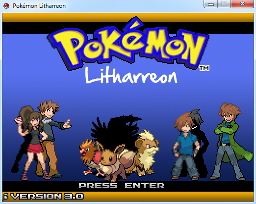
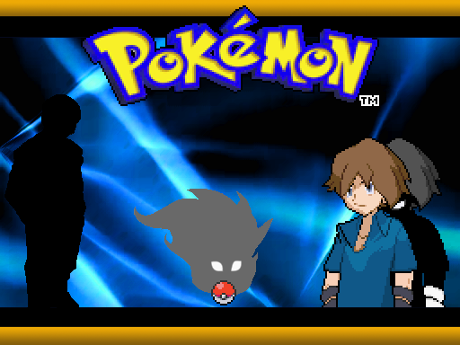
now to my screenshot, its not much a screenshot, but it's seriously bugging me - I need critique on it, I hate it, but it seems pretty okay, but I need some advice and criticism:
Spoiler:
First off, you really need to work on composition. Right now, all characters are just lined up. Try mixing it up by having them in different distances from the viewer. Try looking at movie posters for inspiration. Also since Pokémon sprites are bigger scale than trainers, it looks like the people are very small.
Secondly, no background is a big minus.
The evil-shadow behind the guy on the right is a nice touch though and is a great idea for things like a titlescreen.
Also: Don't feel restricted by the borders that exist in a standard title screen. Try making something completely original.
Lastly, don't use the in-game sprites for a titlescreen. A titlescreen is supposed to be something epic that will draw players into wanting to play the game. Try making original sprites for the characters, in differents sizes and make a cool composition. It will look a lot better, even if the spritework may not be top notch.
I'll work on the other problems and I see what you mean, but the gradient background isnt good? I'm not sure what else to use, but I'll think of something
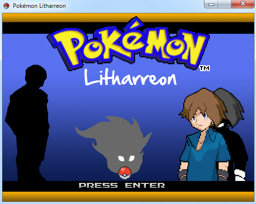
- Well, I've been working on it, and I have something halfway decent, but I'm not quite sure what type of background would fit...
Spoiler:


I like everything, but the lack of shadow below the Pokemon and the split between the characters is pretty abrupt. Maybe a little detail on the separation? Like a flash of lightning or something.. idk.
In Magic: The Gathering, there is a mechanic called Split Second and the mechanic is often reflected in the art, and it is a really neat split concept for opposition or change.
http://www.wizards.com/magic/images/mtgcom/products/timespiral/creative2_l97xjj11t7mxvx3r.jpg
or
http://www.epilogue.net/sites/default/files/imagecache/gallery_lg/images/06/38/36331_1159156800.jpg
or
http://www.wizards.com/magic/images/cardart/TSP/Word_of_Seizing.jpg
I feel like it would be a decent execution of the concept even on a title screen as it creates action and interest while keeping things busy
Even altering something like a pixel picture of a forest to have part of it on fire or something, as opposed to the gradient.
They are the HGSS Follow me's, not dolls, and they were only in there for the screenshot.the dolls are a little offputting, you should make them more doll-like, at first I mistook them for pokemon, but then I thought it'd be weird so it must be dolls
other than that the center seems a little cramped but I suppose its fine the way it is
I think the contrast on the counters is too little.
Also: A more orangey, or at least lighter red, color would be better for the wall.
It doesn't look great when its the same as Nurse Joys counter.
Other than that, I think it looks really nice :D
Your new one looks A LOT better!
The problem I have with your background is that the gradient have too many colors, and the gradient isn't high contrast enough. I can barely see that the background is chganging color. Since the rest of it is pixel art, why isn't the background?
This is my Titlescreen:
(I'd like some feedback on mine aswell! :P)
Still, I love your new sprite and evil-shadow, along with the mysterious shadow on the left.
You might want to have something more on the left side, that isn't a shadow, to give the composition more balance!
Keep up the good work!
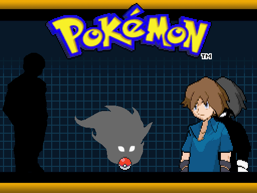
as for your advice, I've been working on the placement to get it down, but I'm not sure what else I can add to balance the composition out without making it too cluttered
(and also I like having the shadow in the back left, as there isnt much to draw attention to it, yet it still catches your eye; similarly, you never see the main antagonist until the end, yet he is mentioned and he catches your attention)
as for the gradient, I suppose it doesnt really fit, or maybe I should make it more drastic - I'm not sure x.X anyway - I took your ideas and made two (though I think #1 is the better of the 2) one is more drastic changes as well as interesting - while the other is more pixel art, and sort of cool - I'm not sure, I'm driving myself mad trying to make the perfect backgorund
Spoiler:#1#2Spoiler:Spoiler:

I see what you're saying - as for your screen, it seems a little abrupt with the change, I suppose its fine like that but they look very different, as one's hat is comparably larger than the other it seems a bit off-putting, and the backgrounds are also very differently shaded so clashing them together doesnt really blend well, but at the same time the contrast is still very interesting, maybe if the two sides were a little more symmetrical or asymmetrical - because there is too much of both right now - it should be one or the other, and I think you're looking for symmetry
Overall I like it a lot, but it could use some changes
as for your advice, I've been working on the placement to get it down, but I'm not sure what else I can add to balance the composition out without making it too cluttered
(and also I like having the shadow in the back left, as there isnt much to draw attention to it, yet it still catches your eye; similarly, you never see the main antagonist until the end, yet he is mentioned and he catches your attention)
as for the gradient, I suppose it doesnt really fit, or maybe I should make it more drastic - I'm not sure x.X anyway - I took your ideas and made two (though I think #1 is the better of the 2) one is more drastic changes as well as interesting - while the other is more pixel art, and sort of cool - I'm not sure, I'm driving myself mad trying to make the perfect backgorund
Spoiler:#1#2Spoiler:Spoiler:
I tried fixing the split and adding shadows to the Pokémon.
I also recentered and added some borders.
HAHA! XD
I was hoping noone had time to post yet, so I could edit my post.
I just did that. :P
I plan to make the sprites of the pokemon much softer as well, when I have time XD
I would actually, probably leave them and maybe soften up the BG just a touch then adjust the trainers to be honest. The trainers look much more anime still, which looks a bit awkward I think, but Damn that is starting to look good :D