• Our software update is now concluded. You will need to reset your password to log in. In order to do this, you will have to click "Log in" in the top right corner and then "Forgot your password?".
  • Welcome to PokéCommunity! Register now and join one of the best fan communities on the 'net to talk Pokémon and more! We are not affiliated with The Pokémon Company or Nintendo.

Map Showcase and Review Thread

Status
Not open for further replies.
55
Posts
10
Years
  • Seen Jul 21, 2015
*Sigh* sorry for my critique, but i see a lot of problems

If coming from the left,

Your route is pretty much a walkway. You can avoid ALL the grass.

I dont like the fact the ledges are STILL easy to pass, and in weird places. It would be different is the were facing the opposite direction.

IF FROM THE RIGHT

Essentially the same thing.


Also,
You have tress on the mountain with a green bottom part when it is a rock.

Your grass doesnt have a border for transitioning with snow. Same with the trees. It looks to perfectly even .

That's fine! {XD} Whatever people tell me I can learn from, so thanks! :P And for the trees, I was eventually going to add some with bottoms of snow, like all snowy trees, and some without grass on the bottom for that.
 

Nickalooose

--------------------
1,309
Posts
16
Years
  • Seen Dec 28, 2023
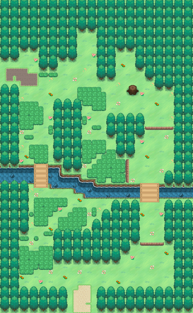
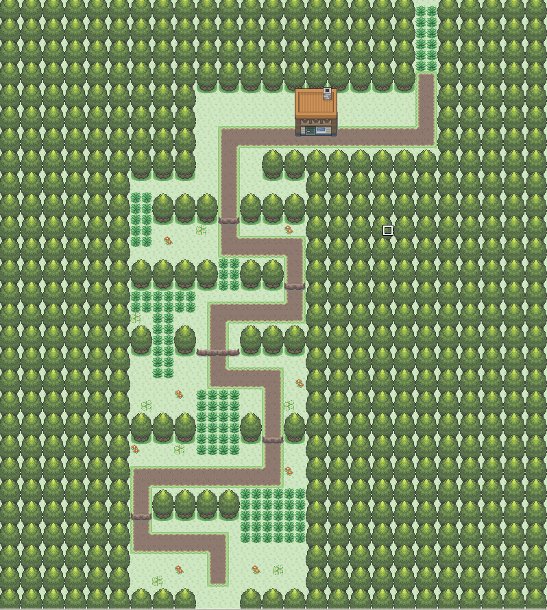
@kronos, your map looks fine except for the snow/grass mixture... The ledges going from left to right are fine, there's nothing stopping a player going from a town to the next HAVING to traverse through lot's of grassy patches but coming back VIA a ledge, Pokémon RBY did it from Viridian to Pallet, why can't you do it... And from Cerulean all the way to Vermillion, you could avoid every grass patch of you wanted... P.S, there is already a tree with a snowy base.

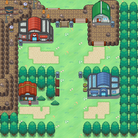
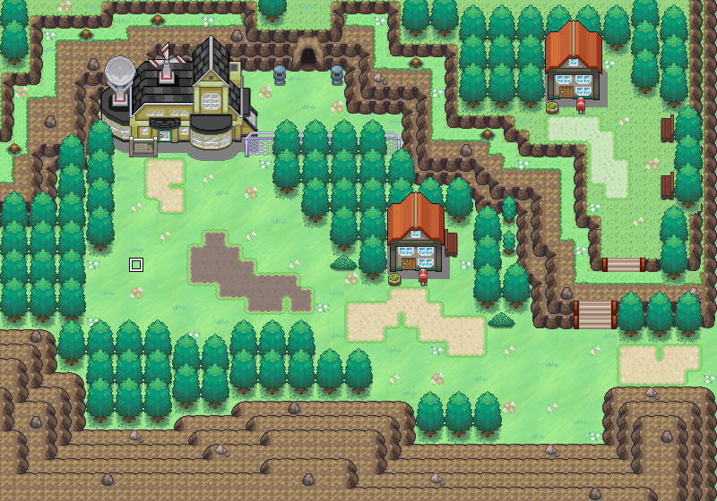
Your town is too spacey... Fill it out a little or shrink the map a few sizes... Otherwise, no complaints (except the snow/grass mixture as before).

@KirakonGxi, your map looks pretty good, except the double house, needs some spriting work for definite, your fences need to have an end part of the fence, but everything looks pretty good in my opinion... I don't like, however, the mixture of picket fences and log fences, stick to one or the other (the log ones look fine), although the picket fence on the west most exit is fine as it is, but the mixture of logs looks awful... The city also has a height of 2, but the west most wall has no end, lowering the 1 wall then adding the 2nd will look much better.

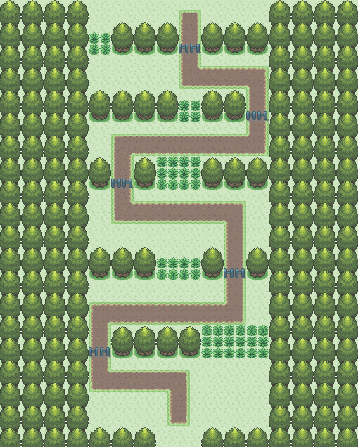
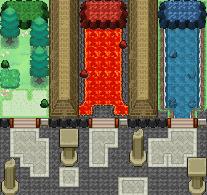
@Elarmasecreta, I don't like those tiles, prefer HGSS style or DPPT, but from what you've made, it's pretty basic, nothing pops out, there are no obstacles so the path is pretty clear cut, quite boring if you ask me, give the town some life, the entrance to the town (south), is a little large, I never liked large entrances unless used well, in this case, I don't think it is, I think adding trees would suffice.

@kronos, kirakonGxi and Elarmasecreta... I like the tree layouts, very natural.
 

Wootius

Glah
300
Posts
11
Years
  • Seen May 31, 2022
Not to be rude but... Nobody has anything to say about my maps? I've made sure to comment on a few maps every time I've posted one and no one, not even when you've responded to my comments has said anything about them.

KirakonGxi, I love it. The lamp/fence usage and that great pond. The ridges feel a bit cramped to me and don't you have some doodad flowers instead of just grass tile ones? A lamp on the bottom right might look good too.
 
55
Posts
10
Years
  • Seen Jul 21, 2015
The new Route 4, to Sable City. It connect to the southern part of the end of Route 3
51f07708aba86.jpg


My starting town
Spoiler:

Hey that route looks pretty nice! :) It looks like it would be in a desert or like victory road or someplace. Looks kind of forbidden or something.
As for the starter town, try adding a border for one thing. And I see a couple of errors at the top of the map, with the pond. And there is white in the background of some tiles. Either not transparent, or in the wrong layer. Either way, nice work! :)
 

Wootius

Glah
300
Posts
11
Years
  • Seen May 31, 2022
Yeah, switching between paint and paint.net messed up my tilesets. What do you mean by add a border? You mean the rest of the trees?

The route looks evil because of those dark rocks, you're used to the reddish ones. I've made the second half of Route 3/Mount Moon more barren. Kanto is supposed to be a bit barren, but the Game Freak mappers are lazy sods.

Thank you for reviewing.
 
55
Posts
10
Years
  • Seen Jul 21, 2015
Yeah basically the rest of the trees. Sort of like this:
Spoiler:

Trust me, i'm terrible with borders. I almost never add borders and people always tell me to. xD

AAANNNDDD I made another map. I whipped this up in about 30 minutes. It's the forest after Route 01, Verdigris Forest. Verdigris is a synonym to Viridian. :)
verdigris_forest_by_0_rufus-d6fcy3q.png
 
Last edited:

Wootius

Glah
300
Posts
11
Years
  • Seen May 31, 2022
It's good. I feel it's a bit wide on the right and you forgot about the river bank on the side, but you have non-solid grass and nice doodad placement.

One thing you could look at is placing tree a bit crookedly. A picture works best here I think. If this was more then a 30 second slapjob there'd be tree layering too.
51f371447d0e7.jpg
 

Harvey_Create

Pokemon Apex Team Member
187
Posts
11
Years
  • Age 27
  • Iowa
  • Seen Jul 12, 2015
That's fine! {XD} Whatever people tell me I can learn from, so thanks! :P And for the trees, I was eventually going to add some with bottoms of snow, like all snowy trees, and some without grass on the bottom for that.

I'm happy to took it as criticism. I had the same things said to me way back when i started. And if you can sprite it, do it. lol A lot of my tiles are becoming custom as I want certain "No Outline 3D" tiles. So ill have to resprite them.

Yeah basically the rest of the trees. Sort of like this:
Spoiler:

Trust me, i'm terrible with borders. I almost never add borders and people always tell me to. xD

AAANNNDDD I made another map. I whipped this up in about 30 minutes. It's the forest after Route 01, Verdigris Forest. Verdigris is a synonym to Viridian. :)
verdigris_forest_by_0_rufus-d6fcy3q.png

Toward the right of the map, move the river down 1 tile.
 
Last edited:
55
Posts
10
Years
  • Seen Jul 21, 2015
I fixed the river thing in Verdigris Forest. It's on my deviantart.

Sorry to keep spamming with so many maps, I just keep making new ones. xD
So here is the town after the forest. Still deciding whether it should be a side town, or a main town. Probably a side town, as I might make a bigger town with the 1st gym.
2nd_town_by_0_rufus-d6fezl6.png
 

Radical Raptr

#BAMFPokemonNerd
1,121
Posts
13
Years
Here's a route I cranked out in about 15 minutes

route_1_by_pokemoner2500-d6ff1gf.png

it really shows that it was done in 15 mins - its way too bland for a route, theres no...flow, it feels like it was forced, you might as well have made it a straight path
after a certain point the player would be able to see the boring pattern, and get bored with it, and plus theres nothing eye catching

the colors (in my opinion at least) do not go together at all, and are an eyesore - like its like having yellow text on a white background

it also looks very empty, theres really nothing the player would enjoy from it, it's just so empty and boring, there needs to be more, mix things up a bit
 

Harvey_Create

Pokemon Apex Team Member
187
Posts
11
Years
  • Age 27
  • Iowa
  • Seen Jul 12, 2015
Here's a route I cranked out in about 15 minutes

route_1_by_pokemoner2500-d6ff1gf.png

I have yo agree with Saving Raven. It is very boring. *Cue Rant Time* I hate how people map out very boring things, or open maps. I know i used to do it, but instead of asking for critiques for every map, I studied other peoples maps. Like Abnegation's Maps. They were highly detailed, and influenced me. I know critiques help people out, but some people on this thread will take the help, and recreate it exactly. If I build an example for you to go off of, don't Recreate it exactly. That's basically stealing. But i hope you don't take this wrong. I would feel bad. Haha. Just my rant.

I would recommend:

~Rounding out the map. Add 2 trees going each direction in the corners would help.
~Vary up the terrain. Its quite uniform. Rather then Go right, up, left, up, right, up. Try doing right, up, left, down, left, up, right. up, left, down, right up. (Randomly typed, so i dont think there are any loops in that. :P


Hope this helps.
 

Wootius

Glah
300
Posts
11
Years
  • Seen May 31, 2022
Just the grassy side path helped it look that much better. The ledges fit the dirt path better then the fences did too. Just be sure to set the house off the road.
 

Rayquaza.

Lead Dev in Pokémon Order and Chaos
702
Posts
12
Years
Added some flowers moved a few things and added a lot

route_1_by_pokemoner2500-d6fjtif.png

Sereious problem(s) with the map; too much path usage; too much empty space and a randomly placed house. The house just looks unnecessary because of its position in the map. Try adding some flowers or rocks but not too randomly. It can be a nice map but must first have character to it.
 

pkmn.master

Hobbyist Game Developer
299
Posts
15
Years
  • Age 28
  • USA
  • Seen Jun 7, 2022
New starter town for my game:
starter_town_1_by_0_rufus-d6fvm6f.png

Very nice concept. The map is clean in layout, but does need to be busier in features. In the general walking area of the lower left part of the map between the house and the lab needs some TLC. There is too much empty space. Place some trees or raised mountain to close the area up some. In the upper right hand corner, there are three trees overlapping the side of the mountain, move them over one space to the left along with the benches to close up that wide space some.

Also, your paths look a bit disfigured, which is nice, but fill in the small "pinches" of grass, since it doesn't look very natural.

Added some flowers moved a few things and added a lot

route_1_by_pokemoner2500-d6fjtif.png

The map is kind of bland, but not too much to worry about if this is a first or second route in the game. Still, spruce it up with some randomly placed trees to make it look more natural and avoid too much empty space. Try and create some dented areas around the perimeter, since it is somewhat square. The pathway is somewhat too perfect, try and create some distortion in it or remove it all together and see how it looks. The upper area by the house needs some work also, keep the house off of the path and try to add in some more vegetation to the space on the left and right sides of the house.
 
Last edited:
55
Posts
10
Years
  • Seen Jul 21, 2015
This is where you choose your starter. It is the cave behind the pokemon lab. I might make it to where there are actually about 4 starters though. Fire, Grass, Water,and a fakemon line i'm working on (Eevee like)

Now I know some other people have done things like this, but it technically isn't SOMEONE's idea.
starter_selection_cave_by_0_rufus-d6fwx48.png
 

Radical Raptr

#BAMFPokemonNerd
1,121
Posts
13
Years
This is where you choose your starter. It is the cave behind the pokemon lab. I might make it to where there are actually about 4 starters though. Fire, Grass, Water,and a fakemon line i'm working on (Eevee like)

Now I know some other people have done things like this, but it technically isn't SOMEONE's idea.
starter_selection_cave_by_0_rufus-d6fwx48.png

I'd say there's nothing wrong with an idea like this - as everyone tends to have the same general idea - but gives it their own personal flare (which would be similar to saying someone came up with the idea of a rock-paper-scissor type trio and no one else can use it)

to comment on it however, there are several problems:
-They all seem too long, you should shorten it a few tiles
-The grass one is pretty good, not many problems there
-The fire one - while most fire pokemon probably wouldnt mind lava, it seems a but ridiculous for majority of it be lava with a tiny bit of land, also the rocks are placed in such a way that it is breaking dimentions (ie, half on one surface while on another that is either non existent or not equal) - it needs to have one land tile for itself
- The water one seems fine, but personally I'd make it more of a beach
-Finally, on the fire and water one, the mountains look odd in the way that they are barely attached to land, and then hang over the liquid

Overall its a nice idea, and with some changes it could look amazing
 
99
Posts
14
Years
  • Seen Jan 16, 2023
This is where you choose your starter. It is the cave behind the pokemon lab. I might make it to where there are actually about 4 starters though. Fire, Grass, Water,and a fakemon line i'm working on (Eevee like)

Now I know some other people have done things like this, but it technically isn't SOMEONE's idea.
starter_selection_cave_by_0_rufus-d6fwx48.png

Assuming you don't walk on liquid, how does one access the fire and water starter?

On a side note, I wish this thread was more active. I love to see maps people make, it's eye bleach for me. I might contribute some maps too soon since I'll be making maps in PokeSharp for testing purposes.
 
Status
Not open for further replies.
Back
Top