• Our software update is now concluded. You will need to reset your password to log in. In order to do this, you will have to click "Log in" in the top right corner and then "Forgot your password?".
  • Welcome to PokéCommunity! Register now and join one of the best fan communities on the 'net to talk Pokémon and more! We are not affiliated with The Pokémon Company or Nintendo.

Help Thread: Map Rating/Review Thread

Status
Not open for further replies.

marcc5m

what
1,116
Posts
13
Years
Looks like we're back to "high number/10 for a map that needs major improvement.

Map Name: Kajoten Town

Map Game: Fire Red

Comments: I'm new at mapping and this might have errors that I didn't see, if it does can you tell me exactly where. This is the starter town in my hack Pokemon Lost Time, in this hack i will be introducing The Doctor from Doctor Who and his Tardis.
Spoiler:

Umm...You're not new at mapping at all, I remember seeing this map last year--along with your other maps--and telling you you should post here. Took a while. :\
Anyway, the first god thing about this map, is that the Doctor will be in it.
That's it.
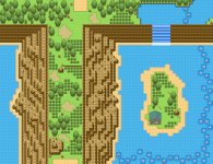
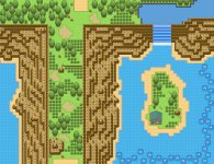
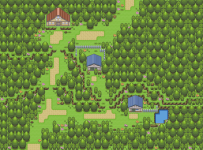
First of all, you have tall grass in a Town. Accessible tall grass. By the looks of it, you could maybe get to it without having a starter Pokemon. It should not be there. If you made it only accessible through Surf, and not just a tiny little patch in the middle of a Town, it'd be fine. There are tile errors all over the dirt path and the mountains. For instance, the transition between the puddle--which is not needed and looks incredibly random--is...there isn;t a transition. It goes into a little bit of grass and then randomly goes back to the path. Btw umm...you do know how to use the block editor, right? Those rocks on the grass, but with mountain underneath them look really bad. Actually, FireRed has rocks with grass underneath them already. :\ There is not a single tree in this town. And the mountains are incredibly straight and narrow, and should not be used as a border for any place other than a cave. Now you're going to have to make the border block grass, and it'll look bad. So many one tile and two tile paths too. You need to widen the map to give the player more room to walk. Flowers are incredibly unnatural too. Then again the whole map is tbh. :\ Have a loot ak some of the maps in this thread by Colcolstyles, DrFudgey and QuilavaKing if you want to see what you're doing wrong and what it should be like. I feel there's more I can say but I'm too lazy so bye.
 

Quilava's Master

Shattered Dreams '13
694
Posts
16
Years
  • Seen Aug 14, 2023
8/10

I love forest theme maps, but i feel its a bit crowded, try widening up some pathways and use up some of that space you don't even see. the tiles fit well too.

Mine-v

Map: Littleroot Town
Rom: FR
Hack: Emerald Remake (no official name yet or thread..)
Comments: Began a remake of the story on Emerald on Fire Red, going to be different scripts, more events etc tho. and I'm trying to spice up all the old towns yet keep the original shape/size. It looks a lot different but resembles Littleroot still to me.

ojpnrn.jpg

Thoughts and Suggestions?
EDIT: the picture smudges are not tile errors, just the image is blurry
First things first, why so many fences? They all look randomly placed as in whether or not they're there, they have no bearing on the map. I like that you're using more than one grass tile but there are patches with no tufts of grass making it [the map] look extremely uneven in terms of grass. The flowers are a nice touch. The door on the lab looks weird. Well not so much the door but above the door it looks like the door was cut off. If anything else this map looks extremely boring. [This was also a flaw with the original Littleroot Town as well].

Rating: 6/10

9/10 Your map looks very good, I like the tileset you inserted,
how you mixed tilesets and kept your map simple.


Map Name: Kajoten Town

Map Game: Fire Red

Comments: I'm new at mapping and this might have errors that I didn't see, if it does can you tell me exactly where. This is the starter town in my hack Pokemon Lost Time, in this hack i will be introducing The Doctor from Doctor Who and his Tardis.
Spoiler:

Oh boy, where to start. Well first things first, the cave leading out into the mountain looks...bad? It would look better if there was one entrance [a double sized one] that led to a piece of land where the player had the option to Waterfall down and subsequently Surf. Right now it looks like the player would be forced to automagically Waterfall down and then Surf [whether or not they had a Pokemon knowing the required move]. I foresee a buttload of border block errors. All of which could have been avoided. Tall grass in a town? Not a good look. Why is there a sign in the puddle? Also the path looks WAY overused. There's no normal grass at all, just path which doesn't really look good. There are a lot of tile errors with the mountains [as in you're using ones with grass underneath as opposed to having mountain underneath]. The houses are hideous as they are WAY too small. Also you need to expand the stairs [all of them uptop] since it should be two tiles wide. I spy a tile error with the rocks that are randomly placed around the map. Some of them have mountain underneath despite being on grass. None of the houses have windows which is highly illogical. This map needs a lot of work.

Rating: 2/10
 

jabberjabber8

../\..
213
Posts
13
Years
8/10
Map: Littleroot Town
Rom: FR
Hack: Emerald Remake (no official name yet or thread..)
Comments: Began a remake of the story on Emerald on Fire Red, going to be different scripts, more events etc tho. and I'm trying to spice up all the old towns yet keep the original shape/size. It looks a lot different but resembles Littleroot still to me.

ojpnrn.jpg

Thoughts and Suggestions?
EDIT: the picture smudges are not tile errors, just the image is blurry

I am not quite sure where you are going with his map, its either a full copy of little root or its not, and if you decide it is not you really need to make it more interesting.
Now rant over on to the rating, your tiles are not flawed and the layout of the town is good (If a bit boring) the only concerns I have are the over use of fences, One would be fine in a town this size. Also I think you have gone a bit over the top with the flowers but that is a matter of opinion
If I were you, I would stop trying to make it look like little root, and and start the town over from scratch, littleroot was boring to start with...

My map:
Inspiration from this map came from a map posted here by R0bert I had some spare time and decided to try and a similar idea, so credit to him,
Route: N/A
Hack: N/A
Footnotes: This is a very large map you may need to enlarge it (by clicking it) then enlarge it again after that to open it in a new window (by clicking it again)
 

Attachments

  • Test map.jpeg
    Test map.jpeg
    267.8 KB · Views: 109

M.L

Invisible
761
Posts
13
Years
  • Seen Dec 21, 2017
I am not quite sure where you are going with his map, its either a full copy of little root or its not, and if you decide it is not you really need to make it more interesting.
Now rant over on to the rating, your tiles are not flawed and the layout of the town is good (If a bit boring) the only concerns I have are the over use of fences, One would be fine in a town this size. Also I think you have gone a bit over the top with the flowers but that is a matter of opinion
If I were you, I would stop trying to make it look like little root, and and start the town over from scratch, littleroot was boring to start with...

My map:
Inspiration from this map came from a map posted here by R0bert I had some spare time and decided to try and a similar idea, so credit to him,
Route: N/A
Hack: N/A
Footnotes: This is a very large map you may need to enlarge it (by clicking it) then enlarge it again after that to open it in a new window (by clicking it again)

i have to say and not being harsh your routes are much better than your towns lol i like this map placement of trees are good and the concept is very nice some things arnt my style but thats not my choice lol..... 8/10

ohk so my map yeah i started my game over and got some freinds to help insert tiles so all only a few tiles are inserted(credit anbuuja EC marxville)

its just the first town i dunno is it a bit too random i would like to know? and any other comments those houses do suck they are getting replaced dont worry well here
town1.jpg
 

DrFuji

[I]Heiki Hecchara‌‌[/I]
1,691
Posts
14
Years
My map:
Inspiration from this map came from a map posted here by R0bert I had some spare time and decided to try and a similar idea, so credit to him,
Route: N/A
Hack: N/A
Footnotes: This is a very large map you may need to enlarge it (by clicking it) then enlarge it again after that to open it in a new window (by clicking it again)

I'd like to congratulate you on making a very playable map, there is plenty of space for the player to walk around. Unfortunately, while it looks fun to play the style varies quite drastically in some areas, making it aesthetically muddled.

The effort you seem to have put into constructing your mountains and beaches varies quite significantly. Compare the cliffs lining the main body of the route to those surrounding the waterfall - They look quite different don't they? You've transitioned very quickly from a random and 'natural' cliff face to one that his as straight and unimaginative as possible. As a consequence of how your mountains are constructed, your beaches also suffer from having to live in the long and straight line of the cliff.

I guess the same thing could be said of the main body of your route as well (Though it may not be as noticable as the cliff face). The completely straight borders you have provided running up and down the sides of the main walkway are sandwiched between your random placement of trees and the well done crags of the lower mountain levels. While I have nothing against making the map easier to make or traverse, the straight lines of the upper mountain really do go against the 'natural' style you have been cultivating throughout most of the map.

Finally, I believe you could better construct the the body of water above the waterfall. Currently the water looks strange as it appears to be at the same height as the cliff edge as it doesn't have something like a riverbank indicating otherwise. I'd suggest you construct some tiles similar to tiles 224 - 26 in a regular FR tileset and provide the water with a simple but aesthetically pleasing bank. Also, I think you should rethink the area at the bottom of the waterfall, as I doubt you've prevented the player from seeing the border.

This is a very good and playable map, but your sudden and dramatic change in mapping styles takes away some of it's coolness. Other than that it, I'm sure that it would look and play very nicly following a few tweaks :D

ohk so my map yeah i started my game over and got some freinds to help insert tiles so all only a few tiles are inserted(credit anbuuja EC marxville)

its just the first town i dunno is it a bit too random i would like to know? and any other comments those houses do suck they are getting replaced dont worry well here
town1.jpg

I'm afraid I'm going to have to be brutally honest here; there is very little to be excited about in this map. It is plain, boring and seems to have little thought put into how it was constructed. This map only has four elements to it: large trees, water, houses and paths - Where are the flowers, mountains, small trees, signs, rocks and fences? There are so many more things that you could have put into this map to make it bright and interesting, whereas right now it is extremely empty. Fill up your empty space with auxillery pieces - They're in tilesets for a reason. Also, that small island in the water really shouldn't exist, as the player can't walk on it and just looks weird jutting out like that.

I'm sorry to be so critical, but this map really needs a lot more work put into it to make it interesting. Keep adding to this map if you want to bring out it's full potential.
 

Chiar

327
Posts
13
Years
  • Age 25
  • Seen May 5, 2014
The map is uninteresting. The paths are scattered pretty randomly around it and there are no ornaments which make the map more interesting (even flowers could help a bit). The pond has an unnatural, symetrical shape and the island on it is completely unnecessary. 3/10.
Map Name: Route 135
Map Game: Emerald
Comments: A small, simple route (first in the game). It has some errors with tree shadows, as I'm still thinking about how they should look alike.
Spoiler:

@down
tile errors there are quite a few lol
Huh? I'm sure that I only have errors with the tree shadows. If you think the "cutted down trees" are an error, they actually go on the next map normally without any anormalities.
 
Last edited:

M.L

Invisible
761
Posts
13
Years
  • Seen Dec 21, 2017
lol i would of added more things as were still busy with the tiles so they are still being added fixed ect i will post this map again once i fix it up
Map Name: Route 135
Map Game: Emerald
Comments: A small, simple route (first in the game). It has some errors with tree shadows, as I'm still thinking about how they should look alike.
Spoiler:
its not bad i can definatly see its the first route
tile errors there are quite a few lol but you can just fix that uhm well i can see its basically the same as most first routes in E/R/S so maybe mix it up a bit but other than that its good....... 6\10
 
1,344
Posts
14
Years
  • Seen Dec 10, 2021
ohk so my map yeah i started my game over and got some freinds to help insert tiles so all only a few tiles are inserted(credit anbuuja EC marxville)

its just the first town i dunno is it a bit too random i would like to know? and any other comments those houses do suck they are getting replaced dont worry well here
town1.jpg
First of all, that map is way too empty, the houses are constructed wrong, and it just seems uninteresting. It's just a straight line with two houses pretty much. try adding some more decoration (flowers, bushes, small trees, fences) and general shape to it because it's just dull. it also looks like you'd have some border problems. 2/10
----------------------------------------------------
Map Name: Lush Town
Map Game: FR
Comments: My first map in a while. it's for a private project of mine.
Spoiler:

Credits to Zein for the log.
 

jabberjabber8

../\..
213
Posts
13
Years
Map Name: Lush Town
Map Game: FR
Comments: My first map in a while. it's for a private project of mine.
Spoiler:

Credits to Zein for the log.
I know this thread is not to review tiles but at the end of the day they effect the overall look of the map, so it seems odd that you have inserted 2 tiles but kept nearly all of the fire red tiles, This gives it a unfinished look, either keep the tiles or insert new ones. Onto the map there are no tile errors I can see so well done with that, the town has a nice structure, However You might want to keep the path the same width through out (it gets larger in front of the lab)
Congratz fix the tiles and the path and I don't think I can fault this map...

..........................................................................................

Base: N/A
Route: N/A
As I said last time credit where credits due, Inspiration for this map came from a map posted here by R0bert
I was told to fix the mountains, the lake and the path down the middle, I think I have fixed the mountains, I had a crack at fixing the lake but I am not sure if it worked. Also I am sorry to say i am happy with the path in the middle and do not want to mess with it.
 

Attachments

  • test map 2.jpg
    test map 2.jpg
    273.5 KB · Views: 60

DrFuji

[I]Heiki Hecchara‌‌[/I]
1,691
Posts
14
Years
Map Name: Lush Town
Map Game: FR
Comments: My first map in a while. it's for a private project of mine.
Spoiler:

Credits to Zein for the log.

This is a nice map, chrunch. There is good room for the player to move about and I think it is very lively.

There are a number of tree shadowing errors which need attention (they are mostly confined to the trunks of the trees lining the top of the map but I can see two elsewhere). The trees directly below your lake will also appear to have errors as a result of the border block, so I suggest you make the map larger and insert another row of trees with the shadowing they should have. The cut down tree in the centre of the map is a bit useless as it forces the player to got into a one-tile path, so I think that it could be placed better. Finally, I think you could create and then insert two extra tiles to your lake - Corner tiles for the bottom right curves (which will be similar to inverting tiles 130 and 131 in a regular FR ROM). It will make your map seem more complete and wouldn't hurt to try :3

Anyway, I congratulate you making a nice map with lovey tiles :D

Base: N/A
Route: N/A
As I said last time credit where credits due, Inspiration for this map came from a map posted here by R0bert
I was told to fix the mountains, the lake and the path down the middle, I think I have fixed the mountains, I had a crack at fixing the lake but I am not sure if it worked. Also I am sorry to say i am happy with the path in the middle and do not want to mess with it.

Those upper mountains are looking much better :D

While you've used the 'riverbank' tiles for your lake above the waterfall, they should only be lining the mountain top, not the waterfall itself. Similar to what I said to chrunch, inserting corner tiles for the bottom riverbank curves would only improve you map and make it look more complete. I guess the only other thing I can say is that it appears like you can escape the map when surfing below the waterfall, as there is nothing to stop you when the boundary rocks meet the coastline. Use tiles similar to 1F8, 1F9, 200 and 208 in a regular FR ROM to prevent the player from surfing and escaping beyond the rocks.

Other than that, you map is still looking very nice and you never needed to change the boundaries of the path in the middle if you didn't want to :)
 

~Anbuja

Let's Keep It Simple
321
Posts
13
Years
I know this thread is not to review tiles but at the end of the day they effect the overall look of the map, so it seems odd that you have inserted 2 tiles but kept nearly all of the fire red tiles, This gives it a unfinished look, either keep the tiles or insert new ones. Onto the map there are no tile errors I can see so well done with that, the town has a nice structure, However You might want to keep the path the same width through out (it gets larger in front of the lab)
Congratz fix the tiles and the path and I don't think I can fault this map...

..........................................................................................

Base: N/A
Route: N/A
As I said last time credit where credits due, Inspiration for this map came from a map posted here by R0bert
I was told to fix the mountains, the lake and the path down the middle, I think I have fixed the mountains, I had a crack at fixing the lake but I am not sure if it worked. Also I am sorry to say i am happy with the path in the middle and do not want to mess with it.
This map looks more better than the others of you:)(not meant bad)
as dr/fuji said the waterfall should have those tiles like that but this is easy to fix.the mountains are an thing i like on this map too but the way shouldnt be so straghit but the others of the mountains are very nice:)
rating 8/10
_______________
So To My Map:D
Map name : Devika Town
Description: The first town you get after the starting town:D
game:Pokemon legend of Anbuja
credits: are on my deviantart:)
Spoiler:
 

NurseBarbra

くら くら?
322
Posts
13
Years
  • Age 29
  • Seen Feb 4, 2017
Blah Blah Blah
Better dust off my ranting skills...
Ok so. First off, the shape of the map is very nice and flows well, the ponds are a little TOO square, and the paths wouldn't hurt to be connected... + 7 points

The Tiles are nice, And I am intrested in how you inserted the houses. the rock looks a little off but that I can let slide.. + 3 points.

As for playability? The map feels open enough to play through, yet closed enough to have direction. + 4 points.

Altogether: 7+3+4 / 20 = 14/20 = 7/10 (B / 70%)
 

Quilava's Master

Shattered Dreams '13
694
Posts
16
Years
  • Seen Aug 14, 2023
i have to say and not being harsh your routes are much better than your towns lol i like this map placement of trees are good and the concept is very nice some things arnt my style but thats not my choice lol..... 8/10

ohk so my map yeah i started my game over and got some freinds to help insert tiles so all only a few tiles are inserted(credit anbuuja EC marxville)

its just the first town i dunno is it a bit too random i would like to know? and any other comments those houses do suck they are getting replaced dont worry well here
town1.jpg
I must say, the houses are definitely off-putting. Overall the map is more than a little boring. There are only two houses and no place with two houses could logically be called a "town"/"village" etc. The random pond is a nice touch. The paths are random and don't look very good at all; not to mention they are only two tiles wide. The trees are also pretty randomly placed and as someone stated earlier there are no ornaments in town [ornaments being flowers, benches, mailboxes, signs etc.] which makes it look extremely boring.

Rating: 1/10


The map is uninteresting. The paths are scattered pretty randomly around it and there are no ornaments which make the map more interesting (even flowers could help a bit). The pond has an unnatural, symetrical shape and the island on it is completely unnecessary. 3/10.
Map Name: Route 135
Map Game: Emerald
Comments: A small, simple route (first in the game). It has some errors with tree shadows, as I'm still thinking about how they should look alike.
Spoiler:

@down

Huh? I'm sure that I only have errors with the tree shadows. If you think the "cutted down trees" are an error, they actually go on the next map normally without any anormalities.
Meh this map looks exactly like Route 101 from Hoenn with a few added trees and grass. The path curves near the bottom and just looks off. Also there are MANY tree shadow errors. So much so that it is actually distracting. I mean there really isn't much to say about this map other than it lacks serious creativity. It'd be a good idea to start the map from scratch instead of using Route 101 as yoru starting point.

Rating: 2/10

First of all, that map is way too empty, the houses are constructed wrong, and it just seems uninteresting. It's just a straight line with two houses pretty much. try adding some more decoration (flowers, bushes, small trees, fences) and general shape to it because it's just dull. it also looks like you'd have some border problems. 2/10
----------------------------------------------------
Map Name: Lush Town
Map Game: FR
Comments: My first map in a while. it's for a private project of mine.
Spoiler:

Credits to Zein for the log.
Ah well done. This map is fairly flawless. The only issues I see are that the path gets wider near the lab and that there are a few tree shadow errors you should attend to. It's not bad just odd. Also the path near the upper middle house curves up and leads nowhere. That's weird too. The fences are a nice touch and used well. Above all, however, is that I really love the simplicity of the town. It definitely gives off the vibe of being a starter town.

Rating: 9/10
I know this thread is not to review tiles but at the end of the day they effect the overall look of the map, so it seems odd that you have inserted 2 tiles but kept nearly all of the fire red tiles, This gives it a unfinished look, either keep the tiles or insert new ones. Onto the map there are no tile errors I can see so well done with that, the town has a nice structure, However You might want to keep the path the same width through out (it gets larger in front of the lab)
Congratz fix the tiles and the path and I don't think I can fault this map...

..........................................................................................

Base: N/A
Route: N/A
As I said last time credit where credits due, Inspiration for this map came from a map posted here by R0bert
I was told to fix the mountains, the lake and the path down the middle, I think I have fixed the mountains, I had a crack at fixing the lake but I am not sure if it worked. Also I am sorry to say i am happy with the path in the middle and do not want to mess with it.
Okay first things first, I really like this map. It's probably the best one I've seen posted by you [this is a compliment]. There is a tile error in front of the waterfall. I love the sand tiles and the path you used. The island in the middle of the water looks good if not a little too narrow. Also it would help if there wasn't so much free space on the island behind the house. Overall the map looks great.

Rating: 8/10
This map looks more better than the others of you:)(not meant bad)
as dr/fuji said the waterfall should have those tiles like that but this is easy to fix.the mountains are an thing i like on this map too but the way shouldnt be so straghit but the others of the mountains are very nice:)
rating 8/10
_______________
So To My Map:D
Map name : Devika Town
Description: The first town you get after the starting town:D
game:Pokemon legend of Anbuja
credits: are on my deviantart:)
Spoiler:
I'm no fan of the tiles but this isn't the place for that. I really like this map. It's nice and spacious and offers a gold mine of playability. There's a lot of space to roam and that's very important. My only issue is that there are too many dirt [sand] patches. But overall it's a solid map.

Rating: 7/10
 

DVK

Hack based-God
134
Posts
13
Years
So To My Map:D
Map name : Devika Town
Description: The first town you get after the starting town:D
game:Pokemon legend of Anbuja
credits: are on my deviantart:)
Spoiler:

nice map, but the patches of dirt path look a bit strange and some need to be connected and some erased but overall a very playable map and a good layout.

8/10
________________
My first map ever haha xD
Map name : Route 1
Description: Route 1 heading up from the starting town
game: pokemon fire red
credits: GAMEFREAK/Nintendo :P

1zlyoug.jpg
 
Last edited:
45
Posts
13
Years
nice map, but the patches of dirt path look a bit strange and some need to be connected and some erased but overall a very playable map and a good layout.

8/10
________________
My first map ever haha xD
Map name : Route 1
Description: Route 1 heading up from the starting town
game: pokemon fire red
credits: GAMEFREAK/Nintendo :P

1zlyoug.jpg

Okay, so first, the way you used that bush looks really bad, try to stay away from stuff like that, it seems that every new mapper tries to make maps that always look symmetrical (the ones i have seen), but the truth is it looks bad and you should try to aim for a more natural style,and the tree placement in your map isn't good as well, it looks as if you are trying to make a maze like map using the trees, you should place trees more randomly instead of having them straight looking.in the end, i think this map gets a 5/10

Map name: i suck at making map names
Rom base: firered
Hack: none, maybe i might make a ROM base out of this
Comments: it's the starter town for (i can't say my hack, it's just a map for fun)
 

Attachments

  • Themap.png
    Themap.png
    41.7 KB · Views: 96

DrFuji

[I]Heiki Hecchara‌‌[/I]
1,691
Posts
14
Years
Map name: i suck at making map names
Rom base: firered
Hack: none, maybe i might make a ROM base out of this
Comments: it's the starter town for (i can't say my hack, it's just a map for fun)

Firstly, good job on the tiles - They look very nice. Your map has one or two issues that it needs to overcome/ improve, but as a whole it is well done.

Everytime the player goes down a mountain level (Through that weird gap in the mountains) you are forcing them through a one-tile path, severly restricting their movements. It is usually best to avoid these, so I suggest widening those mountain gaps to two or even three tiles in width. The mountain gaps to the left of the right-most house even lead into a short one-tile path, so that area should definitely be widened.

I'm not sure why you used the mountains in front of the red house, but I personally don't see it as looking good. I also suggest creating an then inserting some corner tiles for your small lake-thing. It will make your ROM base (If you are planning to release it) look more polished for those using it.

Apart from those small nitpicks, I still think that this is a beautiful 'natural' map, so congratulations on that :D
 
63
Posts
14
Years
Okay, so first, the way you used that bush looks really bad, try to stay away from stuff like that, it seems that every new mapper tries to make maps that always look symmetrical (the ones i have seen), but the truth is it looks bad and you should try to aim for a more natural style,and the tree placement in your map isn't good as well, it looks as if you are trying to make a maze like map using the trees, you should place trees more randomly instead of having them straight looking.in the end, i think this map gets a 5/10

Map name: i suck at making map names
Rom base: firered
Hack: none, maybe i might make a ROM base out of this
Comments: it's the starter town for (i can't say my hack, it's just a map for fun)

Good map the trees look quite nice with the rest. I don't know why but it reminds me of the original silver version. 8/10

Map Name: WATERFALL PASS
Rom Base: Fire Red
Hack Name: Pokemon Lost Time
Comments: It looks much better in game, this route leads you to Tohjo Falls, and from there Jhoto.
Spoiler:
 

DrFuji

[I]Heiki Hecchara‌‌[/I]
1,691
Posts
14
Years
Map Name: WATERFALL PASS
Rom Base: Fire Red
Hack Name: Pokemon Lost Time
Comments: It looks much better in game, this route leads you to Tohjo Falls, and from there Jhoto.
Spoiler:

This would be so much easier with a full mapshot ;_;

The first thing I noticed when I saw this map was the tall grass - It is very excessive. There are only a few tiles which don't have the chance of a wild Pokemon encounter, and most of those are dirt paths. I'd advise you to use more of the regular ground tiles to break up the large patches of grass and make it so you don't have to rely on the dirt paths as much.

Your waterfalls are looking nice, but your staircases could use some work. Give the player a staircase that is at least two tiles wide as it prevents them from being funneled into a restrictive one-tile path and generally looks much better. Your mountains are looking fine, but you're definitely going to experience some border issues around the top-left cave and the lowest waterfall.

The general shape of the map looks fine, but I see the reliance on tall grass and the small staircases as neding improvement.
 

~Anbuja

Let's Keep It Simple
321
Posts
13
Years


Good map the trees look quite nice with the rest. I don't know why but it reminds me of the original silver version. 8/10

Map Name: WATERFALL PASS
Rom Base: Fire Red
Hack Name: Pokemon Lost Time
Comments: It looks much better in game, this route leads you to Tohjo Falls, and from there Jhoto.
Spoiler:
first off let me say its quitte a nie map:)
i need some improvements like less tall grass tiles because you force the player to go through grass almost all the time here...the waterfalls seems quitte good but as dr/fuji said you will get some border errors oz some part the player will see add mayb 2 or 3 tree maybe and make the mountains a little more random coz it still looks kinda straigth and boring
6/10
here my map
rom base :fr
hack:Legend of anbuja LoA
comments it the starting town in LoA CnC please:D
Spoiler:
 

DrFuji

[I]Heiki Hecchara‌‌[/I]
1,691
Posts
14
Years
here my map
rom base :fr
hack:Legend of anbuja LoA
comments it the starting town in LoA CnC please:D
Spoiler:

First off, the tiles you are using have made your map very visually appealing, so good job on that front :P

As for the map itself, there are a lot of positives. You've made the map very intricate with your 'natural' placement of trees and other tiles. While doing this can help to keep the map fresh (The player doesn't have to see row after row of uniform trees) it also sometimes influences bad map design. For example, you've created a small path up the left side of the map that leads to a bench - This pathway restricts the player's movement to quite a high degree. You have to be aware of how your placement of trees and other tiles will affect the player's movement when you're mapping with a 'natural' style. I guess another example of this would be to the right of the left-most body of water because the player is forced to walk down a one-tile path in order to progress.

There is only one more thing that I think you could imporve in this map. The area in front of the top-right house is quite empty in comparrison to the rest of the map. Put in some more flowers/ small trees/ large trees/ benches/ whatever you think you be appropriate to fill in the currently unused space :D

Anyway, I think that this is a very good map. On a whole, it has a lot of variety and is very interesting as a result. Working on the two things I mentioned in my review would only serve to improve it's awesomeness in my opinion :3
 
Status
Not open for further replies.
Back
Top