• Our software update is now concluded. You will need to reset your password to log in. In order to do this, you will have to click "Log in" in the top right corner and then "Forgot your password?".
  • Welcome to PokéCommunity! Register now and join one of the best fan communities on the 'net to talk Pokémon and more! We are not affiliated with The Pokémon Company or Nintendo.

Screenshot/Music Showcase

Status
Not open for further replies.
489
Posts
16
Years
Just a few screenshots of my WIP game...
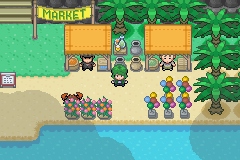
Madera Village (Madera = Wood in Spanish, just put different words into Yahoo Translate =D)
maderavillagescreenshot.png


Madera Forest
maderaforestscreenshot3.png


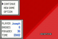
and also a WIP Pokedex (I say WIP because of the font base and shadow colour need changing)
pokedexscreenshot2.png

Just some Credits: Epicday (http://epicday.deviantart.com/), Alucus (http://alucus.deviantart.com/)
 

Zadow

Pokemon Ebony Developer
82
Posts
14
Years
Mwuahaha, Pokemon Ebony....RMXP style!
So...I've been needing something relaxing to do, and the past 30 days I've been
using RMXP and Poccil's essentials. I'm also learning Ruby. (So I can impliment awesome features.)

capture015-1.jpg

I'm having so much trouble deciding on what tiles to use, there are so many great
tile artists here at PokeCommunity (And Deviant). This is a test map just to
display another group of tiles I can't really decide, do you think the tiles in this shot go together?

capture020.jpg

(I got the HGSS overworlds from Help14's thread,
I'm not sure if there is someone spesifc I am meant to
credit for these or not, but they're not in the right RMXP
format (They walk wrong) so if you know who to credit please
tell me. -_-')
And this is a shot from Ebony Forest :]
Feedback and comments are appreciated.
Also, can't forget a list of credits for tiles. (Obviously you wont see all of them in the screenshots but I'll list them all so none will be forgotten!)
Spoiler:

and...
RM2K3Kid - For ripping the D/P Overworld Sprites.

(Hah that was a bit of post for two screen shots, I guess I just don't want to annoy anybody D: )
Respond pwease :]
 

shinylugia249

I'm back
437
Posts
16
Years
  • Seen Sep 29, 2016
Just showcasing some screens form Ryen. I've had more time to work on it lately so I'm getting back to progressing graphic/event-wise.

Notable changes are the new screen size, new tiles, new ow style, and new battle system (I'm still working on it the pic is just a concept).

sigpcc.png
 

Peeky Chew

Master of Palettes
829
Posts
14
Years
Wow, lots of great screens to rate!

@Soul.//Silver: Good name. The tiles are a little unimaginative since you've mainly used direct rips from HG/SS. Maybe try changing the pallets on the grass and using different trees. Always good to see Alucus' tiles.
It's quite hard to see what it looks like, since it's night, but that little bit you've shown looks well mapped.

@Zadow: Now that's what I'm talking about! Brilliant mix of tiles, I'd never have thought of mixing the Alucus (or mayble Alistair?) Poke Mart/Centre tiles with those Dewitty ones. The long grass matches and, for once, that grass looks great too. Only one problem, you haven't set some of the shadows to transparent. Apart from that, perfect.
The second is just as good. The fog compliments it well, without detracting to much from the tiles. The use of a different grass is also good, it looks more polished like that. You used Poke overworlds too!
If all the maps are this nice, then I can't wait for this game.

@shinylugia249: Yay! More Ryen screens!
The stairs are great, I've never seen them that way before. The new overworlds are great too, I'm wanting that style for my game. The only bad thing about this screen is the AA on the parts next to the stairs, in this case I think it would just be better to stay without it as it's too noticable and detracts from the rest.
That background's from FF right? It looks great. Having the options under the text is very innovative, I'd never have thought of that. Great work.


Now my turn.
Marketnew.png

The market or Aurora town. I'm pretty happy with this, I cant see anyway for it to be improved, which is why I'm putting it here. Check my thread for credits.
 

Crazy Weavile

Manufacturing a deity
317
Posts
17
Years
It's a joke.

Although, if you want HGSS rips you have to clean them up yourself. They're NOT pixel art; HGSS rips are real-time, and a pain in the neck to clean up.

The mountain tiles? That wasn't a joke. Ripping and tiling those things was horrible.
 

carmaniac

Where the pickle surprise at?
671
Posts
15
Years
It's a joke.

Although, if you want HGSS rips you have to clean them up yourself. They're NOT pixel art; HGSS rips are real-time, and a pain in the neck to clean up.

The mountain tiles? That wasn't a joke. Ripping and tiling those things was horrible.

I know just what you had to go through with it. Takes ages to clean those dang things up eh.
 

Cilerba

the hearts of lonely people
1,162
Posts
14
Years
Just showcasing some screens form Ryen. I've had more time to work on it lately so I'm getting back to progressing graphic/event-wise.

Notable changes are the new screen size, new tiles, new ow style, and new battle system (I'm still working on it the pic is just a concept).

sigpcc.png

Those screenshots look good ^_^
Have you ever thought about placing shadows under the characters?
 

Peeky Chew

Master of Palettes
829
Posts
14
Years
It's a joke.

Although, if you want HGSS rips you have to clean them up yourself. They're NOT pixel art; HGSS rips are real-time, and a pain in the neck to clean up.

The mountain tiles? That wasn't a joke. Ripping and tiling those things was horrible.
Well actually, most of the time they are pixel art. A lot of people do rip of course, but the most popular tilers (Alucus, Alistair, Dewitty) actually look at the screen and try and copy it. Or do it from memory. It makes the tiles a lot more unique.

Now could someone rate my screen?
 

Zadow

Pokemon Ebony Developer
82
Posts
14
Years
Now my turn.
Marketnew.png

The market or Aurora town. I'm pretty happy with this, I cant see anyway for it to be improved, which is why I'm putting it here. Check my thread for credits.
Wow!
haha, yes, my first response is wow.
The palettes flow together really nicely, and the Hero's OW is interesting, it's very green, but it's not bad.
I also love the sign that says "Market"
Crabby hiding is cute, and the clouds float nicely with it all :]
Reminds me of the tiles in the Slateport Market in Hoenn (Is it supposed to?)

and...Is that Giavonni? O.O

The only thing I don't like is the sign o.O I think it's just the colour of the outline (the red bit) but that could just be me :p

Okay! Now I have some more screenies :D Hope to get at least one response ^^

First screen featuring the new Menu, Displaying the party on the right, menu incons on the left and Pokedex completion down the bottom. Massive thanks to Carmaniac, I just chose the icons and the black theme :]
Also you can see part of my remapped Littleroot in the background :D
capture006.png

And Down here, Route 101! That's right, awesome looking First route of Hoenn, Hoenn will become avaliable after completeing the main story line, Hoenn will also feature a few new maps, and wont be 'exactly' the same, but mostly :)
capture007j.png

Feedback is always appreciated.
 

Luka S.J.

Jealous Croatian
1,270
Posts
15
Years
Few screenshots of Pewter City in Blue Chrome. What do you think of the new concrete tiles? (weren't originally made by me, but I can't find the name of the creator. If anyone knows something...please inform me) I rarely post things here, but why not?

capture081.png
capture082.png
capture067.png


credits to Kyledove, Alucus, WesleyFG for the tiles, and Newtitieuf for tiles and Ash OW.
 

Worldslayer608

ಥдಥ
894
Posts
16
Years
I have been hiding this screen for a while now, and I figured I might as well release it since it is a bit outdated now.

This screen has a peek at one of my games forests, and a bit of the lighting effect I have used with it, as well as the beginning stages of the GUI.

EDIT: Added a new peek at the revamped Odale Grove.

Pokemon__Dissension_Peek_by_worldslayer608.png


Peek__The_New_Odale_Grove_by_worldslayer608.png

 
Last edited:

Peeky Chew

Master of Palettes
829
Posts
14
Years
Wow!
haha, yes, my first response is wow.
The palettes flow together really nicely, and the Hero's OW is interesting, it's very green, but it's not bad.
I also love the sign that says "Market"
Crabby hiding is cute, and the clouds float nicely with it all :]
Reminds me of the tiles in the Slateport Market in Hoenn (Is it supposed to?)

and...Is that Giavonni? O.O

The only thing I don't like is the sign o.O I think it's just the colour of the outline (the red bit) but that could just be me :p

Okay! Now I have some more screenies :D Hope to get at least one response ^^

First screen featuring the new Menu, Displaying the party on the right, menu incons on the left and Pokedex completion down the bottom. Massive thanks to Carmaniac, I just chose the icons and the black theme :]
Also you can see part of my remapped Littleroot in the background :D
capture006.png

And Down here, Route 101! That's right, awesome looking First route of Hoenn, Hoenn will become avaliable after completeing the main story line, Hoenn will also feature a few new maps, and wont be 'exactly' the same, but mostly :)
capture007j.png

Feedback is always appreciated.
Thanks for the rating :)
I'm editing it a bit and I'll repost it here soon.

You know people, it would be nice if you actually rated the screenshots above your post. If you want yours rated then rate others!

Anyway. I really like the menu, it all looks really good and I like how you can see through. The only part that's not perfect is the render on some of the images in the menu. Who made the water? I really like it.

For the second screen. Also very good, but there are a couple of errors. First, the sides of the trees should be conncted in the to at the right and two at the left side of that part. The other is the ledge, it doesn't have an ending tile likeit should.

@ЩѻƦḽᶑʂḽдƴƹƦ™: I'd rate it, but it's too resized.

Here's mine:
Selectionscreen.gif

I wanted to make a nice animation for once, instead of just making simple backgrounds. Comments?
 
Status
Not open for further replies.
Back
Top