
You are using an out of date browser. It may not display this or other websites correctly.
You should upgrade or use an alternative browser.
You should upgrade or use an alternative browser.
The Circle of Life
- Thread starter moments.
- Start date
More options
Who Replied?


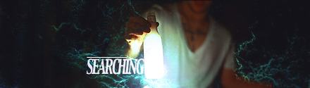
http://i233.photobucket.com/albums/ee207/mattimogalli/searching-1.png
This. This is the sex.
Your eye for good text is probably the best thing that came of your time with elements.
And after using it in Multimedia for school, I've got no clue how you did it. You are a magician with elements.
http://i233.photobucket.com/albums/ee207/mattimogalli/rainbowflick.png
I also like this, sexy purple is sexy.
I hope you've made Selective Color your new best friend.
Duckie wins cause he is first!
I hope you realize I'm not using Elements anymore.. Although I learnt a hell of a lot from it regarding typo and compo, because really, it was all it could do...
I actually preferred that tag without the text, just because it doesn't need it to fill space and I get to show off the effects.
As for the icons, they all have Selective Colouring abused beyond comprehension, so yeah, I guess you could say it's my new best friend!
Last edited:

Kotone
someone needed a doctor?
- 2,787
- Posts
- 15
- Years
- somewhere ;]
- Seen Jun 29, 2018
beautiful.
i love the coloring on them all. the tags are gorgeous<3
i love the coloring on them all. the tags are gorgeous<3

- 5,814
- Posts
- 16
- Years
- Age 30
- Seen May 19, 2021
http://i233.photobucket.com/albums/ee207/mattimogalli/ICONS/lipseye.png
http://i233.photobucket.com/albums/ee207/mattimogalli/foxtree.png
I love these two icons.
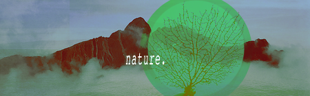
http://i233.photobucket.com/albums/ee207/mattimogalli/nature.png
I love this tag.
These are seriously, amazing. For a first with icons, you did a great job.
http://i233.photobucket.com/albums/ee207/mattimogalli/foxtree.png
I love these two icons.
http://i233.photobucket.com/albums/ee207/mattimogalli/nature.png
I love this tag.
These are seriously, amazing. For a first with icons, you did a great job.
Flipnotic
shroomylove.blogspot.com
- 56
- Posts
- 15
- Years
- Age 34
- Tx, but FROM Philippines.
- Seen Sep 28, 2010
those are really nice..i love the girl in the red dress one lol
Thanks so much, much appreciated!beautiful.
i love the coloring on them all. the tags are gorgeous<3
Shanks a lot, I liked the lips icon heaps too, my own fave?http://i233.photobucket.com/albums/ee207/mattimogalli/ICONS/lipseye.png
http://i233.photobucket.com/albums/ee207/mattimogalli/foxtree.png
I love these two icons.
http://i233.photobucket.com/albums/ee207/mattimogalli/nature.png
I love this tag.
These are seriously, amazing. For a first with icons, you did a great job.
That tag was risky, I didn't know how many people would like my mashing of like 10 different stocks. :O Clouds, mountains, water and tree. Cloud stocks, like 6 of them...
Thanks a lot for commenting and liking that tag, I didn't think many of the people would like it as much as I did. ;)
Thankies a bunch, that was one of the earliest icons and I too really liked it!those are really nice..i love the girl in the red dress one lol
UPDATE:

(More of a photo manipulation, but I liked the stock and got some ideas when I saw it..)

No icons for now because I'm going to build up the collection to post more at once, rather than give you small dabs...

Nice graphical things dude. Its like a candy shop. :D
http://i233.photobucket.com/albums/ee207/mattimogalli/rave.png
http://i233.photobucket.com/albums/ee207/mattimogalli/ICONS/lipseye.png
http://i233.photobucket.com/albums/ee207/mattimogalli/rave.png
http://i233.photobucket.com/albums/ee207/mattimogalli/ICONS/lipseye.png
- 10,673
- Posts
- 15
- Years
- Age 30
- Seen Dec 30, 2023
http://i233.photobucket.com/albums/ee207/mattimogalli/relaxation.png
Just a few comments on your lastest tag. As far as effects go (C4D's, LSD's etc.) go you've used the minimal, so a lot of your tag needs good photo manipulation and good lighting. That's just what you've acheived. I'm loving this but there's a few things that might throw some off, the fact that it's a little blurry urked me somewhat and it could do with a little more brightness and contrast. It's a nice, simple, effective tag with not a whole lot going on but I can see the work that went in nonetheless. The text compliments it well, though I will say that it stands out a little too much as the tag is so dark yet the text is polar white. But it still suits the style.
I'd like to see more of what you can do in future works, possibly a brighter tag to show off your talent, you're being a little modest it seems. Good work though.
Thankies, I like candy! ;)Nice graphical things dude. Its like a candy shop. :D
http://i233.photobucket.com/albums/ee207/mattimogalli/rave.png
http://i233.photobucket.com/albums/ee207/mattimogalli/ICONS/lipseye.png
Thanks a lot for the crit, 'twas helpful and I appreciate that people prefer more colourful art which is often funner on the eye. I have tried to take this into consideration while keeping my own elements part of it and I came up with one tag that I'll post now and then update again later hopefully with some more tags and icons.http://i233.photobucket.com/albums/ee207/mattimogalli/relaxation.png
Just a few comments on your lastest tag. As far as effects go (C4D's, LSD's etc.) go you've used the minimal, so a lot of your tag needs good photo manipulation and good lighting. That's just what you've acheived. I'm loving this but there's a few things that might throw some off, the fact that it's a little blurry urked me somewhat and it could do with a little more brightness and contrast. It's a nice, simple, effective tag with not a whole lot going on but I can see the work that went in nonetheless. The text compliments it well, though I will say that it stands out a little too much as the tag is so dark yet the text is polar white. But it still suits the style.
I'd like to see more of what you can do in future works, possibly a brighter tag to show off your talent, you're being a little modest it seems. Good work though.

I like this new one, though I feel colours could be a little bit more vibrant, but that's just me, I like vibrance.
Text could be worked on a bit more, but the c4d use is really good.
Whatever you had going on in the background would have looked good coming out either side of the c4d's, to help that empty space.
Otherwise, I like it, one of your best to date.
Text could be worked on a bit more, but the c4d use is really good.
Whatever you had going on in the background would have looked good coming out either side of the c4d's, to help that empty space.
Otherwise, I like it, one of your best to date.
- 4
- Posts
- 14
- Years
- Seen Apr 10, 2010
All the icons were really wonderful, designs, colour combinations and the pictures are beautiful,especially the one which is below the icons of lips.I like it very much its a natural. Good work.