• Our software update is now concluded. You will need to reset your password to log in. In order to do this, you will have to click "Log in" in the top right corner and then "Forgot your password?".
  • Welcome to PokéCommunity! Register now and join one of the best fan communities on the 'net to talk Pokémon and more! We are not affiliated with The Pokémon Company or Nintendo.

[Showcase] pen.pencil.paper (scans)

loucas

100% hot
245
Posts
14
Years
hey guys!
i decided to open this thread to showcase what i got, other from doing Pixel Art (haha!)
so, i've scan some drawings of mine. some characters i made for my fiction.
okay here they are

sss001_zpsd2033075-1_zpsb155baf8.jpg

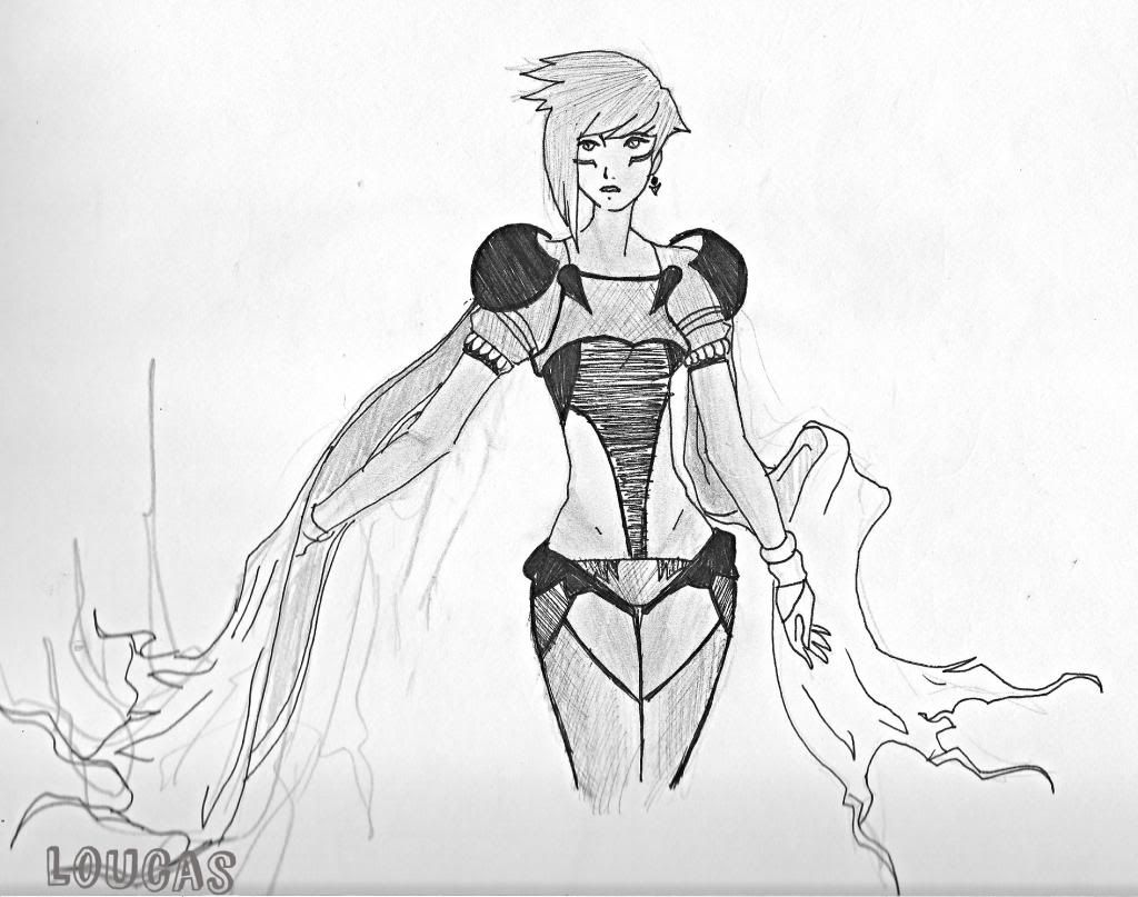
this is scanned in greyscale, so much more closer to the original drawing.
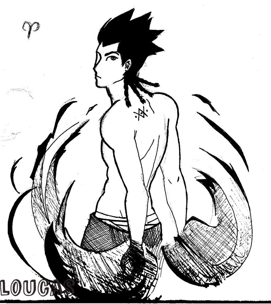
the following are in black and white.
eli001_zpsec29b852-1_zps3b06812b.jpg

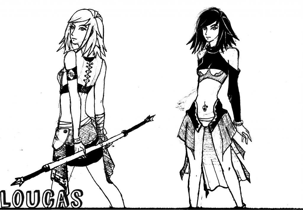
do you think these two are different in a way? it's the same character that i drew in a different way, if so which is better?
gar001_zps3b74aa71-1_zps4b884c33.jpg

vin001_zps0bcff3ae-1_zps188e2850.jpg

zed001_zps9f4ce6df.jpg

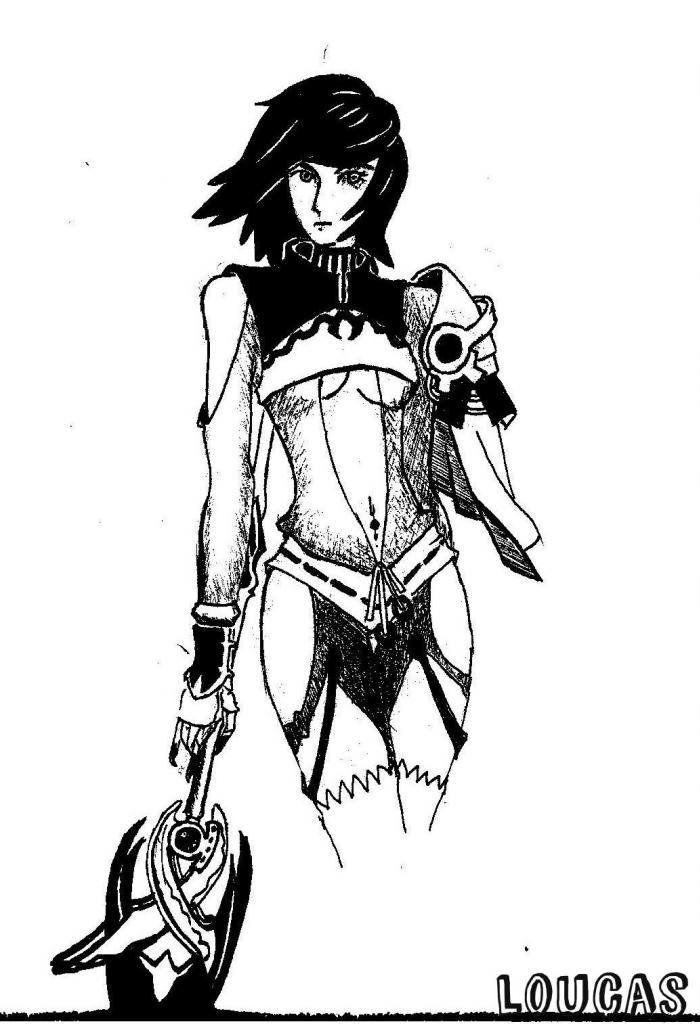
my main girl protagonist -___-'
pen001_zps57e3073a.jpg

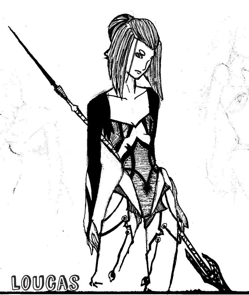
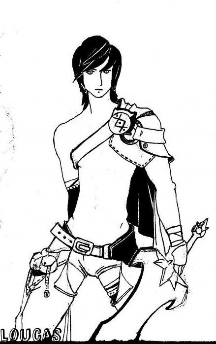
my version of a mage, think Al Bhed Costume minus the Steampunk Goggles plus magic XD
pon001_zpsec38b26c.jpg


so there. i'd like to here what you think :)
thank you for stopping by :)))
 
Last edited:

Patrick

Ya'll Are Weird
543
Posts
11
Years
I think they're fine, to be honest. Your cross hatching and line weight is a strong point, I like the way you do eyes, and you know how to create costume pieces (I'm gonna say costume in the loosest way). I like the first piece the most, but you'll see why in a second.

The second drawing, I'd go with the first version of the character. It might be a contrast bias, but I do think that I like it aesthetically better as well. I also like the armor parts on the 3rd to last, and I love the way the woman looks on the 2nd to last. I like her expression, it's muted, but it's cute.

Now, everything following this is part of a suggestion. It's subjective, not of any real consequence, I probably don't know what I'm talking about and unironically everyone else probably won't notice it, but I think everything is too dark.

What I mean is that if you could adjust the levels just a touch towards the lighter side of things, I can see the details a lot better without feeling overwhelmed with so much black. For example, aim for what you have in your first picture. I can see everything clearly in that one. The 3rd picture is very bold and busy near the bottom. The danger is that it may be too late to adjust levels or curves to get softness in your lighter lines. I don't want them to wash out into nothing, either. Play around with that if you can.

If you're going to go for extreme contrast, like if you're doing a comic, you'll have to clean up what looks like drafting residue to show more clarity, and make sure your lines are really smooth and flowing. I remember seeing an independant comic where the guy crosshatched the ever living heck out of that sucker, and it was busy there too, no doubt. But he made it work as well, because there were only two clear colors, black and white. It probably helped that his drawing style was juvenile to a degree (most indy comic art is, that's not a bad thing). I'd still say it was an eye strain after a while, though, but maybe that's just me.

And that's also why I dunno if I'm all wet on this one.

Yeesh, what's wrong with me today? I'm usually never this critical. Must be because the neighbors returned. >_< Life was good, once... D:
 

loucas

100% hot
245
Posts
14
Years
I think they're fine, to be honest. Your cross hatching and line weight is a strong point, I like the way you do eyes, and you know how to create costume pieces (I'm gonna say costume in the loosest way). I like the first piece the most, but you'll see why in a second.

I think everything is too dark.

What I mean is that if you could adjust the levels just a touch towards the lighter side of things, I can see the details a lot better without feeling overwhelmed with so much black. For example, aim for what you have in your first picture. I can see everything clearly in that one. The 3rd picture is very bold and busy near the bottom. The danger is that it may be too late to adjust levels or curves to get softness in your lighter lines. I don't want them to wash out into nothing, either. Play around with that if you can.

i'd like to quote this in particular, i appreciate it that you liked the first picture, and i have to say, almost everyone of them are supposed to be like that, my mistake is that the rest (2nd pic up to last) were scanned as Black and White while the first picture was in Greyscale, that's why the first pic was very close to the original (paper, hard copy)

i really appreciate everything that has been said :) thank you dbp.
 
17,133
Posts
12
Years
  • Age 33
  • Seen Jan 12, 2024
Your costume design is very impressive.

I find your innovation, rather than the images themselves, the most fascinating part of this thread. Your imagination that really prevails here, at least in my opinion. Your characters all have different personalities, maybe because they all stem from stories, but that really draws me in and keeps me interested.

I would like to see you detail out your details, if that makes sense. This picture, for instance. This character isn't lacking in detail (those pants are fantastic), but I'd like to see you add more texture. Make the armor feel metallic-- or leathery depending on its material-- and make the pants feel stressed and worn. I agree with dbp, if you use less contrast, those textures and grey tones will read better and your drawings will feel less 2-dimensional overall.

~
Okay now disregard this entire next paragraph if I'm wrong. I'm using my ever-unreliable-artists-intuition.

Correct me if I'm wrong, but it seems like you have a problem with drawing hands? The majority of your characters only have one visible.

Well, it looks to me like you can quickly sketch a character's hands (and by quickly I mean at the same rate as you draw the rest of the character) without investing a huge amount of time into positioning and perspective. Your hands look fine for the quality of the character being drawn-- don't feel insecure about drawing them. They're coming out just fine. n_n
~

Nooowwww.....
.....post more!! xDD
 

loucas

100% hot
245
Posts
14
Years
thanks Alexial357!

yes i've got a little problems with hand, and yes i draw them as fast as i could draw a line, because the more i spend time doing them, the more they mess up.

as for the details, i've been practising, i haven't an experience truly focusing in details though, i feel it takes to much time, that my inspiration would run out half-way through XD, but yeah, i'll post more when i've come to practice details (steel, leather, etc.)
 
Back
Top