

Rayquaza.
Lead Dev in Pokémon Order and Chaos
- 702
- Posts
- 12
- Years
- Age 27
- United Kingdom
- Seen Jan 24, 2021
Happy Halloween everyone!
Last edited:

Happy Halloween everyone!

This is a college project? This is all very basic.. cout and cin maybe a if/if else loop, some key press checks doesn't really seem college level, but anyways its a good start hope it works out for you
Looks really cool, love the tiles and the character sprite


Menu WIP
Just a mock up of the menu WIP. I will be adding a section for a clock, and a bag quick view (current ball count etc) in the left and right. The clock will open up the options menu, and the other will open up the bag.
The center button with the player OW sprite, will open up a sub menu for options like Pokedex, Trainer Card, and Save.
I want to have the selected button be brighter and have the icon animated, maybe have the name of what option is selected written at the bottom of the screen, such as the name of the Pokemon, or "Player" if the center is selected as in the example above.
It is all subject to change, since this is a mock up I would love some feedback on what I could change, etc.
IMHO That looks amazing, very new and different. I like how you thought outside the box somewhat literally.
I always thought the point of a GUI element was that you could see it. That first version in particular is really quite dark. Also, which two Pokémon are going to be going into a double battle? I'm assuming the one at the top is the lead Pokémon.
How are you going to access the party screen? Please don't say you're getting rid of it, because seeing the information panels for all the Pokémon in your team at once (without having to hover over them) is very useful. And if you're keeping it, is it going to be arranged in hex form too for consistency?
I'm not keen on the idea of having to press a button again to get access to the other pause menu stuff (Dex, Card, etc.).


Our team is scrapping most of my graphical work for a few reasons(for the better in my opinion), so I thought I'd post'em just to get people's opinions so I know what to do better next time around. Please criticize anything, I've got tough shell :)
I already know they are in many different styles, please ignore that.

Spoiler:Our team is scrapping most of my graphical work for a few reasons(for the better in my opinion), so I thought I'd post'em just to get people's opinions so I know what to do better next time around. Please criticize anything, I've got tough shell :)
I already know they are in many different styles, please ignore that. Also, the hands, green fakemon, trainer mugshot were something quickly whipped up, they weren't final products.
Spoiler:Battle!
I am still unsure about the battle buttons, but they will be something like that :D. I may change them, I may leave them.
quick pet peeve: I feel like as a community, we can move beyond "what will X do". the player knows that's the question, they don't need it in their face every turn, you know? I feel like a lot of fangame battle UIs I see are super cluttered, and that's mainly because they're trying to fit in that information, which imo is unnecessary. all you really need are the options
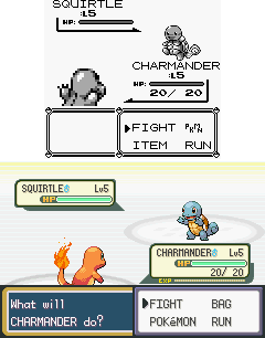
specific to your screenshot: I like the shape of your buttons, I don't love that fitting them together means the whole shape is asymmetrical. I feel like it would look better (in my opinion) if you got rid of the question, somehow made the shape of the option buttons symmetrical (maybe make the inner edge just a straight line, as opposed to the <? that way they could just fit together), and then centered it on that cool wavy black bar.
as an aside: super into your pokemon info bars! they look snazzy and informative without being too cluttered or out of place. they look very cool! I really like the subtle checkerboard pattern.
As a player who has played the games before, I agree. I do not think the "What will X do" question is really all that necessary.
As a designer, I will tell you that it is an integral part of communication between the game and the player. There is a reason you still see Nintendo putting it in their games, and they are how many generations in?.
They are actually just BW2 rips. The only thing I changed was the shades of the health indication color :P.
As a designer, I will tell you that it is an integral part of communication between the game and the player. There is a reason you still see Nintendo putting it in their games, and they are how many generations in?
The main reason I disagree with the removal of "What will Pikachu do?" is that it's useful in double battles to tell which Pokémon you're ordering. This is especially true if you make another of the common changes to the battle system, which is to stop the ordered Pokémon from bobbing up and down (probably because you're using BW sprites) - this bobbing, the bobbing of the data boxes, and the message are the only ways in which you can tell what's happening and whether the game is awaiting an input from the player.quick pet peeve: I feel like as a community, we can move beyond "what will X do". the player knows that's the question, they don't need it in their face every turn, you know? I feel like a lot of fangame battle UIs I see are super cluttered, and that's mainly because they're trying to fit in that information, which imo is unnecessary. all you really need are the options
I'm not so sure it's as important for fan games though. Nintendo/Gamefreak only does it so they can dumb it down for kids just getting into the games. I assume if someone is going to be playing your game, they've played a few pokemon games before, or at least can figure out what's going on.
I'm not saying get rid of it, because it doesn't bother me, but I don't think it's as important as your stating.
Also, I like the scene, HP boxes, and all that. Only thing I'd suggest is put Fight above Bag, since it's usually the first option. I believe that it would make more sense to be above bag. That's just a nitpick though, everything looks dandy.
The main reason I disagree with the removal of "What will Pikachu do?" is that it's useful in double battles to tell which Pokémon you're ordering.
It's not exactly "in their face every turn" either. And besides, there's nothing else to put there instead except for making the command buttons larger. Better a message that some people would consider redundant than empty space which everyone would consider redundant.
I don't, and wont design anything based on an assumption of audience. That is just something that translates over from media design though, the worst thing I have done was work on an ad campaign that was assumptive in nature and it was a failure.

It looks quite good so far, but I do recommend showing the wireframe mesh if you want to get any real feedback on it. As it stands, I can't see much wrong with it yet!


