(Most of the spoilers are images, for some reason they won't shrink and them being so big is obnoxious...)
Sorry, my fault for not elaborating...
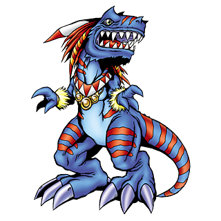
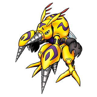
Firstly, the shading style isn't digimon, but it's most definetely not Sugimori (at least I don't see it that way). The color tones are sort of... intense. The color tones in the official artwork is more softer, I find these ones "hard".
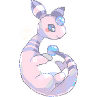
I compared Sinistrunk to to Shiftry, the most similar Pokemon I could think of. See the difference?
Of course, the simplistic shading magnifies this. Still, I feel the Sugimori tones are harmonius, but these are strong and sort of battle for attention. I have a few more examples.
Another thing, apart from the harsh tones, are the random color combinations on some of these. In pokemon, the colors on a pokemon are considered and coordinated to be (once again) harmonius, but here it feels (on some pokemon, others were better) you stuck them on randomly to grab attention, which is VERY characteristic of Digimon.
It hurts my eyes!
Another issue with detail is the seemingly random patterns on some.
Whenever you felt a pokemon was sort of empty, you put a bunch of paterns on (in a few cases, in colors that disrupt the color scheme). Sound familiar?
(Just to make this clear: the following isn't directed at your designs, it's just explaining why I don't like the patterns. You barely overdesign a few, and the rest are fine.)
I feel this greatly disrupts the 'natural' theme I get from Pokemon. Most of the pokemon feel more or less realistic. Obviously, I don't mean Rattata realistic (that's just unorginal) or that floating dream-eating tapirs are realistic, but they aren't overachievers. They know not to overdesign a pokemon and to keep the design fairly simplistic.
Next, answering the "do you think the new pokemon look like digimon" question: absolutely not. The differences aren't from generation to generation, but from Sugimori to yours. I think the reasons above explain that.
Lastly, the "do any particular designs remind you of digimon?" question.
I'm kind of short on time won't go in depth with all, but here's one I found...coincidental.