DexJr Karnage
Shiver TheKid
- 47
- Posts
- 10
- Years
- Age 30
- The Pokemon World
- Seen Aug 20, 2014
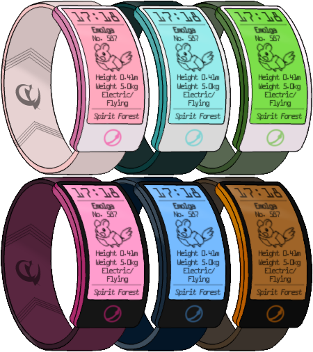
Lately on my free time i decided to make a theme of a Future PokeDex. I didn't have enough to open a Gallery so im assuming i must post here. This is still a work in Progress and its barely Version 1. Lots of changes will be made. Just toying at the moment. Just wanted to know what you all thought of v1.