- 4
- Posts
- 7
- Years
- Age 22
- Seen Apr 19, 2018
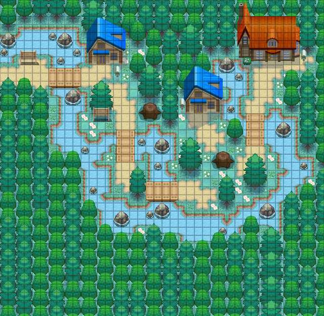
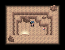
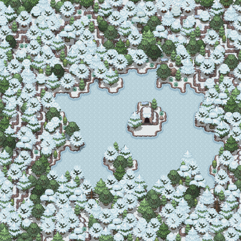
Heyo, recently I've started mapping but I've never really got very far with my maps.
This is one of the first ones I've completed. Since this is one of my first maps I would love some constructive-criticism on it so I can improve on my mapping abilities.
If you like the map and would like someone to map for your game feel free to message me. :)

Thanks! :D (Also I don't know how to get pictures to work so just right click on the thingy inside the spoilers and click open in new tab. :)
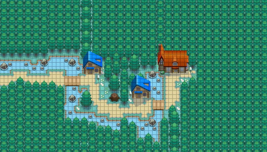
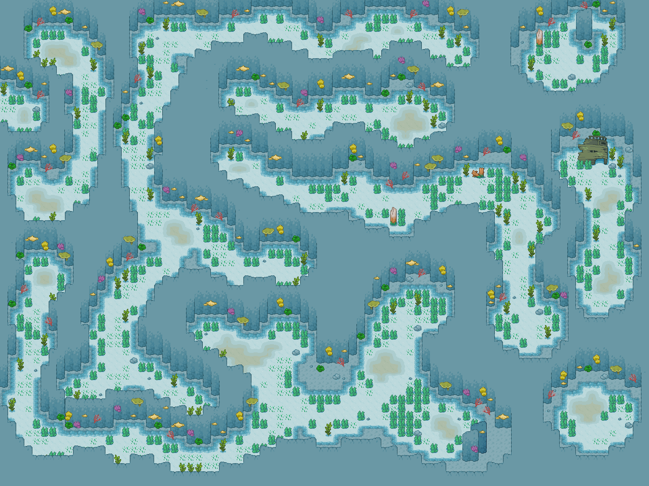
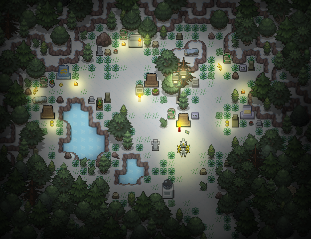
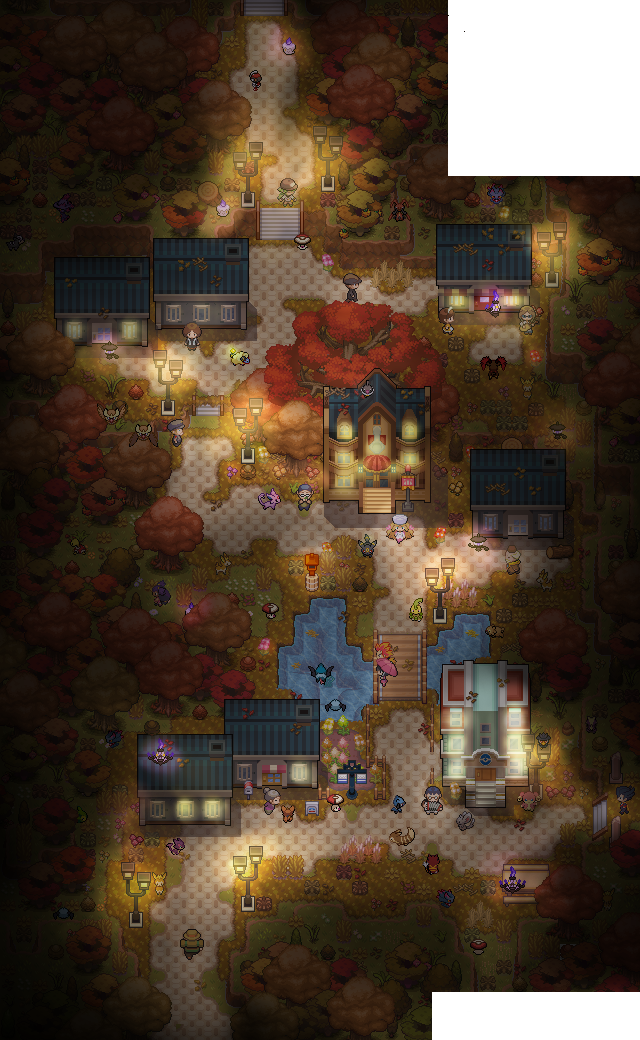
This is one of the first ones I've completed. Since this is one of my first maps I would love some constructive-criticism on it so I can improve on my mapping abilities.
If you like the map and would like someone to map for your game feel free to message me. :)
Spoiler:
Thanks! :D (Also I don't know how to get pictures to work so just right click on the thingy inside the spoilers and click open in new tab. :)
Last edited: