• Our software update is now concluded. You will need to reset your password to log in. In order to do this, you will have to click "Log in" in the top right corner and then "Forgot your password?".
  • Welcome to PokéCommunity! Register now and join one of the best fan communities on the 'net to talk Pokémon and more! We are not affiliated with The Pokémon Company or Nintendo.

Graphics: Gen VI: DS-Style 64x64 Pokemon Sprite Resource

1,323
Posts
16
Years
  • Seen Dec 9, 2023
Touched-up Goodra's back a bit to try and smooth things out a little:
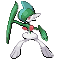
2119n9d.png
 
61
Posts
11
Years
Can you make a Diancie front/back and normal/shiny sprite?
@ shawnking2255 MrDollSteak said Quote:
ALSO! I do realise that Gen VI sprites are in high demand at the moment but I would like
to remind you, DO NOT POST REQUESTS!
I've seen Chaos' thread riddled with requests which put it in constant danger of being
shut down, so I would like to stop this before it can even begin.

please don't request here.
 
Last edited:

MrDollSteak

Formerly known as 11bayerf1
858
Posts
15
Years
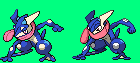
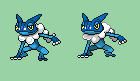
I made some sprites, all backsprites are fully scratched and some front sprites source from the web resized.

These are great, can you tell me where the original sprites are from so I can source them.
I'm definitely using Fletchinder!

Hey,what happened to MrDollSteak?.

I only post here when I have submissions.
I've been doing other things as Chaos said!

That said here is Pangoro!
Front sprite is from the XY Sprite Project, Credits to Branflakes325!

FZZQ13M.png


Next thing I want to do is fix Amaura's front sprite, and then Fletchinder.
 
10
Posts
11
Years
Helioptile(by Wobblebuns)
Heliolisk(by Noscium)
Fletchling&Fletchinder(by zerudez)
And all backsprite by me


来句中文看你认不认识 XD
 
2,138
Posts
11
Years
Interesting suggestions, I'm not going to change Frogadier or Greninja.
I may alter Frogadier slightly in the future, but in that case it'd likely be it's backsprite.

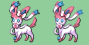
I have taken your advice for Chesnaught and Sylveon and have tweaked some of the shading, though I won't be using the face you made for Chesnaught.

1.There are some fundamental flaws especially with the shading and linework of Frogadier that obfuscate the X/Y design. It's difficult to tell it's even the same pokemon (especially when just looking at the face) and the shading is too saturated for the aesthetic you are going for, D/P.

2.Further, the shading, is the major issue with frogadier's sprite.

3. Sylveon's eyes go too far over to the side rather than looking over diagonally, as I have corrected. (Rule of thumb, the pupils should never be in the same exact same position on both eyes. Along with the mouth that looks gauche as it touches the eye; though it doesn't necessarily need to have an open mouth as in my sprite, it seemed to be a good alternative and appears cuter. The new edit to Sylveon still looks gauche in the face. Still flat and no dimension as I improved with the previous edit, lining the cheek of the face with a darker outline.

4. Chestnaught still feels...soulless in the face. The eyes don't pop, and it's expression is lost without some contrast. The style is not very characteristic of DS spriting style in that regard.

Spriting is all about giving the character simple shading and clean lines so it's structure and expression pops. I hope you reconsider the choices you have made on a technical/aesthetic basis for the sake of improving the quality of the resource.

Again, this is a team effort. Your spriting is great. There are plenty of sprites I have no suggestions! These ones have little, yet significant errors, that are really easy fixes. The fact that I only needed to rework a few things tells that they were executed well to begin with. Just, "well", can always be improved.
 
Last edited:
142
Posts
15
Years
I guess soon you are gonna be adding Mega Latios and Latias to the list for Mega Evolution sprites since they do exist in X/Y just not officially annouced yet.
 
1,323
Posts
16
Years
  • Seen Dec 9, 2023
the shading is too saturated for the aesthetic you are going for, D/P.
Sorry, but I flat out disagree with this. The colors in MrDollSteak's Greninja sprite are perfect. The shading style he is going for is not D/P, but to be more specific, the style used by the Gen I & II Pokémon in HG/SS and the Gen V Pokémon in B/W. They're supposed to be high-contrast shades, as it's specifically trying to mimic typical Japanese anime style, generally having two main shades and a third bright shade that's used as the icing on the cake. The colors are supposed to be bright, vibrant, and high-contrast; your colors are rather faded and desaturated, and that is not something I want for the DS-Style 64x64 Sprite Project. Your colors for Greninja and Frogadier don't match up with the official art that well, and one of the major points of the DS-Style 64x64 Sprite Project is to have a set of Pokémon sprites that actually match up with Ken Sugimori's depictions of them.

(not trying to bash you, as I agree with a few of your other points such as Frogadier's shading could be improved, but I'm just making a point that the HG/SS/B/W style is supposed to have vibrant, high-contrast shades)
 
Last edited:
2,138
Posts
11
Years
Sorry, but I flat out disagree with this. The colors in MrDollSteak's Greninja sprite are perfect. The shading style he is going for is not D/P, but to be more specific, the style used by the Gen I & II Pokémon in HG/SS and the Gen V Pokémon in B/W. They're supposed to be high-contrast shades, as it's specifically trying to mimic typical Japanese anime style, generally having two main shades and a third bright shade that's used as the icing on the cake. The colors are supposed to be bright, vibrant, and high-contrast; your colors are rather faded and desaturated, and that is not something I want for the DS-Style 64x64 Sprite Project. Your colors for Greninja and Frogadier don't match up with the official art that well, and one of the major points of the DS-Style 64x64 Sprite Project is to have a set of Pokémon sprites that actually match up with Ken Sugimori's depictions of them.

(not trying to bash you, as I agree with a few of your other points such as Frogadier's shading could be improved, but I'm just making a point that the HG/SS/B/W style is supposed to have vibrant, high-contrast shades)

Oh, I get the style that MrDollSteak is going for now. And, no; I take no offense! :)

There are still issues beyond the saturation, I quite like the more saturated look if we aren't going for D/P style, but the HGSS.

So, here are some revisions to the sprites, with the original high contrast color. My other edits didn't change the color, and actually probably added more contrast to the crucial areas of the face, which should work well with the style we are trying to achieve :)

dsgsd_zpsa01c4af7.png


dsgsd_zps1a16c401.png


Sylveon_zps71605737.png


chestnaut_zps7f2ad6b9.png
 
Last edited:

MrDollSteak

Formerly known as 11bayerf1
858
Posts
15
Years
Oh, I get the style that MrDollSteak is going for now. And, no; I take no offense! :)

There are still issues beyond the saturation, I quite like the more saturated look if we aren't going for D/P style, but the HGSS.

So, here are some revisions to the sprites, with the original high contrast color. My other edits didn't change the color, and actually probably added more contrast to the crucial areas of the face, which should work well with the style we are trying to achieve :)

dsgsd_zpsa01c4af7.png


dsgsd_zps1a16c401.png


Sylveon_zps71605737.png


chestnaut_zps7f2ad6b9.png

While I appreciate you trying to 'improve' the sprites, you are doing so in an incredibly patronising manner.

I have no problems with you saying things such as 'I'd personally change the shading on Frogadier' with some specific examples rather than making snarky comments such as the following:

'There are some fundamental flaws especially with the shading and linework of Frogadier that obfuscate the X/Y design. It's difficult to tell it's even the same pokemon (especially when just looking at the face) and the shading is too saturated for the aesthetic you are going for, D/P.

As Chaos pointed out earlier, D/P isn't the aesthetic, so also make sure you read the first post to understand the project better, before offering redundant criticism.

You have also reposted the exact same images as before which I have already rejected, for sprites that I have already touched up, using some legitimate improvements which I saw in your work.

I already said I am not accepting any of those sprites, so it is quite frankly, disrespectful that you'd repost them after criticizing both the old sprites a second time, and the new ones (though for all I know you didn't even bother looking at them).

If you honestly think your sprites are an improvement (an opinion I do not share for various reasons, primarily the proportional neglect that I reference in the first post) then feel free to use them. I am not forcing you or anyone else into using my sprite resource.

If you wish to critique my further submissions, feel free, I value constructive input. Though make sure you are being constructive, and not just opinionated. I have found some of your criticism to be valid and constructive, such as Chesnaught and Sylveon's original shading. However I am offended by your patronising attitude to my spriting ability when using terms such as 'spriting is all about', 'rule of thumb' obviously implying you view me to be new to spriting (completely untrue, I have being so for the past seven years) and your subjective statements such as 'as I improved'.

All that being said, I have taken 'some' of your improvements towards Frogadier which I found helpful and valid, and have touched the sprite up, specifically the shading in regards to the bubbles.

SluhoqS.png


With that out of the way, please do not bring up those sprites again, I am frankly sick and tired of you bringing up the exact same 'issues' in regards to those sprites. I have touched them up frequently and am completely satisfied with them. I would at this point rather spend my time working on new sprites, and fixing sprites that I believe need actual edits, such as Braixen, Delphox, Litleo and Gogoat.
 
Last edited:
2,138
Posts
11
Years
The Greninja/Frogadier sprites are quite different from the original edits. I have taken into account the HGSS/BW/Sugimori (Anime) style that was recommended, and have already acknowledged that this wasn't a D/P aestetic, no need to reiterate that point.

The changes in frogadier look great. It really looks better with just a few minute touchup, so very little time investment, since the changes though significant are quick to perform, but little edits can turn great results. :)

Though, the foot on the right is still a bit off.

All posts have been constructive, don't take offense to spriting tips. I am sure you have some for me as well. They allow us to see some improvements that can be made to our art, since we overlook certain aspects of our own art. I have people suggest minor to major sprite changes to ALOT of my work.

Some of the issues seem apparent though, like Slyveon looking directly left, sprites face forward, to the left. So, they are very little change that are general rules of thumb. Just as another person pointed out high contrast is a general rule for this resource. The edits of slyveon still have that issue, as well as the gauche mouth, since the black mouth pixel neighbors the black eye lining in a limited area, and perhaps, Sylveon would never be depicted with a side-smirk in the anime. The other edits on sylveon look great, I was pointing out that those are still needed little, one-minute, changes. So it was to reiterate a point you may have missed during your edit.

And the collasped face in Greninja, which doesn't look characteristic of the anime. Requires just a bit of new pixels around the head. The original sprite, honestly doesn't resemble the 3D model or Sugimori art in the head area only, which is a fundamental flaw, or of central importance to the sprite. I am not seeing the snarky comment.

These are as objective as comments I can, though all art is subject. I always make sure to point out the positive part of the sprite as well; which there are many. We could also ask which aspects work better.

Good luck with the resource.
 
Last edited:

MrDollSteak

Formerly known as 11bayerf1
858
Posts
15
Years
Though, the foot on the right is still a bit off.

All posts have been constructive, don't take offense to spriting tips.

Some of the issues seem apparent though, like Slyveon looking directly left, sprites face forward, to the left. So, they are very little change that are general rules of thumb. Just as another person pointed out high contrast is a general rule for this resource. The edits of slyveon still have that issue, as well as the gauche mouth, since the black mouth pixel neighbors the black eye lining in a limited area, and perhaps, Sylveon would never be depicted with a side-smirk in the anime. The other edits on sylveon look great, I was pointing out that those are still needed little, one-minute, changes. So it was to reiterate a point you may have missed during your edit.

And the collasped face in Greninja, which doesn't look characteristic of the anime. Requires just a bit of new pixels around the head. The original sprite, honestly doesn't resemble the 3D model or Sugimori art in the head area only, which is a fundamental flaw, or of central importance to the sprite. I am not seeing the snarky comment.

What did I just say?

"With that out of the way, please do not bring up those sprites again, I am frankly sick and tired of you bringing up the exact same 'issues' in regards to those sprites. I have touched them up frequently and am completely satisfied with them. I would at this point rather spend my time working on new sprites, and fixing sprites that I believe need actual edits, such as Braixen, Delphox, Litleo and Gogoat."

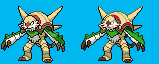
I made diancie(front back and its shiny)
y3VOqmn.png
y7ftFMC.png
YY9dPLp.png
VJdoHbH.png

Sorry I'm not accepting these.

Anyways I've touched up the Fletchinder sprites!
Credits to Zerudez for the front sprite, and al199288 for the backsprite!

7nk8PWB.png
 
Last edited:
Back
Top