I can't go into too much detail. On phone so pardon any vagueness and the short nature of this post.
First off, your works are pretty darn amazing for someone who started so recently. Really. You've got most fundamentals down - lighting in particular. Text leaves something to be desired, though. I don't really think I have as big a problem with text placement as with their font choice. Explore dafont and get new, creative ones I'd say. These look too plain. Also, try to stay away from relying on brushes too much. I feel the tags where you've utilized c4ds are your strongest and brushesh your weakest. Edit: don't wanna go the c4d direction? Do more smudge based or texture based ones!
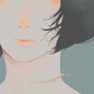
As for smudge tags - the first one is worthy of love. It looks great. Just a minor nitpick - would've been perfect if you had some of the smudging done over the character too. Would've helped a lot with blending.
Anyway, member with explosive potential here! Looking forward to your updates.
Edit: also, my mobile's screen size is 2.5 inches. I can't really look at each minor detail of each tag. So take what I say with a grain of salt lol.