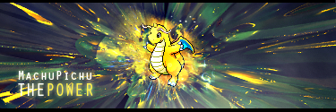
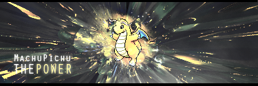
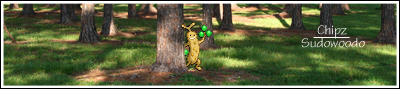
I'm only looking at the 2011 tags cause I feel it is more relevant / you've improved a lot since those earlier time frames.
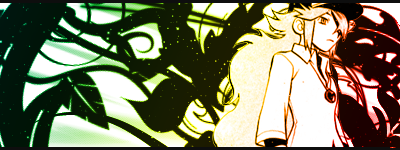
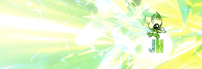
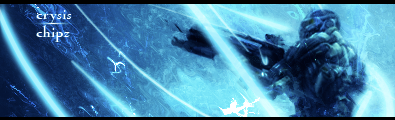
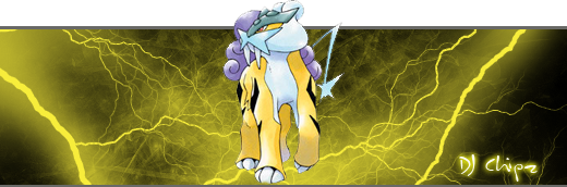
GloriousHD.png
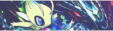
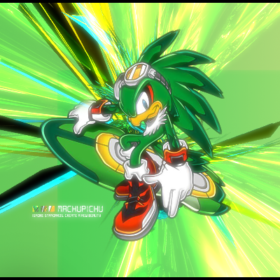
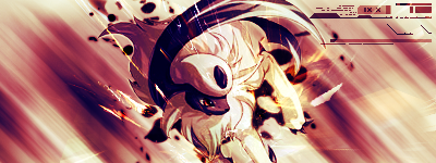
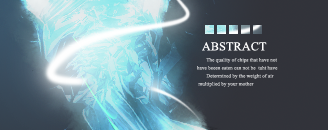
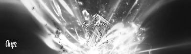
RadientHD.png
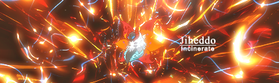
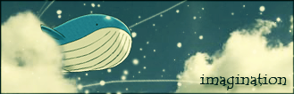
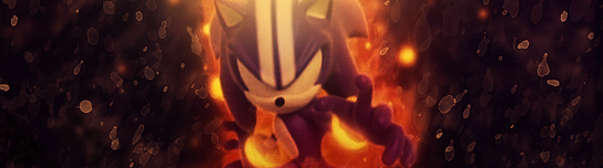
ExplosiveHD.png
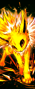
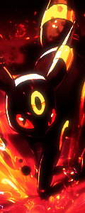
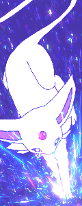
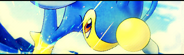
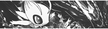
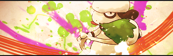
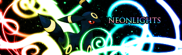
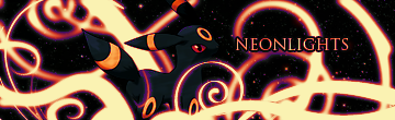
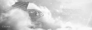
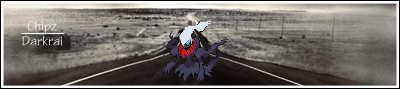
These three are your best, basically just in terms of the colours and adjustments you've got going on. Nearly all your other tags are over contrasted and some are low quality, either over sharpened until they look pixelated, or just by bad decisions on effects and stocks and stuff. Examples, the three vertical Eeveelution tags are all over contrasted, the blacks are too black and colours too bright, except for the Espeon one, which has been sharpened way too much, and you can see the pixelation around the edges of the stock.
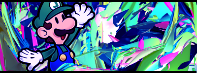
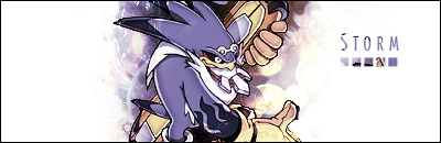
That said, you've got a lot of works, with a bucket load of potential, just not executed to the best that the idea could've led to.
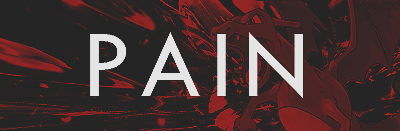
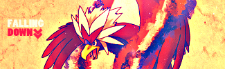
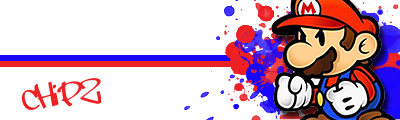
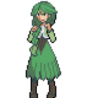
PAIN.png
This one is so close to being a great tag, just a few things you've added which really bring it down. First of all, while the text is pretty original, and I definitely think something in this style could be effective, it really just doesn't work with this particular tag. It takes too much focus, is too spaced out. But maybe on a lighter tag / if you used darker text colour, it might've worked!
Otherwise, the effects, placement of Charizard are both really, really good! The only thing I'd reconsider, and again, same as the above, it could definitely work on another piece, just isn't working on this one, is the colours. You've got a solid gradient map over it, but it's just too monotonous like that. I can tell by the shades and tones of the colours that you've got a very nice baseline, good contrast and everything, just the fact it is all red and black is detracting from the tag as a whole I'm thinking...
Anyways, you've got a lot of work here, a lot of potential, some not so good, but you definitely have the skills and the ideas to pull off some really nice stuff! I think perhaps spend more time on each piece, maybe experiment more with each step you take, like play around with effects, positioning, colours and stuff and then choose the best, don't just pick what immediately looks good, see if you can find something better!
But yeah, keep it up, you will go far!