I'm bored.
No rating from me, they seem too objective. I'm not going to say one map is better than another just because it has a higher rating. I certainly hope no one has a problem with that.
Map Name: Serenity Village
Map Game: Fire Red
Comments: I changed some palettes, and got rid of the green grass. (although not entirely). The water is part of a lake, and It's not a water route. And to be honest, I don't really like those flowers much......
Mapshot:
It's not really that good. The map is dominated by sand paths and the rest of the map suffers because of it. It's also filled with many tile errors, especially tree shading errors. The fence just seems unnecessary and the 2 solitary bushes make no sense. The flowers are in one spot, and it can't really be helped when the sand paths are in the rest of the map. The one tile paths are just annoying, I'd suggest to not have them at all in towns, especially when they're right in front of sign posts. The palettes aren't really the best as you changed the grass and tree palettes. The sand paths and houses don't fit in as much with those palettes, but I guess it's acceptable.
Make the sand paths smaller, add more flowers, fix the tile errors, make the map more open at the one tile wide paths, and it's not necessary, but you should make the palettes work with the sand paths more.
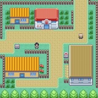
Map Name: Unnamed
Map Game: Fire red
Credits: Disturbed
Comments: Just a practice map.
Map shot:
Oh my, this certainly is a square map. I can't really say anything about this that wasn't already said in the first sentence. This is a town and not a city, so putting the houses in such an
ersatz is a no-no, especially to this degree. Spread the flowers out more, make that cave at least seem like it has a purpose, and please fix the borders. Make the trees continue off of the map, the border tiles should fix it.
Just don't make it feel completely artificial and give it some shape.
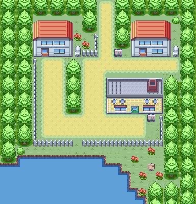
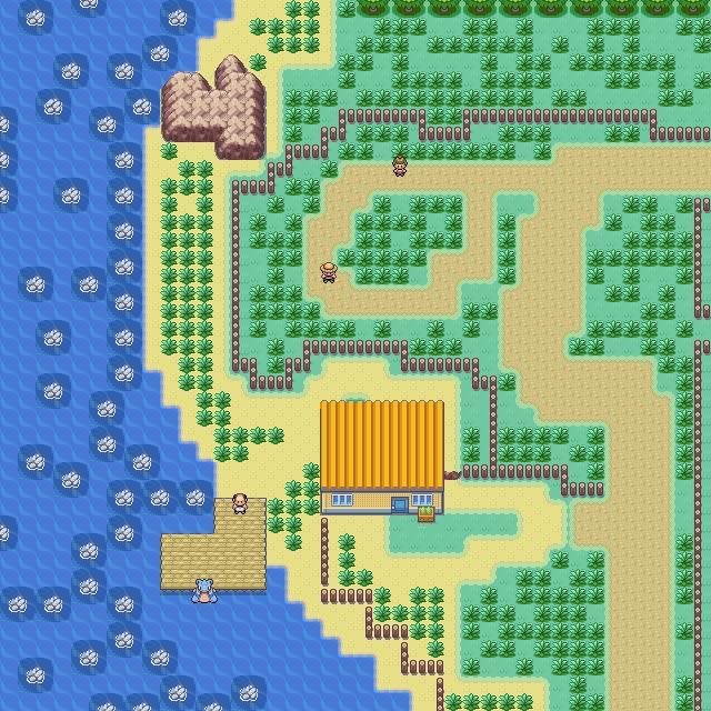
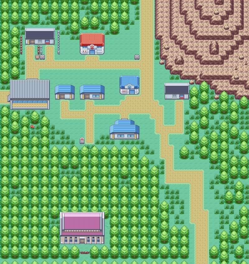
Map Name: MT. Pallet
Rom Base: Ruby
Credits: Reck and Banjora
Comments: Well I posted another map that wasn't rated so, I already updated it, so might as well post the better version of the map. Please give my map a rating and hit with your best shot because I will improve it.
It's um…small. The houses don't really fit that much with the tiles. The one tile wide stairs are irritating and so is the one tile path to the lower house. I'm pretty sure the tiles of the small trees against the mountains are tile errors. And the mountain follows itself too much.
Change the houses, fix the tile errors, and
please don't make one tile wide paths.
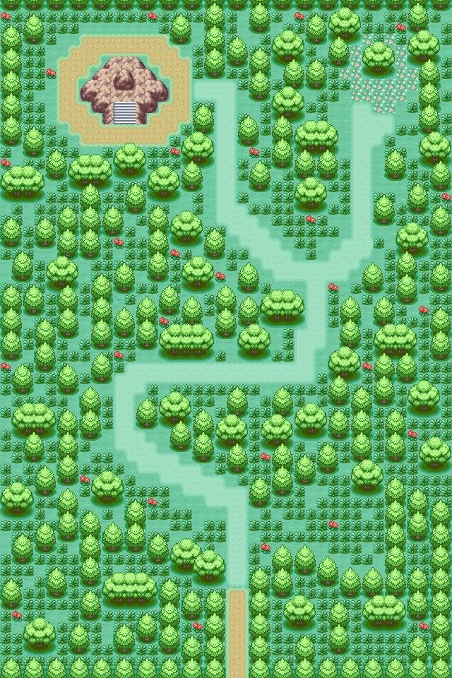
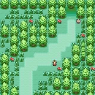
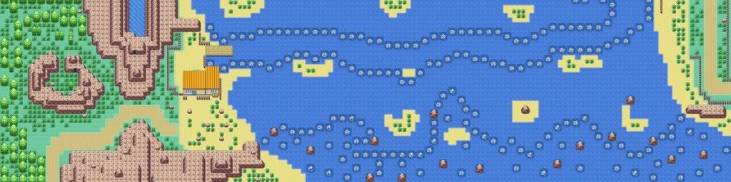
Name: Northwest Route 1
Game: Hyacinth
COmments: You enter at the bottom. Top left route leads to a bypass of the next town. Top right and center leads to the next town. In the middle is a forest dungeon.
Here's your spoiler...
Both halves of the map are certainly missing something that makes them really nice looking. The bottom half doesn't really have flowers that are spread out over it. The mountain just looks like it's there for the lulz and the lake is similar, although it should have lake tiles. The house looks just as pointless as the mountain. The top half is just missing something that makes it look more diverse. It's somewhat of a big fault, to me at least.
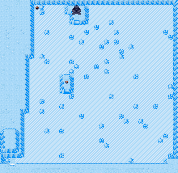
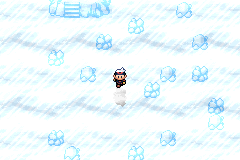
Map: Destiny Cave (working title)
Hack: Iolite (not enough progress to post on PC yet...)
ROM Base: Ruby (U) [AVXE]
Comments: It's an ice maze. I LOOOOOOVE making ice mazes. This one is the most difficult I've done so far. (Ignore Groudon, he's a placeholder for a different Pokémon. ^^)
It certainly is hard to navigate. When making an ice puzzle you have to remember that you need to give the players a small spot for a break. The mountain border also looks terribly linear for something like an ice cave.
Fix the mountain shape and put some small floor patches so the player can have a break. It looks irritating otherwise.
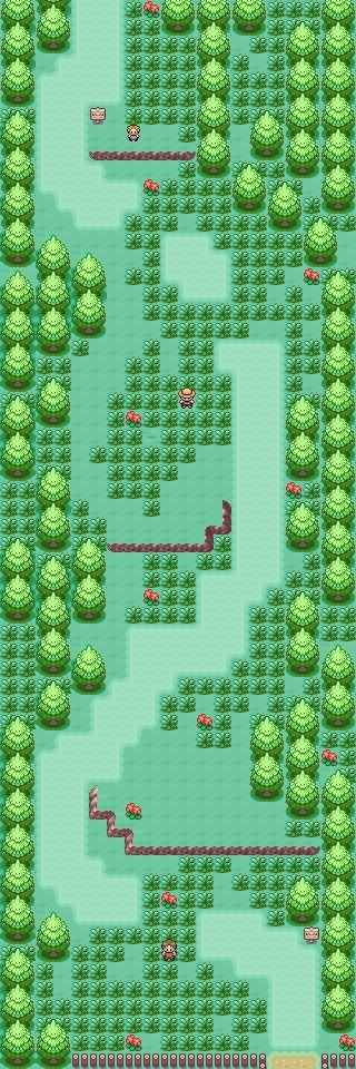
Map Name: Route 301
Map Game: FireRed
Comments: This map I made for fun. Credits to Kyledove and Alucus for tiles ~
Mapshot:
It's extremely empty. The sand paths are pretty big and I don't know how much people actually like when that happens. I have a lot of trouble rating maps that don't have much happening in them, so this is the most I can do for this map.
Add some flowers to make the map more vivid, after slightly thinning the sand paths of course.
Map Name: Greenwood Town
Map Game: FireRed
Map Hack: Pokemon Destiny: Legend of Death
Credits: Wesley FG and Kyledove for tiles~ I forgot who the house's tiles owner is VM me if you know...
Comments: I think it's a decent town. I like it, and the sidewalk's shape is pretty good I'm guessing.
Mapshot:
Ugh, fat sand paths again. The gym and house feel too out of place and it lacks flowers. The mountains are incredibly organized, and I don't know why, but I have a problem with "one tile wide" mountains, they just don't fit in any maps PERSONALLY. The sand paths don't go up to the houses despite being so big, and those one tile wide paths yet again. I know it shouldn't be much of a problem, but it's just a pet peeve.
Fix the paths, add something to make the map more vivid, and use more fitting tiles please.
If I didn't rate your maps, I most likely have a reason to.