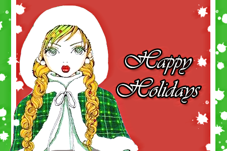
Ryouki --
I still can't see why you don't like that banner D: I fell in love with the background <3 It looks so... Pretty, I guess. The clipping masks over the guy's shoulder stops it from looking like a render pasted onto a background, which is really cool. And the colours are lovely as well. More effects would have been nice, and the text needs some work, but other than that, I have nothing else to say. Besides the fact that it looks nice, and it sort of makes me want to watch that anime.
Souless --
I'll focus on the banner, but the same stuff may probably apply with the avatar, as well. Compared to some banners I have seen from you, this one looks better, I guess. I don't like the lowered opacity of Jirachi, nor do I like the yellow-ish drop shadow, which was rendered with the image :| And, because of the lowered opacity, and probably because of the colours used, the text stands out more than it should. The spacey background fits with the theme, but there's too much open space around the banner. Smaller banner dimentions, with smaller text should fix that up, though.
evilcheese --
I guess the dark and grungy style works with Flygon... But perhaps it's a bit too dark? Or I'm just not used to dark banners. Anyway, I like how you blended Flygon into the background, almost making it look like it was in a sandstorm or something. Very nice. Although it would look more like a sandstorm, if the effects were sharper, and more, erm, sand-like, rather than lookin slightly blotchy. The text is okay, but the outer glow is a bit much. Then again, you can't really remove the outer glow, because then it'd be impossible to read the text, so, I guess it's not too bad now. Oh, and I like the colours.
Chikara --
Simple is best? xD Aaaah! The image is so cute x3 The selection border looks very appropriate here, and almost adds to the 'cute-ness' factor. The only bad thing I have to say is that the outer glow looks 'misplaced'. Unless it was part of the original image. But yeah, it looks strange O_o A white, 2-3 pixel stroke probably would look better, instead. The pink-ish background is good too, and the colours are nice. Oh, and the avatar dimentions are nice, too. I don't tend to see avatars like that, so, it's uniquely cool.
Satsuki --
[banner 1] Ooh, spatter... -shot'd- The background isn't too bad. But it's the fact that the background is so simple, yet the render is quite complicated. It looks... Odd, in a way. Although, a more complicated render means that most of the focus is placed on the image, so a simple background could be advantageous, as well. It's pretty good, for one of your first backgrounds ^^ As for the text, the stroke may be just one pixel too big. Or maybe more. But, yeah, it's a bit too thick.
[banner 2] I like this one ^^ I especially love the colours. I also like the 'paint on canvas' look (it kind of looks like that for me, so if it's not meant to be like that, then I'm just seeing things). The image quality isn't the best, though. At some areas, it looks grainy, almost JPEG-y (when you save something in JPEG using Paint). Other than that, it's still very nice.
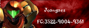
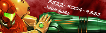
joangaes --
You need to work on rendering D: It looks way too rough, and I can see black bits floating around Samus. This makes the banner look like a render slapped onto a background, which is the kind of thing people should try to avoid. The render quality looks unpleasant, as well. Way too much space in between the two lines of text, and the white seems to come out of nowhere. The font doesn't match, either. The background is nice, but perhaps needs a bit more work.
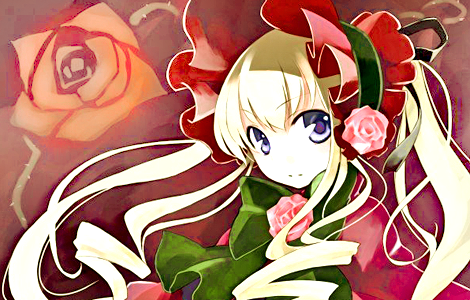
Shika --
lul, it actually does look like she summoned the background. The background colours match the render, but the spatters in the background are all blotched together behind her. So it looks like one giant purple splodge D: The C4D background is pretty cool, but if you want it to fade to white around the outside, erm, make it look 'fade-y'-er? -shot'd- But really, it doesn't fade to white too well. Oh, and you still need to blend the render more to the background. It's pretty good, anyway. I like the border... xD
---
Gah, I want a banner rated, but it's not done yet... >.>