So apparently my house decided to blackout hours after a thunderstorm went away and all my critique was lost, to my dismay. Would've done this earlier, but man do I hate redoing things. I'm really rusty with critique, so this is kind of awkward for me.
@ Choice 1:
+ Interesting depth
+ More aesthetically pleasing the more I look at it
- Depth makes the whole thing look like an awkward blur
- I'm not sure if it's because of the depth or the color pallette of the render, but the colors look rather weird, which makes the green in the middle a little glaring
- Typography could use some work, it draws a little more attention than I would've liked
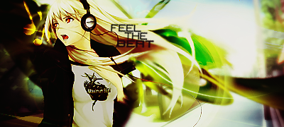
@ Choice 2:
+ Colors. Frankly monochromatic color schemes have gotten boring to me over the last year, but it's made interesting through the lens flare looking things.
+ Typography. People might not agree with me on this, but honestly I see the subtext as flavor and it makes the typography more interesting, yet not distracting.
+ Flow combined with theme.
- Lighting. Strong, but strange. I assume the black gradient in the top left is supposed to draw attention to the focal, but it bothers me that it overlaps with the light source. And on that note, it's also rather strange how there's this one strong light source, but the lens flare looking thing is just as strong, and it makes the tag look kind of unpolished.
@ Choice 3:
+ Lovely execution of the theme
+ Use of complimentary colors
± Coloring, particularly on the face, looks kinda weirdish. Well, plus-minus because it looks aesthetically pleasing to people who haven't gotten tired of coloring. Make that what you will.
- Trebble sign is a bit distracting
Hmm... personally I feel this is a close tie between 2 and 3, but my vote must go to...
Number 3.
Okay to be fair, when judging this on personal preference, I would've said number 2, however I feel number 3's resource placement was done much better than number 2. Honestly I would've hated to vote for this battle based on personal preference.