• Our software update is now concluded. You will need to reset your password to log in. In order to do this, you will have to click "Log in" in the top right corner and then "Forgot your password?".
  • Welcome to PokéCommunity! Register now and join one of the best fan communities on the 'net to talk Pokémon and more! We are not affiliated with The Pokémon Company or Nintendo.

[Free Shop] Store of Magical Qualities (Unicorns currently out of stock)

Circuit

[cd=font-weight: bold; font-style: italic; backgro
4,815
Posts
16
Years
Aiden's Graphical Store of being Awesome!

WELCOME ONE AND ALL TO A GRAPHICAL STORE BEYOND YOUR IMAGINATIONS.

Here we offer magical tags and creative icons and other things besides! Within the following Spoiler tags you shall find a collection of my more recent works, and a couple of older works too. In the event that you really like something and wish for me to extend the awesome to you as well, scroll down a tad further and fill out a little form. That will go a long way towards getting you your very own wondrous creation!

Without further ado, let me present to you my work thus far:
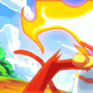
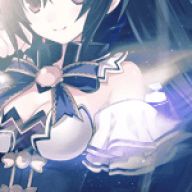
Wallpapers:
Spoiler:


Tags:
Spoiler:


Icons:
Spoiler:


Requests!

Shop Status: CLOSED

If you would like to request something from me, please feel free. If you do, just follow this guideline, and I'll get back to you as quickly as possible! To prevent myself from becoming overloaded in the future, I will only accept up to five requests at a time, but at least one should get done per day. You may request whatever you like, as long as it is within PC's rules, and you will in due course receive your very own personalised piece of magic :D

Also, it is not compulsory, but if you do request something, it would be very much appreciated if you could pick an existing piece you particularly like and explain why you like that piece. This will also help me give your request that extra sprinkle of awesome to make your request totally amazeballs!

Remember please to give me credit for your art somewhere in your signature as well please, if you use my art. Helps me a lot ;)

Request Form:
Username:
What you want: (Tag, Icon, Profile Pic, Wallpaper etc.)
Render/Stock: (This is the image you'd like to be the focus of your signature)
Colour Palette: (If you know what you'd like to go with your focus. I may or may not follow this, depending on if the colours work)
Theme: E.g. Calm, violent, vibrant
Size: (For Wallpapers and Icons mostly, but if you know the size of Tag you want, always helps)
Text:
Avatar counterpart (For Tags)? Y/N

Current Requests:
Spoiler:


If there is anything unclear about any of this, drop me a VM/PM and I'll get back to you when I see it. Otherwise please enjoy your stay, enjoy your requests and enjoy my art!​
 
Last edited:
113
Posts
9
Years
  • Age 26
  • Seen Dec 23, 2022
Your stuff looks good, especially the sig. I'd personally move the text a bit to the left tho.
 

Skip Class

previously zappyspiker, but rainbow keeps trying t
4,717
Posts
15
Years
It's nice to see someone asking some critique for once here. I'm not the best at it, but I'll try give you some:

Took a bit of piecing out how your tag worked xD

Well first of all, nice job on the signature. Out of the 3 it is definitely your best work.
Really like the colouring to what you've done on the original render.
  • First things first is that I feel the stock has been pushed a bit too far to the right. Even just the slightest bit left would make a bit of a difference. Placement of a stock or render is incredibly important since with just that you can already make things like the flow, text placement and empty space work even better.

  • Black/ greyish background doesn't really blend well with the stock image. Too much contrast, not enough blend. The change between the blues to the blacks is a bit sudden. The blacks themselves a little too black.

  • Light source by her hand is a bit too bright and somewhat distracting, it feels like you've really over burned it. You should tone the lighting effects down a bit since it somewhat divert any attention on the other details of your tag.

  • I can see a flow starting to come into the tag but it's still coming out pretty unclear especially with the change in opacity level/ layer setting. There's a bit of clash going between the c4d that you've used and Ahri's tail. Definitely look into getting more flow into your tag. It's incredibly important

  • Personally not fond of the text especially with it's placement. Like SvelteDonut said you can move it slightly towards the left but even placing it on the focal image with a slight offset is something you could try experimenting with.

Another thing you could work with is also trying to get some depth into your tag. With the stock/render you have currently, there is a lot of potential and opportunities for some depth to be in there somewhere.

That's all I'm going to write for now, but I do really hope you make some more graphics pieces :) It's definitely a good start and you've got lots to improve upon. If you haven't already, definitely take a look at this thread - It's incredibly helpful.
 
Last edited:

Circuit

[cd=font-weight: bold; font-style: italic; backgro
4,815
Posts
16
Years
It's nice to see someone asking some critique for once here. I'm not the best at it, but I'll try give you some:

Took a bit of piecing out how your tag worked xD

Well first of all, nice job on the signature. Out of the 3 it is definitely your best work.
Really like the colouring to what you've done on the original render.
  • First things first is that I feel the stock has been pushed a bit too far to the right. Even just the slightest bit left would make a bit of a difference. Placement of a stock or render is incredibly important since with just that you can already make things like the flow, text placement and empty space work even better.

  • Black/ greyish background doesn't really blend well with the stock image. Too much contrast, not enough blend. The change between the blues to the blacks is a bit sudden. The blacks themselves a little too black.

  • Light source by her hand is a bit too bright and somewhat distracting, it feels like you've really over burned it. You should tone the lighting effects down a bit since it somewhat divert any attention on the other details of your tag.

  • I can see a flow starting to come into the tag but it's still coming out pretty unclear especially with the change in opacity level/ layer setting. There's a bit of clash going between the c4d that you've used and Ahri's tail. Definitely look into getting more flow into your tag. It's incredibly important

  • Personally not fond of the text especially with it's placement. Like SvelteDonut said you can move it slightly towards the left but even placing it on the focal image with a slight offset is something you could try experimenting with.

Another thing you could work with is also trying to get some depth into your tag. With the stock/render you have currently, there is a lot of potential and opportunities for some depth to be in there somewhere.

That's all I'm going to write for now, but I do really hope you make some more graphics pieces :) It's definitely a good start and you've got lots to improve upon. If you haven't already, definitely take a look at this thread - It's incredibly helpful.

Thanks for all your C&C. It's quite a lot to work on at once, but hopefully my next piece will be better, and show some form of improvement! I'm going to try and produce one piece a day, but I may not have time on some days. But keep an eye on this post, I'll update it a lot, and hopefully get a lot of critique to keep me improving as I go :D
 
17,133
Posts
12
Years
  • Age 33
  • Seen Jan 12, 2024
You know, I actually like how static and far to the right your signature is. I don't know why, but the colors and the positioning.. it just sits well with me. Really, it just doesn't seem like you added enough.. depth. The whole sig is very shallow, and lacking any distinct foreground and background. The best thing you can do for this piece and for yourself in the long run is just keep experimenting. Keep having fun and pushing yourself. You've got the basics down, and it's clear you know what you're doing. Just keep at working those skills and practicing, because I can see good stuff coming from you with enough time and patience.

Please keep it up man. Super excited to see what else you can come up with! :)
 

Circuit

[cd=font-weight: bold; font-style: italic; backgro
4,815
Posts
16
Years
I think depth is going to be my main focus, and you'll see me working on it quite a lot in the days and weeks to come, and hopefully I can show you how much I want to improve.

So, I finished a piece today focusing mainly on depth, trying out a few new techniques and such. I'm working with tags, as there are a lot more stocks and renders available for me to work with, and they are just generally good for practising on. So today's piece:

ryukotag_by_firestar84-d8elice.png


Again, any C&C you can give is greatly welcomed! For this piece I am more worried about depth, but anything that is good, but can be made better for future use, anything like that etc. Thanks!
 
Last edited:

Circuit

[cd=font-weight: bold; font-style: italic; backgro
4,815
Posts
16
Years
Just a small bump ^^

So my update for Monday is here. I have a new Tag which also has some text in (general shock and gasps from the - rather empty - audience). Yes! And I wonder if it looks any good at all XD Anyway, another play around with depth, and I've (tried) to make the flow a little different. Whether it worked or not is up to you guys. What do you think?

kirito_tag_by_firestar84-d8epgvl.png


Remember, I'm looking for all the C&C I can get. So I'd love to hear about what you think seeing my pieces guys!
 

Saki

The Fire Fox
168
Posts
10
Years
Hey darling!
I really admire the depth on this piece here:
Spoiler:


It makes for some really interesting visuals. I don't think I can be as helpful as Zappy is but I can tell you that it's my personal opinion that the Eren wallpaper could be made a bit more exciting. I understand you added text and wanted to keep it flowing with the work and well blended but I truly think if you brought it down to interact with the render, made it big and exciting, changed the font, and really worked with it then it could come out incredible. I am sure this is vague but my thing with text has always been "go big or go home" (it doesn't mean it need to be big but more so that you spent some time on it and its got some level of complexity or contrast. If you want it to blend in as much as it is then maybe just remove it? If you want to get some focus on the image and some neat flow going on then pick a different font and get creative.

Regardless I truly like the said wallpaper and would consider using it for my own desktop.

I look forward to seeing more from you. :)
 

Skip Class

previously zappyspiker, but rainbow keeps trying t
4,717
Posts
15
Years
Great job on the work Aiden :) And getting them up so fast too! Won't give too many comments today since I'm not on for very long, but I'll give you a few comments:

ryukotag_by_firestar84-d8elice.png

Definitely a big improvement in terms of the depth. I think this is my favourite tag from yours at the moment and it had a lot of potential to improve and become a really powerful piece.
  • Good start working with the blur, but the blur doesn't have to be too blurry. Yes it creates depth, but you don't need that much especially since you've sharpened Ryuko well. I can see you have some parts of the exploding c4d slightly less blurred than others which makes it even slightly more three dimensional.
  • In the future, don't be afraid to erase parts of C4Ds out. Only worry about this tag is that it's a tad bit cluttered, but at the same time for this tag in particular, that c4d gives out a powerful vibe to go with the the powerful render.
  • With C4Ds, getting started it's good to start with picking ones which fit well with the render. Like how Ryuko has a lot reds and dark blues, you should be aiming to look for that. The yellow isn't that bad per say, but it doesn't quite fit with the render itself. Somewhat goes the same with the background and shattered c4d. The render itself feels a tad bit disconnected with the other parts of the tag.

kirito_tag_by_firestar84-d8epgvl.png

Good to hear that you are starting to look into flow.
  • Most important thing that stands out is definitely the text. No doubt text isn't easy. Even I still have lots of trouble working with text, so I don't usually put it in. You're starting to get a good placement of the text (text should always be near the focal) - Personally I would have gone closer to his stomach.
    Text overall needs a lot of work, the sudden white with black outline doesn't work well with the rest of the tag and the dark blue text with blur also doesn't work. Sometimes just a simple white/black font can do a lot by itself.
  • Those green effects going on there are somewhat a tad bit distracting, the colours themselves don't fit well with the render.
  • I can see action happening with the c4ds, but they're still not creating much of a flow (c4ds are really clashing and a bit messy atm).
    When creating a tag, pay attention to your render and see if you can find a certain "flow" of direction from just the render itself (if the render or certain part of a render has a flow that's stands out in a certain direction). Then place your c4ds according to the flow of your render. (haha it's hard to explain, but hope you can get something from it.)
I really admire you making at least one a day, can't wait to see what your next ones are like!
 

Circuit

[cd=font-weight: bold; font-style: italic; backgro
4,815
Posts
16
Years
Thanks for all the critique Zappy! I will be sure to come back to these pieces and update them in time, but for now I want to focus on getting as much practise with different renders and styles as possible. But rest assured all your comments are being noted, and I'm really trying to make sure I'm more aware with every piece I make!

Saki, I'm glad you like the wallpaper, and yes, those are some improvements I now would love to try and implement on the wallpaper, but sadly, that was one of the pieces I lost when my hard drive was wiped, and now it only exists on Deviantart. So unfortunately, I can't update it in future. But next time I will make sure I keep your advice in mind, thanks!

And for today's piece:

toothless_tag_by_firestar84-d8etihd.png


I've focused a bit more on trying to get some flow into the piece, but of course I'm also practising depth and working on improving my lighting. No text this time, I decided I can't focus on everything at once, so I've left it out for now, but I'll be back another time with more. So, how can I improve it? What is good but can be better? What do you dislike? I want to hear it all! :)
 

Circuit

[cd=font-weight: bold; font-style: italic; backgro
4,815
Posts
16
Years
Another small bump!

I am sorry for not posting yesterday, I didn't have much motivation for anything XD

Anyways, I would love it if you guys would comment on my work. I really need C&C to help me improve, but positive comments are always nice to hear as well! I want to hear from you guys, so please say whatever you think!

Today's piece is a piece I am VERY happy with. I feel that it looks really nice compared to some of my previous pieces. There is always room for improvement, and I want to know what I've done wrong, right and what I could make better here.

lelouch_tag_by_firestar84-d8f3y6n.png


So please, comment away!

EDIT: Aiden's shop is now OPEN!

You guys come now come to me with requests for anything you'd like. See the first post for what I can make for you, and the small easy form you should fill out for me to make it as good as I can for you!
 
Last edited:

Circuit

[cd=font-weight: bold; font-style: italic; backgro
4,815
Posts
16
Years
Yet another bump (come on guys, I'm almost pleading for comments, criticism and so on).

I have a piece of Rin this time, practising more flow and depth. I'm very sorry for my lack of updates, I've hit a low I'm struggling to get over, but I've done this to put here now anyway. So what do you guys think? I'm still trying to establish a good style to incorporate flow, lighting, depth and more. I think slowly I'm getting closer to a style, but I can't get there without a bit of motivation from the c&c you guys could leave, or requests you could make.

rin_tag_by_firestar84-d8fshrn.png


So whatcha think guys?
 

Infernape

fire power!
340
Posts
15
Years
Nice works! I look forward to seeing your shop flourish! That being said, I'd like to request.
Username: Infernape
Render/Stock: http://i49.tinypic.com/15hfig6.jpg
Colour Palette: White and Deep blues
Theme: Calm
Text: Ice Vengeance
Avatar counterpart?: Yes, 130 x130, please
 

Circuit

[cd=font-weight: bold; font-style: italic; backgro
4,815
Posts
16
Years
Nice works! I look forward to seeing your shop flourish! That being said, I'd like to request.
Username: Infernape
Render/Stock: http://i49.tinypic.com/15hfig6.jpg
Colour Palette: White and Deep blues
Theme: Calm
Text: Ice Vengeance
Avatar counterpart?: Yes, 130 x130, please

I have to say I love your KLK and Code Geass sigs. They're very nice. The slight tints are very well placed in those, in my opinion.

Username: Succubus
Render/Stock: http://www.renders-graphics.com/image/upload/normal/Lightning-3.png
Colour Palette: Pinks and whatever else you'd want to use
Theme: vibrant
Size: 130 x 130

Thanks guys, I'll get working on these right away! And thanks for the positive comments guys, they mean a lot :3
 

Circuit

[cd=font-weight: bold; font-style: italic; backgro
4,815
Posts
16
Years
Nice works! I look forward to seeing your shop flourish! That being said, I'd like to request.
Username: Infernape
Render/Stock: http://i49.tinypic.com/15hfig6.jpg
Colour Palette: White and Deep blues
Theme: Calm
Text: Ice Vengeance
Avatar counterpart?: Yes, 130 x130, please

Well, I'm just about done here! Sorry it took so long, I've been a bit busy than I'd wanted this weekend. But nevertheless I have done it, and hopefully you'll like it!
Here's the Tag:
infernape_tag_by_firestar84-d8g9g7h.png


And here is your Icon:
infernape_icon_by_firestar84-d8g9gku.png


I hope you like it! I had a bit of trouble with this one too, but I hope it has come out to your liking ^^

I have to say I love your KLK and Code Geass sigs. They're very nice. The slight tints are very well placed in those, in my opinion.

Username: Succubus
Render/Stock: http://www.renders-graphics.com/image/upload/normal/Lightning-3.png
Colour Palette: Pinks and whatever else you'd want to use
Theme: vibrant
Size: 130 x 130

So Succubus... I made two, because I used an effect and couldn't decide which variant was better, so I'm going to let you choose :)

#1:
succubus_icon_by_firestar84-d8g9miq.png


#2:
succubus_icon2_by_firestar84-d8g9mru.png


If you dislike both, let me know what's wrong and I'll improve it for you, no worries :) But hopefully, you'll like at least 1 ^^
 
Last edited:

Circuit

[cd=font-weight: bold; font-style: italic; backgro
4,815
Posts
16
Years
Your request that you finished along with the Code Geass signature are my favorites.
The Grey around the subject in ice vengeance is very nice as well as the text! I like the angle you put it.

Username: Noire
Render/Stock: http://fc08.deviantart.net/fs71/f/2..._anime_girl_render_by_schorch2812-d869c4y.png
Colour Palette: greens and white
Theme: Calm
Text: Dragonic Voice
Avatar counterpart?: Yes please! 150x150 in size

Danke ^^ Text has never been a strong point (my weakest actually I think) so a compliment really lifts my spirits, thank you so much <3

You're top of the list, I'll get to it right away! Man, all this practise will get me far (hopefully). And next week I should have a graphics tablet, so I'm going to start practising with drawing my own characters and renders, instead of simply copying and editing them, so I'm looking forward to that step forward. Of course it'll take a while before I even attempt to do requests, but I'm excited :3
 

Shadow Sneak Sableye

Bright Beauty ♥
259
Posts
14
Years
Back
Top