Maraala
a fiery passion
- 1,043
- Posts
- 14
- Years
- Age 29
- Lavaridge Town
- Seen Apr 9, 2016
A ittle bit of Magic~
Better formatting to come soon.
(CSS used with permission by TheSmartOne)
I'm fairly new at graphics, so don't expect something exceptional.
Icons
Other Stuff
Better formatting to come soon.
(CSS used with permission by TheSmartOne)
I'm fairly new at graphics, so don't expect something exceptional.
Icons
Spoiler:
Vocaloid


Touhou


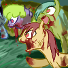
My Little Pony: Friendship is Magic


Kingdom Hearts: Birth by Sleep


Touhou
My Little Pony: Friendship is Magic
Kingdom Hearts: Birth by Sleep
Other Stuff
Spoiler:
Last edited: