
You are using an out of date browser. It may not display this or other websites correctly.
You should upgrade or use an alternative browser.
You should upgrade or use an alternative browser.
Map Showcase and Review Thread
- Thread starter abnegation
- Start date
- Status
- Not open for further replies.
More options
Who Replied?
Harvey_Create
Pokemon Apex Team Member
- 187
- Posts
- 11
- Years
- Age 27
- Iowa
- Seen Jul 12, 2015
well, i know there are errors. i had issues with RMXp, so i had to backup the maps, but when i did and updated everything, tey dissapeared. so i no longer have them
Zodiac.
Flannary Returns!
- 53
- Posts
- 11
- Years
- Age 28
- Wherever I drift off to next...
- Seen Sep 25, 2014
With the permission of Rayquaza-Dot, I now claim ownership of Rishend Town, as you can see I've changed it from BW to Platinum style which is the chosen style for Pokémon Carbon.
It isn't finished yet but will look better once I start to not rush things.

It isn't finished yet but will look better once I start to not rush things.
Spoiler:
Rayd12smitty
Shadow Maker
- 645
- Posts
- 12
- Years
- Seen Feb 21, 2016
@Zodiac
Something seems off with the stairs. It seems like you used individual stairs and stacked them. Its really empty too.
Like the tiles though
Something seems off with the stairs. It seems like you used individual stairs and stacked them. Its really empty too.
Like the tiles though
- 189
- Posts
- 14
- Years
- Seen Nov 23, 2023
^ That, and with vertical cliffs like that, you need stairs longer than the height of the cliff. Pythagoras and all, y'know? Currently, what Zodiac has is a ladder. I'd advise finding a more tesselable stair tile, moving the upperleft stairs slightly to the east and making them 6 tiles high, and the other two stairs 3 tiles high.
Also, the buildings should have borders. At present, the lack of borders clashes with the heavily bordered environment tiles. The left blue building should move slightly east and the right double story house should move slightly northeast.
Also, the buildings should have borders. At present, the lack of borders clashes with the heavily bordered environment tiles. The left blue building should move slightly east and the right double story house should move slightly northeast.
Elaitenstile
I am legend
- 1,908
- Posts
- 11
- Years
- Age 24
- Seen Feb 27, 2015
With the permission of Rayquaza-Dot, I now claim ownership of Rishend Town, as you can see I've changed it from BW to Platinum style which is the chosen style for Pokémon Carbon.
It isn't finished yet but will look better once I start to not rush things.
Spoiler:The image was here
Like the no-outlined tileset for the houses, but not gonna lie, it looks missing without the flowers. Also it clashes with the trees, who have outlines. You might want to put in a sign saying this is Rishend Town xD.
If I were playing a game on this town... I would find it normal, and good-to-go type of style.
And jim42 said the rest of what I wanted to say, except his is more detailed and specific.
Atomic Reactor
Guest
- 0
- Posts
Another thing about this map, that MANY people seem to not realize, is that the mountain terrain that you walk on (below the two homes up top) is not the same tile as the mountain terrain that goes on the top of mountains (like the bottom right mountains)
It's a huge mistake that many people don't realize, take a look at any official map with mountains, they are never the same tile. It also just looks lazy.
The stairs have already been mentioned (they need to be longer, and connected)
And the map in general is just boring. Put some flowers in it, don't make the paths so square. Idk, just make the map have a more natural feel. The ponds seem kinda random as well.
Atomic Reactor
Guest
- 0
- Posts
Well JNathan ,this map definitely needs a lot of work.
It's a good idea to make sure there's a border of trees around it so we can clearly define the exits and entrances of a map.
On top of that, the map is wayyyy too open. The flowers aren't random or natural looking, looks like you just quickly drew some lines of flowers. Paths are too straight and boring. A very unnatural looking map. Break the grass up a bit, add some to the top half of the map as well. Fix some of these things, then upload what you've fixed :)
Thanks, that's exactly what I needed. I'll fix it.Well JNathan ,this map definitely needs a lot of work.
It's a good idea to make sure there's a border of trees around it so we can clearly define the exits and entrances of a map.
On top of that, the map is wayyyy too open. The flowers aren't random or natural looking, looks like you just quickly drew some lines of flowers. Paths are too straight and boring. A very unnatural looking map. Break the grass up a bit, add some to the top half of the map as well. Fix some of these things, then upload what you've fixed :)
EDIT : I just posted a modification of my map.
Last edited:
Atomic Reactor
Guest
- 0
- Posts
Ahh yes, quite the improvement.
The bottom path should be enlarged by two tiles, to the left.
Maybe break the paths up a bit? Have like a line of grass going through them?
Scatter the flowers more, in most games, they have a checkered pattern.
Usually on a route, you HAVE to go through a majority of the grass. Try and make it you're forced through it, but can take the ledges back without going through it.
There's also still openings on the bottom right and bottom left. So we don't know exactly where the entrance/exit is.
Elaitenstile
I am legend
- 1,908
- Posts
- 11
- Years
- Age 24
- Seen Feb 27, 2015
Somehow i feel this map is still as bad as the first one but however...
Spoiler:This is my modified map
I think that it needs more trees around in places. Also most of the grass can be easily avoided so there is practically no use of it since in the gameplay it would be the same. The signpost is also touching the trees which is a bit disturbing, so position it one tile right IMO. Also the flowers are looking pretty square and alligned, which is something you wouldn't want unless you're making a Floroma Town remake. A little more wildness would do. The pathway should be blocked with trees or grass many-a-times so that facing wild Pokémon would be inevitable. Also, the main reason we use ledges is to avoid stepping on grass on the way down, so yeah, you'll have to put grass on the gaps of ledges.

Radical Raptr
#BAMFPokemonNerd
- 1,121
- Posts
- 13
- Years
- Age 29
- everywhere
- Seen Apr 15, 2024
Somehow i feel this map is still as bad as the first one but however...
Spoiler:
I like the feel of it, but it seems too bland and blocky. and the flowers look too perfect; I think you need to spread them out a bit more
I get the fleeing its not much of a major route, just a connection route where you may find some interesting pokemon, is that pretty much what it is?
Meanwhile, lets look at my newest map :D
Spoiler:
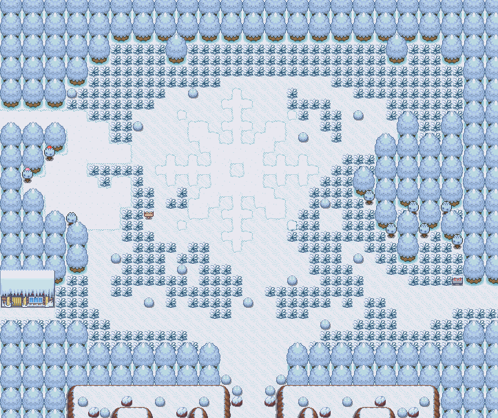
It's just a route that leads to an area i havent though of yet, and the mountain side leading down (this is the summit of a mountain - you emerge from a cave to a town on top of a mountain where it snows (obviously) and connects to the top left of this map.
Elaitenstile
I am legend
- 1,908
- Posts
- 11
- Years
- Age 24
- Seen Feb 27, 2015
Good job with the snowflake design there, and I think you've made the layout well, although I'd suggest adding more 'spice' to the two hills at the start, maybe put up an extra layer, because they look identical.
I think the grass layout is good, but you'll have to block the pathways leading outside the map with a little grass. I think the signpost could be moved one square left, but that's only my nagging opinion xD. I'm sure there are way more experienced mappers than me though... xD
I think the grass layout is good, but you'll have to block the pathways leading outside the map with a little grass. I think the signpost could be moved one square left, but that's only my nagging opinion xD. I'm sure there are way more experienced mappers than me though... xD
Rayd12smitty
Shadow Maker
- 645
- Posts
- 12
- Years
- Seen Feb 21, 2016
Does eevee evolve to Glaceon on this map?
I really like the snowflake!
There is too much grass, especially in the upper area. Also I recommend making the mountain/hills more natural and less boxy. Cool idea
I really like the snowflake!
There is too much grass, especially in the upper area. Also I recommend making the mountain/hills more natural and less boxy. Cool idea
Radical Raptr
#BAMFPokemonNerd
- 1,121
- Posts
- 13
- Years
- Age 29
- everywhere
- Seen Apr 15, 2024
nah, I never liked the whole area exclusive evolution, I decided to make every evolution a stone evolution, so there is an ice one and a grass one for leafeon and glaceon, and the fearow+growlithe equivalents :PDoes eevee evolve to Glaceon on this map?
I really like the snowflake!
There is too much grass, especially in the upper area. Also I recommend making the mountain/hills more natural and less boxy. Cool idea
I'll get rid of some grass, and I added another layer to the mountains but i kinda like how it looks, and the player wont see part of it anyway so i think it looks pretty good
- 309
- Posts
- 11
- Years
- Seen Jun 2, 2014
For a starter route,its good! Needs more grass though. The player can get by with out stepping on anything!
Anyways, what did you mean about I have a feeling its as bad as the first one?
Anyways, what did you mean about I have a feeling its as bad as the first one?
Elaitenstile
I am legend
- 1,908
- Posts
- 11
- Years
- Age 24
- Seen Feb 27, 2015
I took you guys advice and made a remake of the map. I think it is good now.
Spoiler:
@Saving Raven : It is just a connection route, not too important.
EDIT : yup, i'm really bad with flowers.
You might be bad with the flowers but you'll improve don't worry xD.
Great, now it looks like a very formidable and playable map! Although (I'm not gonna rub it in) I think you could add extra trees around near the sign post (A bit away from it, mind you) and an extra layer in some places where the grass is plain. (This might also reduce the flower dilemma)
- Status
- Not open for further replies.