• Our software update is now concluded. You will need to reset your password to log in. In order to do this, you will have to click "Log in" in the top right corner and then "Forgot your password?".
  • Welcome to PokéCommunity! Register now and join one of the best fan communities on the 'net to talk Pokémon and more! We are not affiliated with The Pokémon Company or Nintendo.

[Game] ♔ ART BATTLE #3 ♔ CBD VS killer150 : Pencil

Who wins?


  • Total voters
    16
  • Poll closed .
2,413
Posts
16
Years
CBD VS KILLER150
LET'S DUEL


The specifications:
Pencil Scenery​

Sorry about that grey box, had to cover up the signature for anonymous voting.
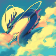
GkCMydd.png

#1

K4minxP.jpg

#2

Voting lasts for one week!
Use the poll, but go ahead put your thoughts about the work in the thread!

Don't forget that you too can sign up for your own art battle here!
Get in the queue today!​

Bigger Sizes:
#1
Spoiler:


#2
Spoiler:
 
Last edited:

ZKE

Not an ounce of maturity.
73
Posts
8
Years
I adore the mountain textures and the rays of the sunlight shining across the scenery in #1. The clouds and the right-side row of forestry is also appealing. The only downside I see is the more fluffy texture to the trees on the left compared to the smoother detailing of the right. In all, it feels the most realistic IMO.

#2's style reminds me more of something I'd see in the cover-flap of a fantasy novel laying out the land. It's not as intricate in detail yet still manages to convey the sense of mountains, hills, road, and if I am not mistaken, a river? A fine piece, but in this instance I have to vote for the more realistic #1.
 
37
Posts
19
Years
I voted for 1 as well. I like that it has more shading though I would argue that the sunrays need to be "evened" out more I guess, rather than a few straight lines if that makes sense? Still, it looks super good! The plants give a nice sense of depth, I wanna reach out and touch it.

Number 2 is also nice. I like the scene itself better, I love the water and forested mountains. It just doesn't have enough detail in the shading to be 1 in my own opinion, though it does have a lot of detail in the land's layout.

Both of you, amazing work.
 

SmokedPaprika

Basically Garbage
177
Posts
8
Years
  • Age 28
  • Seen Apr 2, 2019
Both of these are fantastic. I mean it. The shading and detail on the first one basically catches your eye right off the bat, and it's hard to resist the impulse to vote for it. However, the shading in the foreground is a tad too simple when seen from a larger resolution. The crops in particular feel blended together like one big mass, instead of individual crops. I understand the intended effect, but it just comes off as a little blah close up. The mountains and atmospheric perspective do wonders for it, but I feel as if the "lens flare" effect may be a bit overboard - I get it adds a larger than life feeling to the picture, but I'm not sure what about it needs to be larger than life.

The second one wasn't as immediately tantalizing on a first glance, but had the opposite effect when viewed at a higher resolution. The sheer scale and perspective of the piece is awesome. Going up and down both sides of the path is a real treat to the eyes - I mean it. I'd suggest, however, changing up your line weight/boldness as you get further away from the front of the image - it gives a greater feeling of depth to the overall picture.

I'm going with 2 for this. I admire detail, but I love the overall look of the second one.
 
162
Posts
8
Years
  • Age 37
  • Seen Jun 20, 2016
Number 1 looks more or less like a typical value illustration. The rocks are okay. The subtraction used on the sunlight is okay. However as you get to the feild and land mass a lot of false problems with the horizon kicks in. The Tree is kind of an eye-sore because it looks more like a man-made tree ( That word I forget ) rather then a tree of nature. Like somebody planted it on purpose and does not fit in with the rest of anything else. Otherwise it was a great challenge.

Number 2 is a flat out contour line drawning. Simular to Dragon balll but has much ridged artifacts to it. So it goes. You go tthe Hills and the Valleys. Much too much going on in order to look or admire it. As a background piece of being a part of a simpler image maybe but otherwise it is trying to hard.

Both look equally as good but take away that annoying Tree and maybe number 1 would win. IF number 2 had cut back and actually paid attention to detail work. I would root for it. However that waterfall ( without color ) is very bland and could mistaken for sand or something else. Number 2 uses too much stylization and demands you to stare at it.

I vote Number 1 for being more simpler to view and the artist used the same abilities as number 2 and more. In terms of knowledge wise. Again number 2 has too much and even with all the stylization ( needs to be colored in order to view ).
 
17,133
Posts
12
Years
  • Age 33
  • Seen Jan 12, 2024
I love the detail and mysticism of #2, but I wish it had the depth of shading that #1 did! If you were to put these two images together, you'd get one piece of damn beautiful scenery, imo. Once again I find myself stuck in which to vote for. ;;
 

CDB

148
Posts
8
Years
  • Age 26
  • Seen Mar 13, 2023
Thank you to everyone who commented & voted! I really appreciate all the feedback :) Traditional pencil art has never been something I'm super good at haha
Killer, you did an amazing job :)


Woo thank you for doing these art battles! :) Also I thought it was just a typo but it's actually CDB haha
 
Back
Top