• Our software update is now concluded. You will need to reset your password to log in. In order to do this, you will have to click "Log in" in the top right corner and then "Forgot your password?".
  • Welcome to PokéCommunity! Register now and join one of the best fan communities on the 'net to talk Pokémon and more! We are not affiliated with The Pokémon Company or Nintendo.

CRITIQUE! Map for Pokemon Honor And Glory

Zephdo

Pokemon Honor and Glory Co-Director
91
Posts
4
Years
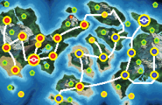
(no outline)ROUTE MAP no shadow.png
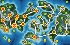
(with black outline)
ROUTE MAP SHADOW v 4 FINAL BEST.png
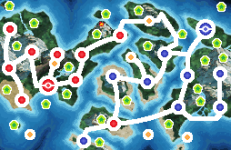
(with white outline)
ROUTE MAP SHADOW WHITE.png
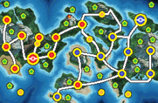
(more routes)
ROUTE MAP SHADOW v 4 FINAL EDIT ADD 2 MORE ROUTES.png
(more route + HGSS Sea Route Color)
ROUTE MAP SHADOW v 4 FINAL EDIT ADD 2 MORE ROUTES SEA COLOR.png

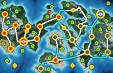
I made prototypes for game maps. I was wondering which style/version is the most aesthetic. Do you have any ideas on how and where can i improve? Any other suggestions?

Please do not steal, reupload or use without permission please...
 
Last edited:

Sunfished

(╯°□°)╯︵ ┻━┻
429
Posts
11
Years
  • Age 28
  • Seen Apr 21, 2024
In my opinion, i think the 2nd, 4th, or 5th one are good. The outlines help a lot to distinguish the routes from the map. 1 is also okay, but the outlines really add that "pop" into the routes, which is why i prefer the ones I listed. The 3rd is a no to me, mostly because it covers a lot of the map and feels really distracting to look at. If I had to make 1 choice, I think the 4th is what I'll go with!

Also really nice map! really diverse and looks fun to explore.
 
11
Posts
4
Years
  • Age 26
  • Seen Sep 23, 2022
I like the fifth one. The water routes are a nice touch, just to let the player know they should trying surfing to get to the next area.
 
Back
Top