• Our software update is now concluded. You will need to reset your password to log in. In order to do this, you will have to click "Log in" in the top right corner and then "Forgot your password?".
  • Welcome to PokéCommunity! Register now and join one of the best fan communities on the 'net to talk Pokémon and more! We are not affiliated with The Pokémon Company or Nintendo.

A Fresh Start

Status
Not open for further replies.

-Smash

Lv.86 Pixel Artist
73
Posts
14
Years
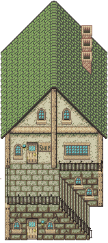
This house just screams FF6 to me.


But for crit:

The scratchy surface of the white walls could be toned down a bit, and the wooden surfaces would look better and smoother without the dithering.. Hell, many things here would look better with a bit more of contrast, smoother surfaces, and without the dithering.

You should remember that when shading small objects, dithering works better for defining rough surfaces and the like.. Over-using it will only get you scratched textures everywhere, giving the piece an unwanted monotony and substracted depth. The goal here is to find a harmonious balance between the elements used and the techniques incorporated.


EDIT: Counted and.. WTF! 23+ colours? That's just way too many.

Economizing colors is one of the most important aspects of pixel art, and surely one of the best methods to help oneself improve. For something like this, 16 colors can give you enough freedom as it is, but the fewer you have, the better, because it forces you to figure out effective placement of the shades and hue mixing, among others. It is why pixeling in 8-bit is the perfect practice you can get, I must add.

Either way, I strongly suggest you to lower the count.
 
Last edited:
2,243
Posts
19
Years
Actually, the first version had more colors. I think it had about 30, but I'm not sure. But yeah, I fully agree on the color part. I am still working on getting more out of there, and finding more "universal colors" (colors that can be used in more than one situation in a map or sprite). But there was at least some reason to my madness. I'm trying to limit my entire palette to 512 colors. That goes for EVERYTHING that will be made in this set, including character overworlds. I was going to say something about the doors, but then again I realized I used the same palette for the doors on the windows. Just for reference, though, the doors would not add to the color count. In the case of buildings, and in the style I am using them, they are treated as seperate, animated sprites (animations coming eventually). This is because they have many uses, not just this one building.

But also, I could say I'm using a layering system and making each object individually on a 16x16 tiled grid, leaving whitespace where these objects should go. I could also say I'm rendering it on a Super Nintendo in Mode 3 as a part of a major background with a few tiles in the second layer. Both of those would be lies, though. ;)

About the paint on the building, I totally agree. It could definitely be toned down. But there was one thing that I probably didn't do correctly, and that would be presenting the columns the way I wanted them to look. They're supposed to be rusted metal supports (made of a copper alloy), but I should probably rework them entirely to make them look that way. I think the contrast thing also goes hand-in-hand with the entire color issue, which means it will be worked on.

But also, you have to remember this is only one building. This is going to be a part of a much bigger background eventually, so what may not look pleasant or correct here could actually look better when added to a bigger map. As I was planning on doing with the last set, I am going to make two versions of the tileset. One with the original way it was made, and an alternate version with your critique taken by heart. That way, I also have some a median to work with if I like certain aspects of one thing but certain, different aspects in the other set.
 

Esmas

General
529
Posts
14
Years
Wow, excellent! I really like your new style. It really reminds me of the classic Final Fantasy games and stuff...I really have nothing to say, though, since Smash basically covered everything. But what I will say is that I think the tile is too big, at least because it looks like the house is supposed to be long and not high. And maybe the stairs don't look like they're in the right perspective.

But overall it looks really cool. :] Good job, Alistair.
 
2,243
Posts
19
Years
Like I said, this is just a small piece of the bigger picture. Sure, it may seem a little awkward now because of the shape, but once it's put into place, it won't look so out of it. And it's not only a house, it's also a shop. Hence the sign next to the door. ;)

But yeah, I editted the building quite a bit, and I am still in the process of doing it. Here is the latest version.

New_House_by_TheDeadHeroAlistair.png


I got rid of the orange-ish palette for the support columns and used the same palette I used on the doors and windows. I also toned down the texture of the walls, and I edited the stairs a little. There are some more things that I edited, too, and I added the shading where it was missing. There is one thing that really bugs me that I noticed today, but I'll leave it up to you guys to find it.

Also, I updated the first post a bit. If you check it out, there's something new there.
 
2,243
Posts
19
Years
Well, some new things. For one, I made a new signature. It originally started out as a prototype for isometric buildings, but somehow ended up being a new signature.

sig2y.png


Second, I am going to touch up some old tiles, and I am making a few tiles for a specific someone (not going to say who, though), but other than that, I probably won't be making any tiles for a while longer. I am rethinking the style I am going to use for my game again, so I'll probably make a few prototype tiles (such as the house/shop combo seen above), but I may not show them.

But anyway, here is the first of a few new tiles. I blurred it to prevent theft.
1blurred.png
 

Scarex

Beautyfool.
41
Posts
15
Years
  • Seen Dec 22, 2020
Hello Alistair ^^
Since the new tile seems to me to be excessively big but I like him ^^, since it is very well realized and hiscolors are fabulous;)
I expect to see more your tiles ^^
Regards!
 

Esmas

General
529
Posts
14
Years
Nice new signature/logo, Alistair. I love the isometric/3D view, and I can read it, but I can't understand it XD The only thing is the darker grey parts on the upper and lower areas don't look enough like a colour transition to me.

And I love the building! It's huge and complicated, but I like it :) Good luck, can't wait to see more of your awesome work :D
 

sab

Now too much of a life.
999
Posts
15
Years
Same thing I said on DA.
Great Alister! your house looks great! I'm really reaching here but the roof kind of looks like (to me at least) it has holes on the front part, because you used such a dark color for the shading.
Also the sig thing looks great, except the "t" looks a little weird to me.
 
2,243
Posts
19
Years
Thanks for the comments.

@ Scarex: Yeah, I'm making them bigger. I can't really help it, now, haha.

@ Esmas: I'm working on a new background. I know the transitions suck. KD

@ Sab: Well, I tried to make it look like roof tiles. Not like regular ones, but the curved ones. Plus, I didn't want to use any more colors. There were already too many as it was. For the signature, that was exactly what I was aiming for on the "t."

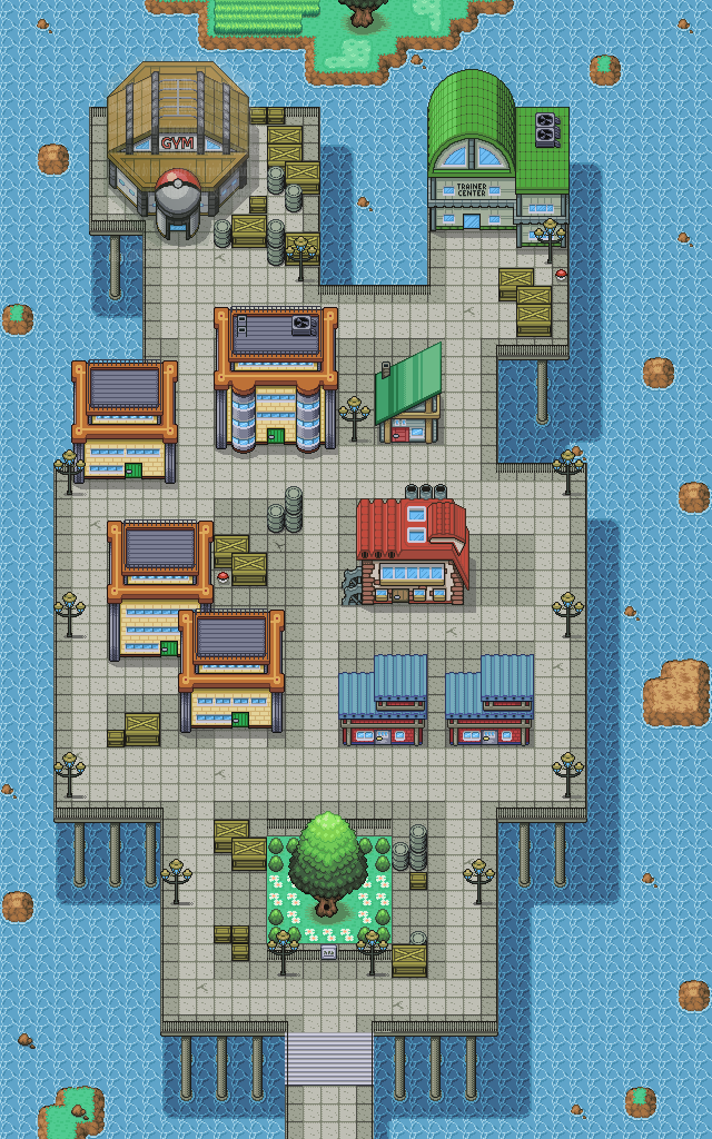
Anyway, I made a new building, a heavy edit of an old building, a new tile, and also a new map. Presenting them all in the town on the waves.

Town_on_the_Waves_by_TheDeadHeroAlistair.png
 

Tropical Sunlight

The Faltine
3,476
Posts
16
Years
Is the "grid" on the floor meant to be there?
Because it's too dark.

And I'm pretty sure you did this because of the spriting limitations, but the height of the city should cause the city's shadow to be more blurred.
 
2,243
Posts
19
Years
Yeah, there is supposed to be the grid look on the town's floor. They are supposed to be slabs of concrete, much like what you'd see in a sidewalk. I did lighten the borders on the lighter tile, though. And about the shadow thing, that was ust me being lazy, haha. All I did mas make a tile with a solid semi-transparent color and layer it over the water, but under the supports.

Anyway, I did make some updates that also weren't mentioned bove. Here is the updated version.

Town_on_the_Waves_by_TheDeadHeroAlistair.png
 
490
Posts
15
Years
  • Age 34
  • Seen Sep 27, 2021
That looks really sweet alistair, That looks like a cool place to visit in a game. I really like the dirty look of the place and the pokeballs that are hidden, it all looks great.
 

sab

Now too much of a life.
999
Posts
15
Years
WOW! That gym may be your BEST tile EVER! I looked at it for 10 minutes straight trying to find a single thing to improve, but it looks perfect to me. Great job!
 

Tropical Sunlight

The Faltine
3,476
Posts
16
Years
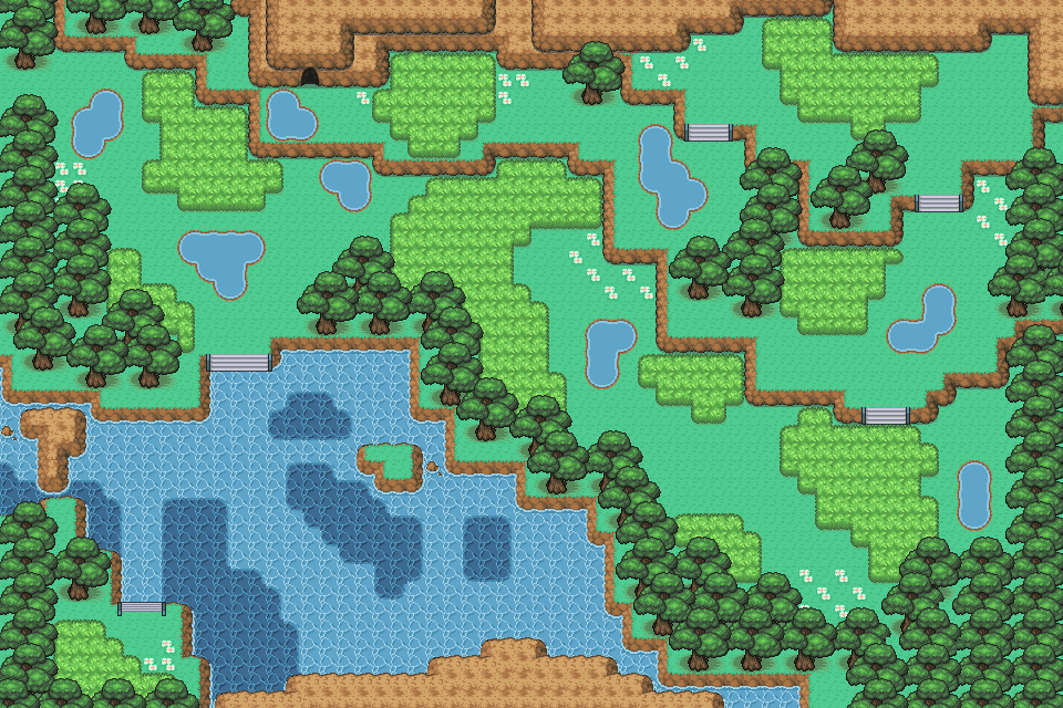
My, that looks extraordinary. The trees look fascinating and everything fits so well...

What, it's difficult for me to find a new compliment every time. XD
 
2,243
Posts
19
Years
Haha, thanks.

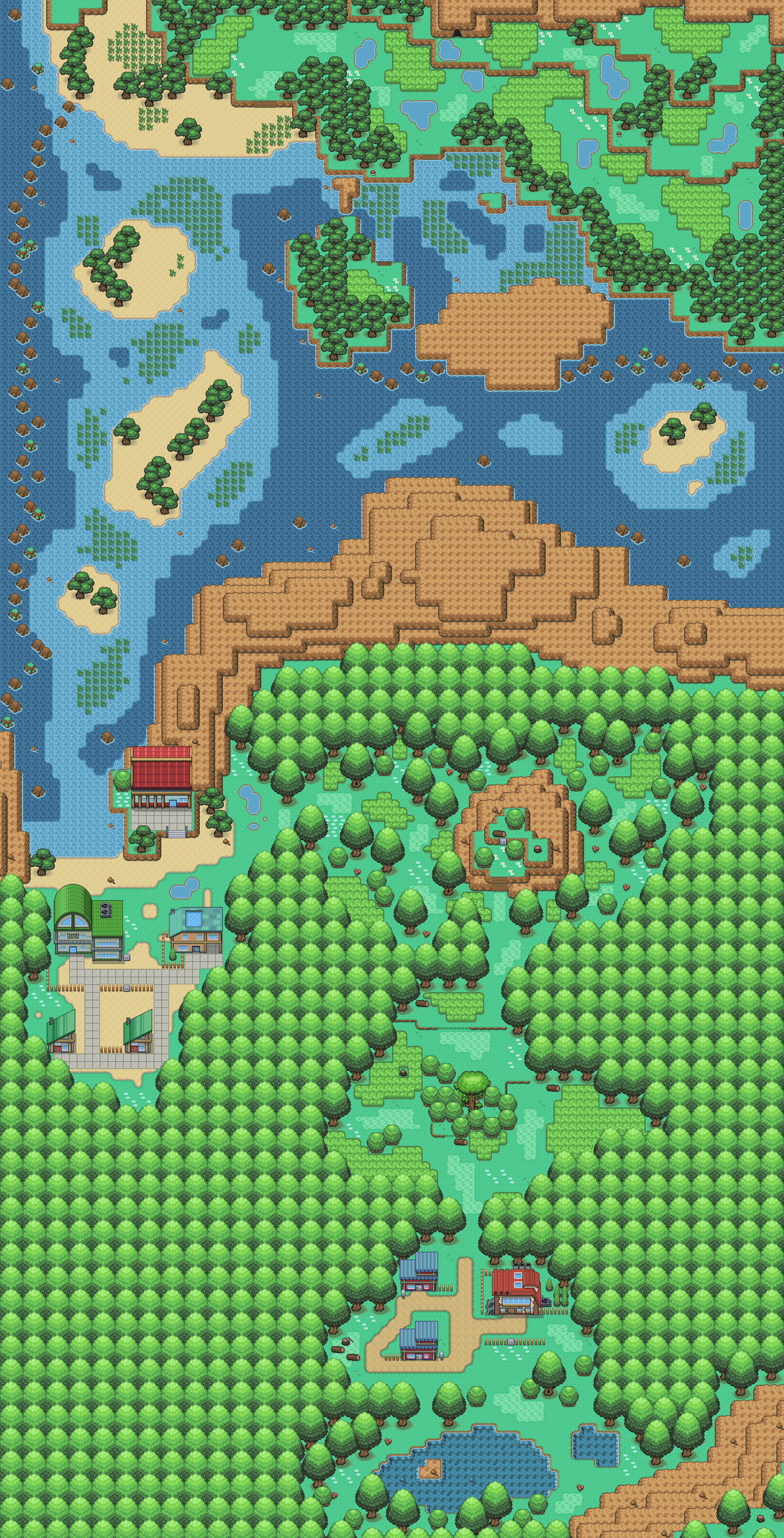
Anyway, here's a new map. It combines my previous map with some old maps and adds some new ares. It's really large, so I'm putting it in spoiler tags.

Spoiler:
 

TB Pro

Old-timer
2,708
Posts
19
Years
Wow Alistair, those new trees look awesome. One complaint I have about the set, is the water puddles. They look too round, which makes them look awkward. Besides that, they're omfgsex.

EDIT: Oyah, I REALLY like the water rock. It's superb. Also, your new wild grass improved on your old version by a ton. I love the cross-hatched look it has.
 
658
Posts
18
Years
  • Age 30
  • USA
  • Seen Dec 10, 2020
Hmm. Not a big fan of your seawater tile-- there's so much contrast and not enough hueshifting, so the lighter parts almost look like they're raised up or embossed or whatever. Also there's a fairly obvious grid. I saw this really really cool tutorial on removing the grid in overworlds, lemme find it...

Here. I haven't done tiles using this yet, but it seems very useful. (Just in case you're wondering, I found it here.)
 
2,243
Posts
19
Years
The water is one of the things I'm working on at the moment, actually. I know, the current water looks like crap, but for now, it's just a placeholder (maybe I chould have used a revamped version of an older water tile instead). And to be honest, I'd rather not read the tutorial. That way, I can experiment for myself and see what works, rather than following someone else's knowlege. ;)

But seriously, Zephyr, I would appreciate a little more feedback from you, considering it seems like you know how to give it.

But yeah, small text update. I'm still working on making the map bigger. I have the entire region planned out, so mapping it should go slightly faster than when I don't plan something. In addition to the new additions, I'm also adding a new area to the lower-left corner. It's really a bit of wasted space, to be honest, and I think it could be put to better use. Also, I'm working on making two types of palm tree (fan palm and a more traditional-looking palm), and some indoor tiles. A bit going on here besides that, but I'm not saying what. I'm probably not going to update for a while after this, unless it's a reply to someone or a small text update.
 
Status
Not open for further replies.
Back
Top