You are using an out of date browser. It may not display this or other websites correctly.
You should upgrade or use an alternative browser.
You should upgrade or use an alternative browser.
Map Rating Thread
- Thread starter Amaz!ng
- Start date
More options
Who Replied?Geeked
Pokemon Crimson Version
- 352
- Posts
- 16
- Years
- Seen Oct 9, 2012
If you've seen the Pokemon maps, I assure you they are not made that way. Sure there might be a little, but with you went overboard.
Oh really? Take a look at this.
https://www.vgmaps.com/Atlas/GBA/Pokemon-FL-Kanto.png
me2hack
Graphics Artist
- 286
- Posts
- 14
- Years
- Seen Mar 12, 2011
None of the cities have a lot of space. |:
Yuoaman
I don't know who I am either.
- 4,582
- Posts
- 18
- Years
- Age 31
- Ontario, Canada
- Seen May 19, 2024
Linking to a series of maps that have nothing in common with the map you posted isn't helping your case much. You do have a tad too much empty space in your map, in my opinion.
DarkDoom3000
Super Pokemon Eevee Edition
- 1,715
- Posts
- 19
- Years
- Age 32
- New Zealand
- Seen Mar 10, 2024
I don't really agree that it's too empty, even though im not too fond of gamefreak's mapping style-
your map- It's just too spread apart. Doesn't really seem like a town, more like a rural settlement. kinda seems spread out for no real reason, except punish people that don't have running shoes XD
your map- It's just too spread apart. Doesn't really seem like a town, more like a rural settlement. kinda seems spread out for no real reason, except punish people that don't have running shoes XD
tImE
It's still me, 44tim44 ;)
- 673
- Posts
- 17
- Years
- Somewhere in Scandinavia...
- Seen Mar 25, 2023
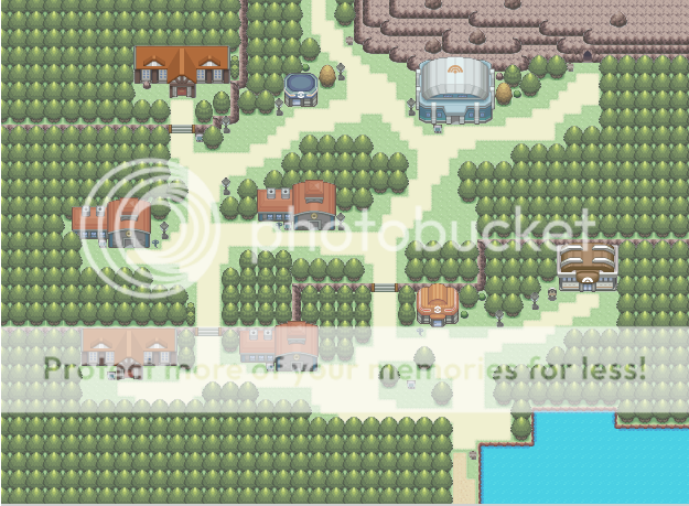
West Point Academy.
The Academy you attend in Crimson Version
Mapshot:
Spoiler:

7/10
Real good natural mapping.
No blocky Mountains, and everything has a good flow.
I'd suggest changing one of the DPPt school houses to something else to separate them.
The only problem with the map is the empty space between the buildings.
Like I use to say; If you can stand on the map (in-game) and see pretty much nothing but floor/ground tiles, you have too much empty space.
Geeked
Pokemon Crimson Version
- 352
- Posts
- 16
- Years
- Seen Oct 9, 2012
Linking to a series of maps that have nothing in common with the map you posted isn't helping your case much. You do have a tad too much empty space in your map, in my opinion.
Imagine playing in-game. Cluttering maps result in the player moving Left/Right & Up/Down back to back. This map is was made for playability, not graphical appeal.
I don't really agree that it's too empty, even though im not too fond of gamefreak's mapping style-
your map- It's just too spread apart. Doesn't really seem like a town, more like a rural settlement. kinda seems spread out for no real reason, except punish people that don't have running shoes XD
Thanks, finally someone who understands. It's not a Town, it's part of an Academy.
7/10
Real good natural mapping.
No blocky Mountains, and everything has a good flow.
I'd suggest changing one of the DPPt school houses to something else to separate them.
The only problem with the map is the empty space between the buildings.
Like I use to say; If you can stand on the map (in-game) and see pretty much nothing but floor/ground tiles, you have too much empty space.
Thanks for the rating, however I'll have to disagree with you on the emptiness, like I've said 1000 times, playability not graphical appeal. I've played way to many hacks/games where I'm always bumping in to stuff and constantly pressing up/down and left/right because of the "zigzag" style mapping most people use which only look good in "MapShots".
Cilerba
the hearts of lonely people
- 1,162
- Posts
- 14
- Years
- Age 27
- Massachusetts
- Seen Apr 28, 2022
Just a suggestion, but next time, don't post your map if you're not willing to accept any of the CC that the members give you.
Ninja Caterpie
AAAAAAAAAAAAA
- 5,979
- Posts
- 16
- Years
- Best City OCE
- Seen Oct 18, 2021
Giant empty spaces do not add to playability. In fact, big long paths and spread-out buildings merely detract from it. Walking long distances does not add to playability nor graphical appeal.
Don't mistake what you're doing for playability. It isn't. Bigger spaces are nice, but you've gone overboard. The paths are too long and everything's too separated.
PS. funnily enough, none of the problems anyone has stated with the empty space are to do with graphical appeal.. In fact, they're not even talking about the empty space. They're talking about how spread out the buildings are (nothing to do with space), and how bad they would be to walk around. lrn2read and lrn2takecrit. If 5/5 people rating your map saying there's something wrong with something, chances are, there is.
@Geeked: You might say the map's made for playability, but there's a lot of unnecessary space in your map. When walking down the paths, the player would have to walk for a long time before they find out where everything is. It takes a long time to get from the cave to the building in the south-west. This doesn't improve the maps playability at all, it just makes it boring.
though it looks good, it's way too oversized, and there are too many buildings there. It might look fine, but as I said before , it''ll take ages to travel through it. I don't think you have started with events on that map, but ask yourself, what are you going with all these buildings? Add some random npc's to them?Just want opinions on a map I was mapping a while back, but never got to finish.
Spoiler:
Don't make your cities larger then necessary, first plan on how many story-related buildings there would be, and then add 3 or 4 random npc's houses.
also you can delete the top few rows, since the player isn't able to go there.
Geeked, your mapping is to open, but the style is great. Also listen to Cilerba, you need to be open to crit, even more so if 3-5 people are saying the same thing.
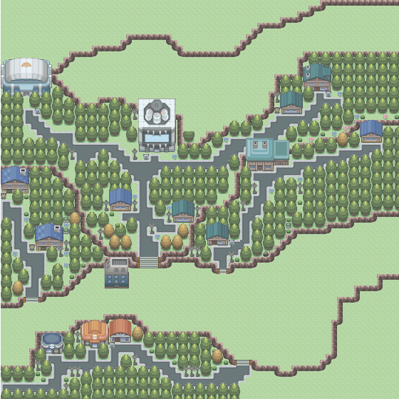
Map Name: Route One
Map Game: Pokémon: Adventures in the Orange Islands
Comments: I know it's empty in places, but please bare in mind that it's a remake of Kanto's route one, which Is very bare. It's my first real map.
Credits: Cilerba: Trees, kymotonian: Mountain Tiles and ledges, Dewitty: Paths & Flowers, spaceemotion: Grass, Me: Pokéball, Sign, Grass & editing alot of palettes. Please don't use anything here.
Mapshot:
Spoiler:

Last edited:
Cilerba
the hearts of lonely people
- 1,162
- Posts
- 14
- Years
- Age 27
- Massachusetts
- Seen Apr 28, 2022
The ledges seem a bit too saturated for the rest of the tiles, the trees are a bit dark for my taste. But it's nice, looks lively.
You mean desaturated, right?
But yes, the ledges should be recolored, Ben.
D. Lawride
Audi Famam Illius, Scriptor!
- 577
- Posts
- 14
- Years
- Lusolandia
- Seen Jan 29, 2022
Map Name: Underwater Passage
Map Editor: RPG Maker XP
Comments: It's supposedly a cave that follows beneath the sea level, and was already flooded once. The two waterways on the top are supposed to link to another map via warp. Didn't take me much time to do. all the tiles belong to Alucus, if I'm not mistaken. Spoilers because it's big.

Hum, I suppose that's how it's done?
Map Editor: RPG Maker XP
Comments: It's supposedly a cave that follows beneath the sea level, and was already flooded once. The two waterways on the top are supposed to link to another map via warp. Didn't take me much time to do. all the tiles belong to Alucus, if I'm not mistaken. Spoilers because it's big.
Spoiler:

Hum, I suppose that's how it's done?
Yuoaman
I don't know who I am either.
- 4,582
- Posts
- 18
- Years
- Age 31
- Ontario, Canada
- Seen May 19, 2024
Just want opinions on a map I was mapping a while back, but never got to finish.
Spoiler:
Paved paths should not zig-zag. Paths zig-zag when people have to walk around obstructions. When a town is paving paths it will pave in a straight line to make things convenient, getting rid of obstacles instead.
Map Name: Underwater Passage
Map Editor: RPG Maker XP
Comments: It's supposedly a cave that follows beneath the sea level, and was already flooded once. The two waterways on the top are supposed to link to another map via warp. Didn't take me much time to do. all the tiles belong to Alucus, if I'm not mistaken. Spoilers because it's big.
Spoiler:
Hum, I suppose that's how it's done?
The mapping is fine, though the water's color seems more like that of a pond exposed to a lot of light than water in a cave below ocean level...
- 189
- Posts
- 14
- Years
- Seen Nov 23, 2023
Map Name: Underwater Passage
Map Editor: RPG Maker XP
Comments: It's supposedly a cave that follows beneath the sea level, and was already flooded once. The two waterways on the top are supposed to link to another map via warp. Didn't take me much time to do. all the tiles belong to Alucus, if I'm not mistaken. Spoilers because it's big.
Spoiler:
Hum, I suppose that's how it's done?
:shocked: You...you...damn it I can't say copied cos I never uploaded my map, but...we both have made maps with the same principle. That principle being a once-flooded, underwater cave with two antechambers above ground to enter it with. It even goes east to west like mine, and contains waterfalls. The only difference (apart from the obvious difference in layout...imagine if that was the same too...) is that my waterfalls go down to a deeper level of the cave and yours don't.
But enough jibber jabber and onto the rating. I agree with the others; your mapping is great and the layout is quite appealing. However the water does look out of place, being the outside tiles. See if you can find the cave water tiles and replace them with those, it would improve the map considerably. I say 8/10, up to 9 if you change the water.
