You are using an out of date browser. It may not display this or other websites correctly.
You should upgrade or use an alternative browser.
You should upgrade or use an alternative browser.
[Showcase] Tha Donut Factory - Art Cafe
- Thread starter SvelteDonut
- Start date
More options
Who Replied?- 113
- Posts
- 9
- Years
- Seen Dec 23, 2022
Yeah you're right, but that was my point. Also I realize that Flygon is only like 6'7", so basically everything is exaggerated on purpose.
- 113
- Posts
- 9
- Years
- Seen Dec 23, 2022
[deleted]
Last edited:
Whoomay
Hand me a bottle of Rum mate!
- 143
- Posts
- 9
- Years
- Age 22
- Why do you care? Are you a stalker?
- Seen Nov 10, 2021
OMG I love these! Keep up the good job! Are you planning taking requests sometime?
- 78
- Posts
- 9
- Years
- Canada
- Seen Apr 26, 2016
my favorite thing about these is that you're nailing perspective and depth and you know how to make dynamic poses which is really fresh. V nice!
- 113
- Posts
- 9
- Years
- Seen Dec 23, 2022
Gee thanks! I don't take requests, nor commissions. That said, if I do end up drawing a blank (haha I'm done), I might ask y'all for inspiration :)OMG I love these! Keep up the good job! Are you planning taking requests sometime?
Thx, I appreciate the feedback!my favorite thing about these is that you're nailing perspective and depth and you know how to make dynamic poses which is really fresh. V nice!
- 113
- Posts
- 9
- Years
- Seen Dec 23, 2022
I got a new one for y'all:

Spoiler:

- 12
- Posts
- 9
- Years
- Seen Mar 9, 2015
Great works and shading, I suggest you keep learning from Youtube tutorials and attempt techniques outside of your comfort range
- 113
- Posts
- 9
- Years
- Seen Dec 23, 2022
Here's a new addition to the gallery: Zoroark
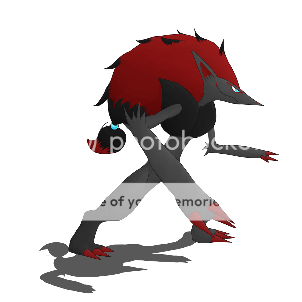
There's YouTube tutorials for these? Can you point to a good one?
Anyway thanks for the comment.
Spoiler:

Great works and shading, I suggest you keep learning from Youtube tutorials and attempt techniques outside of your comfort range
There's YouTube tutorials for these? Can you point to a good one?
Anyway thanks for the comment.
Last edited:
- 113
- Posts
- 9
- Years
- Seen Dec 23, 2022
[deleted]
Last edited:
- 113
- Posts
- 9
- Years
- Seen Dec 23, 2022
eep these are so good! <3
Thank you!
- 113
- Posts
- 9
- Years
- Seen Dec 23, 2022
[deleted]
Last edited:
- 113
- Posts
- 9
- Years
- Seen Dec 23, 2022
[deleted]
Last edited:
- 113
- Posts
- 9
- Years
- Seen Dec 23, 2022
[deleted]
Last edited:
Circuit
[cd=font-weight: bold; font-style: italic; backgro
- 4,815
- Posts
- 16
- Years
- Berlin
- Seen Jan 6, 2021
These are really good so far! Napoleon was pretty cute I have to say :3
I have been meaning to check in here for ages but never got around to it, my apologies! I think with regards to your latest Gardevoir piece, the concepts are really good, but I'm going to talk about the base Gardevoir for now. While I can appreciate there is shading there, I feel the piece is very flat, and takes away from the depth and detailing of Gardevoir. A little more dynamic shading wouldn't do any harm, and that goes for most of your pieces I think. You're most of the way there, but your proportionality and anatomical design of the Pokémon just feels a little off to me. For example, the length of Gardevoir's foremost arm is too long. For the angle she appears to be in your picture, her arm is as long as her body.
Reference:
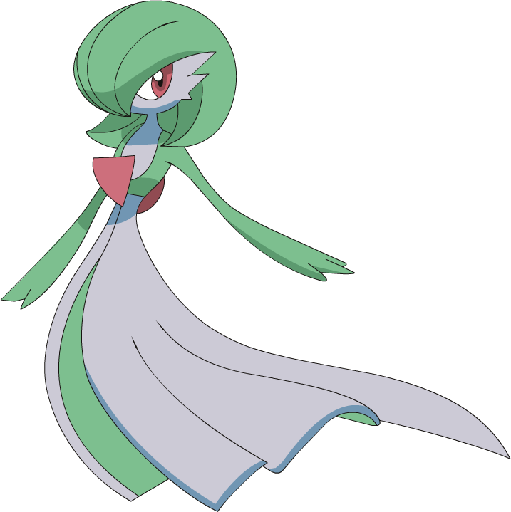
In this picture, Gardevoir's arm is about half the length of the dress-like feature she sports. It is also worth noting that the back piece for the red charm is rounded, and not pointed. And even with the minimal amount of colours used, the anime-style of shading really gives Gardevoir some depth. Of course, with the anime style of shading it's limited, but hopefully you can see what I mean.
Your shadow is good, and with a good light source/shading, you could give this piece a lot of depth and really liven up the picture. Your best piece I can see whilst typing this for shading would be Latios, but even there it could be given a bit more attention.
I really like your drawings thus far. I think for your next piece really try and focus on shading. That is where you need to improve next. Good work so far, and update again soon, so I can see how you improve :D
I have been meaning to check in here for ages but never got around to it, my apologies! I think with regards to your latest Gardevoir piece, the concepts are really good, but I'm going to talk about the base Gardevoir for now. While I can appreciate there is shading there, I feel the piece is very flat, and takes away from the depth and detailing of Gardevoir. A little more dynamic shading wouldn't do any harm, and that goes for most of your pieces I think. You're most of the way there, but your proportionality and anatomical design of the Pokémon just feels a little off to me. For example, the length of Gardevoir's foremost arm is too long. For the angle she appears to be in your picture, her arm is as long as her body.
Reference:
Spoiler:

In this picture, Gardevoir's arm is about half the length of the dress-like feature she sports. It is also worth noting that the back piece for the red charm is rounded, and not pointed. And even with the minimal amount of colours used, the anime-style of shading really gives Gardevoir some depth. Of course, with the anime style of shading it's limited, but hopefully you can see what I mean.
Your shadow is good, and with a good light source/shading, you could give this piece a lot of depth and really liven up the picture. Your best piece I can see whilst typing this for shading would be Latios, but even there it could be given a bit more attention.
I really like your drawings thus far. I think for your next piece really try and focus on shading. That is where you need to improve next. Good work so far, and update again soon, so I can see how you improve :D
- 113
- Posts
- 9
- Years
- Seen Dec 23, 2022
These are really good so far! Napoleon was pretty cute I have to say :3
I have been meaning to check in here for ages but never got around to it, my apologies! I think with regards to your latest Gardevoir piece, the concepts are really good, but I'm going to talk about the base Gardevoir for now. While I can appreciate there is shading there, I feel the piece is very flat, and takes away from the depth and detailing of Gardevoir. A little more dynamic shading wouldn't do any harm, and that goes for most of your pieces I think. You're most of the way there, but your proportionality and anatomical design of the Pokémon just feels a little off to me. For example, the length of Gardevoir's foremost arm is too long. For the angle she appears to be in your picture, her arm is as long as her body.
Reference:
Spoiler:
In this picture, Gardevoir's arm is about half the length of the dress-like feature she sports. It is also worth noting that the back piece for the red charm is rounded, and not pointed. And even with the minimal amount of colours used, the anime-style of shading really gives Gardevoir some depth. Of course, with the anime style of shading it's limited, but hopefully you can see what I mean.
Your shadow is good, and with a good light source/shading, you could give this piece a lot of depth and really liven up the picture. Your best piece I can see whilst typing this for shading would be Latios, but even there it could be given a bit more attention.
I really like your drawings thus far. I think for your next piece really try and focus on shading. That is where you need to improve next. Good work so far, and update again soon, so I can see how you improve :D
Aww man you nailed this. I been trying to figure out what's up with my stuff for a while (A while being forever). I maybe wanna try transparency-based shading like I did with Vivillon again, IDK. For Gardevoir I wanted the right arm to be more to the foreground than the rest, but I guess the shading botched that effect. I'll have to try harder next time (and use a reference XD)! I do have to admit that I have a bad sense of depth tho.
- 113
- Posts
- 9
- Years
- Seen Dec 23, 2022
[deleted]
Last edited:
- 113
- Posts
- 9
- Years
- Seen Dec 23, 2022
[deleted]
Last edited:
- 113
- Posts
- 9
- Years
- Seen Dec 23, 2022
[deleted]
Last edited:
