Bring on the critique!
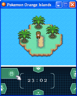
I'm not a very good mapper, even after reading tons of tutorials on it. So I thought why not post a map of my own and let others tell me what's wrong with it, so here 'goes.
This is the starting town in what I hope to be an upcoming fan-game of mine. I encourage the criticism/critique, just please be kind about it.
Look, theres not much bad at all, its actual looks very nice.. but heres my points,
Yes, it is a bit to open, but you could always just add plants, trees, npcs etc to fill that in.
To fix up the blocky-ness try make the trees more all over the place, if you get what i mean, not just in a straight line.
TBH, i like the mixture of tiles.
There is wild Pokemon grass in the starter town? Not a very good idea, what if you run into it without the Pokemon yet?, maybe just put flowers there, better option.
With the paths, there normally the made from people continually walking on them, but with yours, there just not in the right place, try make it leading from the start of the map, to each house then stop it, thats what normally every other map does.
If you don't know how to take a screenshot of the map without the gird, tell me and ill tell you how..
Thats it for now, but great job :)