• Our software update is now concluded. You will need to reset your password to log in. In order to do this, you will have to click "Log in" in the top right corner and then "Forgot your password?".
  • Welcome to PokéCommunity! Register now and join one of the best fan communities on the 'net to talk Pokémon and more! We are not affiliated with The Pokémon Company or Nintendo.

Rate The Signature Of the Person Above You

Status
Not open for further replies.

Purple Materia

Shape the future!
785
Posts
13
Years
    • Age 29
    • Seen Apr 12, 2014
    The colours go pretty good together and it's laid out nicely, but besides that, there's not much to it.

    7/10
     

    Purple Materia

    Shape the future!
    785
    Posts
    13
    Years
    • Age 29
    • Seen Apr 12, 2014
    Not a huge fan of the picture's text, and the background. I can see the colours being kind of difficult to read on some skins, though.

    6/10
     

    SV

    See You Space Cowboy
    3,393
    Posts
    13
    Years
    • Seen Feb 7, 2022
    7/10

    Great Team of Pokemon. :) But nothing TOO special about it. (To me, at least)
     

    Aquacorde

    ⟡ dig down, dig down ⟡
    12,507
    Posts
    19
    Years
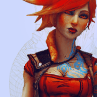
  • Nice and simple, though perhaps the art is a bit too simple. But it works nicely, despite the atrocious lime border. I can dismiss that because it's small, though, so no worries. The sprites at the bottom are nicely ordered and labeled clearly, which is something I appreciate. So you get 8.5/10, I think.
     

    Winneon

    [b][color=#fb0120]しょう[/color][color=#fc6d24]が[/col
    525
    Posts
    12
    Years
  • I'm not seeing anything there in your sig except a dot.
    ~
    2/10
     

    SV

    See You Space Cowboy
    3,393
    Posts
    13
    Years
    • Seen Feb 7, 2022
    9/10

    It's so...mysterious, and yet somehow awe-inspiring!
     

    Winneon

    [b][color=#fb0120]しょう[/color][color=#fc6d24]が[/col
    525
    Posts
    12
    Years
  • I like the simplicity of the tag, and the sprites looks simplistic and orderly.
    ~
    9.75/10

    :D
     

    Ineffable~

    DAT SNARKITUDE
    2,738
    Posts
    15
    Years
  • 9/10. I think same thing as I said before. The CSS is good and neat, but I like the image more than your last image. It really gives this just-right colourful atmosphere, if that makes sense.
     

    MichaelaTheUchiha

    Forever Shawol and Aileean
    2,082
    Posts
    14
    Years
  • 8/10 I like the pokedex idea, but the font colour is kind of hard to read (I know it's Wigglytuff's shade, bust still). I've also seen the pokedex idea before. Still a nice siggy though. ^^
     

    Her

    11,468
    Posts
    15
    Years
    • Seen May 2, 2024
    Although I like how you've put work into it, I'm just not a fan of the image/colors you've used. Nice try, though!
    5/10
     

    Ineffable~

    DAT SNARKITUDE
    2,738
    Posts
    15
    Years
  • Well this theme is pretty and it sort of matches your name what with the fire. I quite like the character there and the whole appearance/colours. It's pretty. :3
    8.5/10.
     

    Purple Materia

    Shape the future!
    785
    Posts
    13
    Years
    • Age 29
    • Seen Apr 12, 2014
    Same rating as before. I'm not really feeling how the flags are kind of out there. To be honest, I'd omit them.
     

    Ineffable~

    DAT SNARKITUDE
    2,738
    Posts
    15
    Years
  • 8.5/10 because I like the picture and the coloured compact text. :3
    I don't think I've gotten a comment related to the flags before, so I'll try it out for an extended period of time if I hear anyone else talk about it. I don't like it without the flags, personally. :(
     
    Status
    Not open for further replies.
    Back
    Top