• Our software update is now concluded. You will need to reset your password to log in. In order to do this, you will have to click "Log in" in the top right corner and then "Forgot your password?".
  • Welcome to PokéCommunity! Register now and join one of the best fan communities on the 'net to talk Pokémon and more! We are not affiliated with The Pokémon Company or Nintendo.

_Ultima//-

Status
Not open for further replies.

AtomicoExploda

I don't know.
689
Posts
15
Years
  • Seen Feb 6, 2013
So I've been meaning to make a gallery here for a few weeks now, but never did it, a little because I wanted to have more to add.
I will start with the latest and work down.

Updates


Updates won't be posted on this post, so look for the most recent post.

Signatures


Groudon.png


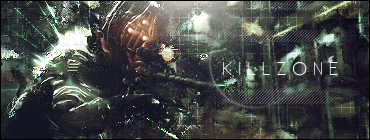
Killzone.png


CoDBW.png


brs.png


ghostsigpng.png


Halloweencopy.png


Gaurdsig.png


InTheSky.png


Random


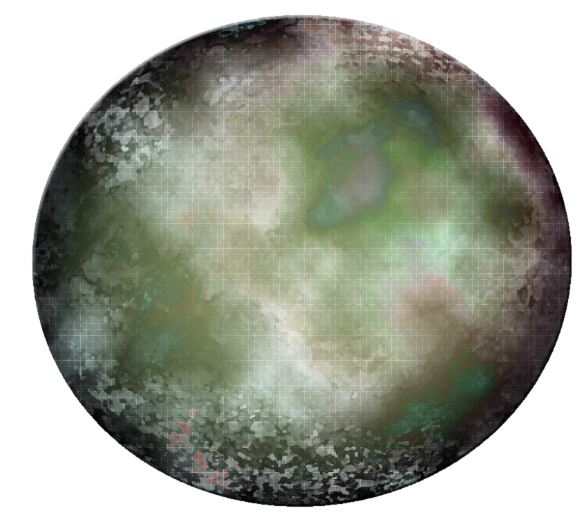
The image is a bit big, so I'll just give the link.
http://i369.photobucket.com/albums/oo133/Zephight/Zentek/abstract.png
planet.png


Last edited:

Dukey

oh.my.gaskarth.
3,266
Posts
15
Years
Your tags have one problem in common, no depth at all, it's all very flat.
I'd say cut the borders, they tend to look tacky.
That Groudon one isn't bad, but seems kinda low quality, not sure what happened to make it look that way.

As for the linked lp, there really isn't any sort of focal, it's just a blurry puddle?
 

AtomicoExploda

I don't know.
689
Posts
15
Years
  • Seen Feb 6, 2013
Yeah, you've got a point there but you might be exaggerating a little by saying there's none at all because I can see a bit.
I like the borders really, but I'll try that.
I know, it's because of the image I used.
Well, I put 'Random' there in big white underlined text for a reason. lol

Thanks for commenting, I'll see what I can do with the depth.
 

Aizuke

[b]long sword style[/b]
3,025
Posts
16
Years
You have something here, but I think you use too much white with most of your banners. I guess that's why it looks like you lack depth, since it's all just white, so there isn't much shading to add depth to it. Some of your renders you used look a bit oversharpened too, with the outlines of the pixels. Or that's just me.

But either way, you have potential as far as I can see. Keep it up.
 

AtomicoExploda

I don't know.
689
Posts
15
Years
  • Seen Feb 6, 2013
Eh, I might use white a lot, but I'm not sure if it's really too much that I use, and yeah, the sharpening on some was a bit over done, well kind of, but I know how to use it better now. Thanks for commenting.

Anyway, I think I may have done better with the depth here, or maybe not, I was just doing more blurring, burning, and a bit of sharpening, also use of the dodge tool.
Oh yeah, I couldn't really make my mind up about the border, so I just did three versions.

Technology1.png

Here is no border like Dukey suggested.

Technology.png

With a normal border because I'm not sure if it looks good without the border.

Technologycopy.png

Lastly, I was trying some different, I'm not sure if it went that well though, kind of experimenting.

I'm still not really sure if I should use borders or no borders. :|
 

Kotone

someone needed a doctor?
2,787
Posts
15
Years
the one above is amazing^^ improvement!
some of the tags, the textures don't really go with it.
the colors are nice.
 

moments.

quixotic
3,407
Posts
15
Years
Just to clear up your border issue, in the latest update the one with no border obliterates the others.
It doesn't cut the tag off, it allows the viewer to assume it continues and isn't confined to a rectangle in which case part of her head and her whole lower body would not exist...
 

AtomicoExploda

I don't know.
689
Posts
15
Years
  • Seen Feb 6, 2013
Well, I just slightly prefer borders.
True, but also not true, because it doesn't look as if the rest is cut off, it kind of adds to the depth making it seem more as if you could dive in. Without a border is like a sentence with no full stop. So I still slightly prefer borders, but just a bit.
 

Uecil

[img]https://i.ibb.co/4jfYrCT/tHdpHUB.png[/img]
2,568
Posts
14
Years
wow they're all awesome :D espeacially the Groundon one! great work! :)
 

Dukey

oh.my.gaskarth.
3,266
Posts
15
Years
http://i369.photobucket.com/albums/oo133/Zephight/Zentek/Technology1.png

This is a large improvement from what I told you, still a few issues I have with it though.
That squares pattern you used seems rather uneccesary, it's barely visible and where it is, it ruins a nice background, also kills any flow.
The three red lines on the right, and the one on the bottom are meh, again killing flow.

Very much an improvement though.
Try adding a sense of layers to your background blurring, way back stuff really blurred, and stuff that is fairly close to your stock you can still blur but not as much as the stock.
 

AtomicoExploda

I don't know.
689
Posts
15
Years
  • Seen Feb 6, 2013
Thanks for the comments.
Yeah, the lines and patterns weren't really needed, I just put them in there.

Well, anyway, just finished this, and it might be better since there's no lines or patterns.
I just left out the text because I wasn't sure of where to place it, it could have ruined it.

sharp.png


sharp1.png


Yes, I'm still not sure about the border thing.
 

iRawr

Poli?
128
Posts
14
Years
  • Age 26
  • Uk
  • Seen Apr 5, 2010
Wow I really like your style!
Especially the Killzone and Cutting the Edge one ;)
Keep up the great work!
 

AtomicoExploda

I don't know.
689
Posts
15
Years
  • Seen Feb 6, 2013
I would have updated earlier, but I was doing rendering instead.

Anyway, I just finished this now.

Alonecopy.png
 

AtomicoExploda

I don't know.
689
Posts
15
Years
  • Seen Feb 6, 2013
Wow, on page three already.

Saber.png


Saber1.png


Not really too great, mainly because I rushed it a little for a battle.
 
10,673
Posts
15
Years
  • Age 30
  • Seen Dec 30, 2023
Woop I didn't notice this one. I'm afraid you bumped your gallery after it had been dead for over a month about 2 weeks ago. So I'm going to need to close this one up. Though alternatively I would like to suggest that you open a new gallery with your new works and start anew, it could most certainly be a good idea. At any rate, I must close this one now but please do start a new gallery as you seem to be improving quite a bit!
L o c k e d ~
 
Status
Not open for further replies.
Back
Top