• Our software update is now concluded. You will need to reset your password to log in. In order to do this, you will have to click "Log in" in the top right corner and then "Forgot your password?".
  • Welcome to PokéCommunity! Register now and join one of the best fan communities on the 'net to talk Pokémon and more! We are not affiliated with The Pokémon Company or Nintendo.

hyspar

Rest

Showstealer Pro: Trial Version
353
Posts
12
Years
  • shumacopy.png
    grahacopy.png


    daharshcopyd.png
    forrowcopy.png
    forrowcopy2.png


    Welcome. About the title, I saw it on a car and thought it sounded cool, so yeah. :P

    First few tags in months. CnC your hearts out!
     

    Rest

    Showstealer Pro: Trial Version
    353
    Posts
    12
    Years
  • whitarcopy.png
    cavelorcopy.png


    chachongcopy.png
    chachongcopy2.png


    Some more stuff I've done these past few days! Oh, and those renders I got from moments' resource pack. Great stuff to say the least. :)
     

    moments.

    quixotic
    3,407
    Posts
    15
    Years
  • General comments a gogo.
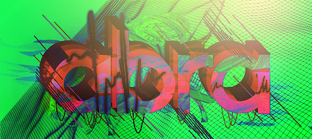
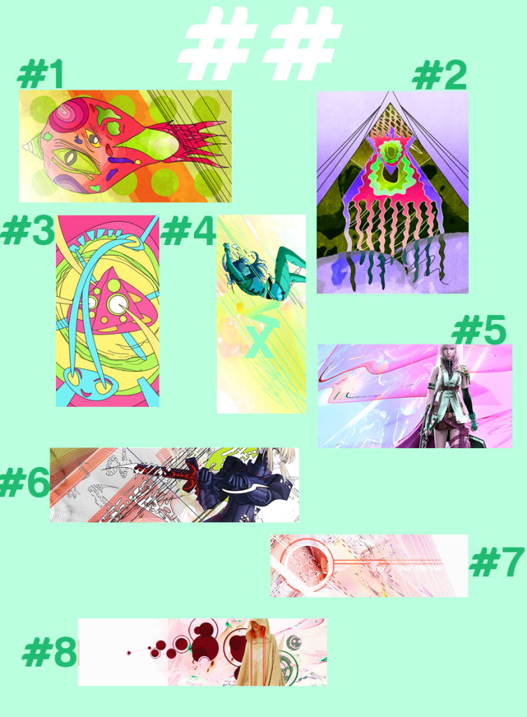
    So, nearly all of your pieces, (all of the first post, and the top two of the second) have either low quality focals, or they are smothered beyond recognition. Not sure what the deal is with those sprite pieces, but the sprites are quite low quality, and honestly spoil the rest of the tag. grahacopy.png This one has the best blending and the best use of the sprite, but the effects let it down, and it really just lacks appeal besides the colour palette which is really good and the use of brightness.

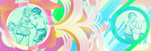
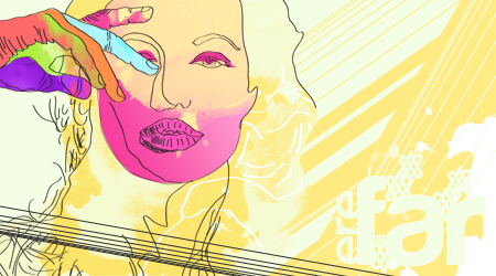
    That said, chachongcopy.png this is the best you've posted. The colours are a bit dorky, and the black and white doesn't quite cut it, but a few gradient maps to town down the magenta (not the box, keep that really vibrant) will do this tag a world of good. Especially the face, which is not a pleasant colour for skin. xD I also would get rid of the magenta gradient on the circle shapes to the right. Keep them solid yellow like the left side, or solid magenta even, but not gradient.

    The focal needs a tiny bit of a sharpen as well. And you've got some weird blurry / low quality effects on the left side in the space area which could be erased completely.
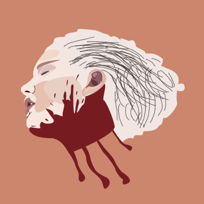
    cavelorcopy.png
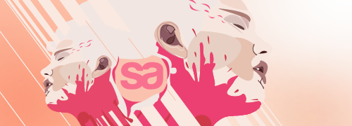
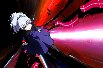
    This has the most potential, but currently doesn't meet the cut. The whole thing needs a good sharpen, especially the focal. You need to flip the lighting to directly above the stock to match the lighting included on the stock. You need perhaps a few more effects, or textures or something to make the empty space in the bottom left and top right a little less empty. That or tone down the contrast so it isn't so black, but I like the contrast, so add the effects is what I think.
    Could go with some dodge tool over the highlights on the girls face as well. Would make it pop a little more.
     

    Rest

    Showstealer Pro: Trial Version
    353
    Posts
    12
    Years
  • Thanks, mate!

    Yeah, it does look LQ at hindsight. I guess sharpening an already-pixelated focus is a bad idea. D:

    Anyways, here's another one to throw out there.

    ormafocopy2.png


    ormafocopy.png
     

    Rest

    Showstealer Pro: Trial Version
    353
    Posts
    12
    Years
  • New stuff. ^_^ Some of these are experiments.

    pizzacopy.png
    ororocopy.png


    katyperrycopy2.png
    katyperrycopy.png


    rainbowbulletcopy.png
    maicopy.png


    samsamsamcopy.png


    EDIT:

    lightcopy.png
    lightcopy2.png


    :3
     
    Last edited:

    Rest

    Showstealer Pro: Trial Version
    353
    Posts
    12
    Years
  • ^ Thanks man, color was once my one gripe when tagging but now I think I'm doing okay. :3

    Sum moar:-

    michellecopy.png
    garfunkelcopy.png


    pukecopy.png
     

    Renyui!

    ascender
    1,402
    Posts
    16
    Years
  • That last King of Fighters tag really sticks out to me. Awesome flow, effective simplicity, and nice combination of colours. You could probably add some depth, but then again, there's not much else to add to a small canvas sprite tag.
     

    moments.

    quixotic
    3,407
    Posts
    15
    Years
  • ororocopy.png
    lightcopy.png
    michellecopy.png

    These three are suave! :O
    Really liking your use of lighting/effects and colours.

    Just try not to be too clunky in your composition and make your tags feel sort of disjointed and rigid. Specifically, the 'orf' tag and variations and the red alteration of 'bejo'.

    garfunkelcopy.png
    This one is also pretty sick, nice lighting and atmosphere, though I'm not feeling the fractal/C4D effects with the stock you've got. Something really edgy, like really simple, but really strong atmosphere, kind of like they are walking through a cave or something would be good!

    Anyways, I was going to give you specific comments, and then you posted more, so I got overwhelmed, but hope those comments were ok. :D
     

    Rest

    Showstealer Pro: Trial Version
    353
    Posts
    12
    Years
  • @ Renyui! - I wanted to add more to that KoF tag, but it looked decent as it is already so I just left it at that. Thanks though. :3

    @ moments. - Gotcha, man. Thanks, any sort of crit would be good really. :D
     

    Rest

    Showstealer Pro: Trial Version
    353
    Posts
    12
    Years
  • I've been on a creative block; haven't opened my PS in 3 days. :< New, went for retro 08'ish.

    vcopy.png


    EDIT:-

    Took moments' advice and fixed it. I made it longer too. :P

    v2copy.png
     
    Last edited:
    177
    Posts
    13
    Years
    • Seen May 9, 2012
    v2copy.png: I feel as if you have something nice going here. However, the right side feels a bit empty and it could probably use more contrast. At the moment it seems a bit boring, add something to it so there's more. Liking it though, kiu.
     

    moments.

    quixotic
    3,407
    Posts
    15
    Years
  • Agreed with Cycle. What you changed, you've done really well. The darker tones and richer contrast on the left is really top notch, and extending the canvas worked really well in making things not quite centred, but balanced. The typo is good, though I'm not a huge fan of the font. Something more blocky, none of those rounded edges would look good, otherwise some special decorative 'space/future' esque downloaded font would also work.
    But yeah, right side is a tad empty now. Though, some textures and more dodging/burning with small brushes will help add some details and make it a little more interesting.

    Nice work though, really nice alternate version. :D
    i thought the border wasn't going anywhere? ;D
     

    Zebra Thunderhead

    the avenger
    3,159
    Posts
    16
    Years
  • pukecopy.png


    I like this quite a lot. the effects are nice and the simplicity works.

    my main concern lies with your sprite tags. for some of them, it seems as though you designed the background stuff first, then put a sprite on it. you seem skilled enough to know that it doesn't work that way. this is mostly applicable to the first bunch of them.

    otherwise, I like the directions you're taking here.
     
    Last edited:

    Rest

    Showstealer Pro: Trial Version
    353
    Posts
    12
    Years
  • Thanks guys. :3

    Here are some more.

    kalerfulcopy.png


    abracopy.png


    shangrycopy.png


    first two are experiments, but I had the time of my life doing them, especially abra.

    Another Michelle tag just for the sake of it. :P
     
    Last edited:

    Rest

    Showstealer Pro: Trial Version
    353
    Posts
    12
    Years
  • More stuff!

    flowertagcopy.png
    moleromonetcopy.png


    flowertag2copy.png


    vintage2copy.png


    The last one's a polished version of the tag I used versus Abne.

    The first three are a nod to one of my favourite taggers of all time, hishy (from other forums). c:
     

    Rest

    Showstealer Pro: Trial Version
    353
    Posts
    12
    Years
  • Some more. c:

    firstportraitcopy.png


    firstportraittagcopy-1.png


    transformcopy.png


    So yeah, I had a hand with vectors. Pretty fun stuff, and the payoff is great.
     

    moments.

    quixotic
    3,407
    Posts
    15
    Years
  • The vector stuff is great, not a whole lot to mention otherwise besides that I'm unsure of your use of the 1px brushing as opposed to 1px wide vectoring. The brushing looks ok in some areas, but it doesn't have the same smoothness to it that vectoring has and looks a little lq in comparison. It doesn't look bad, it just could be better methinks. But otherwise, seriously great stuff, especially the most recent vector, though I would've liked to see some of those blues carried into the tag version more than all brown/pinks.

    I'd like to see some LP vectoring from you tbh. Really get into the nitty gritty, because this looks like the place to pursue, especially considering you are a complete natural.
    Really nice stuff though. <3
     

    Rest

    Showstealer Pro: Trial Version
    353
    Posts
    12
    Years
  • Thanks matey. :3 Haven't been on for a while, so I'll get something up again by Sunday, hopefully.

    Also, large canvases intimidate me, I can't do my work on large-scale and prefer going small. D:
     
    Back
    Top