• Our software update is now concluded. You will need to reset your password to log in. In order to do this, you will have to click "Log in" in the top right corner and then "Forgot your password?".
  • Welcome to PokéCommunity! Register now and join one of the best fan communities on the 'net to talk Pokémon and more! We are not affiliated with The Pokémon Company or Nintendo.

Screenshot/Music Showcase

Status
Not open for further replies.

Worldslayer608

ಥдಥ
894
Posts
16
Years
  • Well, the biggest problem is the fact that I have two titles, which means, I either have to use very small font, or place them apart, otherwise it covers too much off the titlescreen.
    If I could place them together, making a proper arch which flows well would be easier.

    I'll try playing a little with the arch effect and try to make them one half of an arch each.
    That might work.

    EDIT:

    I tried it out, and I think it works pretty well, but like I said, I'm afraid it covers too much screen area :/

    2412332Titlescreen_test_font_5.png

    Play with the arching where it was originally located. It looks best there. I would not move the initial location at all.

    If you have a PSD you can send me in a PM I can play with it too.
     

    tImE

    It's still me, 44tim44 ;)
    673
    Posts
    17
    Years
  • Play with the arching where it was originally located. It looks best there. I would not move the initial location at all.

    If you have a PSD you can send me in a PM I can play with it too.

    Here's one where I played with it in place.

    5505101Titlescreen_test_font.png


    I'll send you a PM with the PSD, too.


    EDIT:

    I have made it into an animation, with fixed font.

    4336361Titlescreen-Final-Animated.gif


    The Charizard has been mirrored and the animation is about 2x faster in the in-game version.
     
    Last edited:

    Rayd12smitty

    Shadow Maker
    645
    Posts
    12
    Years
    • Seen Feb 21, 2016
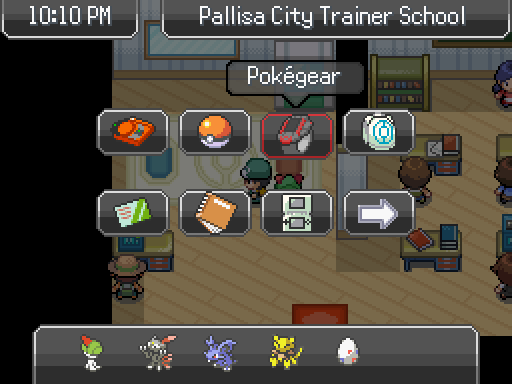
    New menu system for my game! I thought it was time for an upgrade. Thanks to Carmaniac and Venom12 for help learning how to script and the original menu script they made and edited which helped me learn to make this.

    updated_menu_system__wip__by_rayd12smitty-d6hvm36.png


    What do you think?

    Minor Edit: Added red outline to the selected menu option
     
    Last edited:

    PiaCRT

    Orange Dev
    937
    Posts
    13
    Years
  • New menu system for my game! I thought it was time for an upgrade. Thanks to Carmaniac and Venom12 for help learning how to script and the original menu script they made and edited which helped me learn to make this.

    updated_menu_system__wip__by_rayd12smitty-d6hvm36.png


    What do you think?

    Looks pretty good. Also, while pointless, maybe a box with the time below the Day/Night/Morning?
     

    Radical Raptr

    #BAMFPokemonNerd
    1,121
    Posts
    13
    Years
  • New menu system for my game! I thought it was time for an upgrade. Thanks to Carmaniac and Venom12 for help learning how to script and the original menu script they made and edited which helped me learn to make this.

    updated_menu_system__wip__by_rayd12smitty-d6hvm36.png


    What do you think?

    I love it, Its very cool and like a real pause screen instead of the classic Pokemon style - Its very refreshing
    good work!
     

    Rayd12smitty

    Shadow Maker
    645
    Posts
    12
    Years
    • Seen Feb 21, 2016
    Looks pretty good. Also, while pointless, maybe a box with the time below the Day/Night/Morning?

    My original plan was to put the time, but I couldn't figure out how...XD Thanks though! If you know how I could do it, I'll change it to the time.

    I love it, Its very cool and like a real pause screen instead of the classic Pokemon style - Its very refreshing
    good work!

    Thanks man! I've always had one, it was just much simpler. Glad you like it
     
    Last edited:
    378
    Posts
    11
    Years
    • Seen Oct 18, 2017
    New menu system for my game! I thought it was time for an upgrade. Thanks to Carmaniac and Venom12 for help learning how to script and the original menu script they made and edited which helped me learn to make this.

    updated_menu_system__wip__by_rayd12smitty-d6hvm36.png


    What do you think?

    Minor Edit: Added red outline to the selected menu option

    That looks pretty amazing. I am quite jealous.
     

    Rayd12smitty

    Shadow Maker
    645
    Posts
    12
    Years
    • Seen Feb 21, 2016
    That looks pretty amazing. I am quite jealous.

    Thanks! Took about 100 tries to get right but it was worth it

    Quick little update on my menu. Thanks LostSoulsDev/Carmaniac for help with the time thing.

    updated_menu_system__wip__by_rayd12smitty-d6hvm36.png
     
    Last edited:

    Rayquaza.

    Lead Dev in Pokémon Order and Chaos
    702
    Posts
    12
    Years
  • It may be a video but there's no place else to put this so here is my starter selection sequence:

    Spoiler:


    No scripting involved!
     

    Wootius

    Glah
    300
    Posts
    11
    Years
    • Seen May 31, 2022
    Turtwig vs Mudkip.

    Why would you do that to me? The only way it could be was if you added Squirtle.
     

    tImE

    It's still me, 44tim44 ;)
    673
    Posts
    17
    Years
  • not much activity up here...
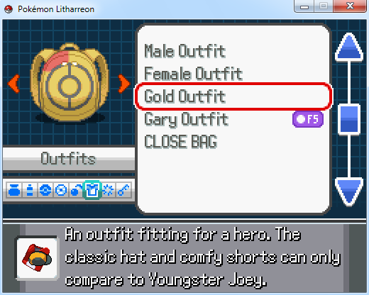
    outfitshowoff_zps41f11275.png

    I'll just leave this little gem here, thoughts? comments? good day

    My only though is, unfortunately, the fact that you've mixed the 1x and 2x styles of spriting again.
    The Item-Icon is too High Res. Either make the whole game high-res or the whole game low-res. It does not look good to mix.

    Otherwise, it's a nice idea, but why not make your own outfits, rather than having the original ones? Makes for a much cooler feature!
     

    Radical Raptr

    #BAMFPokemonNerd
    1,121
    Posts
    13
    Years
  • My only though is, unfortunately, the fact that you've mixed the 1x and 2x styles of spriting again.
    The Item-Icon is too High Res. Either make the whole game high-res or the whole game low-res. It does not look good to mix.

    Otherwise, it's a nice idea, but why not make your own outfits, rather than having the original ones? Makes for a much cooler feature!

    well I guess I'll see about making it low res, it just looks terrible that way
    and so far I've added 2 standard custom ones, and then 3 of my favorite ones - I plan on adding more, but I'm not really sure what to add or create - thanks for the thought though
     

    DarkDoom3000

    Super Pokemon Eevee Edition
    1,715
    Posts
    19
    Years
  • well I guess I'll see about making it low res, it just looks terrible that way
    and so far I've added 2 standard custom ones, and then 3 of my favorite ones - I plan on adding more, but I'm not really sure what to add or create - thanks for the thought though

    I have to agree with tImE- Having different resolution pictures next to each other makes it look very jarring. Keep the resolution constant. it makes it look more polished and professional.
     

    Radical Raptr

    #BAMFPokemonNerd
    1,121
    Posts
    13
    Years
  • I have to agree with tImE- Having different resolution pictures next to each other makes it look very jarring. Keep the resolution constant. it makes it look more polished and professional.

    that makes sense, but instead of showing the icon I decided to make it show the player wearing the outfit, so you can tell what it looks like without having to exit the bag menu and then go back if you dont like it
     

    Unknown#

    'Cause why not?
    457
    Posts
    13
    Years
  • Here is the title screen of my new game, with a logo done by the fantastic Master-Pixel on Deviantart!

    picture.php
     
    378
    Posts
    11
    Years
    • Seen Oct 18, 2017
    I'm lovin that menu! It looks really nice! Only problem is, the text on the four icons on the right seem to be high definition, which looks out of place.
     

    Radical Raptr

    #BAMFPokemonNerd
    1,121
    Posts
    13
    Years
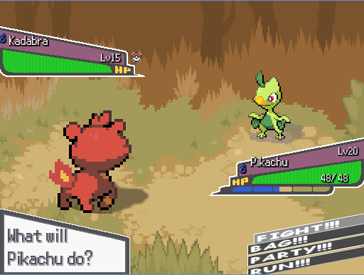
  • Hey guys. Under the cover of darkness Pokemon Imperial Sky is still being worked on. I finished multiple menus and stuff already, but here's one I've worked on for so long I'm not sure if it's good or not...


    Please critique anything, colors, placement, etc. It's pretty much the most important menu in the game, so I want to make sure it looks appealing. Just don't mention the placement of the pokemon's names, I want to see if I can't get those to read diagonally with the purple boxes.

    I love your design, its so simple, and yet so perfect - using this model it makes adding the "call" feature for shadow pokemon much easier - regardless, how does it show the player? will it just show the ball throwing animation? as it seems to be so low to the ground it seems wrong to have the traditional player back shot throwing the pokeball in such a manner

    a question though is where will the "shiny star" (the icon for shiny pokemon) appear? on the purple area of the box? or somewhere else

    the whole design is just so appealing, I love it and how it looks, its just great - a fantastic turn from the traditional rectangle boxes

    as for the scenery, it's great and gives me high hopes for the other backdrops
     

    Unknown#

    'Cause why not?
    457
    Posts
    13
    Years
  • I went back and changed the logo so it would be in the more tradition style. As always, I absolutely NEED feedback.

    picture.php
     
    Status
    Not open for further replies.
    Back
    Top