• Our software update is now concluded. You will need to reset your password to log in. In order to do this, you will have to click "Log in" in the top right corner and then "Forgot your password?".
  • Welcome to PokéCommunity! Register now and join one of the best fan communities on the 'net to talk Pokémon and more! We are not affiliated with The Pokémon Company or Nintendo.

~~Banners~~ *not requests*

.Aero

Tell Me I'm A Screwed Up Mess
1,767
Posts
16
Years
Well I just got PS Elements over Labor Day weekend and I've been making banners/themes/stuff a lot! I have been sharing them with my PC friends (as you can see in Super Gullwings signature) and using some myself. I'm just posting my favorites that I've made and I would like constructive criticisem on them please, like no "They suck".
I also don't want anyone taking them, if you do wish to have one, just PM and I'll reply with a yes or no, and I would like credit for it if you do happen to get a yes.

Well, here they are.
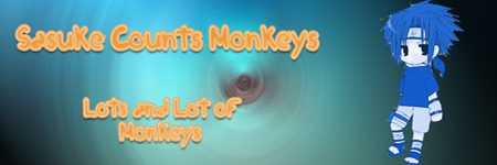
Sasukecountsmonkeys_edited-1.png

My weird Sasuke one. It was completely random, we were talking about monkeys when I made it. XD

DeidaraBanner.png

The one I made for my pair. <3 (DO NOT TAKE THIS ONE!)
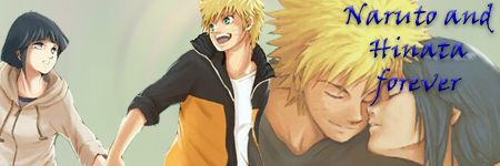
NarutoandHinata.png

This was for my PC brother, Shuri. (again, DO NOT TAKE THIS ONE!)

TobiBanner.png

This is my current theme banner, but I don't think it's as good as Ichi-chan's. :P
A little blank though most people would agree. Not too many Tobi pics out there though...


Pichusig.png

I can't make banners and show them at a pokemon forum without a banner of Pichu!
Render is pretty bad I know. I was just making that one for fun. Took me 2 mintues.
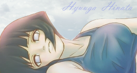

HyuugaHinataBanner-fixed_edited-1.png

*NEW* I took Mizuki's advice on blending with the backround and making the text hardly visible, I hope this makes her happy.


That's all for now, but I will work on more.
 
Last edited:

.Aero

Tell Me I'm A Screwed Up Mess
1,767
Posts
16
Years
Yay! First comment! Yes I'll make more, just not right now because I currently have no ideas. (Although my friend wants me to make another Naruto one for him, but he doesn't go to PC)

So ya, I may take suggestions for banners, but not requests, because then I'm required to complete them and I don't want to be flooded with work. :P

(P.S. Have I seen you on Sky HQ's chatango box? My name there is SabakunoGaara22)
 

Loki

x
6,829
Posts
18
Years
  • Seen Apr 4, 2024
I like how you can find the greatest images to blend together! I think that's annoyingly hard. :<

I'm going to drop off some tips though:

+ Blending is tricky! It's particularly essential in blending that the images look like they were originally together.
+ This means that your backgrounds should fit the images more, as I notice the color schemes don't really match at all.
+ Focus! If the person looking at the image can't really tell what they're supposed to be focusing on, or the first thing their eyes are drawn to isn't the main image, that's never a good sign~ This can be tricky too, because as the person who made it, your eyes naturally gravitate towards where you put the image.
+ Text! I'm personally the type who isn't supportive of the text standing out more then the banner itself. Text is by far the annoying-est, stupid-est, most frustrating-est thing of all. Fiddle around, download a billion fonts, and tweak with opacity and such.
+ Rendering! You have to curve! </3 If you cut off a picture's ear, we can tell! And its the biggest thing that downgrades the quality of the banner. Always check with a black background if you missed any big spots, like the white underneath Pichu's uhhh... left ear! *from our perspective*

^ Those are just my opinions though, there are lots of different ways to make really awesome banners.

Great start though! Deidara is teh smex.
 

.Aero

Tell Me I'm A Screwed Up Mess
1,767
Posts
16
Years
That's some good advice. I'm not good with color schemes yet though, but a little practice and viewing other people's work will help me with that. Rendering on the Pichu was horrible as I admitted in the text underneath. And "Oh crap, who's ear did I cut off now!?" XD I've done that before mainly because I use the magnetic lasso for rendering, and I don't have a steady hand while on a mouse, so I cut off ears often. XD As for text, I don't see why you hate it so much. XD Oppacity is fun to play with, so I'll take your advice on the text.

(Deidara one is my favorite, I think I did a good job on it.)
~desu~
 

RYOUKI

survive the world.
3,252
Posts
17
Years
It's Pretty Good, But It doesn't appeal to me...[even my Banners Doesn't appeal to me]
but you need to Master:

-Backround Making [Backrounds is the most Important in Theme Making]
-Text Putting [O_o, well you atleast need to put the Desired text at the desired Place]
-Spacing [This is your number 3 problem, You banners are too....'Empty']

Other than My Bad Comments, i suppirt your style all the way!
It Totally Beats me BANNERS
 

.Aero

Tell Me I'm A Screwed Up Mess
1,767
Posts
16
Years
Thanks Ryouki, but I personally loved that Hinata + Gaara banner you made for me, except you put Sabaki intead of Sabaku. xD Don't say your banners are bad, or that your comments are, because I agree competely with them. The spacing problem comes up a lot with my banners, but making the pictures bigger and text bigger I personally think would ruin the banner. The only banner that I don't think has that problem is my Deidara one.

Well, I've been kinda busy lately, and havn't had a terrific idea for a banner in a while, so I don't really have anything new, but will keep it updated at least one a week with a new theme/banner.
~desu Saba~
 

Loki

x
6,829
Posts
18
Years
  • Seen Apr 4, 2024
Spacing and stuff can be easily fixed though!

- Change the size of the banner!

Also, a tip is that you CAN make an image a few pixels larger in photoshop, and it won't do anything to the picture. *does it all the time*
 

.Aero

Tell Me I'm A Screwed Up Mess
1,767
Posts
16
Years
~*Update*~​

HyuugaHinataBanner_edited-1.png


I tried hard to make this blend, and make the text a little less visible, tell me if Hinata's face draws your attention the most, that's the focal point I want.

~desu Saba~
 

Loki

x
6,829
Posts
18
Years
  • Seen Apr 4, 2024
That is a major improvement! The spacing issue is gone! [nearly]

But, it's not really Hinata's face I'm looking at, I always end up hitting the spot between her neck and her chin whenever I look at it. D: But the blending of the render with the background is a lot better.

The text still stands out a little bit much, but much less then the other ones, which is really good, especially since this time around it's not the most random-est color that isn't included in any other aspect of the banner; the very same color is in the background too this time~! I think the font plays a part too, as the font doesn't really match the vibe I think this banner is supposed to give off.

Otherwise, that's a big improvement!
 

.Aero

Tell Me I'm A Screwed Up Mess
1,767
Posts
16
Years
Thank you so much Mizuki. I tried. XD I don't really understand what you are looking at, her neck? There really isn't anything between her neck and chin so I'm confused there. Maybe I should mess with the text a bit. I'll get to work on that after Mass today. (It's Sunday and I'm Catholic) Thanks again. =)

EDIT: Well, I messed with the text a little bit to make it less noticeable. Tell me what you think about it:
HyuugaHinataBanner-fixed_edited-1.png


~desu Saba~
 
Last edited:
Back
Top